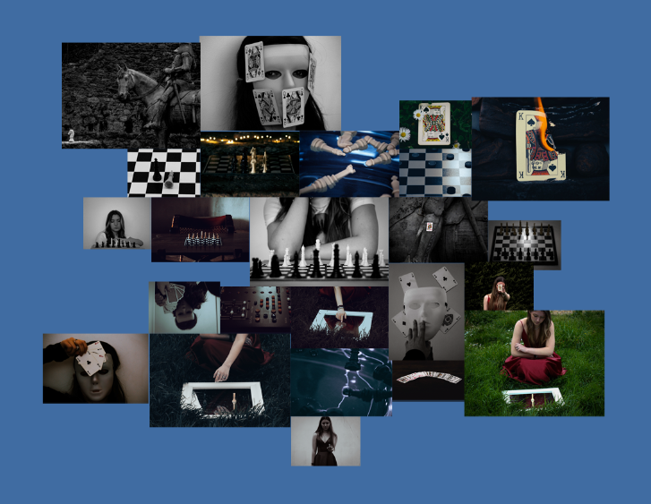
For this layout I decided to lay it out in the way of a mind map, excluding any boarders. If I were to chose this design I would mount all my images on white board so they are all raised from the board while remaining the same height as each other. I like how chaotic the layout makes the images look, all while still displaying the main features of my project.
Second layout
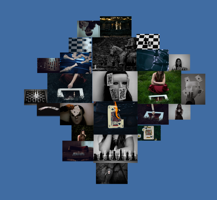
A similar design to my first idea, except the outcome looks more tame and organised. For this idea I would be mounting my images on card since I think having my images flat would go nicer with the design layout.
Third layout
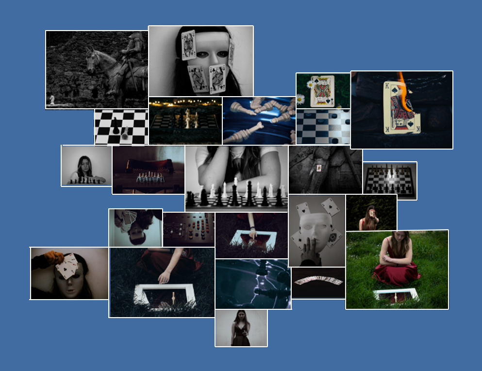
This time around I stuck with the sort of mind map style as my first layout, yet this time decided to see what it would look like with a boarder. To create these mounts I would stick my images to white foam board while making sure to leave a gap from the edge.
Final layout
I chose this as my final layout since I think with each of the photos having a slight boarder helps to create a sense of familiarity among my images, making them connect better and become more visually appealing. I also like the idea of my photos being spread out in a chaotic fashion, yet the closer you look a story starts to show due to all the images branching out from the black and white chess piece in the centre in a similar way to that of my photobook.
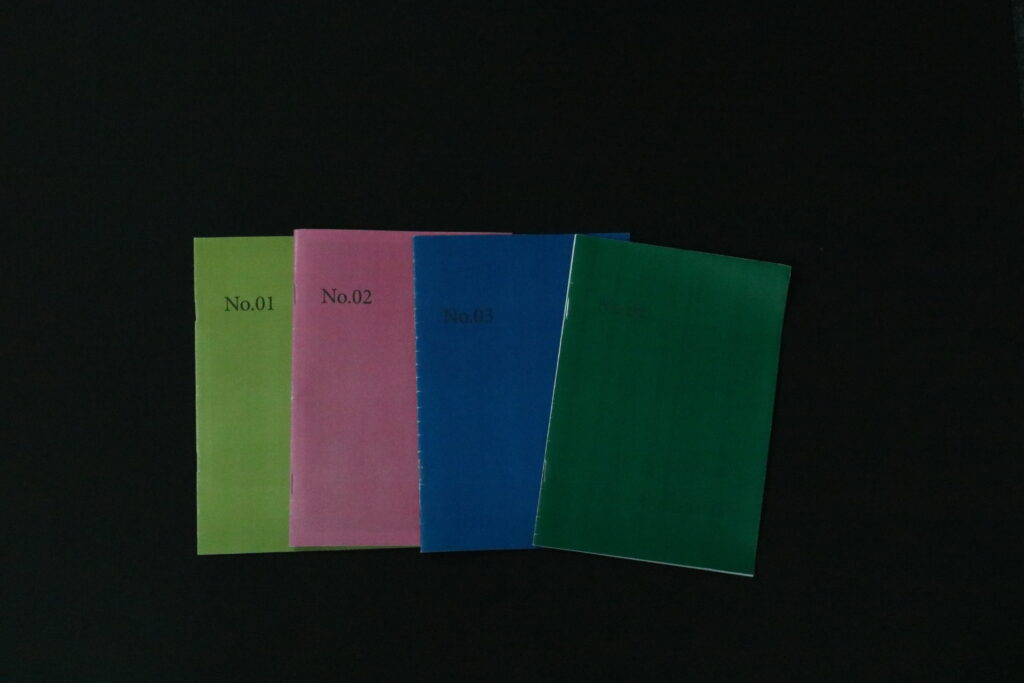
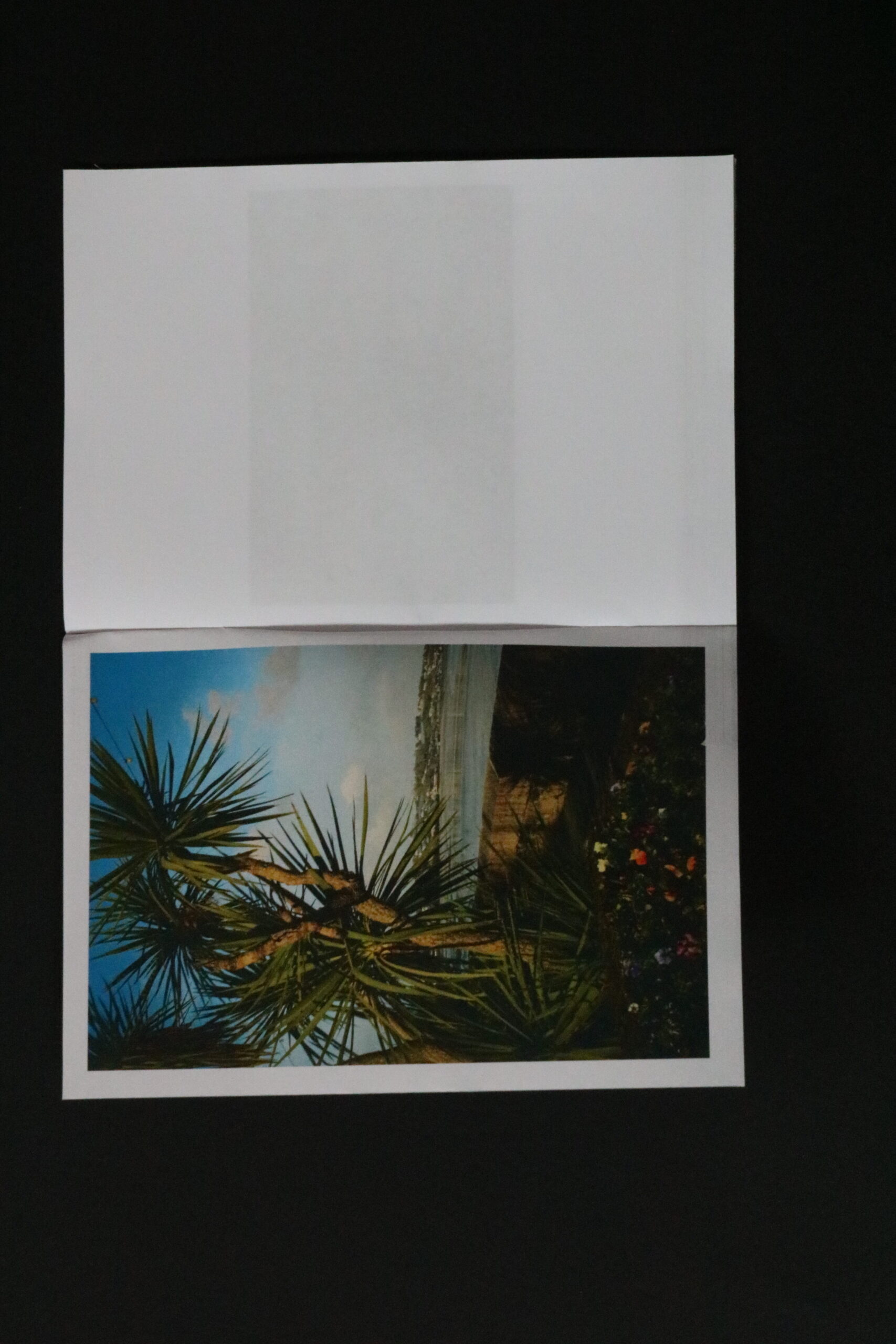
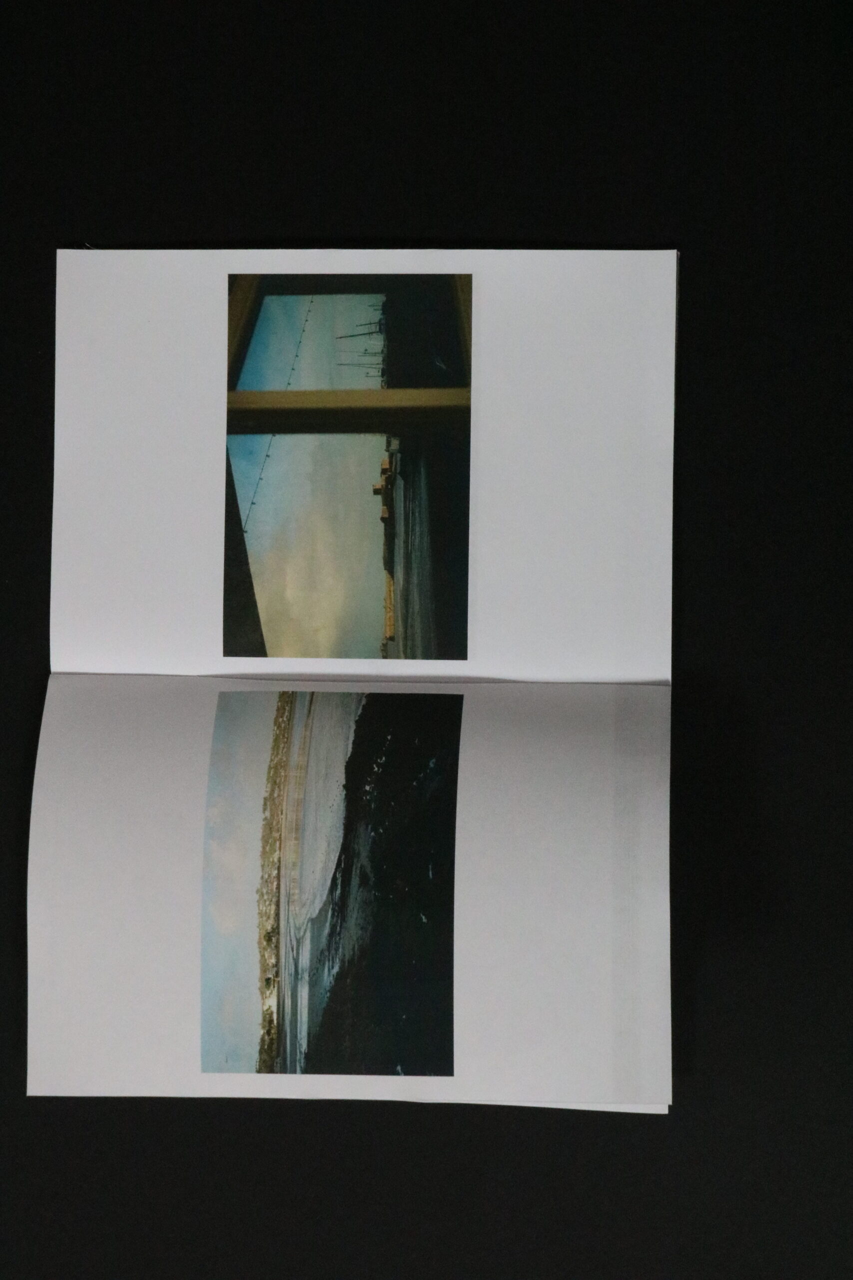
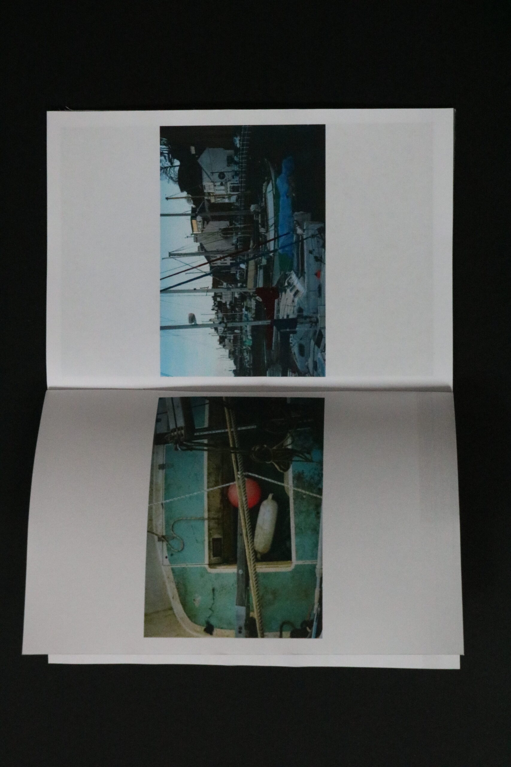
As part of my final outcome I have previously designed in InDesign The layout for mostly each photoshoot I have produced prior to my trip to Norway. For these outcomes, which were explorational and adventurous, I printed them from the layout created in InDesign. Once I had all the pages printed I folded them in the middle and stapled them in the middle. then sing a ruler and a craft knife I cut off the white border which was best visible against the coloured covers, and my zines were completed.
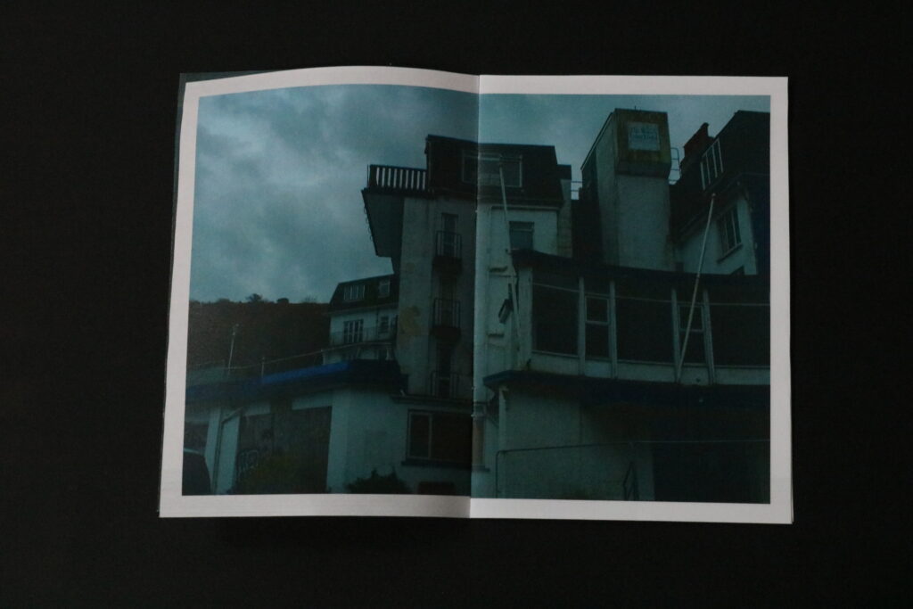
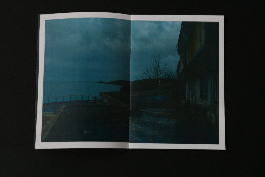
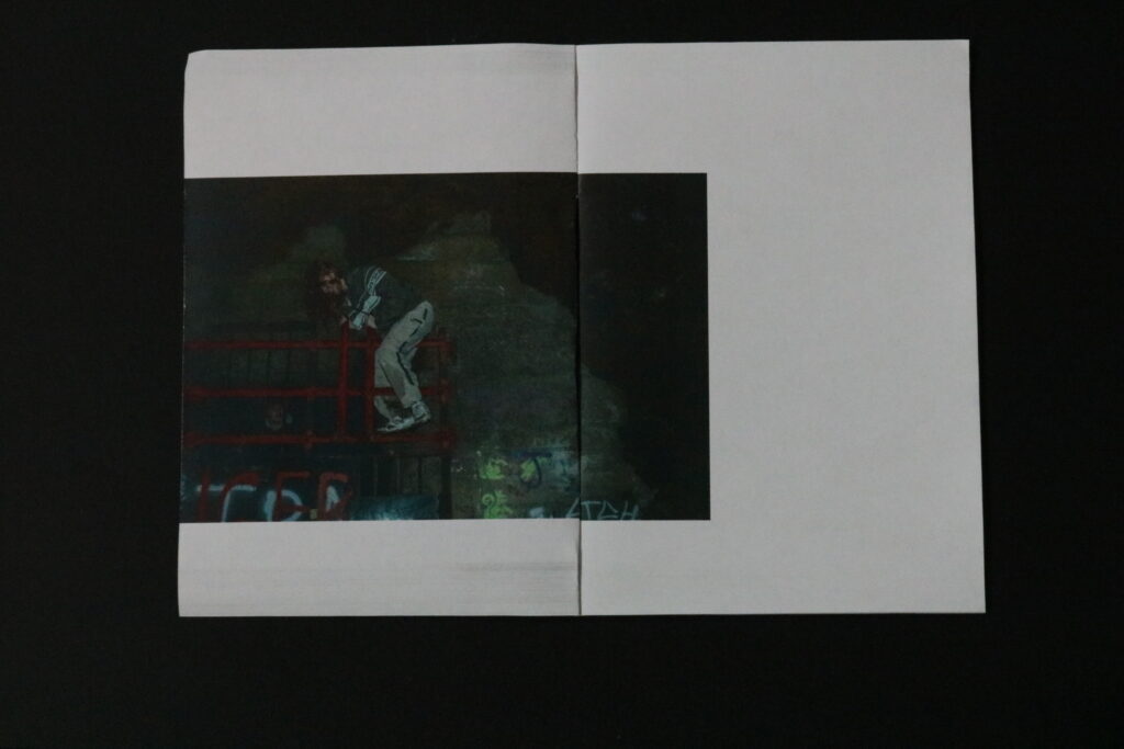
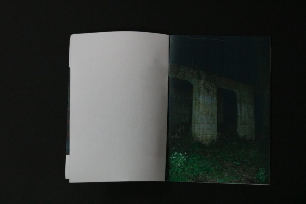
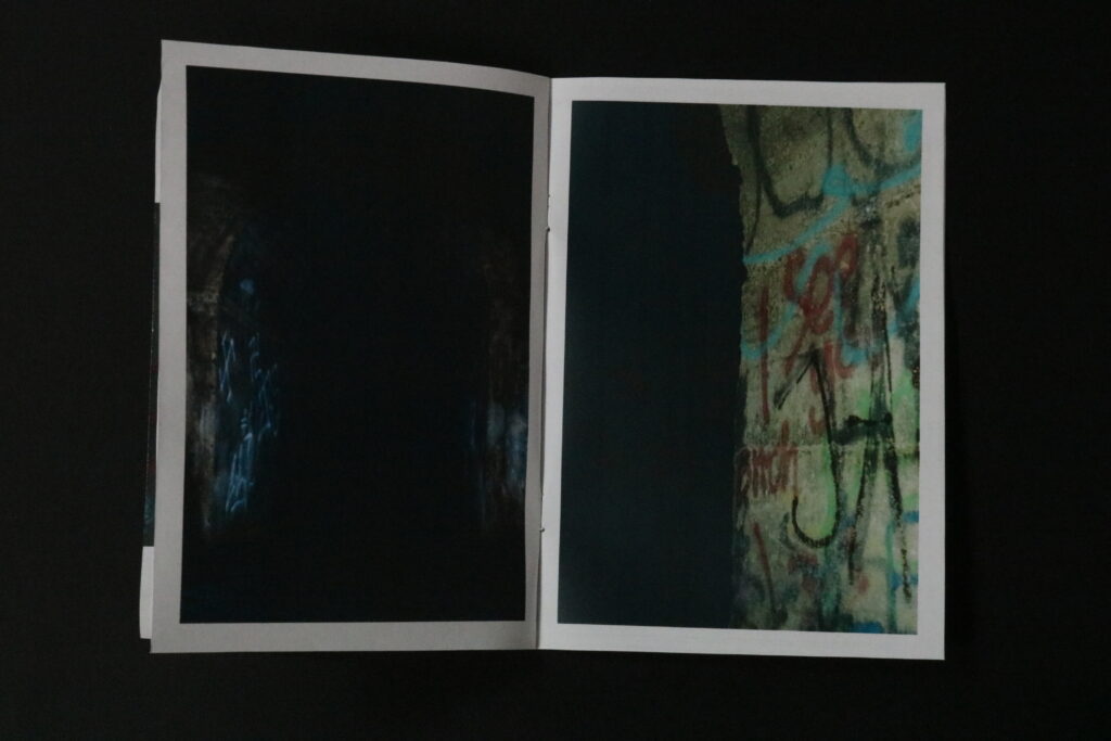
Bellow I have represented how the final layout of these zines turned out, both externally and internally, showing the contents of each one, page by page.
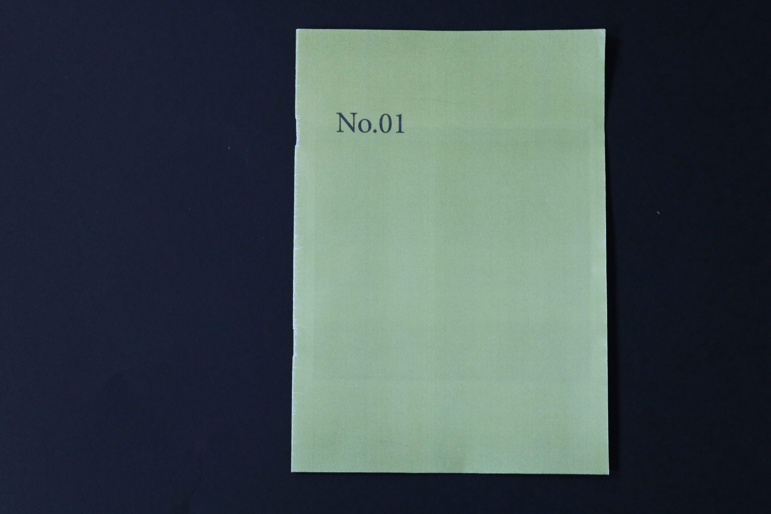
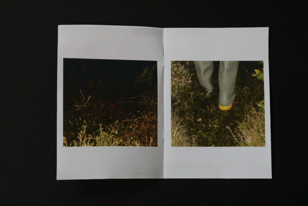
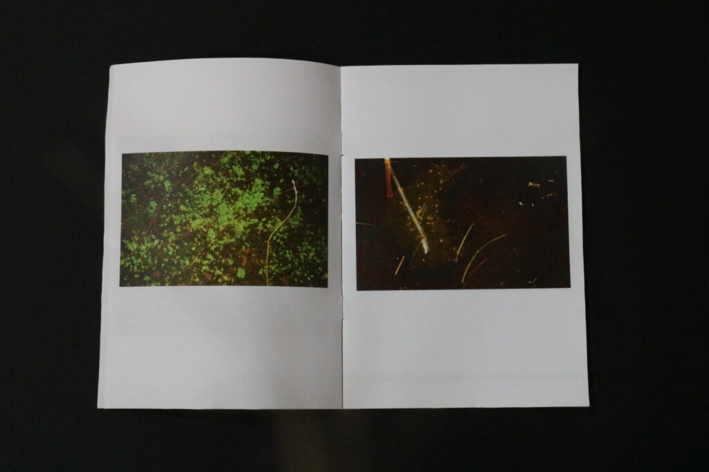
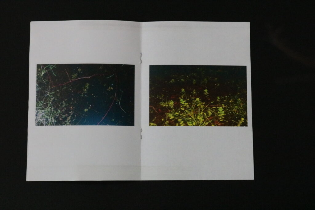
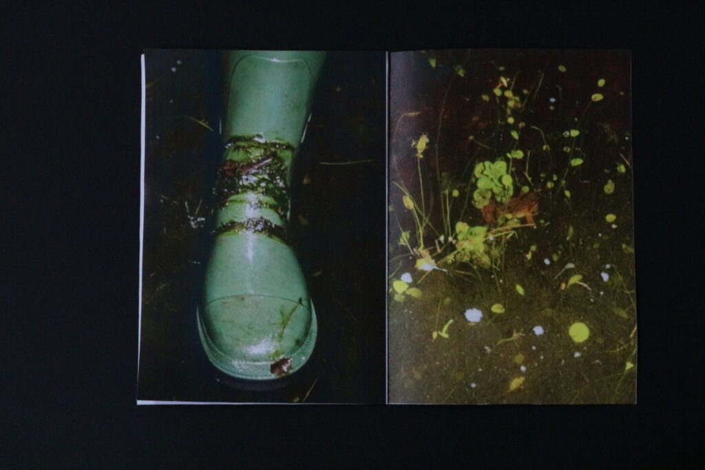
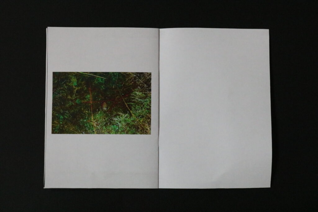
No.01 (frogging)
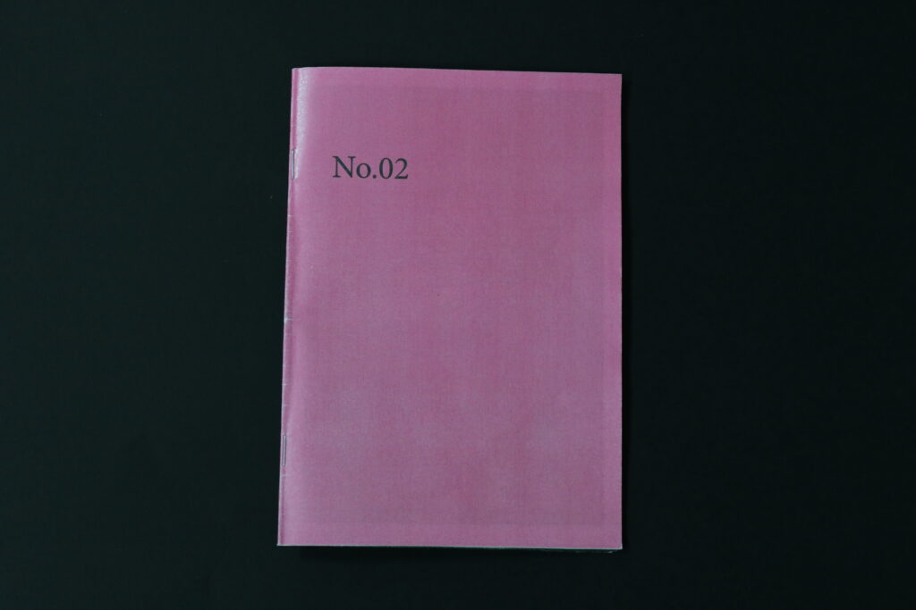
No.02 (sand dunes and St. Aubin)
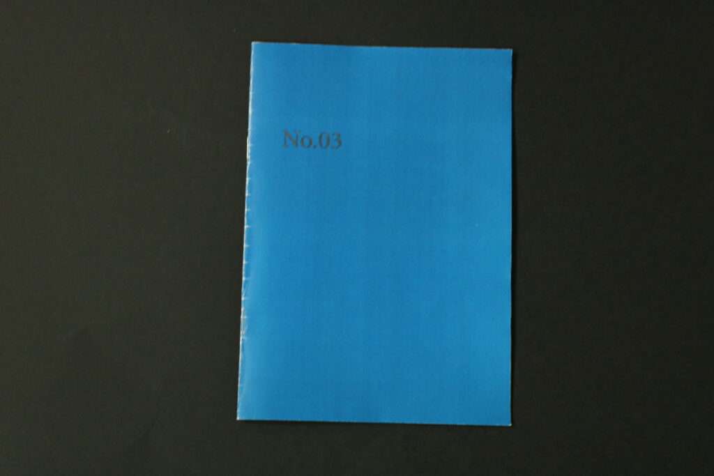
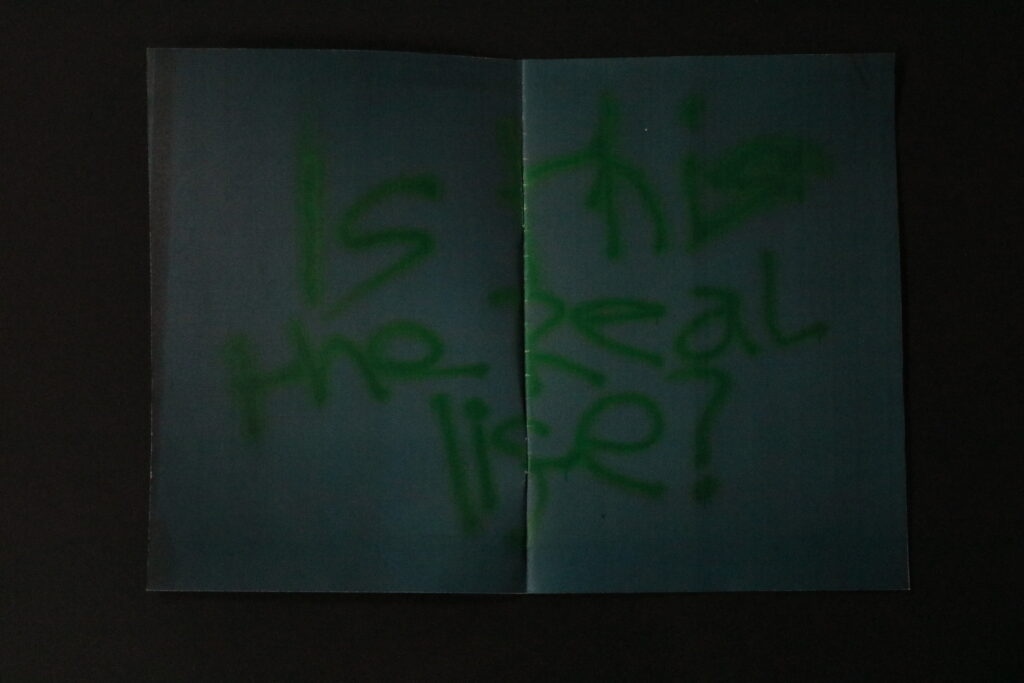
No.03 (Hotel)
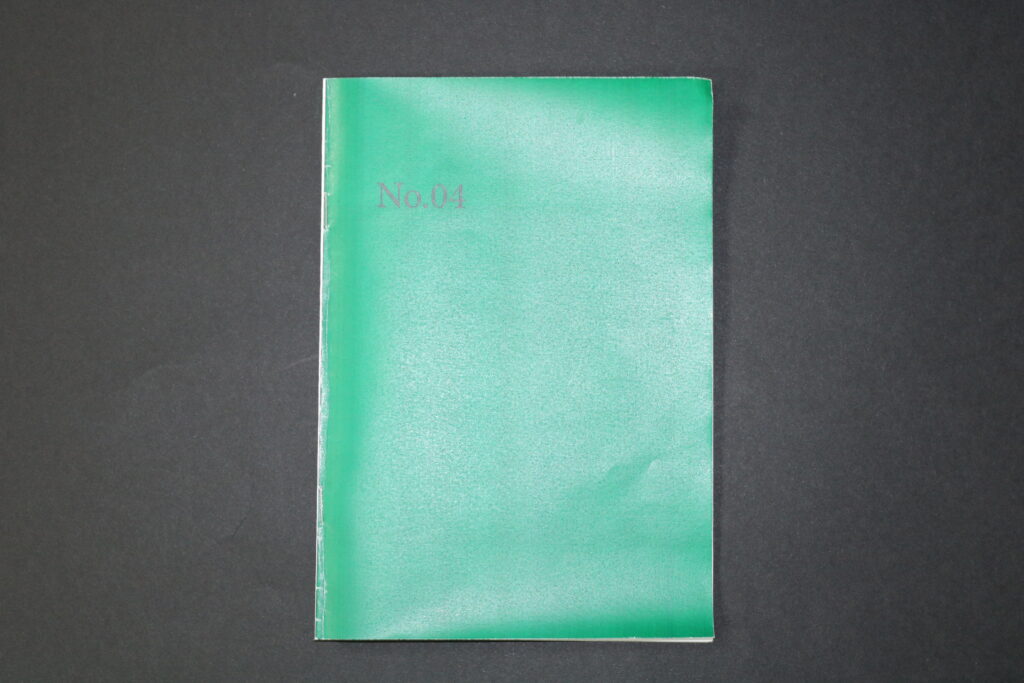
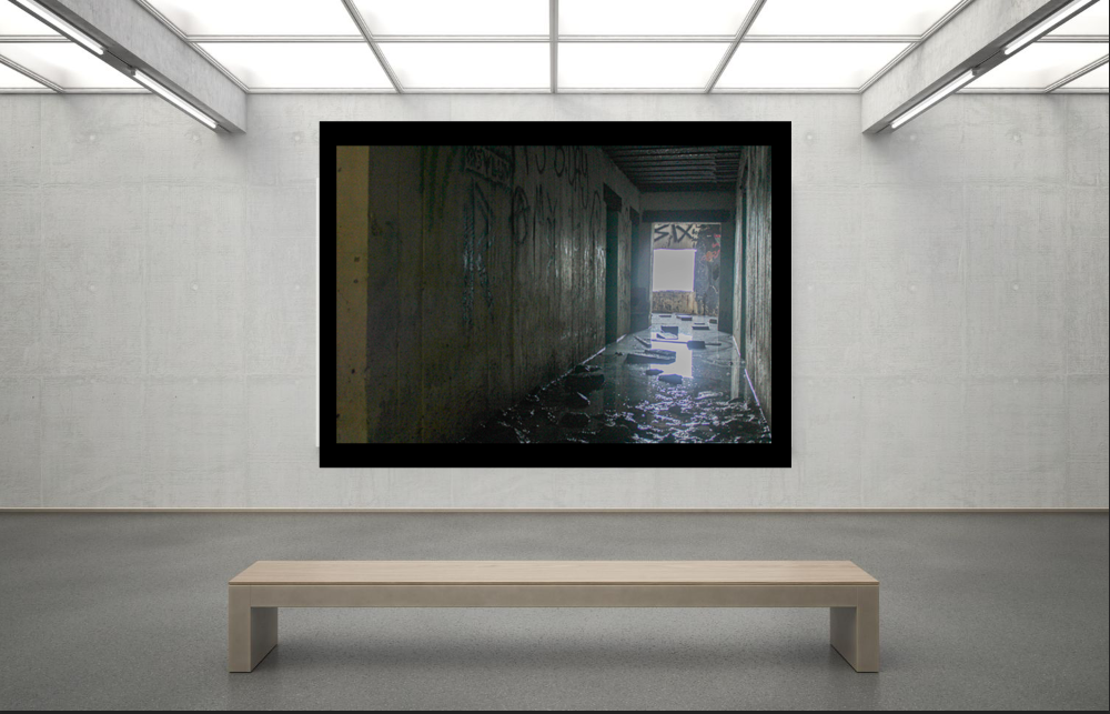
No.04 (tunnel)
Evaluation
Overall I am happy with every zine and how it turned out. It was a simple and quick way to present my outcomes. As I had a large number of photographs I wished to present I am happy I chose this method of presentation as It made it easier for me to group the best outcomes from each photoshoot together. I had a feeling that if I presented all of them together in a single book, the images wouldn’t relate to each other as much, as every photoshoot has a different atmosphere to it. I like how each zine focuses on a different subject, but overall the theme of exploring is evident through the pictures. Each photoshoot challenged me in different ways, like when photographing in darker places like the tunnel and hotel, I had to dramatically change the setting to where I was photographing, in contract of photographing the sand dunes and St. Aubin, where the lighting was dramatic due to the sun setting and there was a high contrast in light and dark values. Therefore I have been challenged to not only explore but to see the world around me through a different lens, though all the photoshoot I noticed that exploring, and seeing something from a different or new perspective, has a great impact on physical and mental wellbeing. Regarding the themes : observe , seek and challenge, I wouldn’t have produced successful outcomes without observing the environment around me through a different motive, and seeking adventures with exploration along side it.
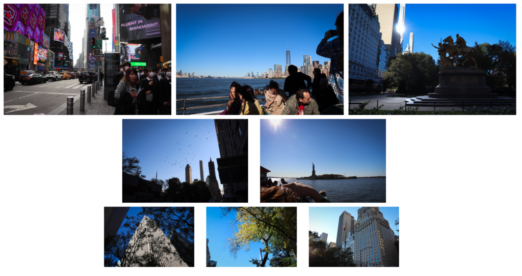
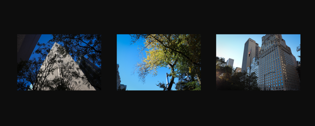
These are the 8 images I have selected for printing. The largest ones are in A3 size, the second largest are A4, and the smallest are A5. I plan to mount every image on foamboard and group the three A5 boards on a piece of black cardboard to act as a triptych.
The other 5 images I will mount on to black cardboard separately if there is enough, but if not, I will leave them as stand-alone foamboard mounts.
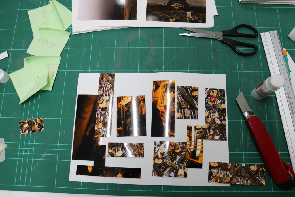
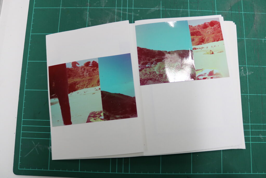
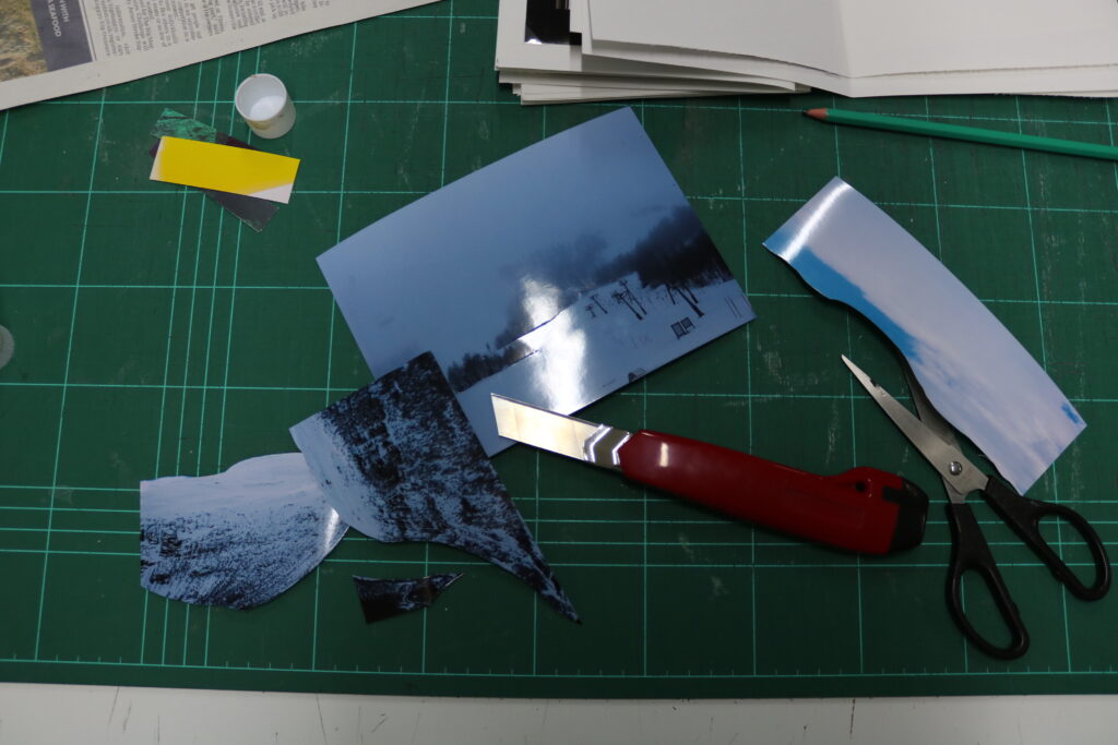
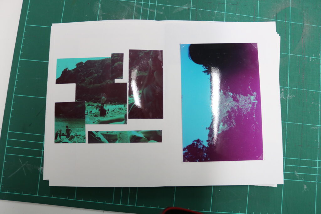
Once the plan was produced on how I was going to tackle and fit the photographs onto the paper, I have worked page by page, in order of the beginning, where the images that were cut up , I have stuck with glue, and images that had no notes on them , to be fitted in using photo corners.
To get perfectly straight cut pieces, I used the strip cutter, then before sticking the pieces in a random pattern, I planed and played with the arrangement until I was happy with it.
As I mainly used the methods of cutting the images into cubic shapes, this process being used to combine images or just on one photograph, I also experimented with a cutting knife when cutting out irregular shape, such as the photograph combining method shown above.
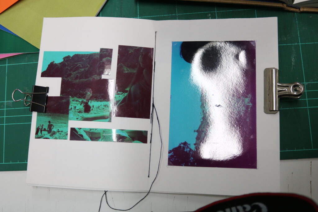
Once all the photographs were secured in the book, I needed to combine these pages together using simple sowing methods. Firstly, I used clips to keep the pages in place, then I have measured 1.5cm from the top(A) and bottom(B), marking it with a pencil, I then figured out the middle of the page by dividing the length of it by 2, from there I measured 5mm on each side, leaving me with 2 marked spots(C+D) ,which the length apart was the middle of the page. I then figured I needed 5.5cm (E) from the top as then if the gap between 2 dots was 1cm, the next mark needed to be 1cm from 5.5 mark (E) leaving me with mark (F). This meant that for it the distance of these marks were perfectly in between A and C. I then repeated the same process , however starting from the bottom. Marking out between B and D.
I was finally left with the order of : A, (E+F), (C+D), (G+H) ,B
This meant I would be left with 3 visible lines of thread/stich, and that from the side I start from, the thread will also leave.
I used a sharp-end tool to poke the holes in the place I have marked, and made sure to slightly bend the book so that I was getting to the centre of the crevice.
The order of how I actually pulled the thread through was : starting at D, the working down to G+H, coming out through B and back to the top through C, then working up to F+E and when it came out through A I tied this string with one that I started from, which was D. This order made the book stronger and had a tighter tension, which made the book more stable.
The image above shows how the stitching looks on the outside, but the image bellow shows the inside of the sticking, going through the middle of the 3 page stack.
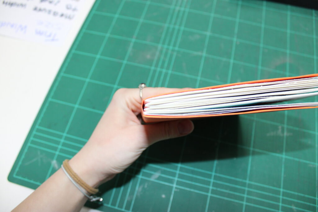
What I had to do then combine this group of page, 4 groups, by sticking them together of the outside side. to do this I threaded the thread through the gaps formed on the other side, which were 1cm, then I tied each one tightly. This combined the stack of all pages together, meaning it acted out like a book rather than a collection of zines.
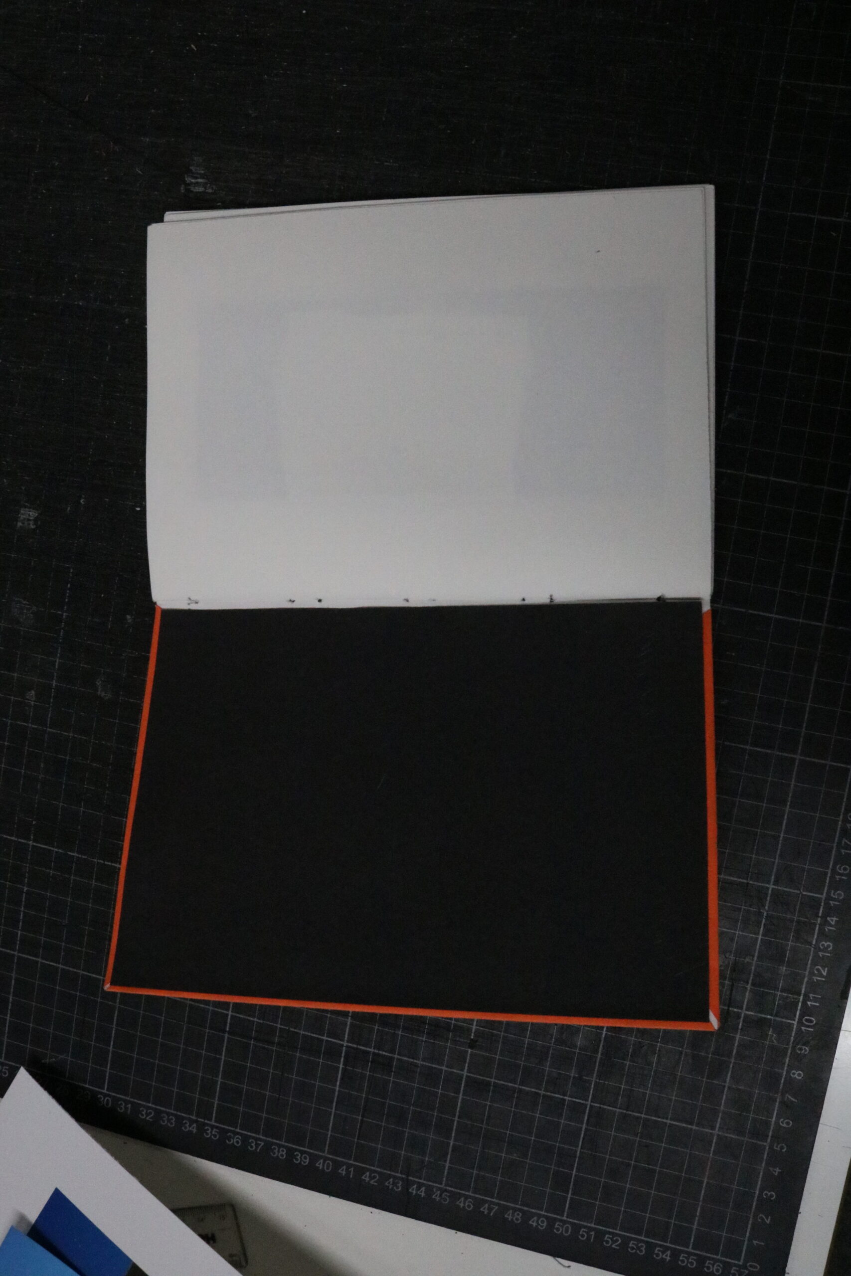
The last thing I have done was to add a cover, to which I chose a bright orange coloured paper, which was thick but not a card. I measured around the pages how much of it I needed and then I left a little more room for the paper to rap around the end pages.
Once I stuck the paper(cover) onto the inside page, I wanted to get rid off the gaps the folded pieces have created, therefore I used a black card and stuck it onto the inner cover, which also strengthened the cover and tidied up the inner look of the book. I chose black to match the thread I have previously used.
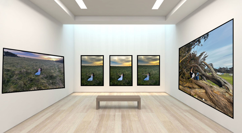
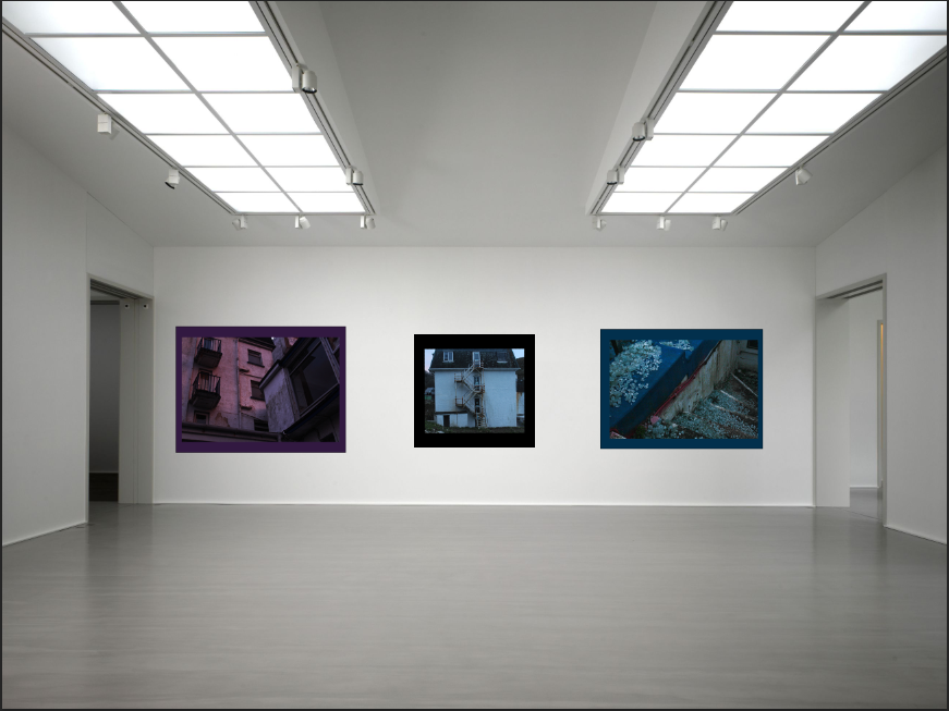
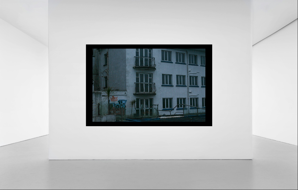
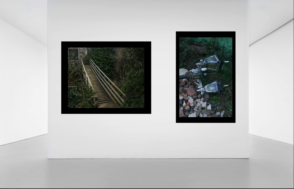
I used these templates to create my virtual gallery.
As these were just templates and weren’t made on the virtual gallery website, due to exam conditions, there was no option to ass a frame to my image. I improvised and used the rectangle shape drawing tool to create boarders around my images. After creating them and placing them in the correct position, I then dragged my chosen image on top; I also changed the colour of some of the boarders to add some more contrast, some of them blended in a bit with just the black background.
I originally was going to create a magazine rather than a book as I’m using very few images. However, decided to do a book to make it look more neat and put together.
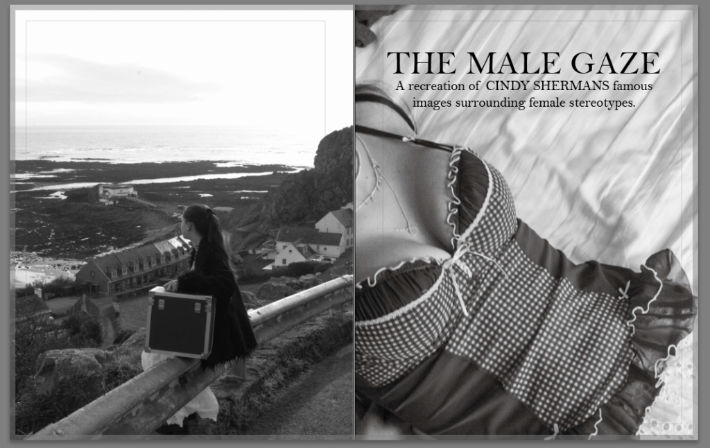
CONCEPT:
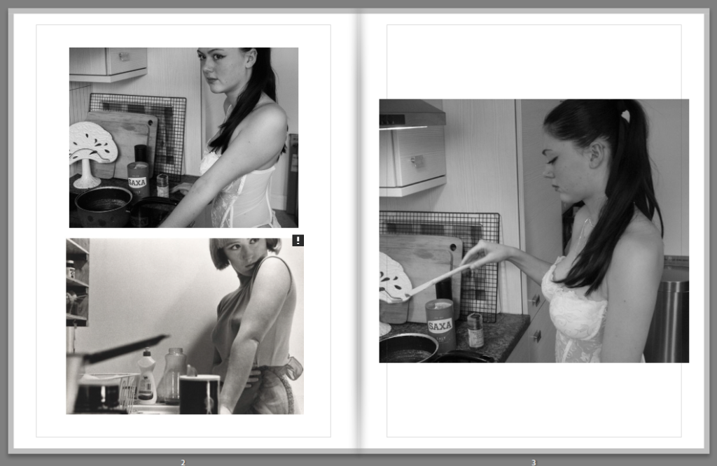
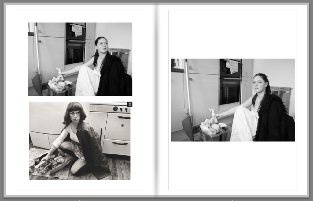
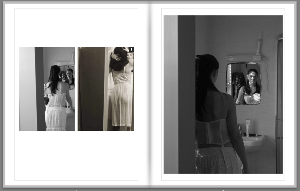
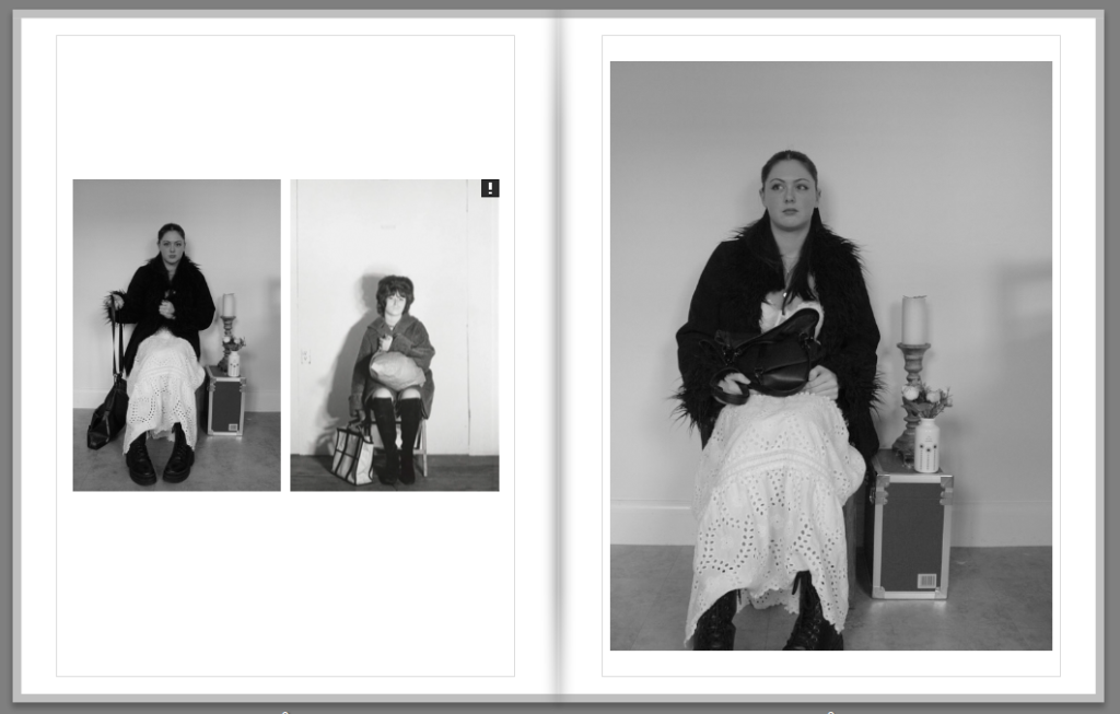
My aim was to recreate Cindy Sherman’s famous pictures surrounding the male gaze and experiment with ‘gender performativity’ by using props, makeup etc.. After having done that photoshoot, i was very pleased with the outcome and how similar some of my images looked compared with Cindy Sherman’s. My book consists of a compare and contrast with Sherman’s work, as i place my recreation of her images next to her original ones. Its meant to be brief and almost to demonstrate how photography can be analysed, reused and manages to still get its message across, in this case, The Male Gaze.
LAYOUT:
On the official pages i have placed my work and Cindy Sherman’s on the left, and then a similar photo on the right which is mine. On the left page is the more identical one to Sherman’s work whilst the images on the right pages are just more form the same shoot.
Back and front cover:
This ‘blurb’ on the back of front page gives the reader an in sight on Cindy Sherman overall and her main objectives when creating these images. I also added my own image on the top as a headline to create a neat welcoming feel into the book. The flowers give it a feminine feel to it.
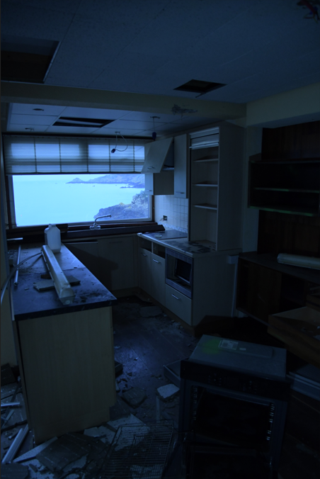
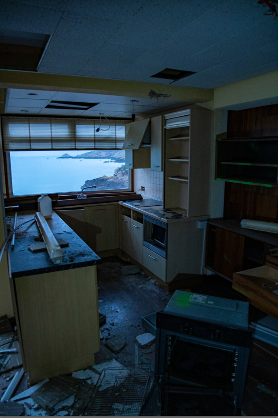
The photo on the left is before editing and photo on the left is after editing, when editing this image I wanted to get more light in it so it didn’t print dark when the book was printed I had that problem with my first photobook I also wanted the viewer to see through the window and see the view as clear as possible.
These are the settings I used to get this image to look the way that it does turning down the highlight the exposer up make it easy to see clearly through the window and you can adjust the brightness of the image with the exposure and contrast.
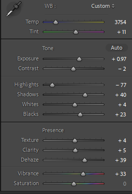
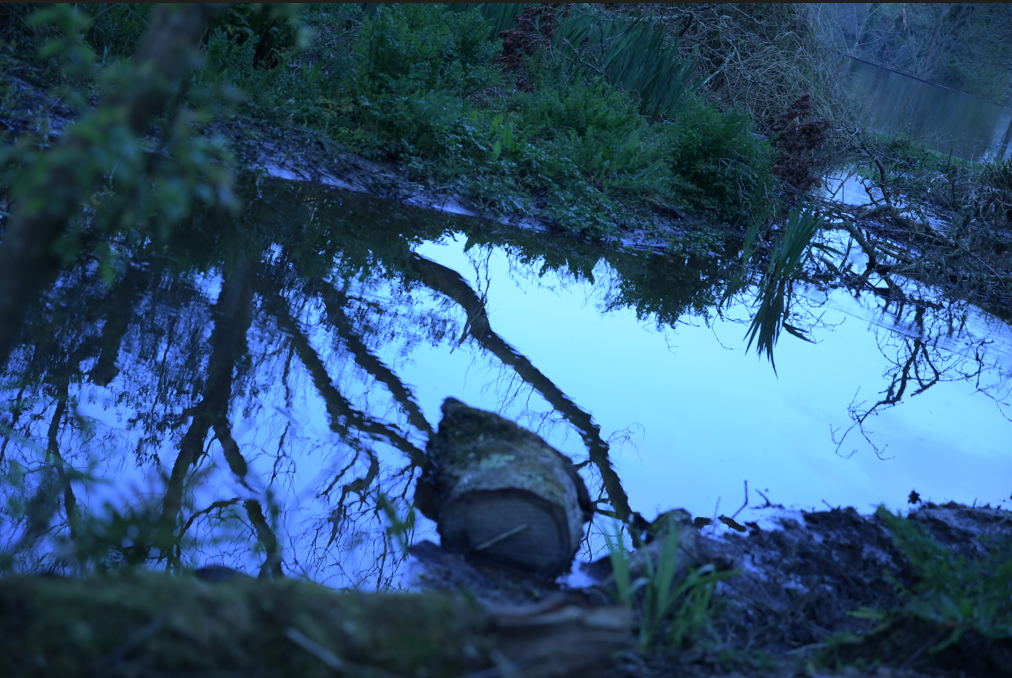
The image on the left is before editing and the one on the right is after editing, when editing this photo I really tried to make the reflection in the pop and look just good because I really like its feature in the image. I made the image blue because the it makes the image just look good and makes everything almost alien for example the plants are a bit greener than usual and the water like silky blue almost like a mirror.
These are the settings to the edited photo when creating the image I just played around with some setting I didn’t really know what I wanted the image to look like but I did know that I wanted the reflections in the water to pop and for the image to look good and I think it turned out alright.
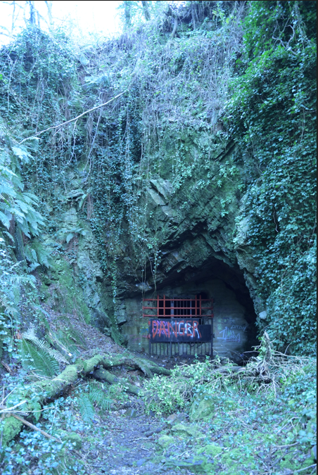
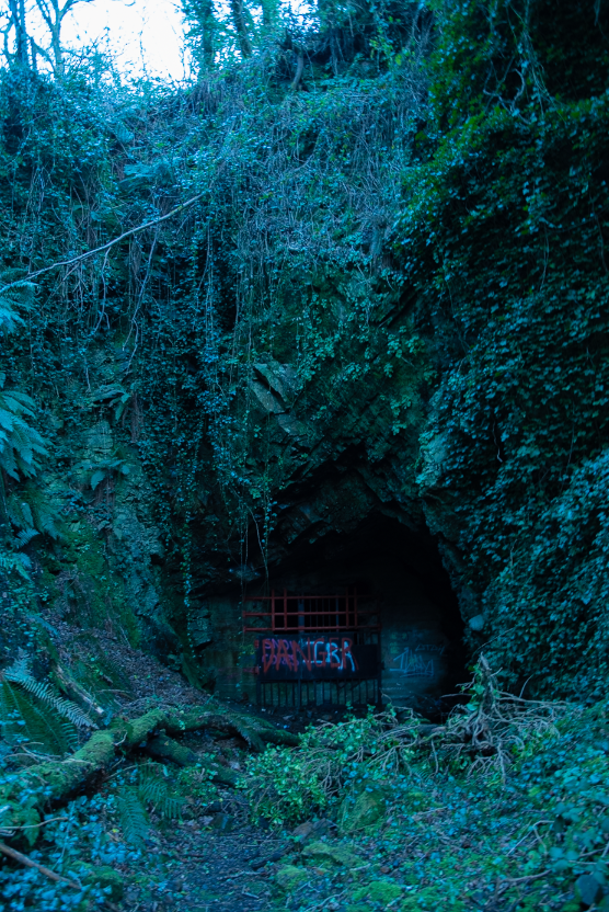
The image on the left is before editing and the one on the right is after editing, when editing this photo I really tried to make it look less bright and get more detail of the rocks around the bunker I also tried to make the plants and wildlife around the bunker. I really like how this photo looks there a lot of wildlife around this concrete structure and it just looks out of place almost not real.
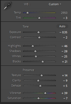
These are the settings for the edited photo when editing I just wanted to turn down the brightness and when I used the exposer I lost a lot of detail when using turing it down to the brightness that I wanted for the photo do I played around with the highlight, shadows, whites and black to get the image I also played around with the colour to make the wild life look slightly unnatural.
One I gathered all of the prints I wanted to use for a physical book. I have firstly went through all the photographic prints I own, this meant I looked at all archival images and selected ones that I thought best relate to the theme of travel and adventure. The book is divided into 4 main areas:
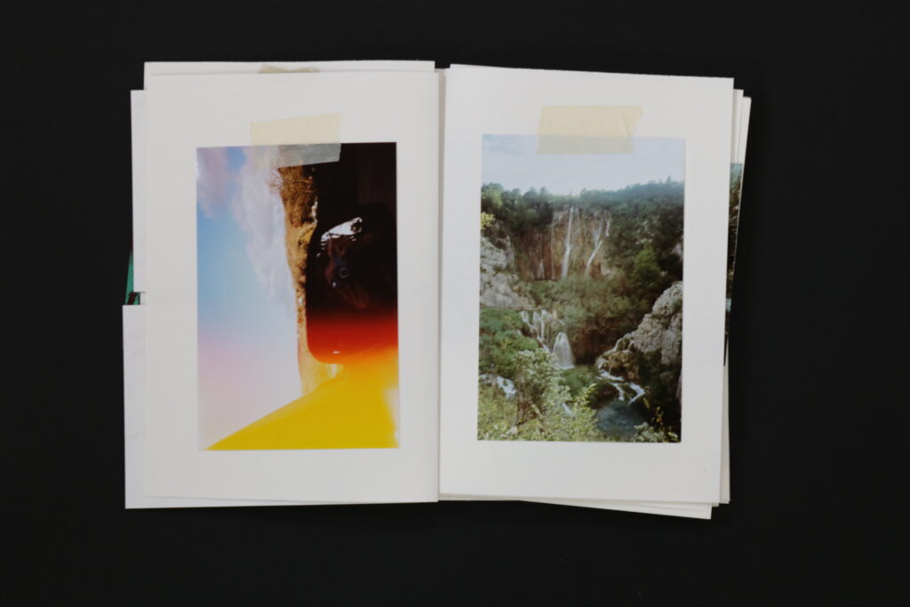
Film Photographs from around 4-5years ago, these are the ones which have more blue/green hues.
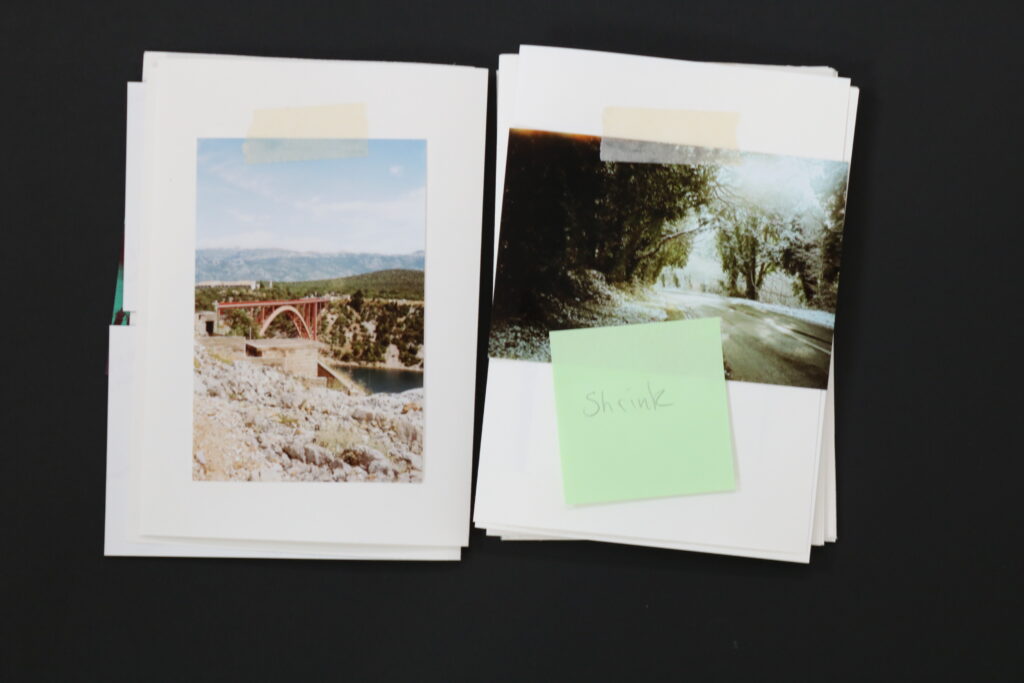
Film Photographs from around 1-2yeards ago, these document my trip to Croatia last summer.
Digital Camera Photographs, which document a trip to Paris, done in November last year
Digital camera photographs documenting traveling to Norway, done 2weeks ago, for the exam
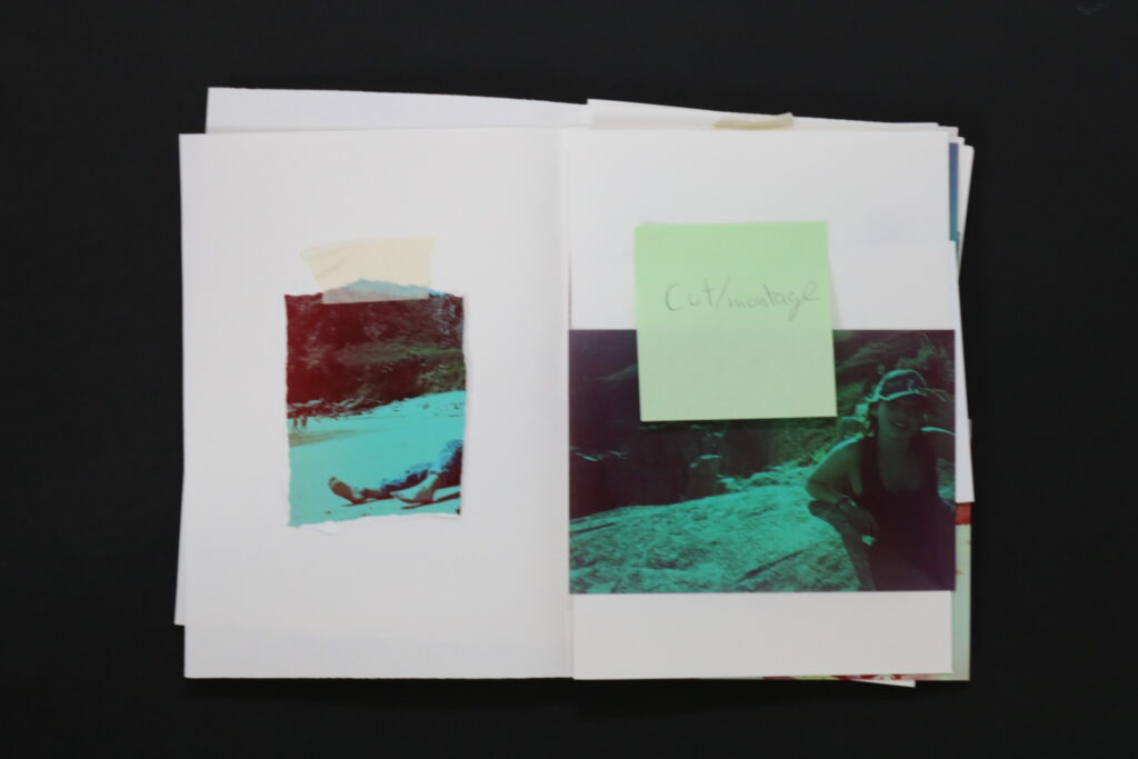
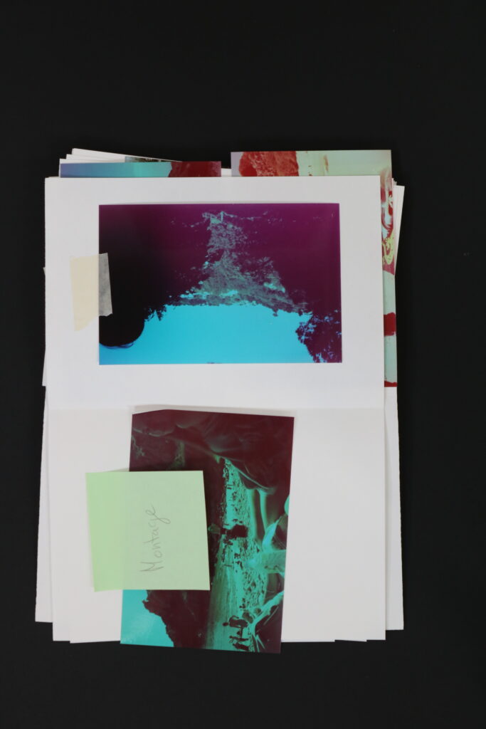
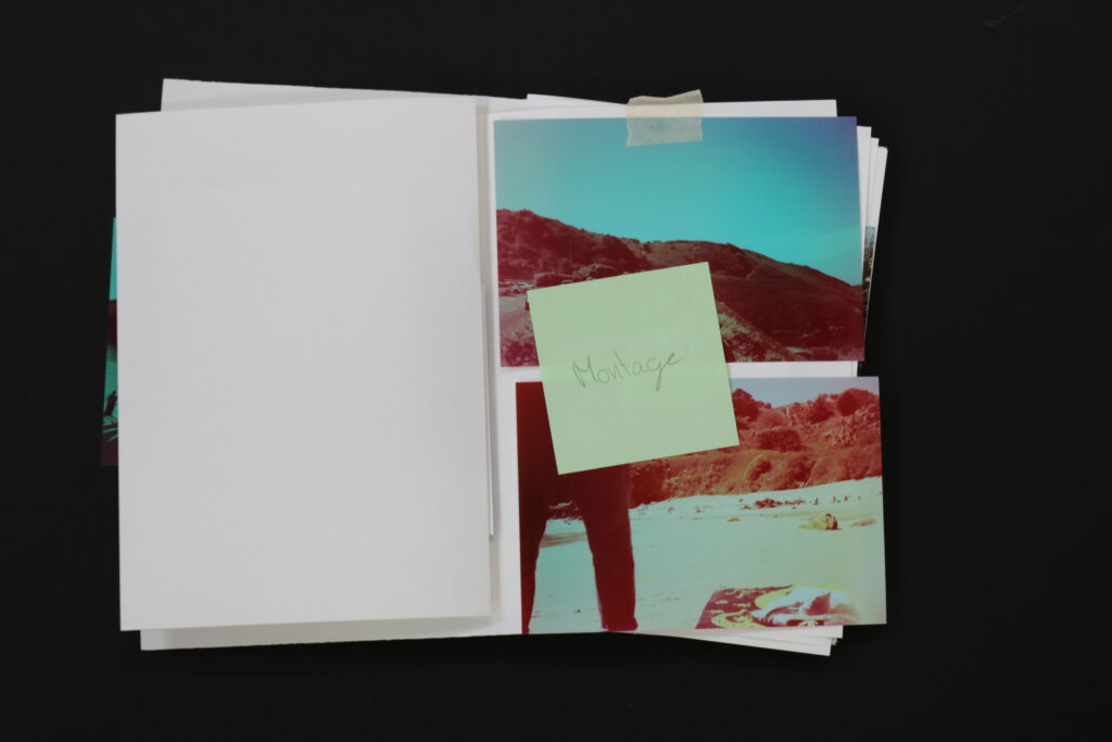
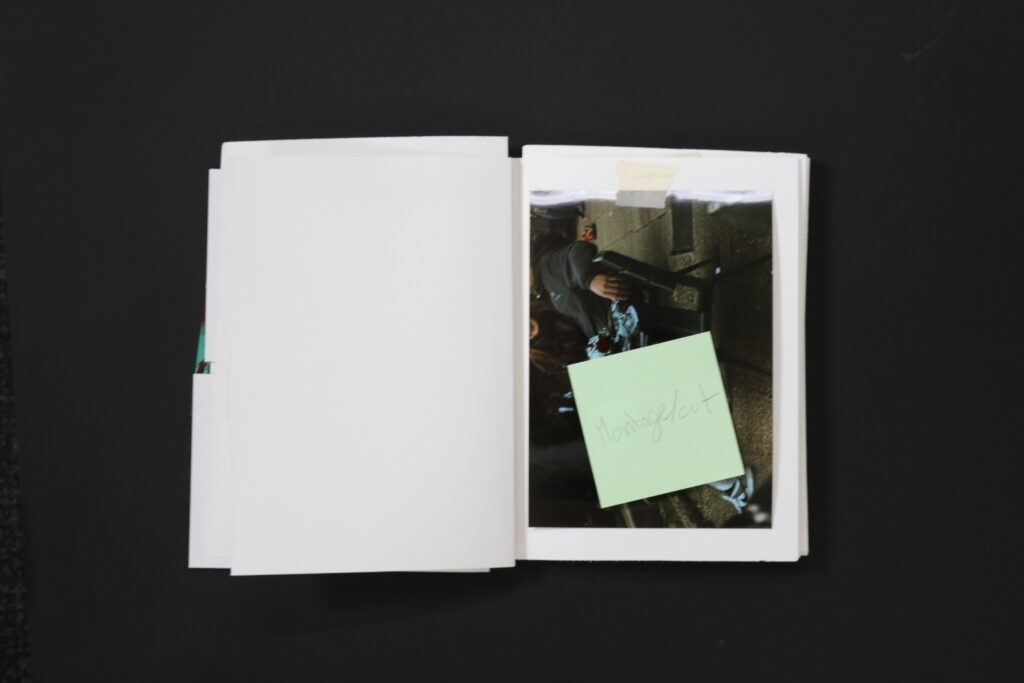
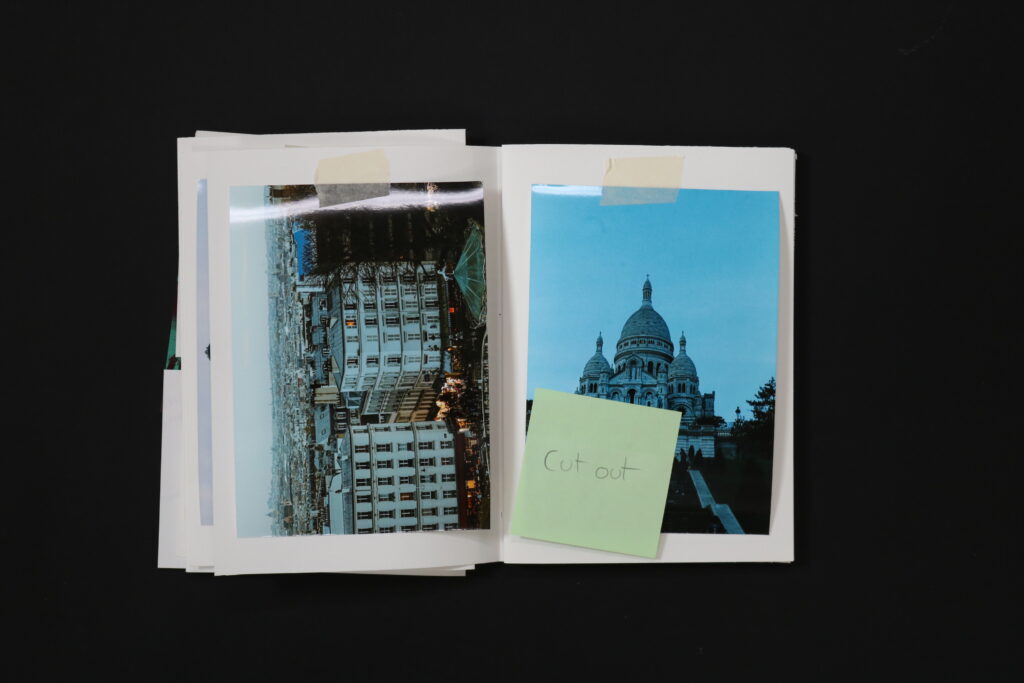
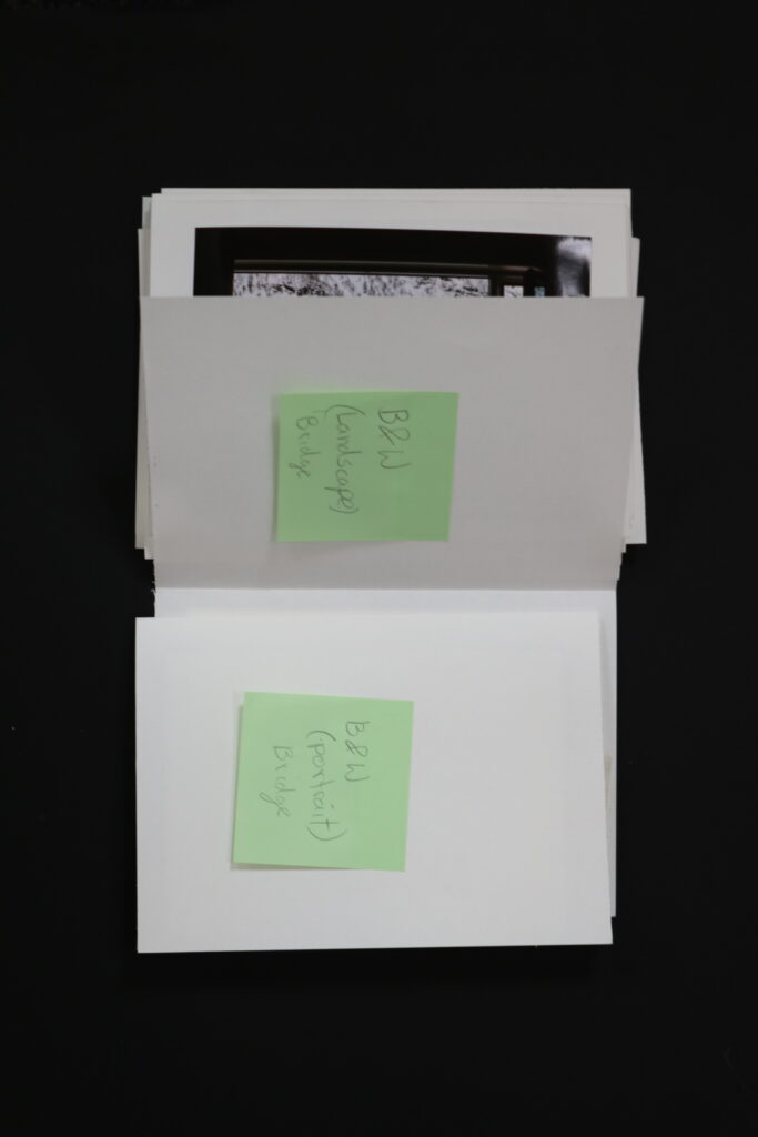
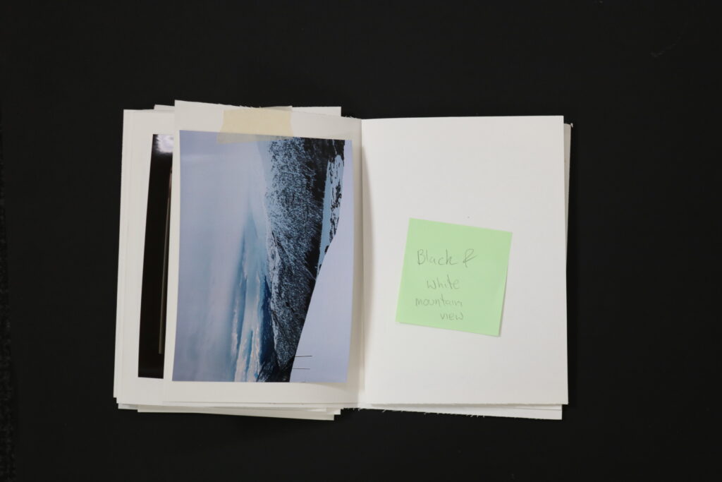
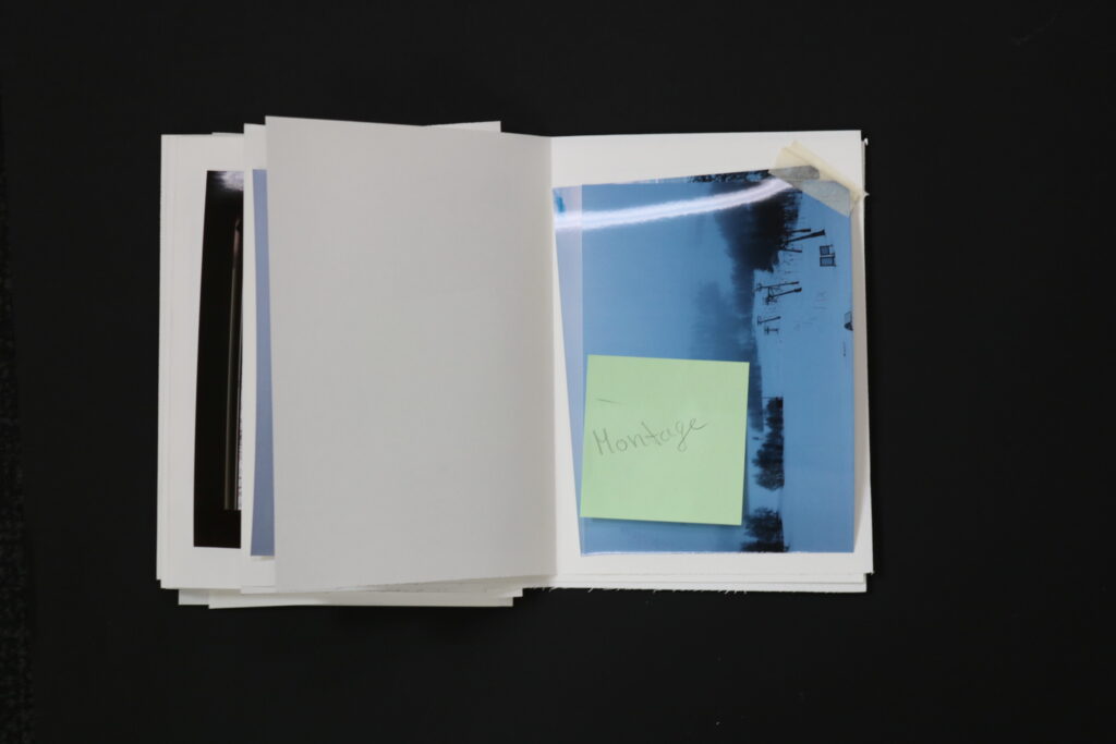
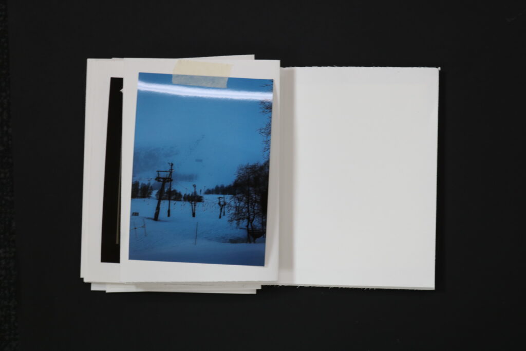
I divided the book into these 4 categories so that I could show them in the correct order of events. I needed to pan the layout of these images, therefore I have used masking tape and sticky notes to roughly plan the order of images. on sticky notes I wrote if I should collage/ Montage or alter the images.
The idea behind altering those images was due to me not wanting an organised order of images, but instead wanted to be creative and show my creativity through the alterations. I think altering images brings out the adventures side of them, they appear more exciting, interesting and new, which are the main qualities people get by traveling and visiting new places. I wanted the photographs to represent this adventurous nature.
When it came to the paper joining and how the book is going to look like, it was the first thing I have done, Because then I could attach the order of the images, since I knew the correct order of pages. What I have done is got 3 pieces of A4 to fold in the middle and for one to go inside the other one. in books a number of 6 is very common, however because I was working this thicker paper it was best to half that amount to 3, leaving me with 6 pages, which meant 12 faces. I have repeated this 4 times and was left with 4×12 faces. however I had to be mindful to leave the first and last as well as the 2nd page from the start free, as this is also a common practice in books.
Bellow is the layout plan I have done before attaching the images onto the pages. When planning out this layout I made sure to pay attention to:
the space for the images I wanted to include, sent to the print folder, which haven’t arrived yet, than how much space I should leave if I am planning to do a certain alteration to the images,
how often I follow through with altering the images,
how I plan to alter them, if its by cutting, bonding together etc.
and one of the most important was the actual layout of the pages ( sheets of A4 paper). – how I am going to fold it and bond them together with thread
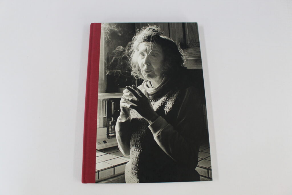
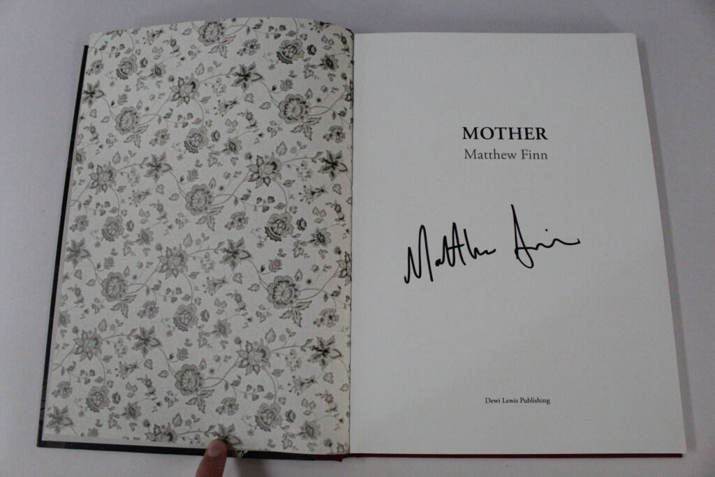
The photobook I used for the inspiration of my layout was “Mother” By Matthew Finn.
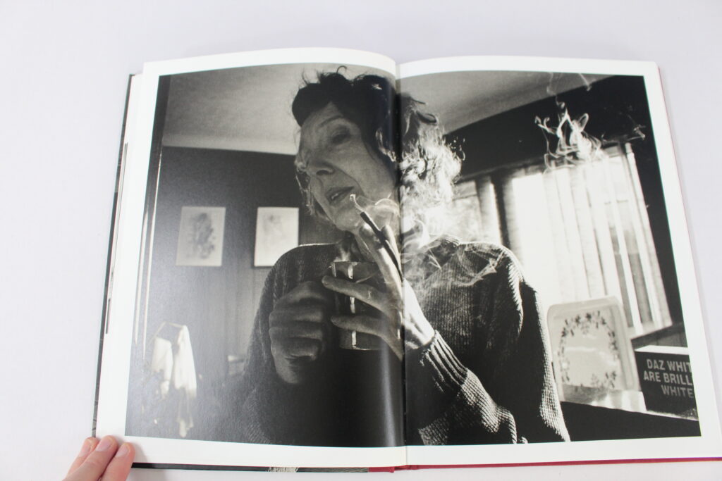
Mathew Finn made this book from photos he has taken of his mother over the years starting from his “Need to create stability” but due to this happening so often Finn stated that it became a “Ritual” and he couldn’t abandon it. One of the main inspirations for this book was to represent his mother as the only parent figure in his life, while his father abandoned him and his family to move on with his life. Many of the photographs are of his mother smoking a cigarette which he states is significant because on the day of his fathers funeral his mother told him that his father had remarried multiple times and had many other children, this news apparently deeply effected Finn and is where his need to create this photobook started. He felt the need to include his message at the front of the photobook before people read it to create a sense of clarity with the audience, And without the context his photos may lack meaning. Though In my photobook I chose not to include any written context I still think that the message that I was trying to portray was clearly evident to the reader.
In the back of the photobook Elizabeth Edwards wrote her account on the subject and named it “Feeling her presence” she describes his images as “not just portraits in the usual sense of the world, yet they are an account of life, a deeply humanistic response to a set of human circumstances” Which really gives the photobook more meaning when it is analysed in such depth.
I chose to use this photobook as my inspiration due to its layout, Though it can be seen as not having any relation to my photobook our formats are really similar. Finn used multiple different formats to display his images, though there are some consistencies throughout.
some of the formats he used are
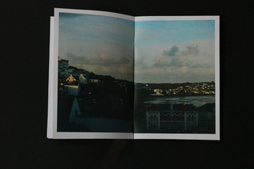
Having a double page spread for one of his stronger images. Though all of his pictures are of his mother, some can be seen as more significant than others such as this image. Finn explained the reasoning behind this image in his context at the front due to his mother smoking on his fathers wedding. By Finn making this image spread across two pages it creates an insight to the audience that this is one of the main images in his book.
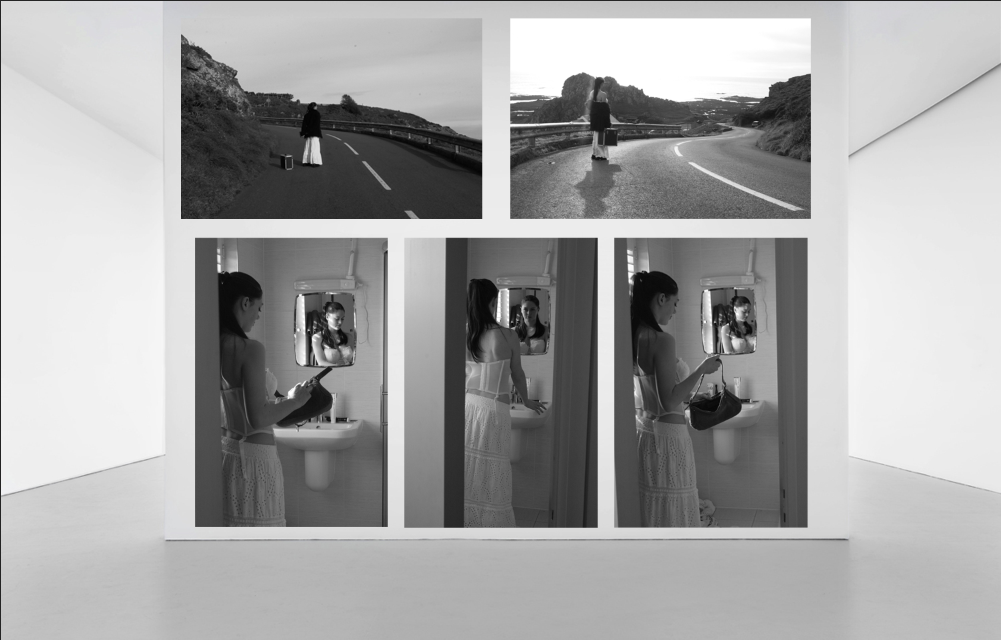
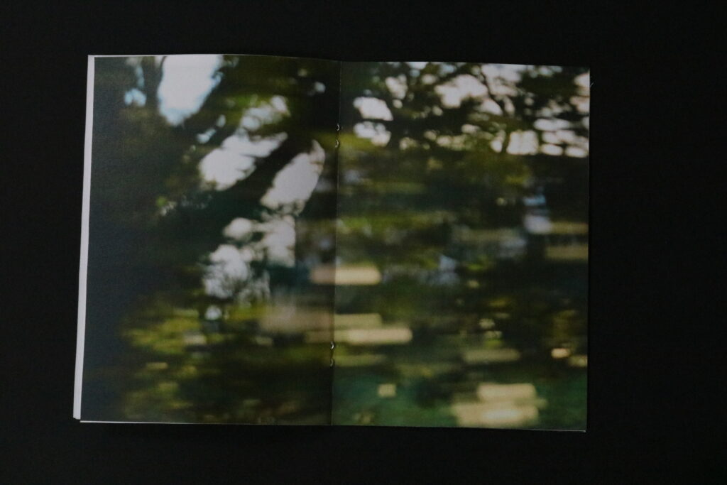
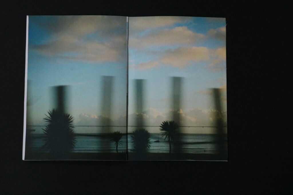
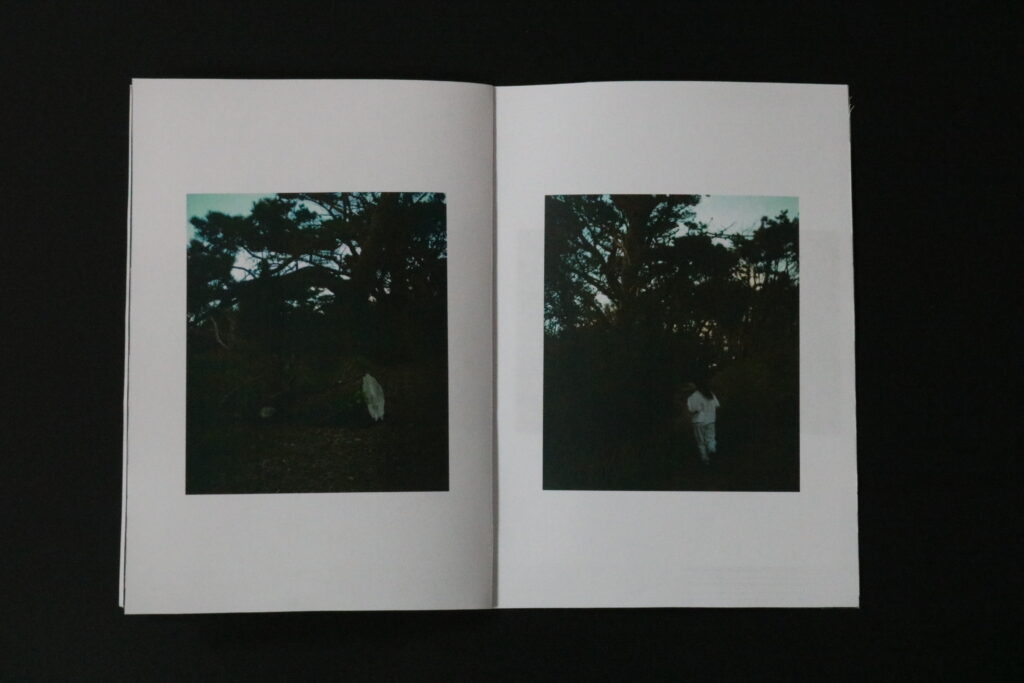
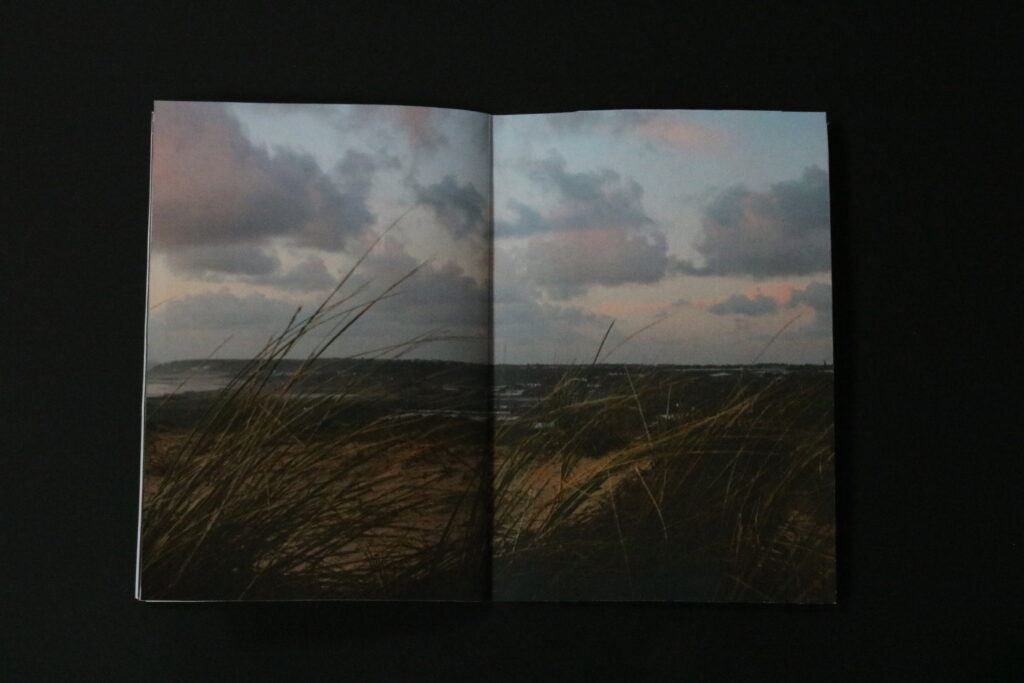
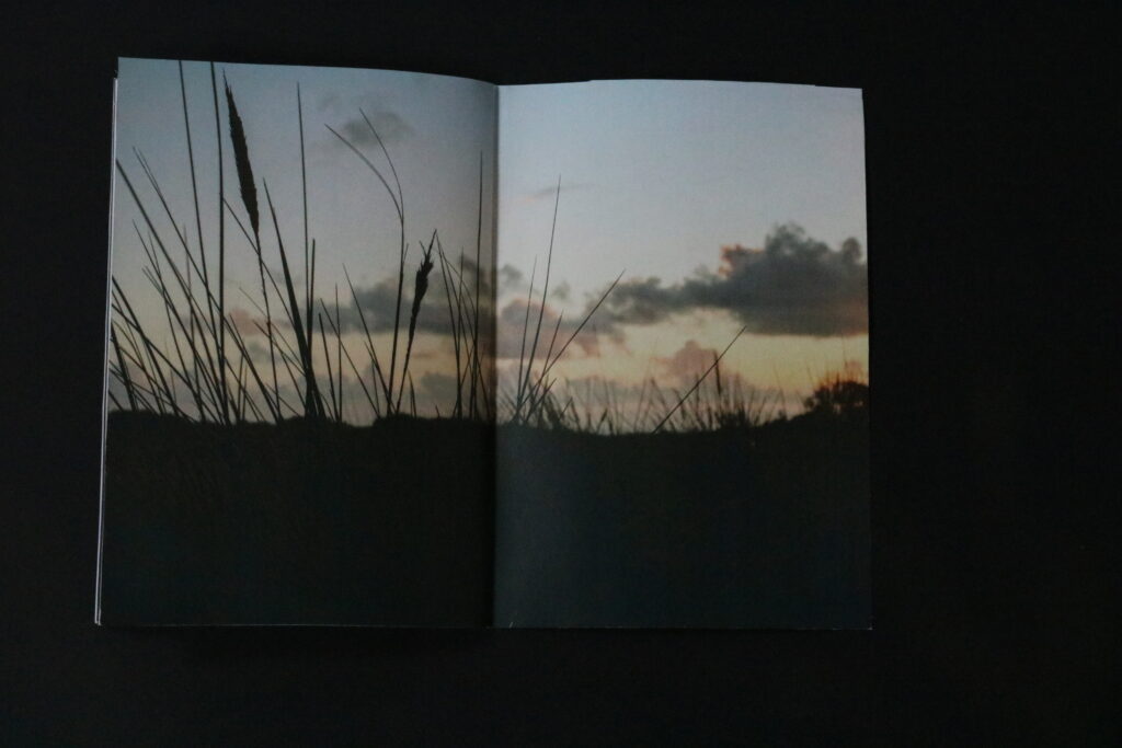
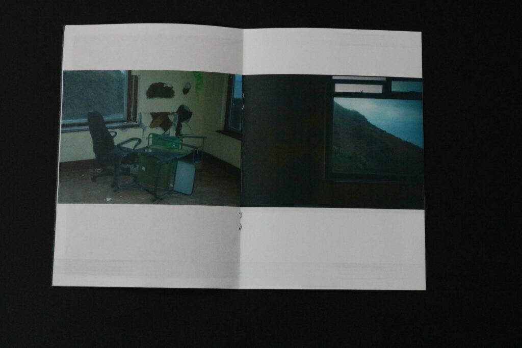
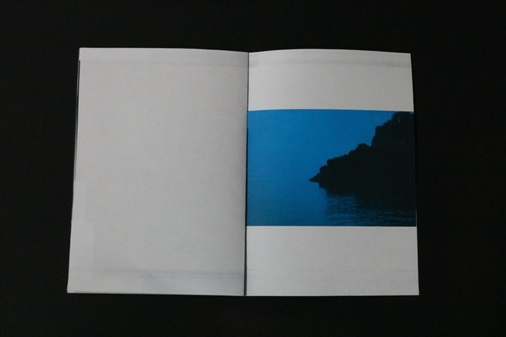
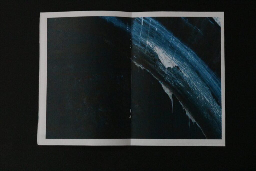
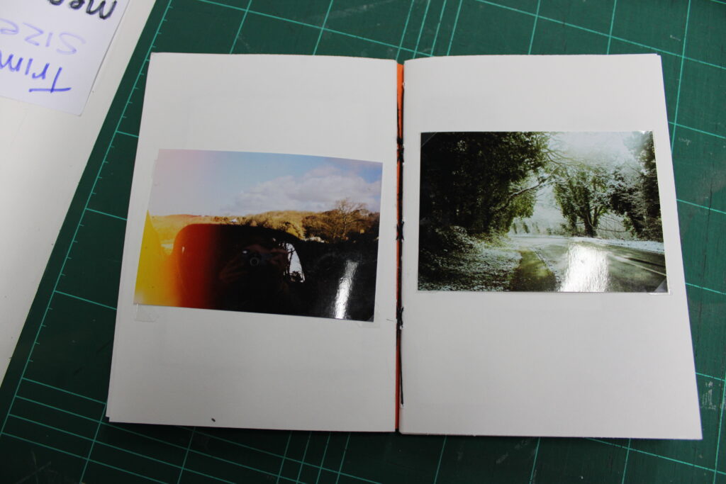
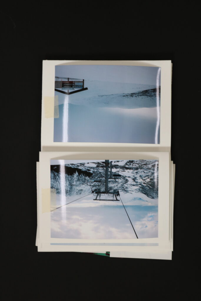
Similarly used double page spreads for my images in my photobook due to them also being significant to me. All of my images that are on a double page spread are my images of nature so that they are more captivating and appealing to the viewer rather than the darker images.
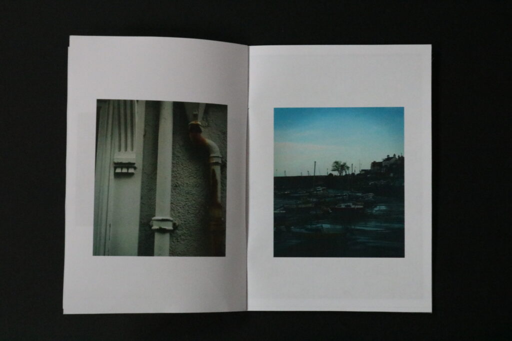
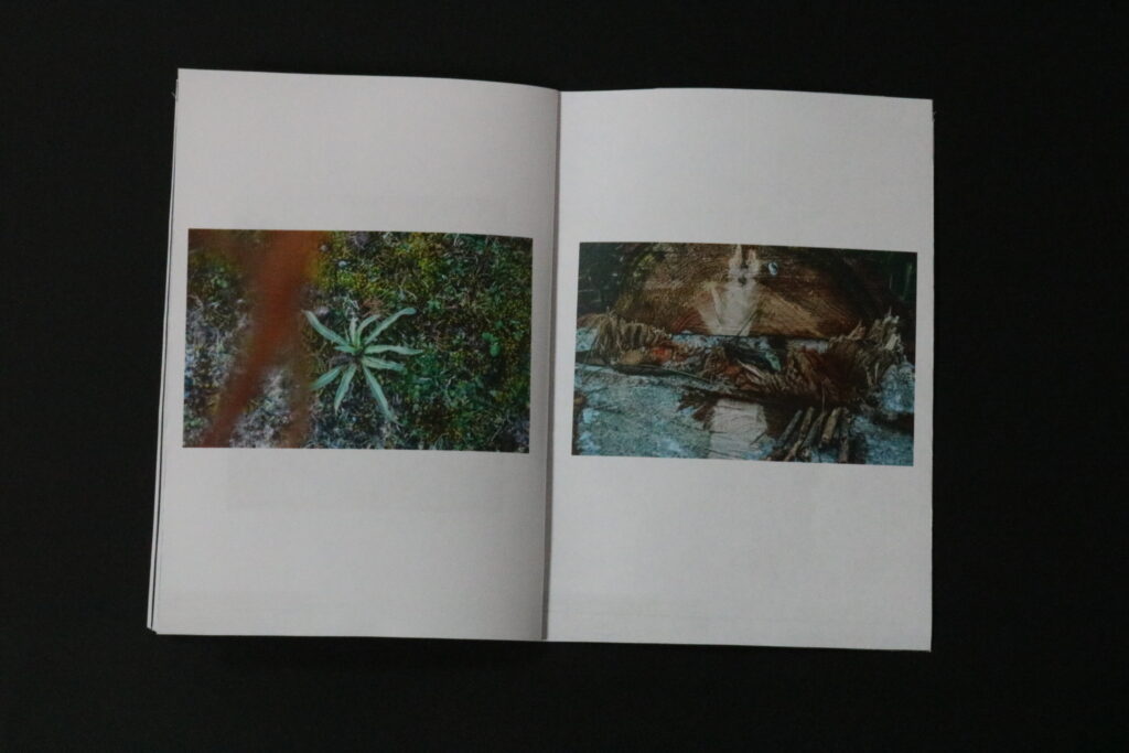
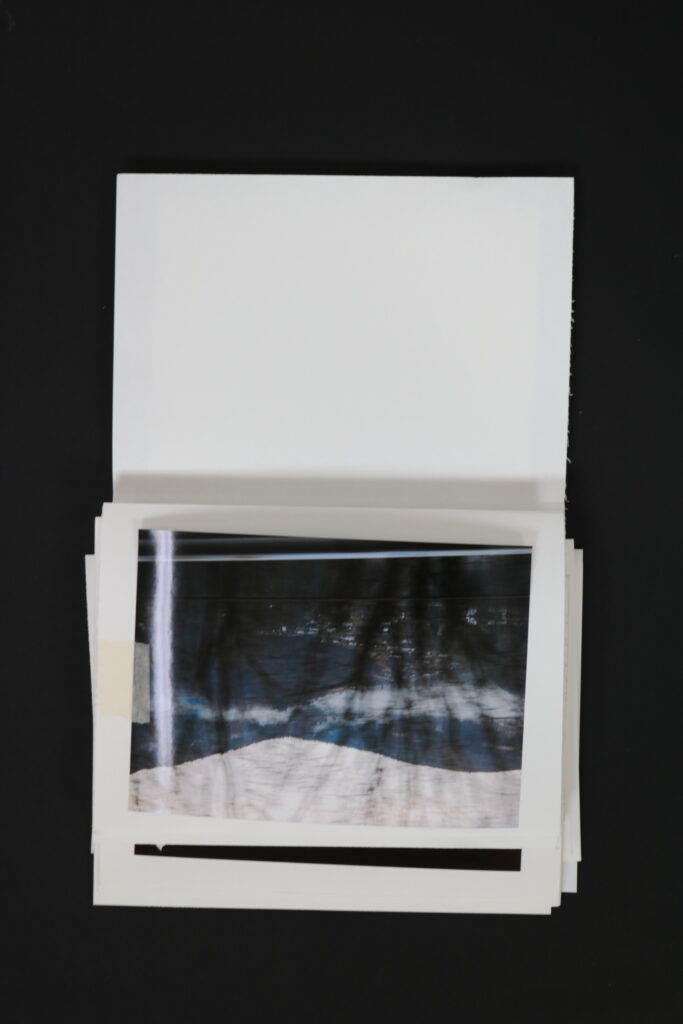
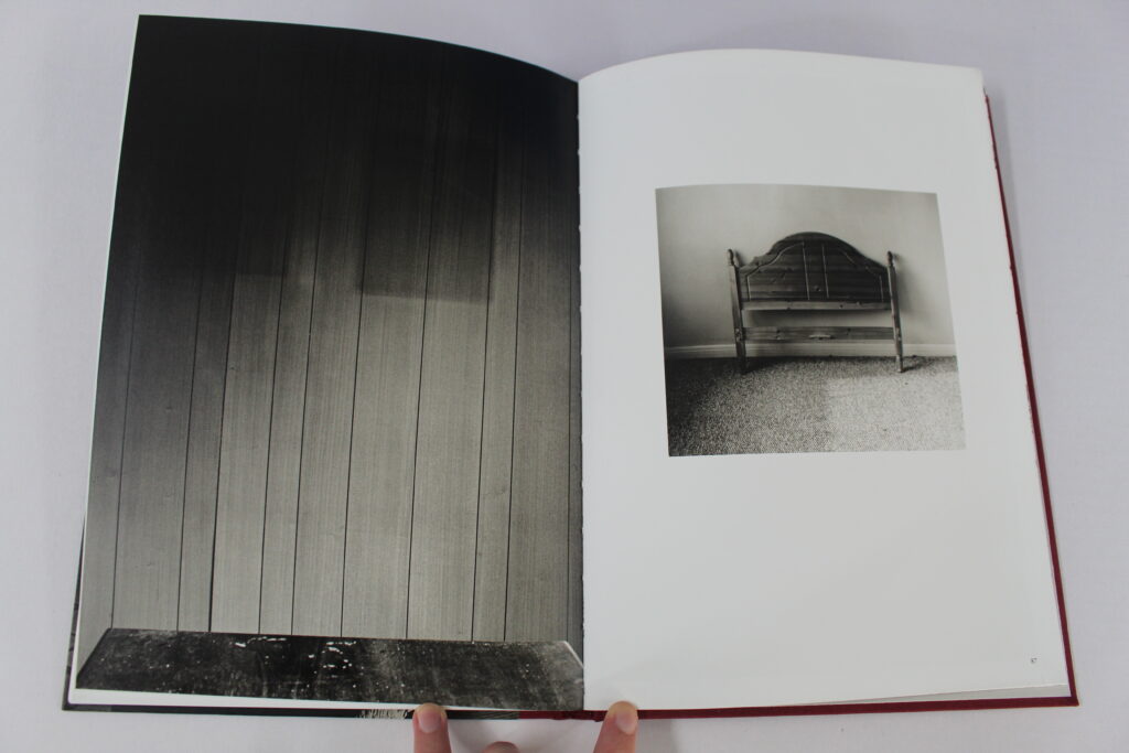
Having one image bigger than the other on two pages. Finn may have done this technique to try and symbolise a relationship between the two images that might not be as evident to the viewer. I like this technique as my interpretation of it is that even though the image on the left is bigger it doesn’t mean that its more significant than the smaller one on the right. I also like how even though they are very different each of the images contain the same type of wood which shows the correlation together.
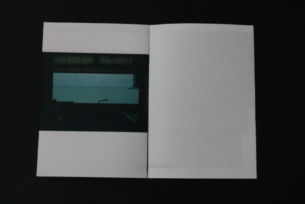
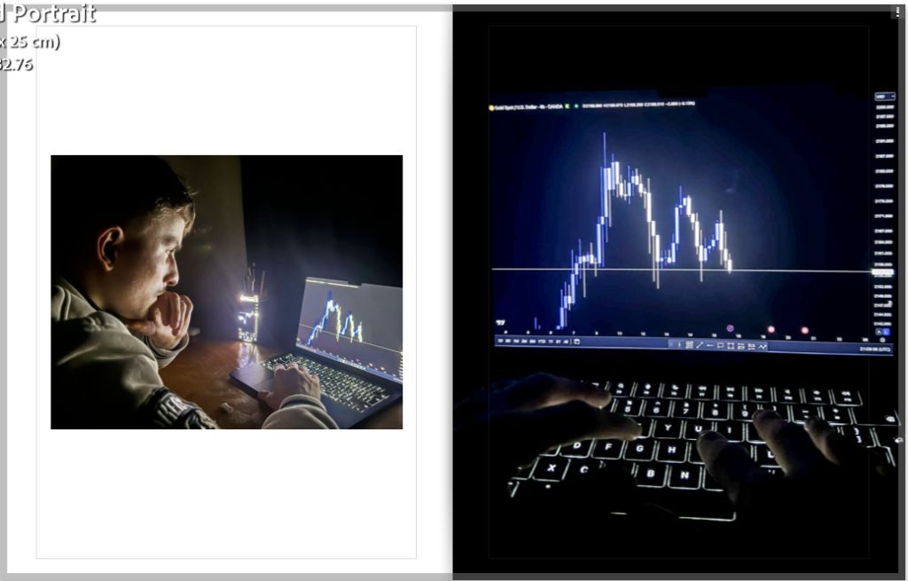
On these two pages on my photobook I also made one a full bleed and the other smaller. I used this technique due to both of the images being very similar as the vocal point of them is the laptop screen. I also wanted to signify that neither one of the images are more important but yet work better as a pair than individually.
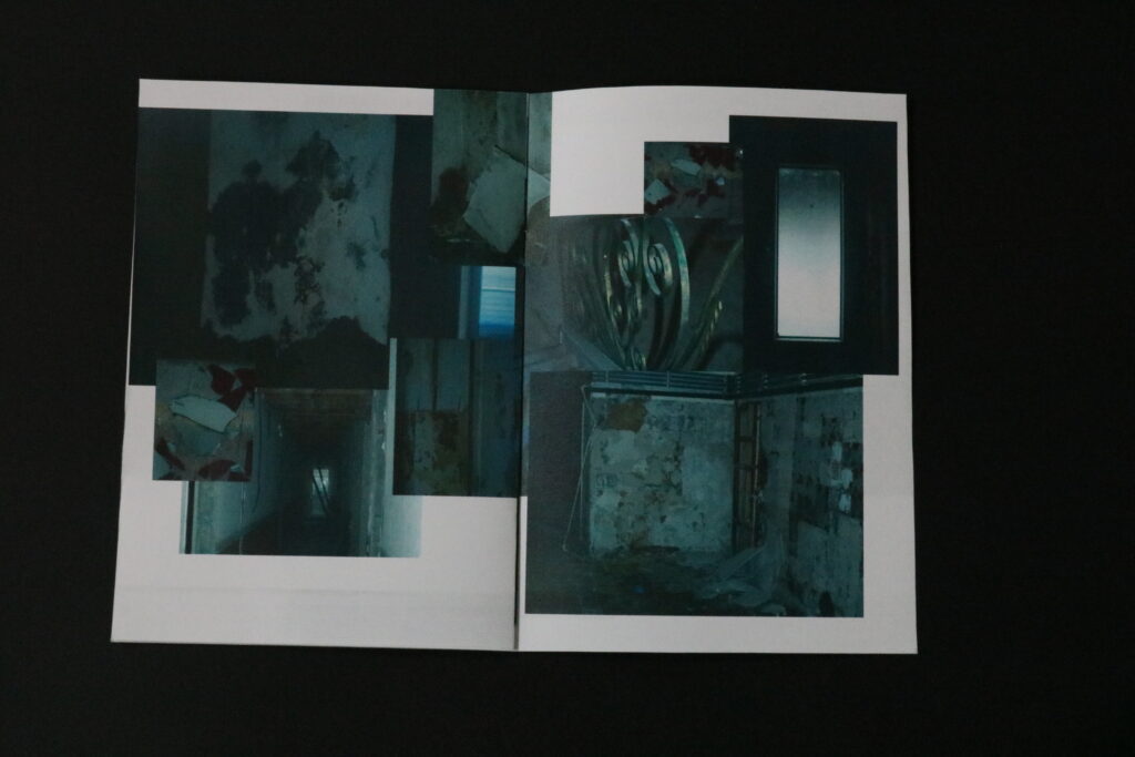
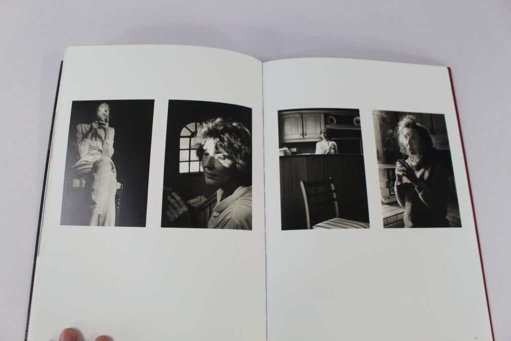
Having multiple images on the same page. Finn would have done this technique due to all of the images having a relationship with the other, Though He does not state this in his photobook It looks as if the two images on the left are his mother when she was younger comparatively to the right where it looks as if the images are of older people. This shows the evolution of his mother which he wouldn’t of been able to achieve without having multiple images on the same page.
On these two pages of my photobook I also put multiple images on the same page, This is again due to the relationship of the images and how well they work together. I also chose to use this technique as it saves space in my book as I didn’t want it to be too repetitive and waste pages.
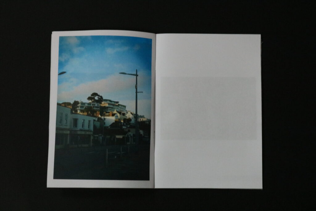
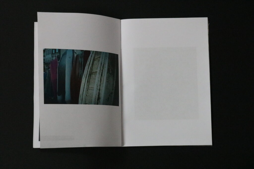
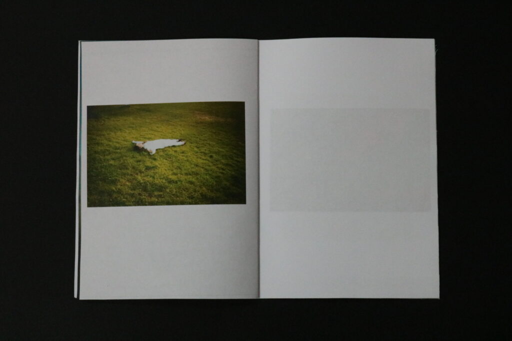
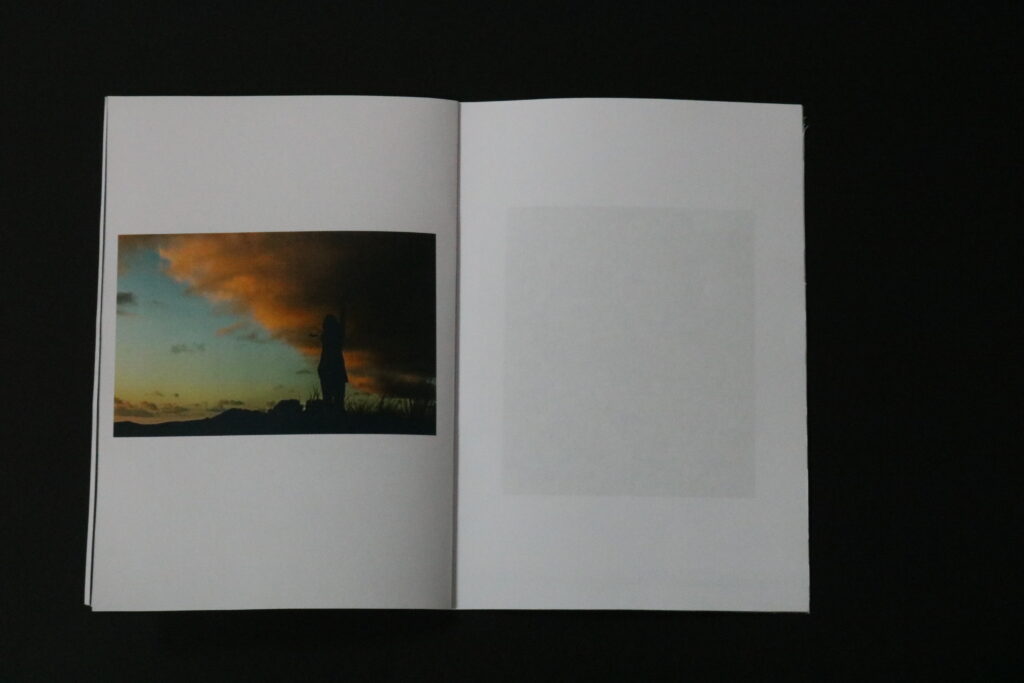
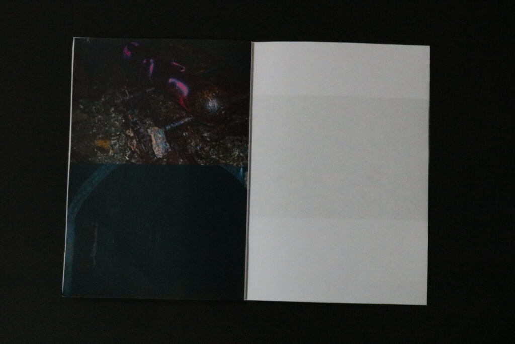
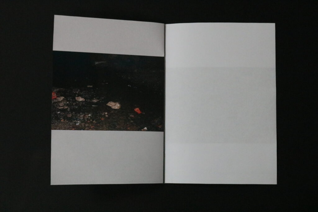
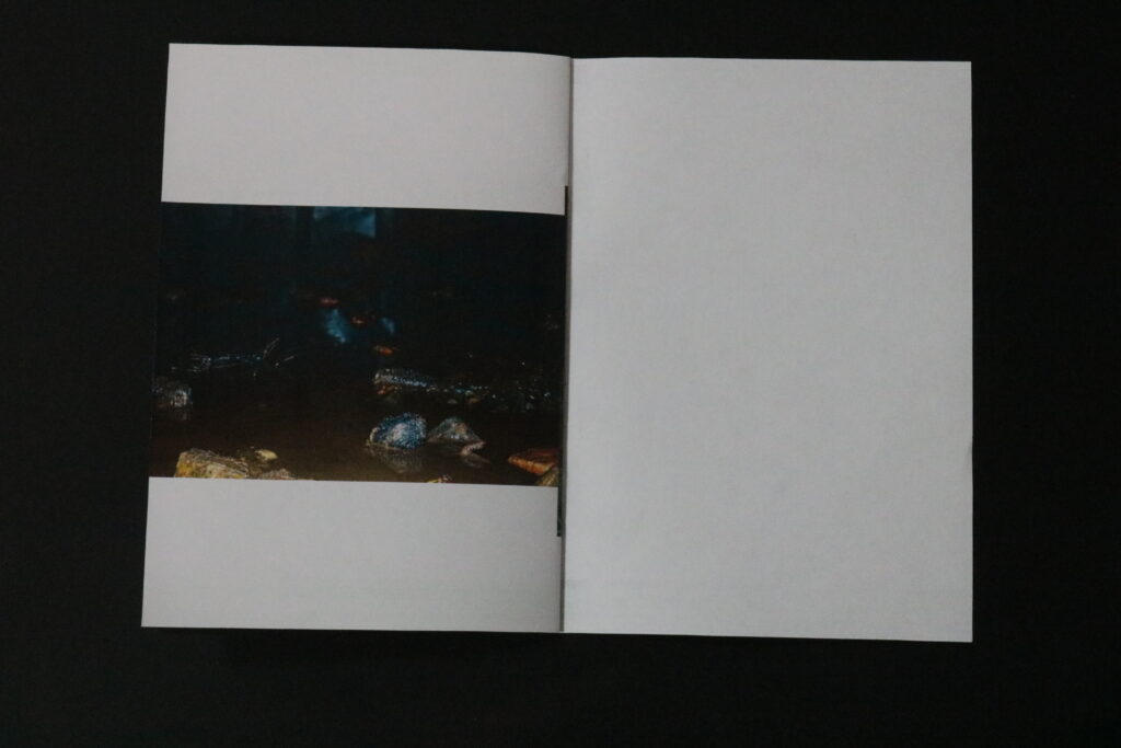
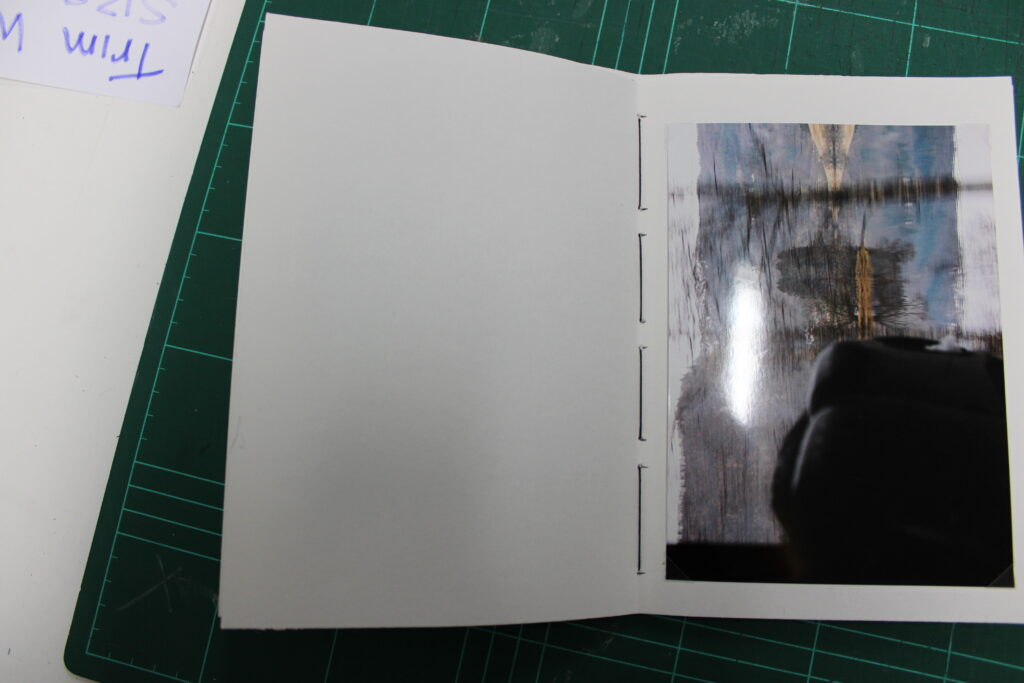
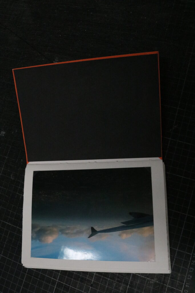
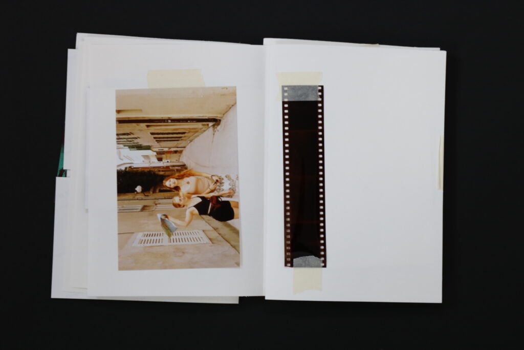
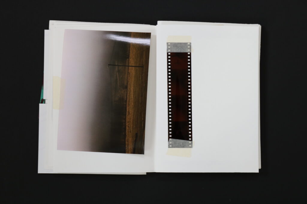
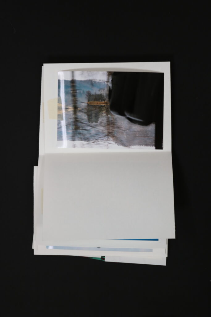
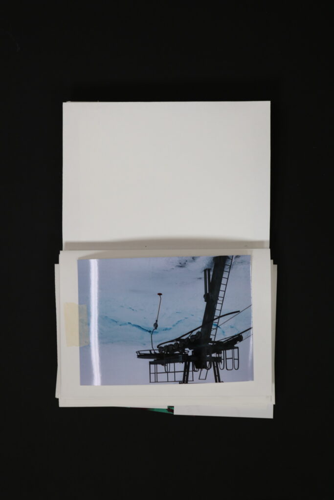
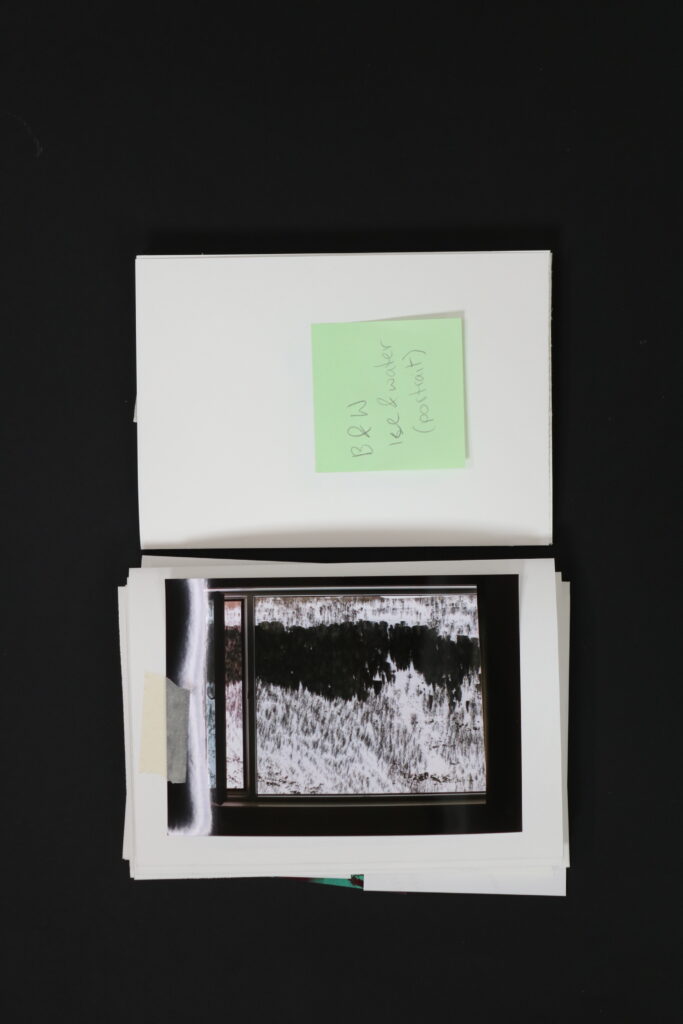
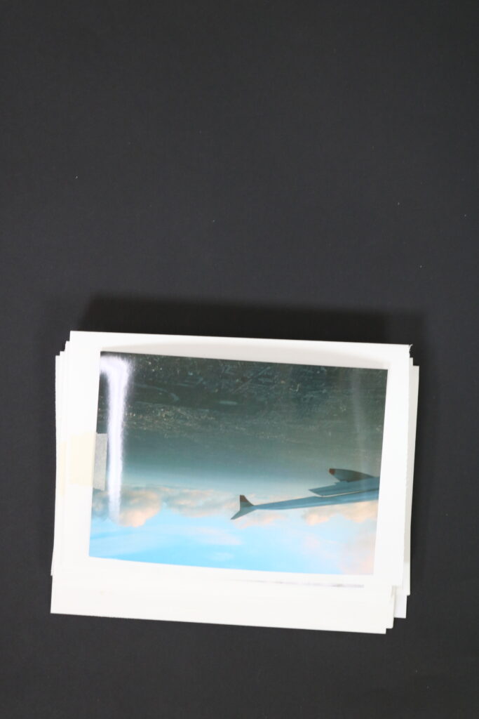
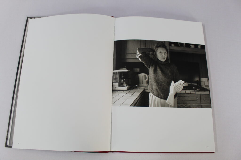
An image on one page and leaving the other one blank. Finn may have used this technique to help not make his photobook appear as too crowded. The use of this type of simplicity can also help to make the viewer not feel too overwhelmed with images and brings the attention back to the main focal point of the book which is his mother.
I also used the same technique on these pages of my photobook where I wanted all of the attention to be on that one singular image but I also didn’t want it to appear too crowed by spreading the image across the double page. Due to this image representing both nature and technology clearly I didn’t feel the need to add another image on the left side.
In conclusion I am glad that I found Finns photobook as I feel that we have very similar ideas for how we wanted our photobook to be interpreted by the layout and though we have different meanings behind our books I was still inspired by his intent and how he4 presented his mother to the audience through just a few images of her. One similarity between our intents is that his book is clearly evident to have an emotional toll on his viewers, as is mine in the same respect that I want it to be also eye-opening to the audience and for them to be emotionally impacted by it