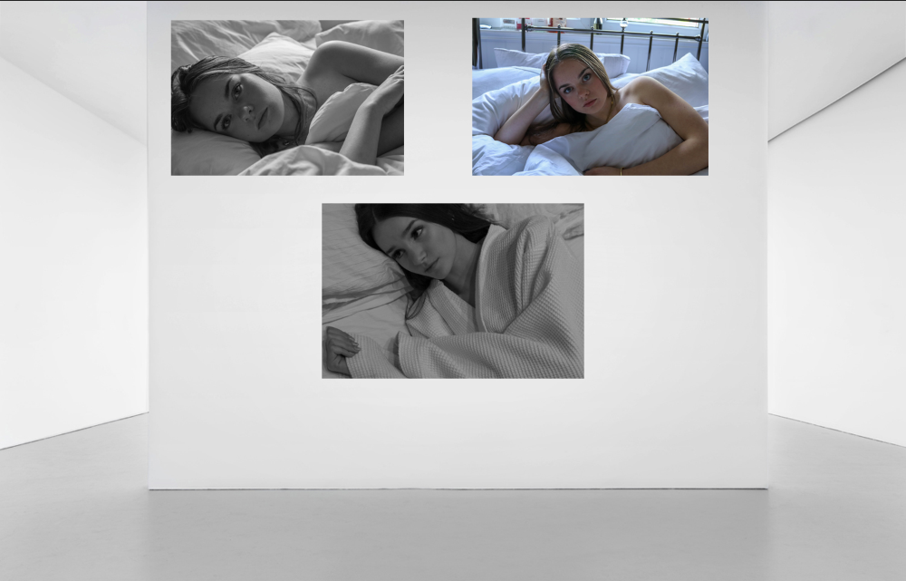
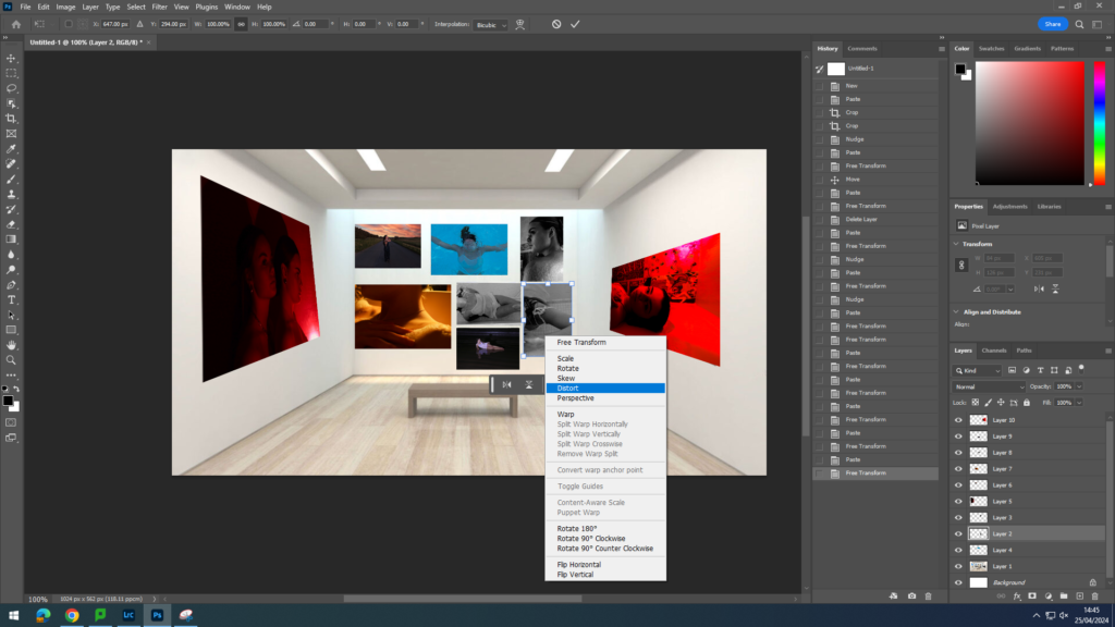
To create my virtual gallery I used Photo Shop and the gallery images which were given to us in the exam. For the galley image below, I had to edit it to remove a white plate from the background in order to make it look like the images are laying flat onto the wall. I did this by using the ‘spot healing brush tool.
For the images which are placed on an angled wall I used the ‘distort’ method’ to move the image and re-size them to the wall, making the closer edge longer and the further away edge shorter to give the illusion that it is lying flat onto the wall.
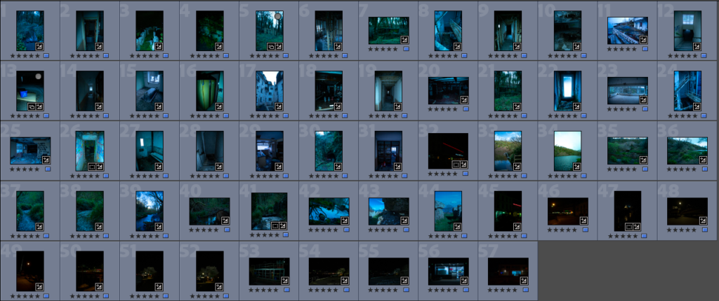
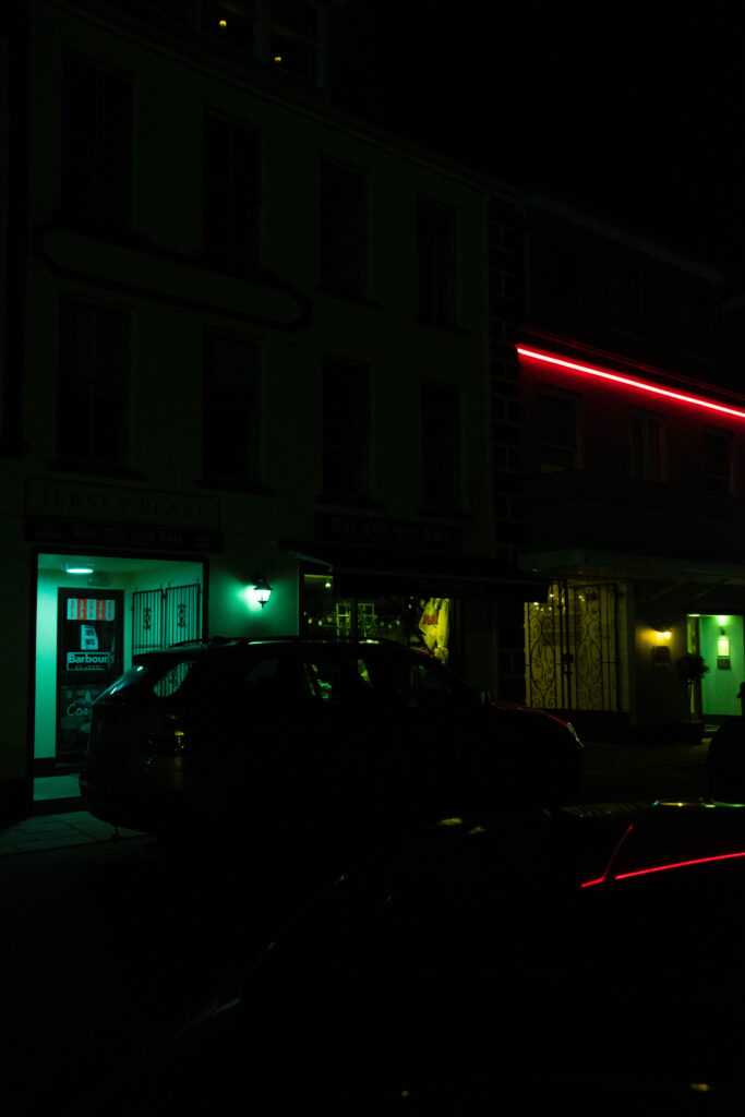
These photographs are no the last of the photographs that I will be takin over the Easter holidays I plan on taking some photographs these photographs are from the mock exam and there the photos that I like the most
All the final photos
these aren’t all the photos there just a selection of images that show what I have added however the photographs look really good with this set of final images instead of just doing night photography I tried to do daylight photography and night I think turned out good and the images look really nice in some of the images I tried to get reflections and different ways to get the light. the night photography will not be in the photobook however some most of the day light ones will be in the photo book
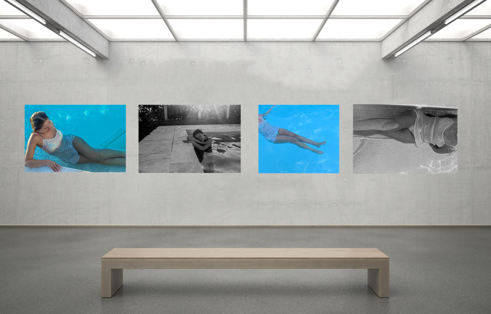
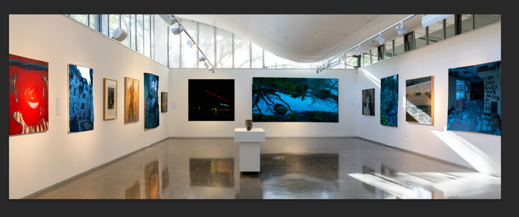
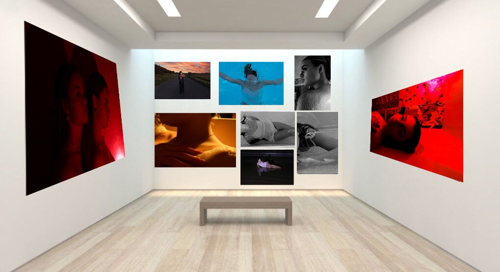
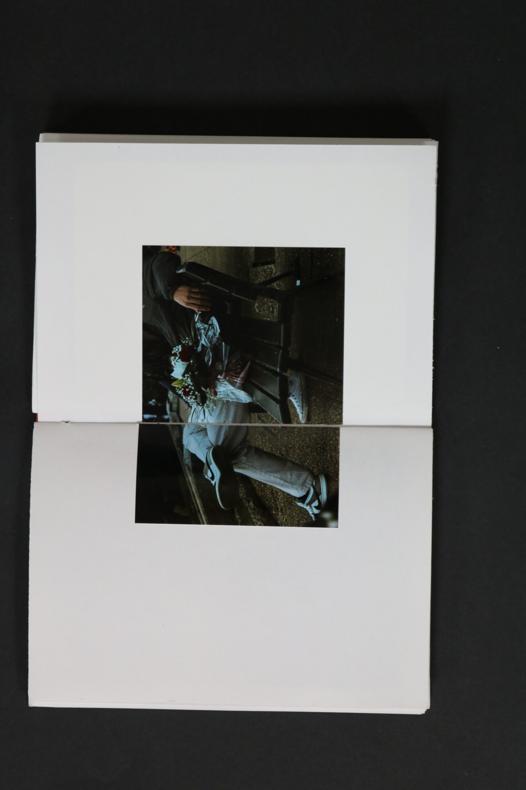
here is my virtual gallery there are only 5 out of my 12 printed photos in here they look a bit jankey because I had to warp them around already existing paintings
the warp just helps get the photos to actually look like its in a gallery
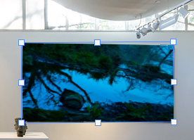
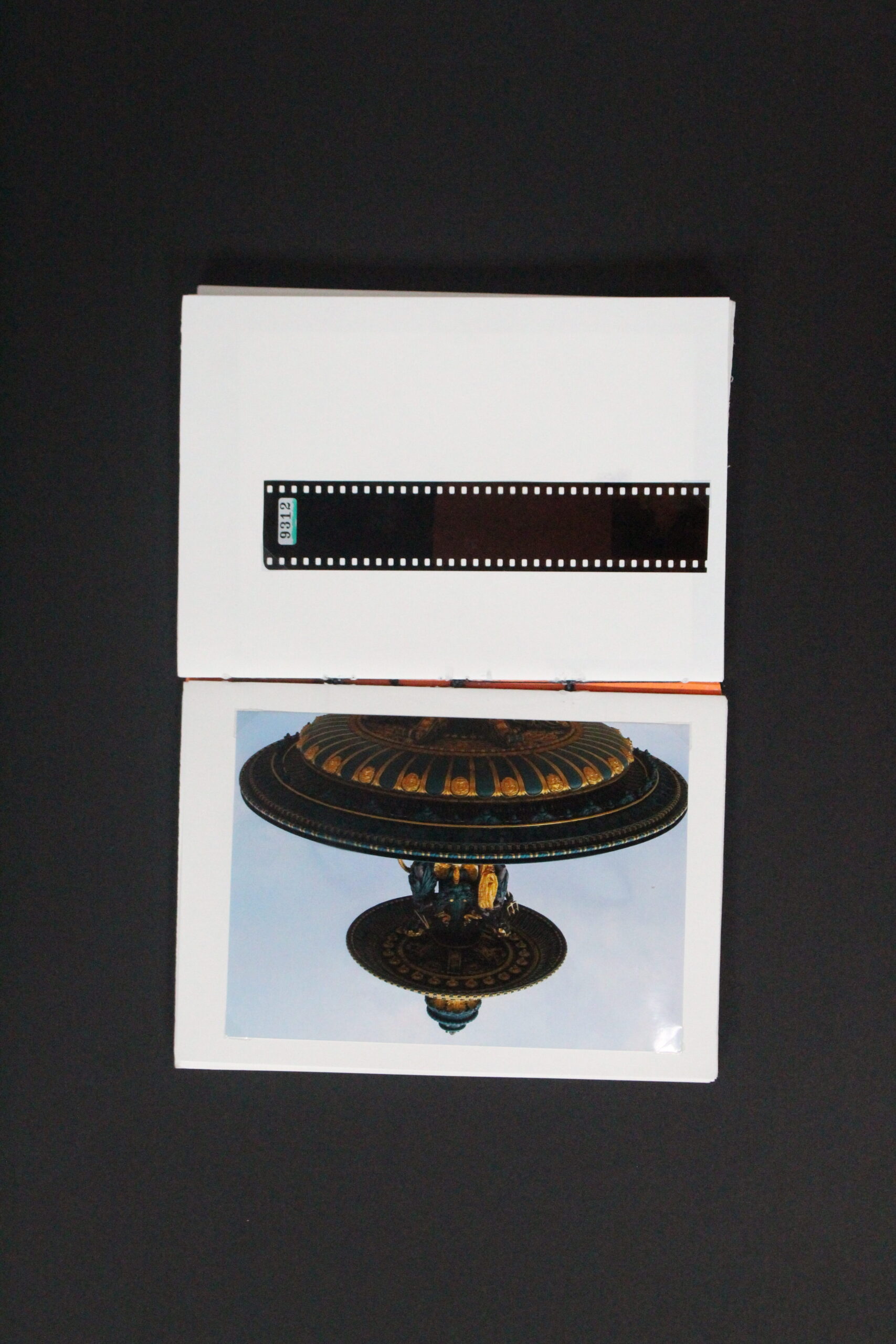
here I was re seizing a photo to fit a frame in the virtual gallery
here’s the separate layer that are the photo that I have put on to the gallery
the virtual gallery was easy to make and only took 20 mins to make however it doesn’t look th ebest but its good enough to get a idea on what the real thing might look like when framing the real images they will be A3 and on foam board.
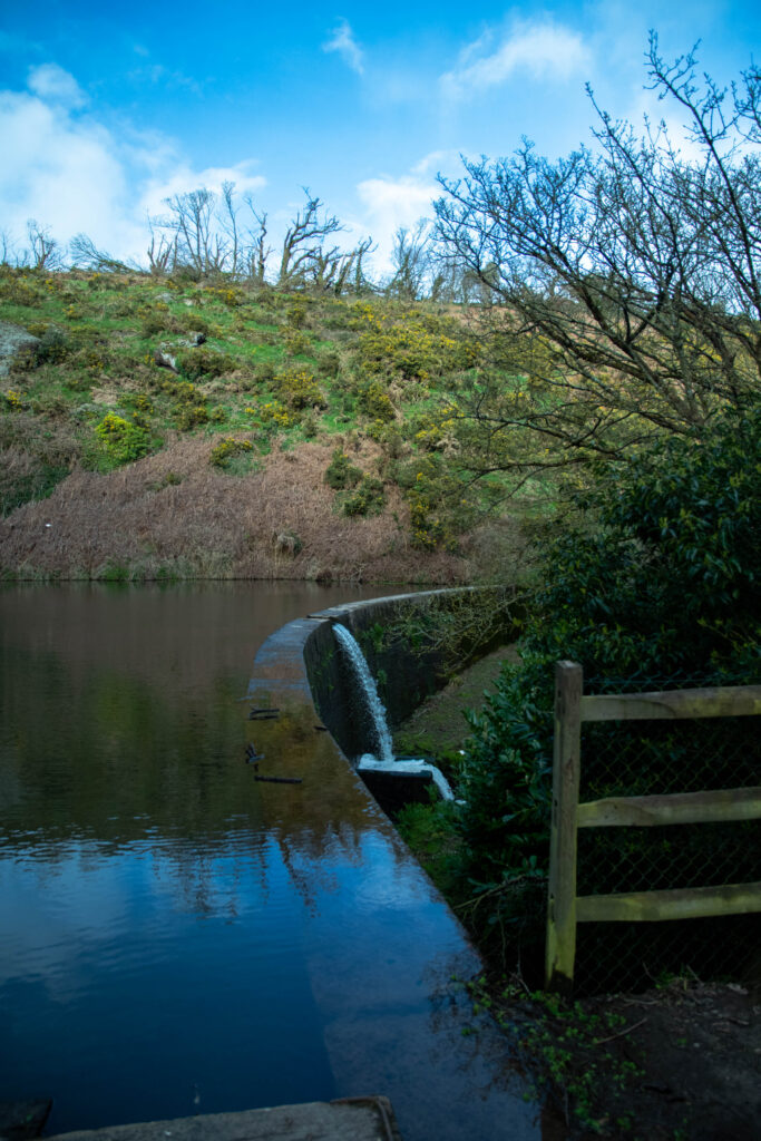
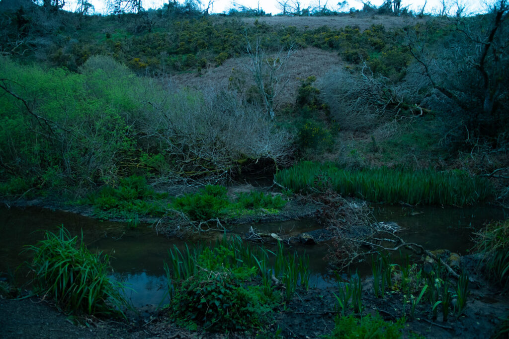
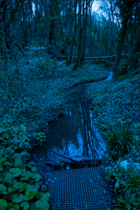
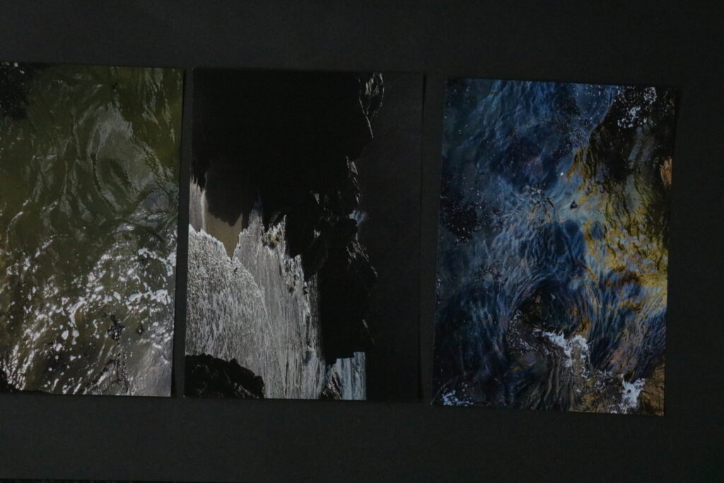
the reason I choose this image to be printed is because I like the way the reflection in the water looks and how the stream curves round the image this image is one of my favorites and that’s why I am printing it. I took this image in st peters valley it’s quiet a random place however its turned out really good.
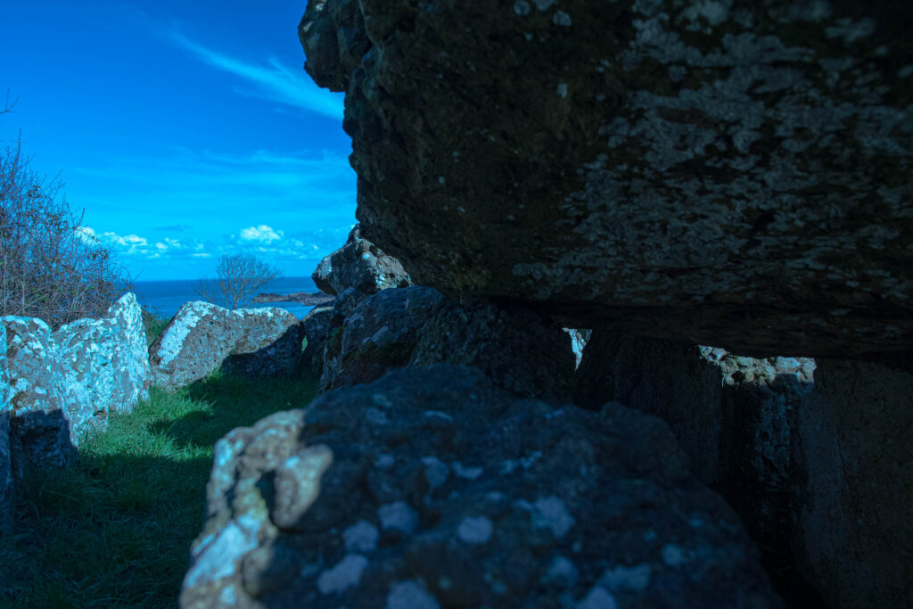
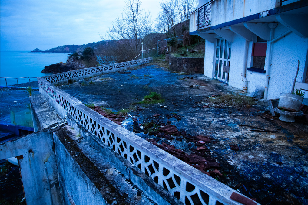
I am printing this photograph because the view on the left and the destroyed hotel on the right just looks really nice and I and happy how it turned out in the editing.
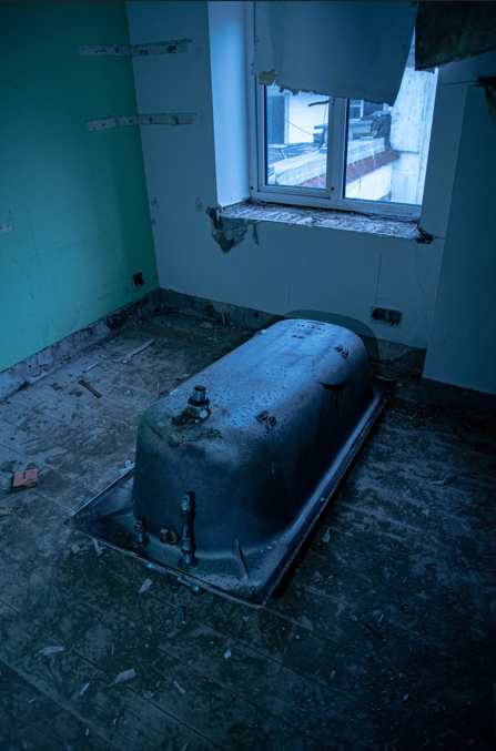
this photograph was taken inside the abandoned hotel the reason i took photo is because I thought it looked out of place and weird and I think photo just look really good.
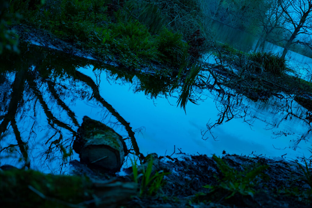
this photograph is my favorite one out of all them sadly it’s not in the book because it doesn’t go with the theme of the book however I love the way it turned out it looks amazing I believe this photo resembles Liam Wongs kind of art style maybe a bit darker but still reaseble his style.
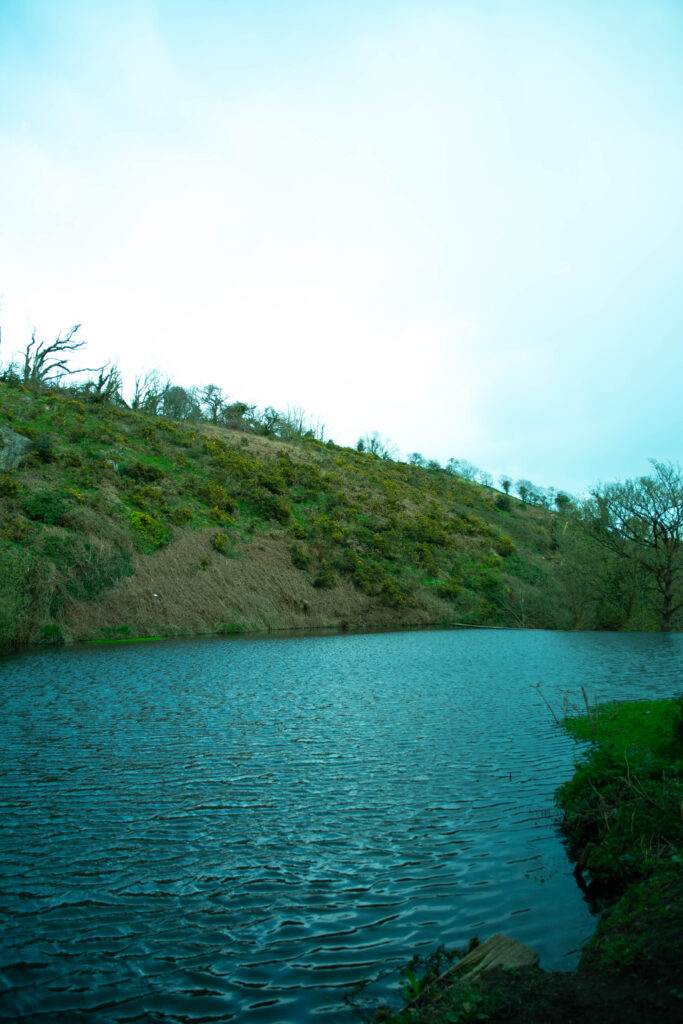
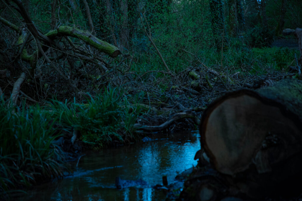
this photograph has to be my second favourite out of all of my images just because I love the way how the water is reflection the scenery around it.
this photo is good its I really like the way it turned out however it might be a bit dark however I really like the way the light look in this photo this photo also resembles Liam Wong sort of work I really like how he plays with light in his photos. and i think I sort of got it in this photo here.
I have created this virtual gallery on photoshop by importing my images from light room onto photoshop I then placed them onto the walls, the ones on the sides of the was done by using the Ctrl T button and then right clicking pressing distort which allowed my to create the illusion of it being seen on the side of a wall.
Evaluation
I have really enjoyed this project, I am happy with the outcomes of it a I believe it reflect well on my photography skills.
The project has been challenging at times and hasn’t always worked in my favour for example when it came to getting my printed mages back as it was don’t my a new printing company the photographs came out darker than I had expected meaning that I was unable to use 4 printed images due to them being too dark and ruining the image its self, however I have learned for this and in the future if I was to print out images again I would make sure the person printing the images has the knowledge on the lighting and print settings of the photos being printed to try avoid the same problem happening again.
The process of exploring photographers and learning about them was intriguing as I got to find out there whole photographic journey and different styles and types of photography each photographer has, I am happy with the photographers I have picked as I found there images fascinating from the way they were taken and the background of the photos. Both artist have inspired me in many ways.
Through out this project taking the images has been my favourite part seeing my thoughts, ideas and mood boards come to life, I loved the technical side of, it thinking and positioning things and people around lighting, and experimenting with coloured lighting. I am proud of my images as they were well thought out and planned before which helped with taking them.
Editing the photographs was time consuming through out the editing process, I spent a lot of time adjusting shadows and highlights to maximize the depth and detail in the images, I enjoyed working on photoshop when it came to editing the sky, as before the images were dull and didn’t have much life to them however when I edited they sunset into a couple of the photographs it brightened the images and made them more interesting to look at.
Framing and mounting up the images was another element of the project I enjoyed as I enjoy practical things, I used a mixture of window mounts where I used a bevel cutter to cut on a 45 degree angle which created a frame for the images, and also used foam board where I stuck down images and also mounted some onto another piece of foam board to raise them up from some images, although the process takes a lot of time due to the precise measurements and cutting skills need for it, the outcome is worth it.
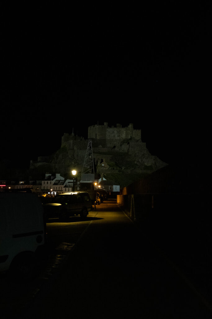
All together I have really enjoyed working on this project and am very happy with the final outcomes of this project there would only be a couple things I would change, for example getting a stronger light for the night photographs so I could see more of the background.
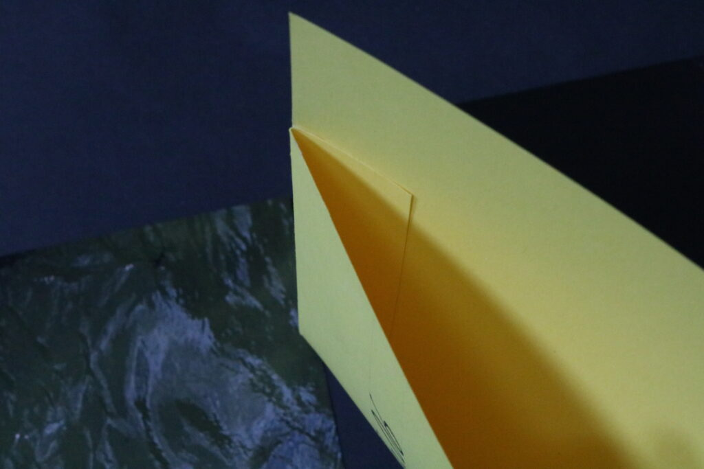
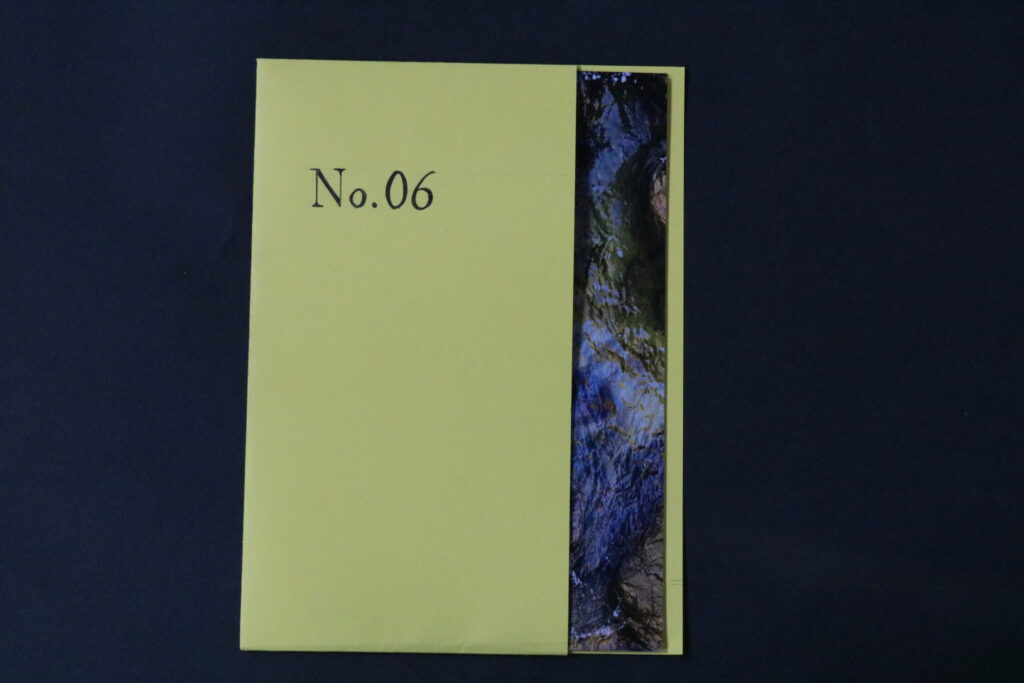
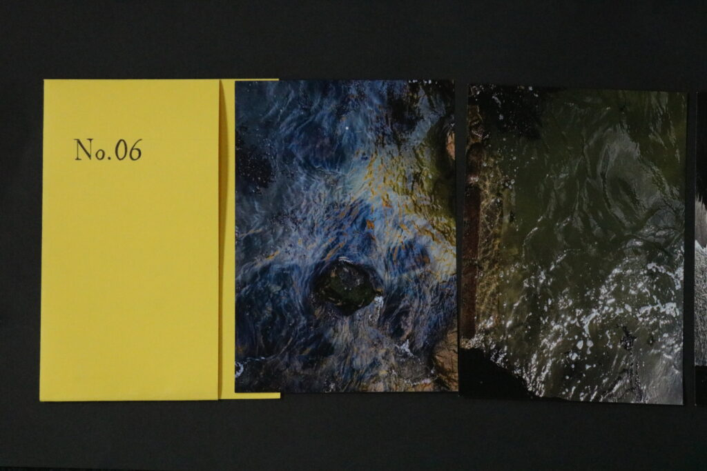
Using a bright coloured, thicker paper, I have made a folder which fitted the 4 photographs, which were printed and showed my best outcomes from the Plemont photoshoot. How I have created the folder through roughly measuring around the prints how much space I needed for them to fit, and leaving a little loose space so it isn’t too tight, then before I cut, I made sure I knew where the bend was so that on the other half( front) is left with a lot of space on the sides, so that the sides could fold, and when glued they would stay together with the other (back) piece. I then wrote No.6 as the title to match the rest of my outcomes.
Evaluation
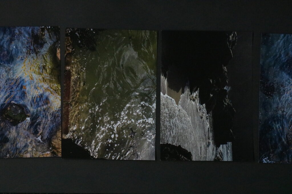
After seeing Maurice Van Es’s book “Now Will not Be With us Forever” I was intrigued by the section which was a folder for a couple images, where the prints could be taken out and unfolded. I didn’t follow this idea exactly, however, I was working in groups of photographs, where they were presented by grouping outcomes from each photoshoot together. As this was an unplanned photoshoot and I didn’t produce many outcomes, I though that it was perfect to display them in a folder. If I presented more prints in such folder it might bore the viewer and they wouldn’t want to see them all as it isn’t an easy to display and see format compared to a book or zine where it is easier to flip a page. I like the order of the Photographs as this has another connotation of travel and journey, the 1st and last image appears the same but it is actually taken of the rock before and after the tide came in, this shows how everything comes and goes and we need to cease the moments we have. I think this challenges the viewer to become more present with reality and observe their life through a more open approach.
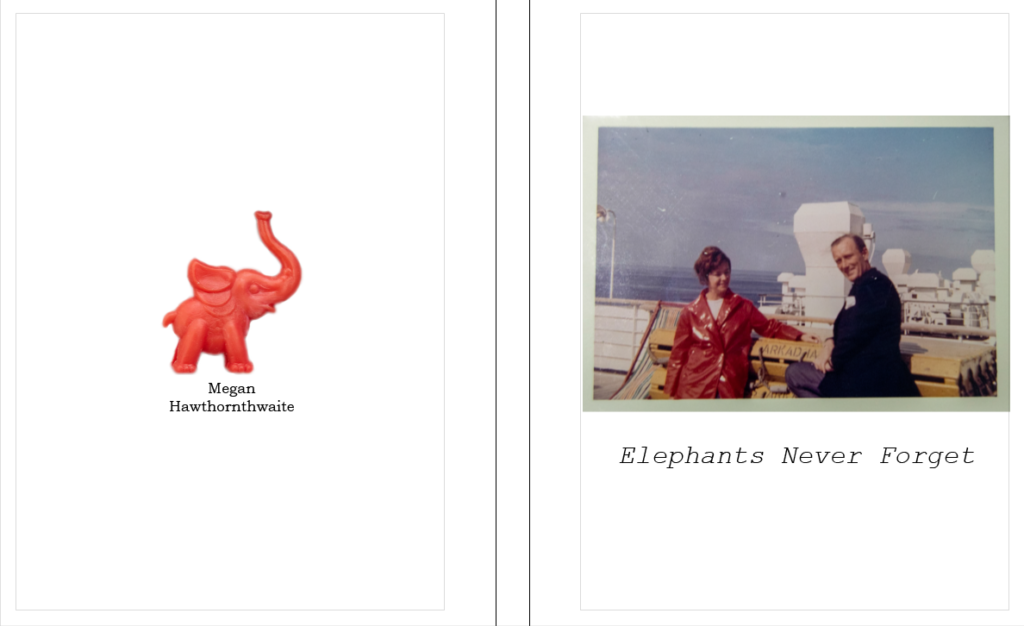
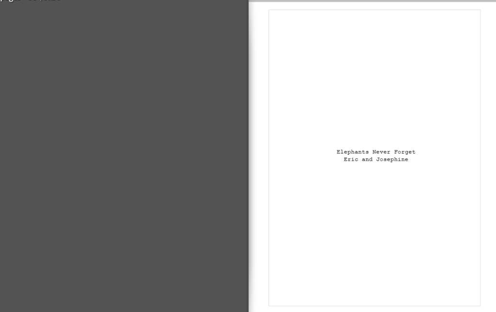
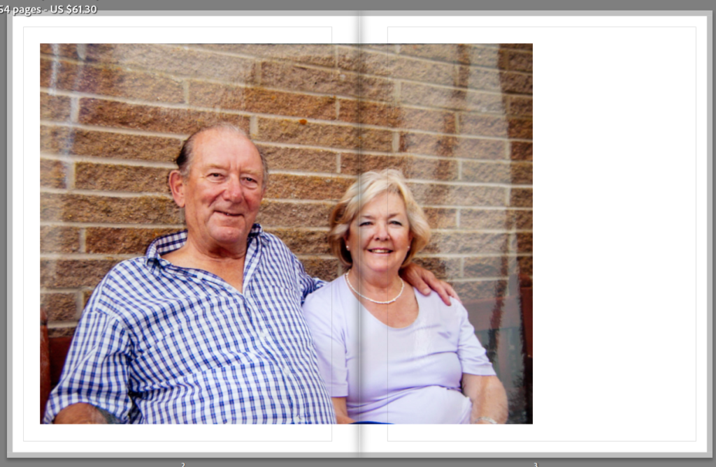
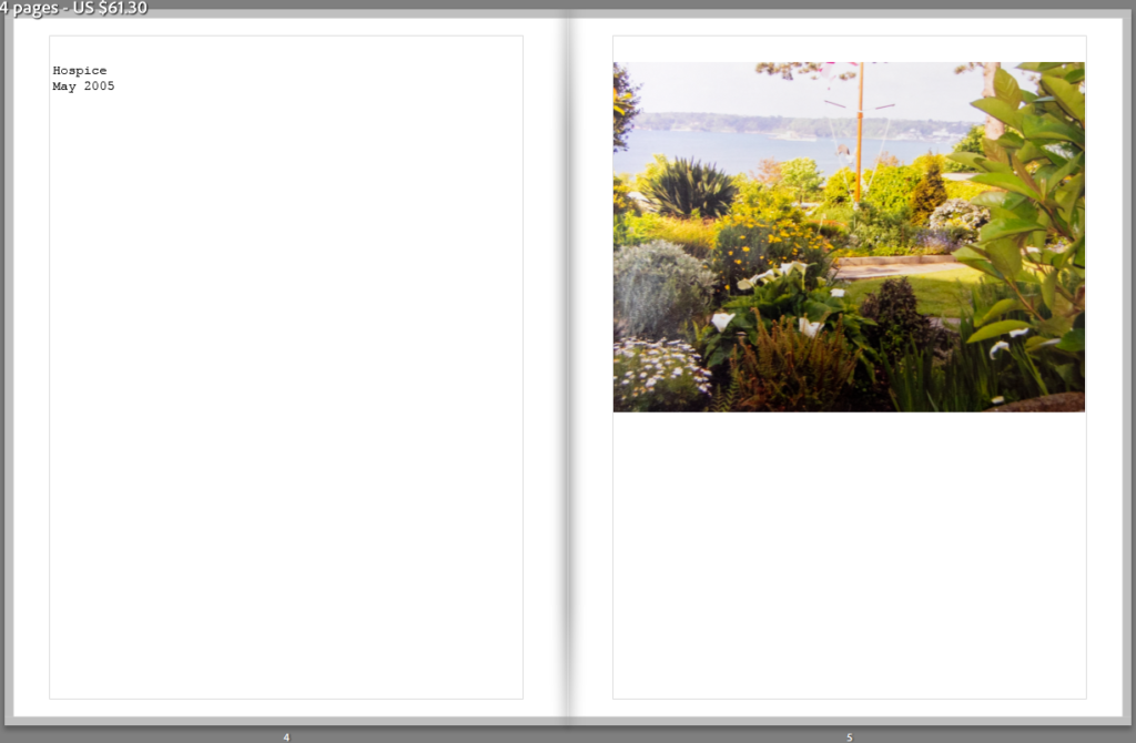
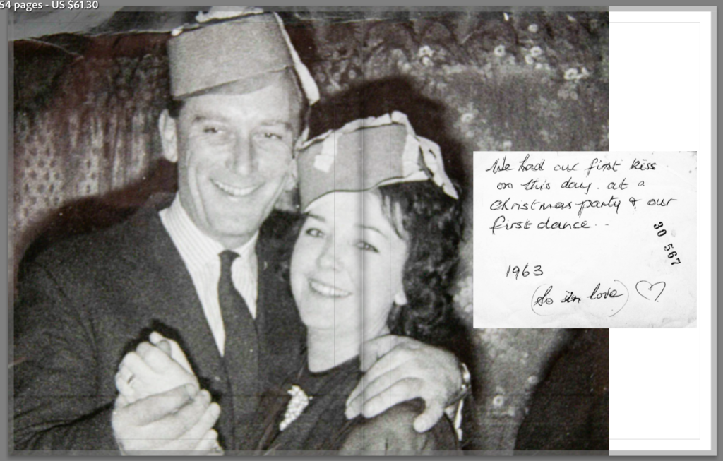
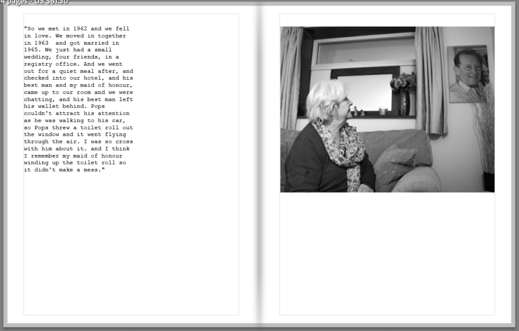
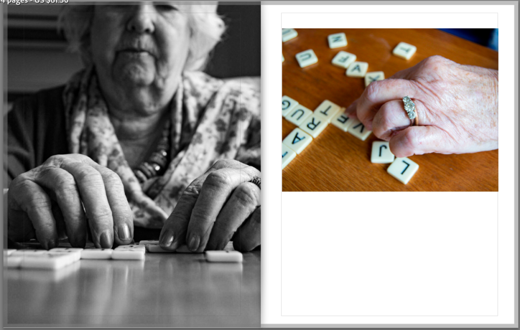
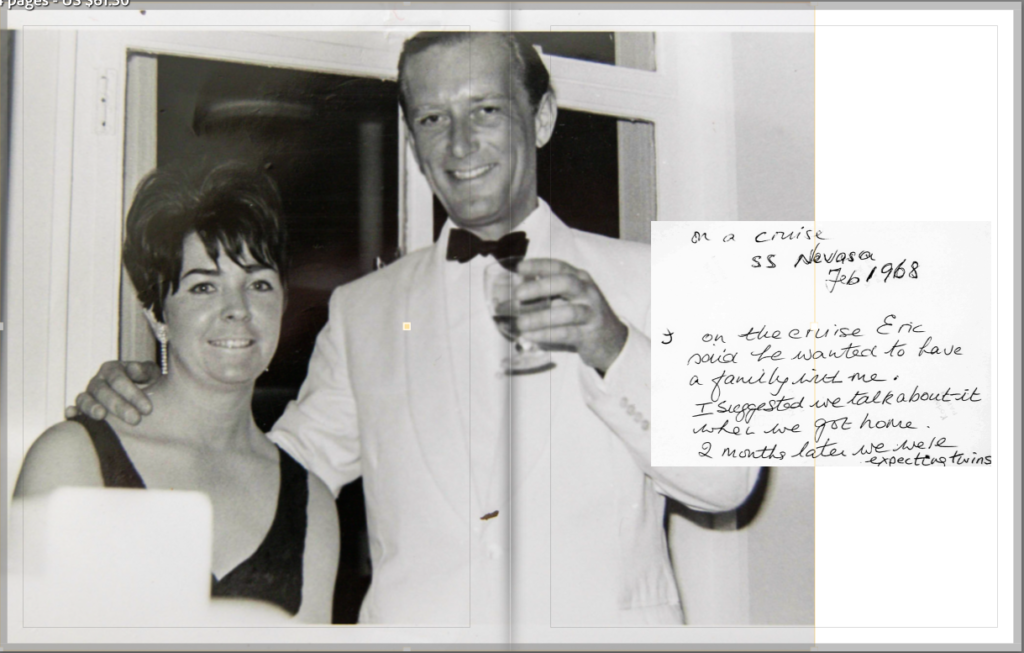
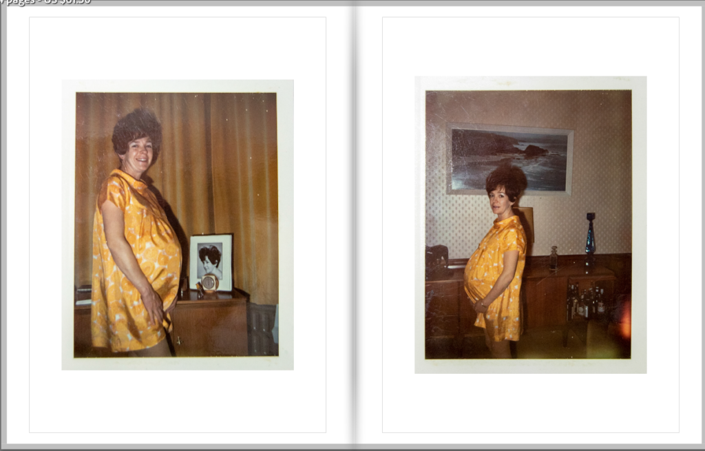
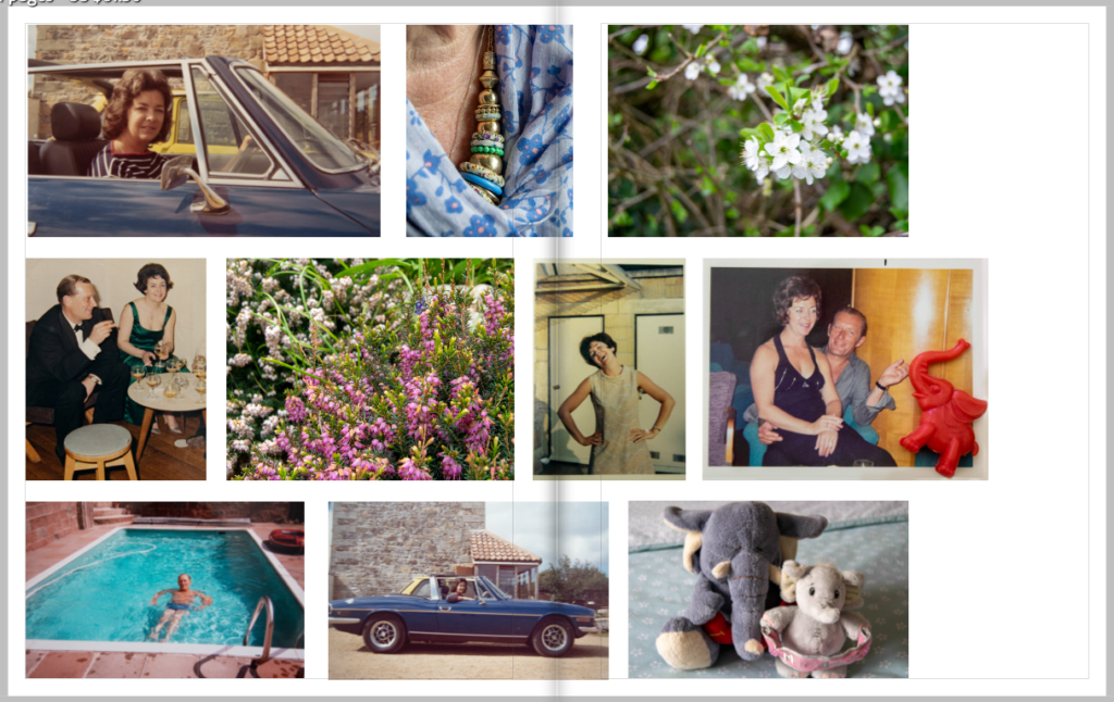
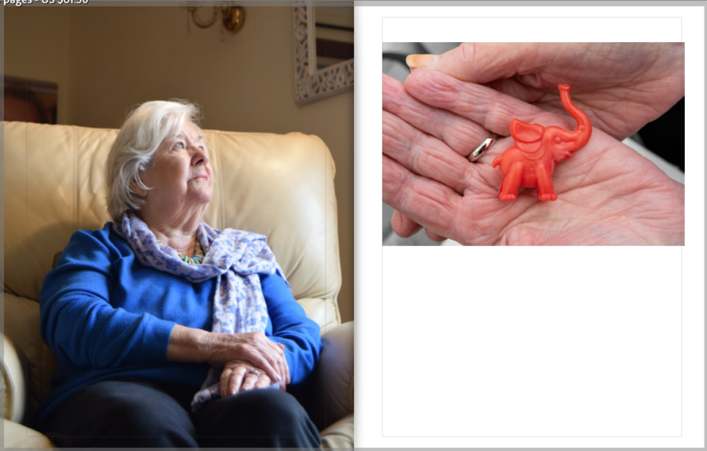
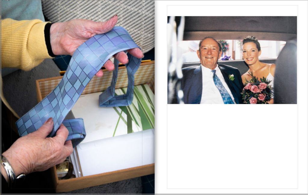
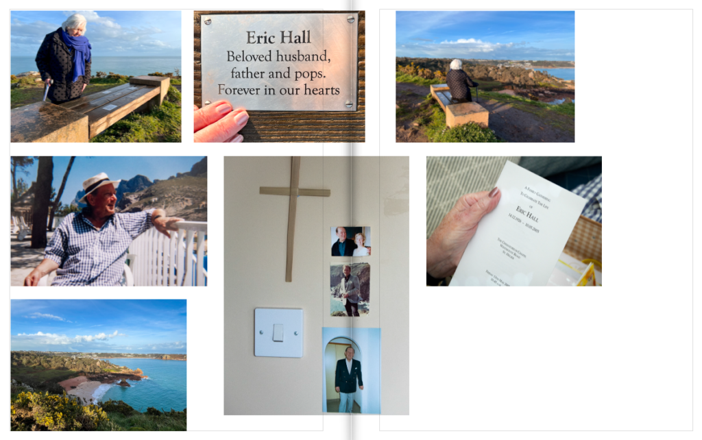
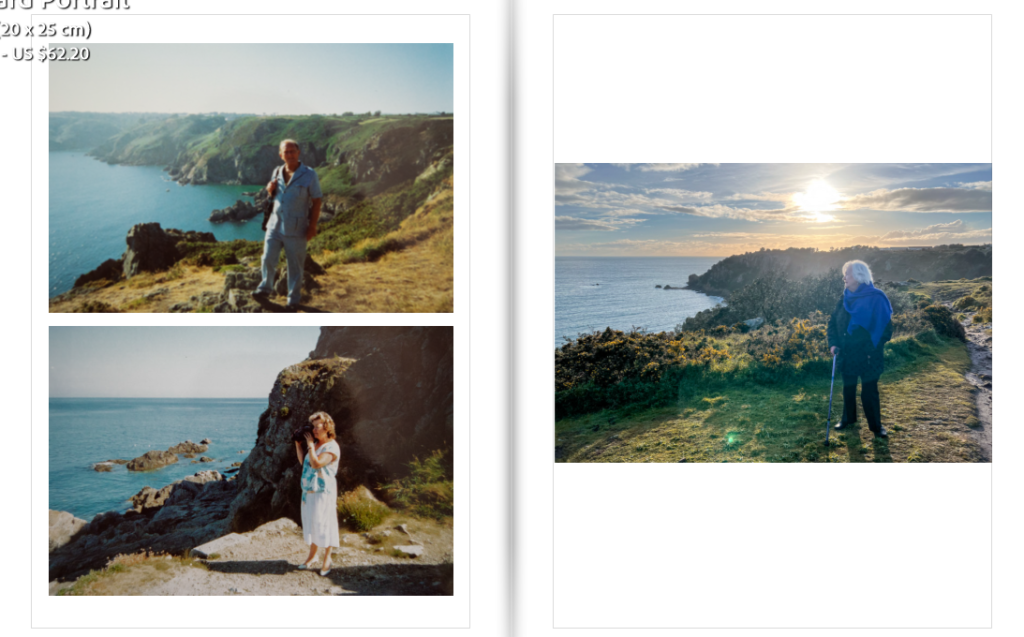
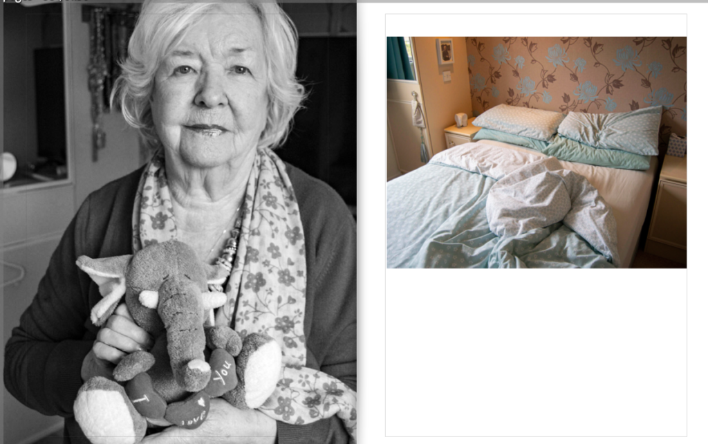
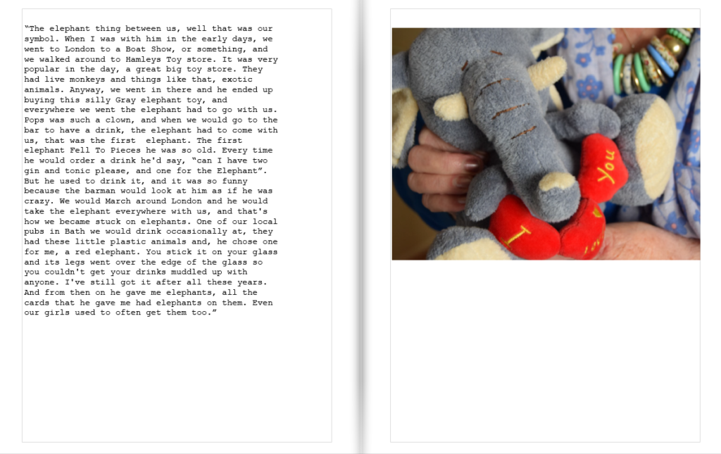
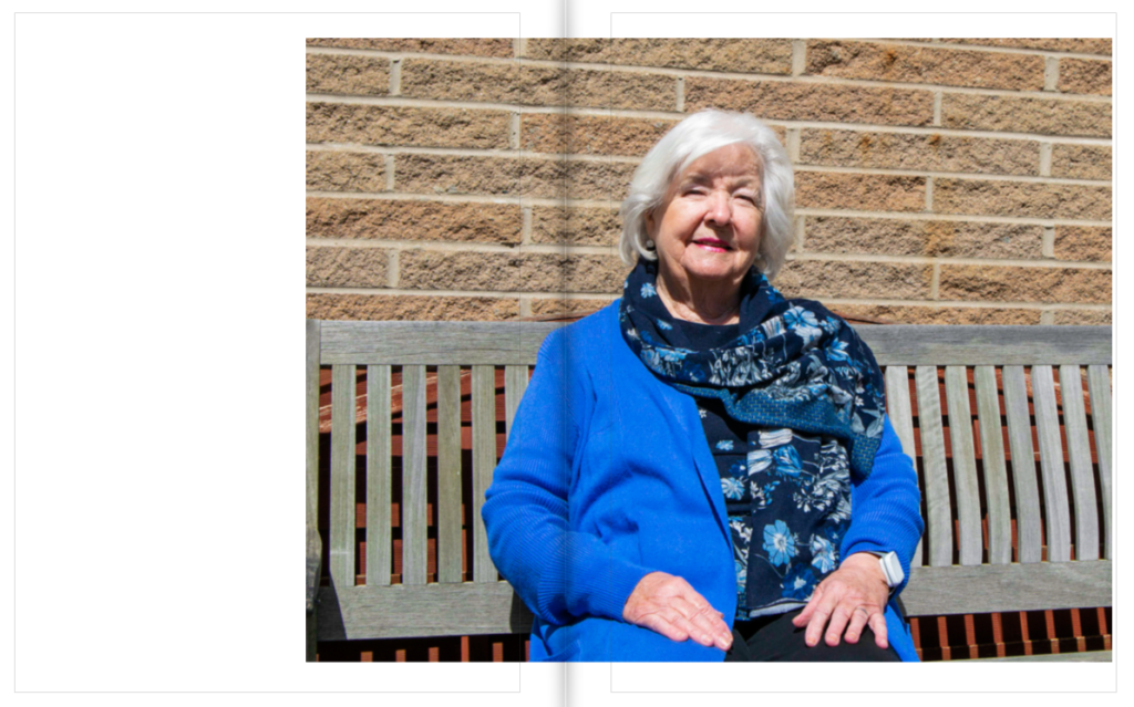
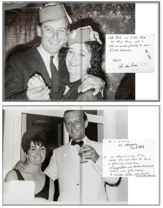
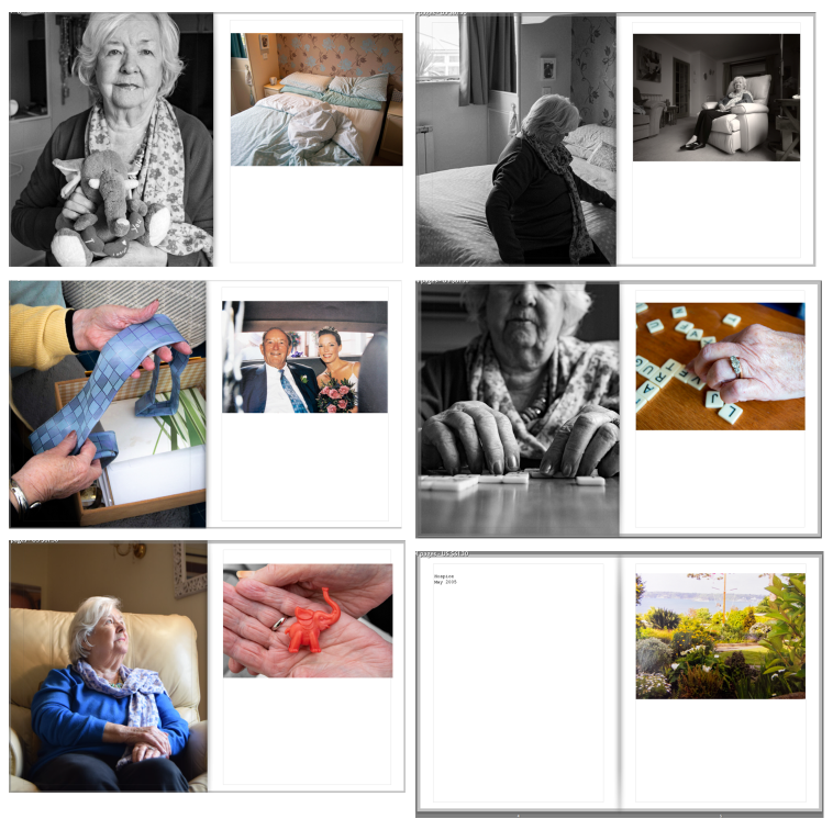
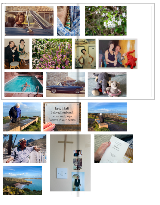
Overall, I am happy with the final result of my photobook. I made sure to create a story from beginning to end, in a vague timeline. I reached my goal of presenting their love and my gran’s loss through the timeline, and including the elephants as a symbol of my grandads love for my gran.
Design: Throughout the book I chose to make a variety of layouts, but keeping patterns, and replicating designs so that the variety was organised. I was inspired by Larry Sultan’s ‘Pictures from Home’, and I think I have turned his style into my own. I also chose to link images through colour and tones, making sure they connected and created a good composition. I linked some images together with objects such as elephants, clothing/ jewellery and scenery too.
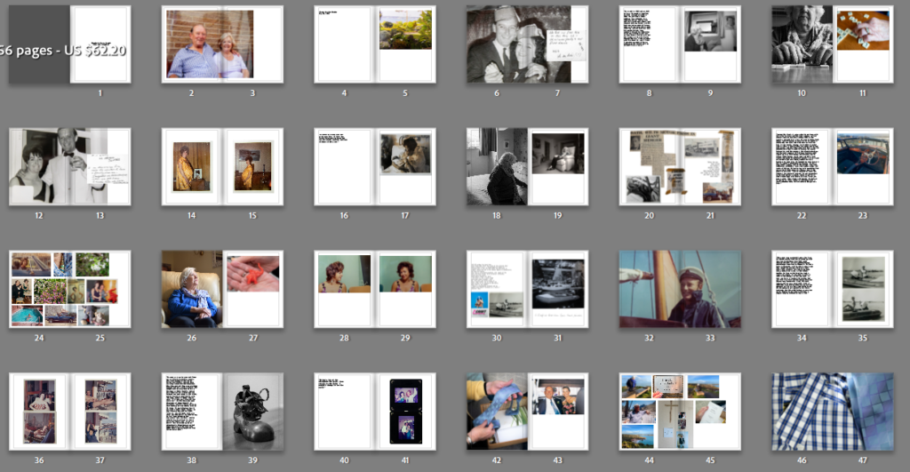
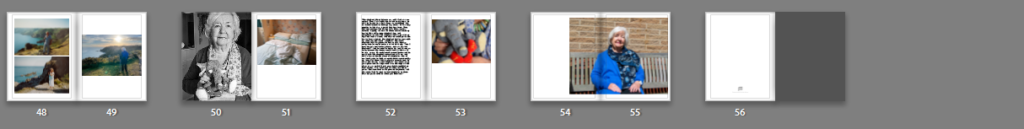
To represent my final outcomes which were in the book, I took pictures of every page, one by one, so that they are in the correct order.
Evaluation
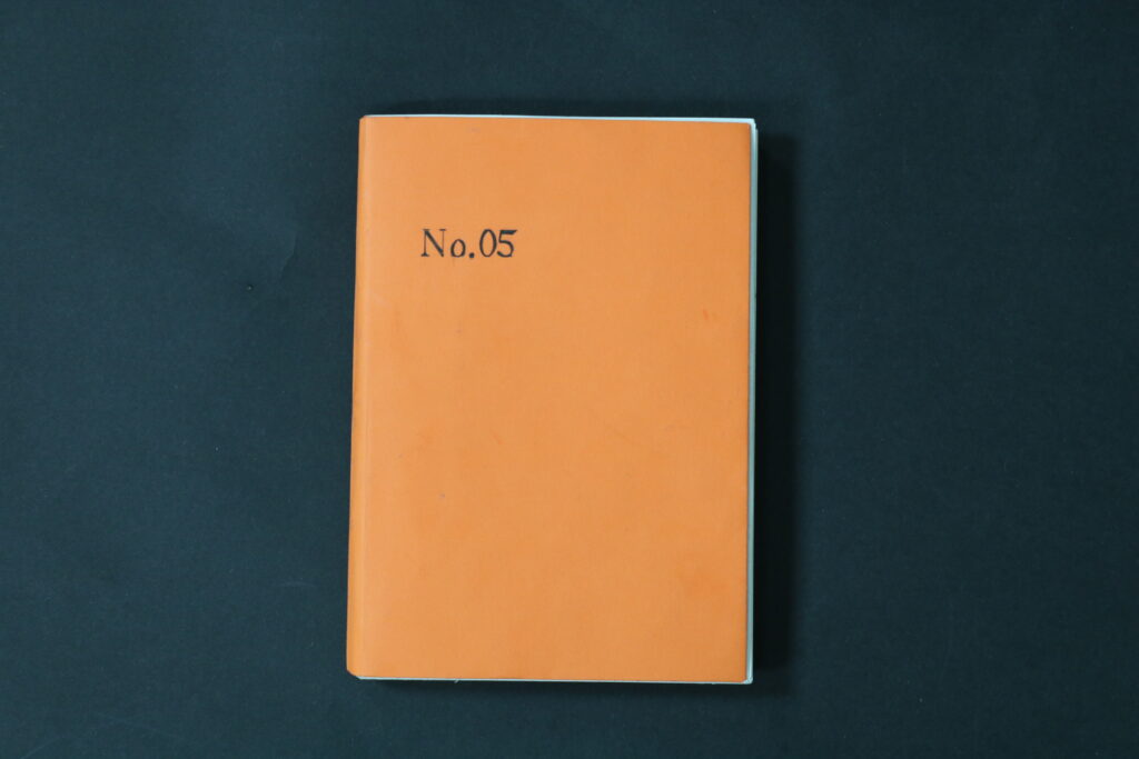
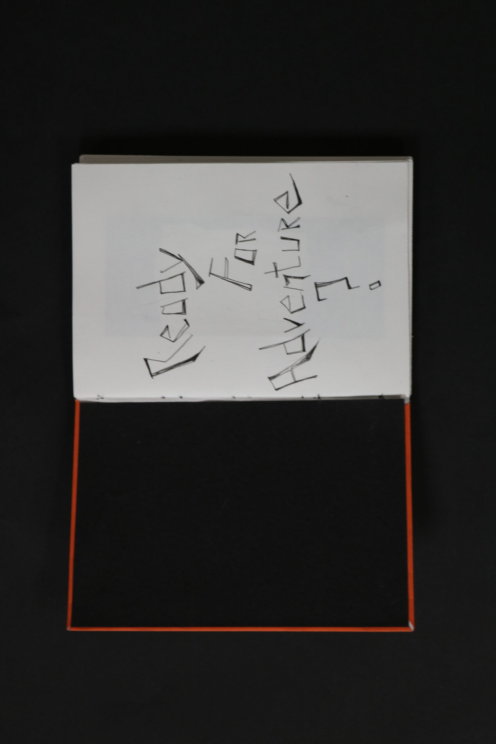
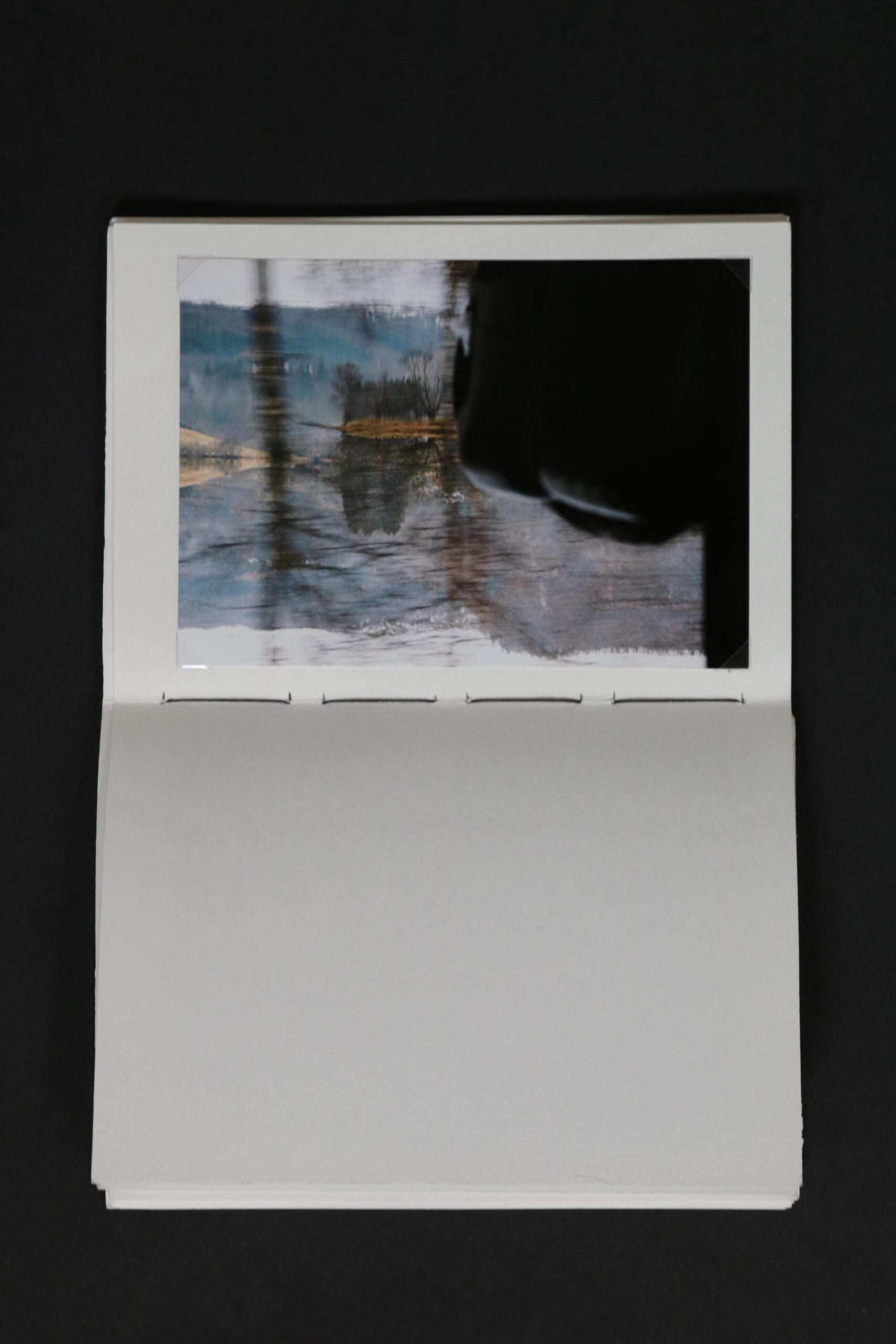
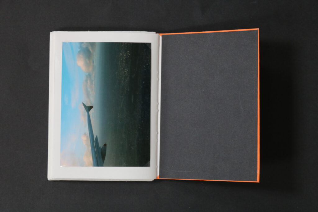
To me the first pages, the cover and the inner first page have a lot of clues about what is the book about, as well as the project. The title, No. 05, is drawn to match the font and fit with the rest of the zines. Same with the colour of the cover, the bright orange is done so the intensity of the colours matches, as most of the colours of the zines are florescent. Together they all fit into this playful theme, almost childlike. As I said before the thread and the inner cover match as they are intentionally both black, which to me fits well with the orange as well as the title. When opening the book the first thing the viewer seen is a question: Ready for Adventure?, this is hand written in a spikey, scribble-like format. I chose to write this in this format as I thought that the messiness of it suits the lifestyle of traveling and exploring, where most is unplanned and experimental. The title invites the viewer inside the book, and giving clues of what it is truly about. Because of this text it is easier to put the pieces together to what the theme of the book might be.
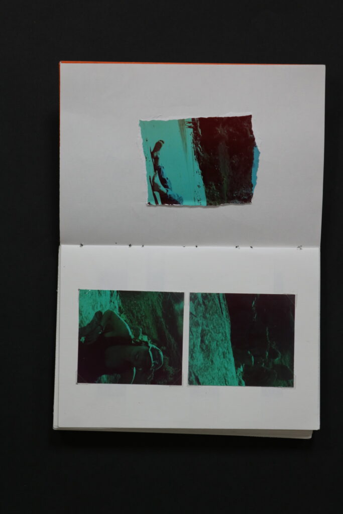
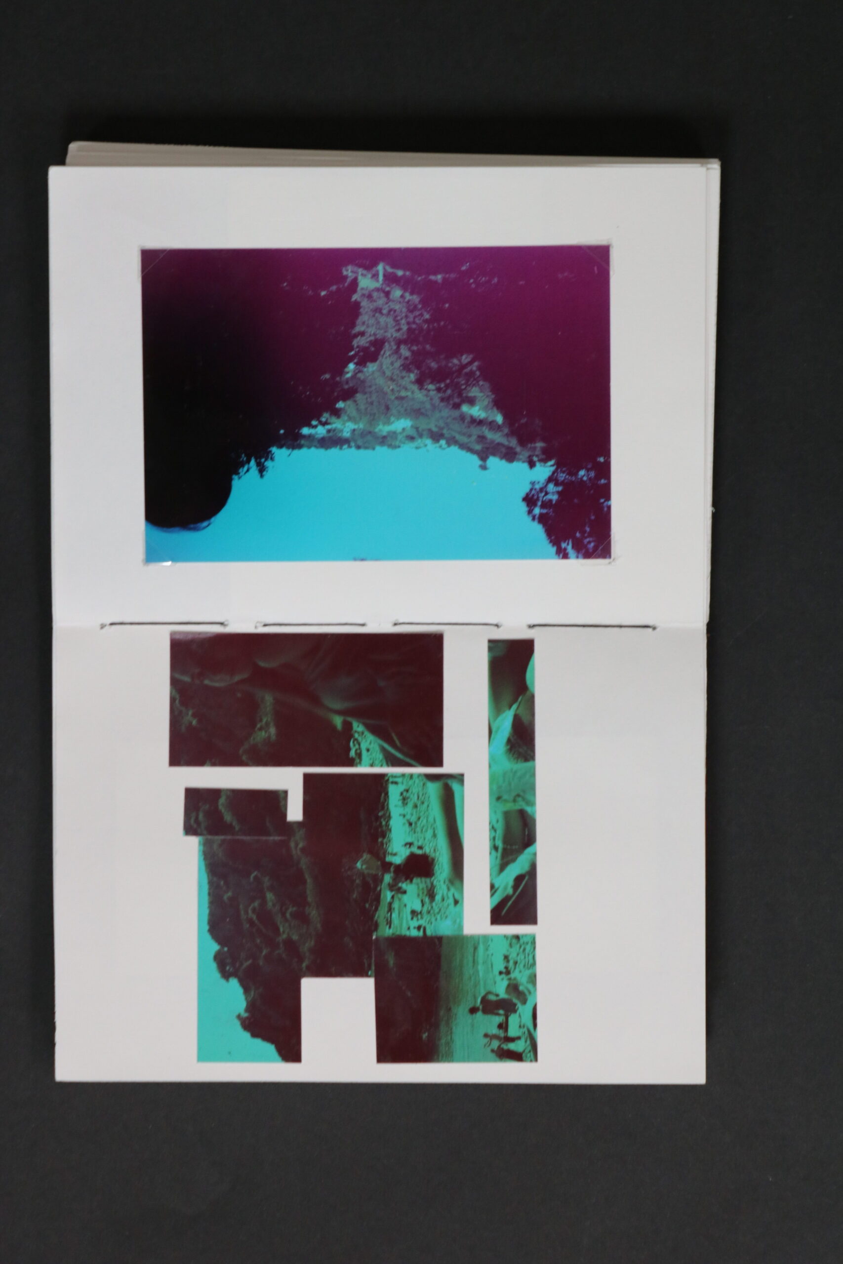
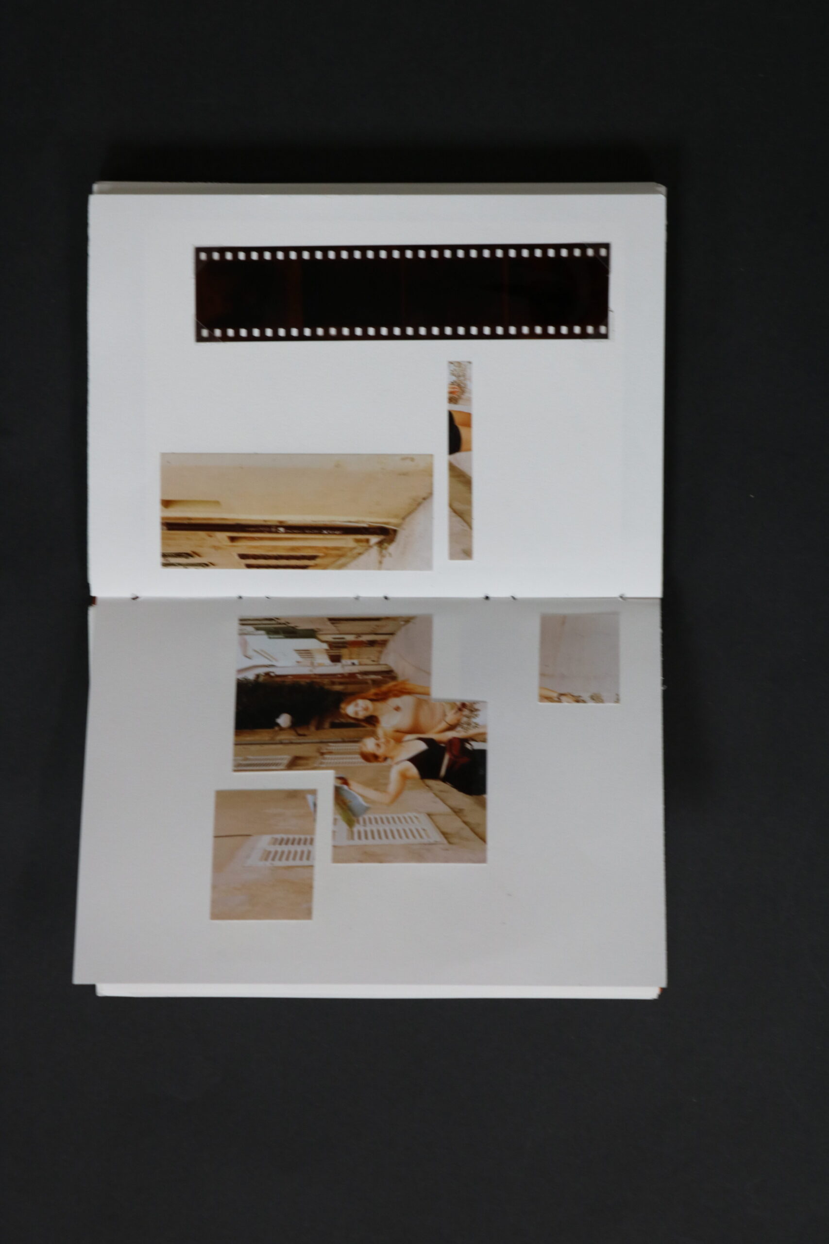
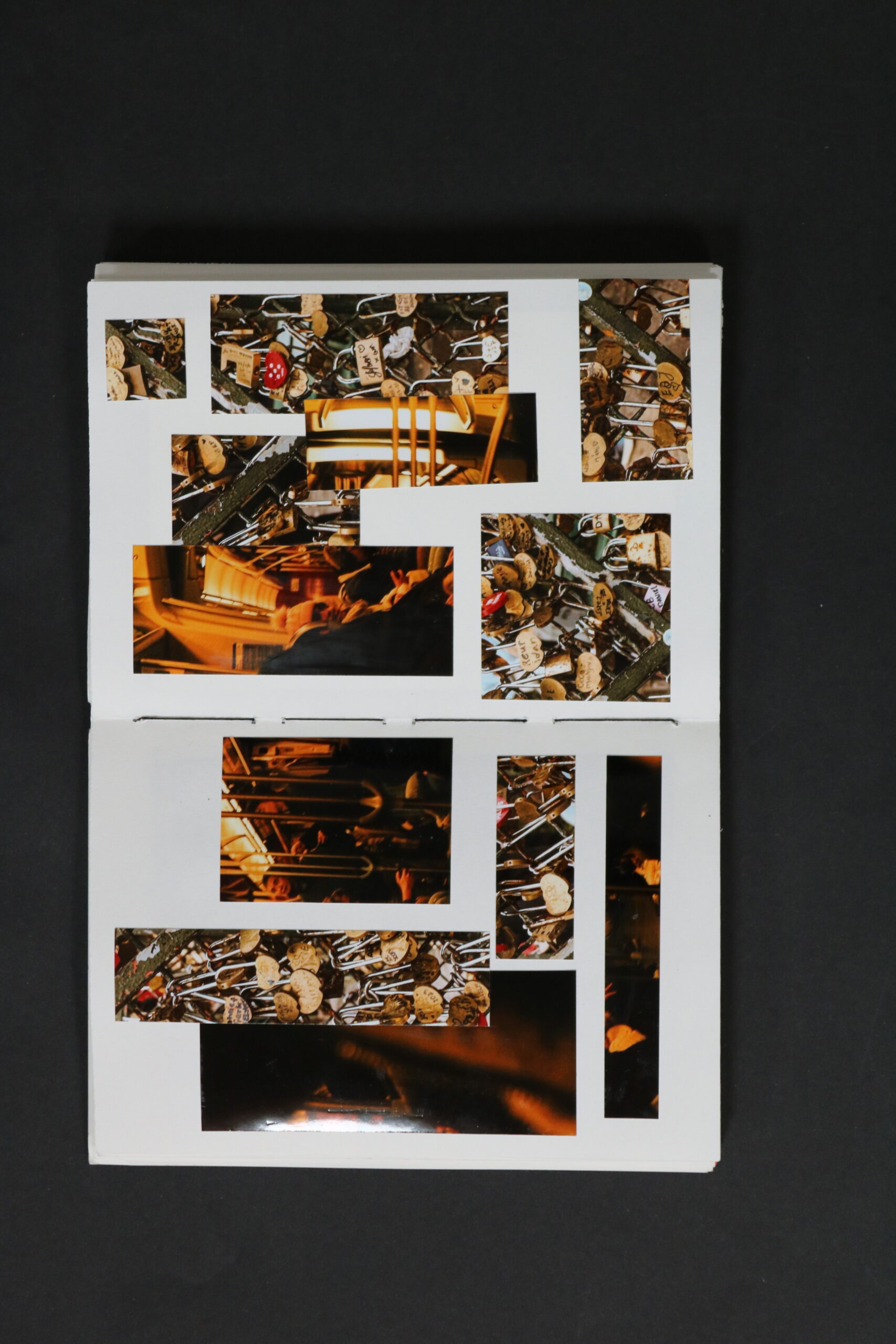
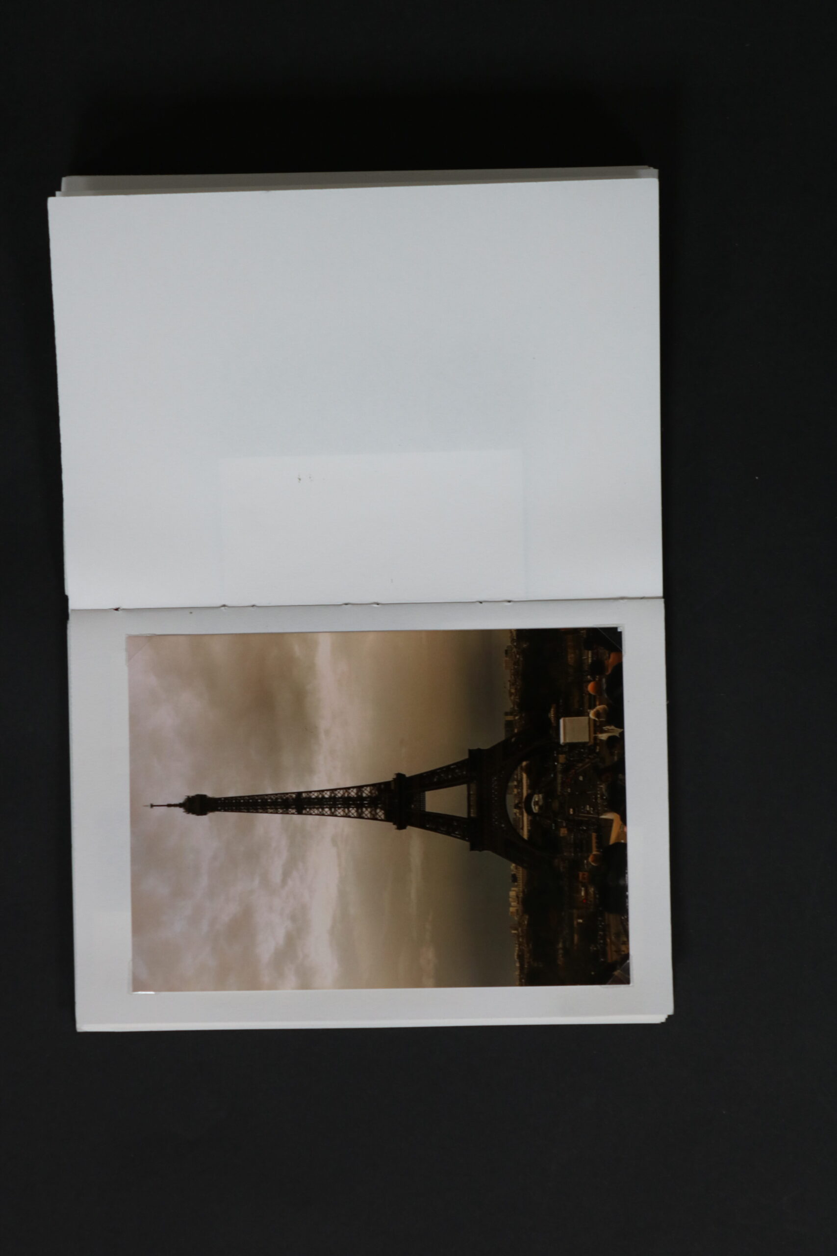
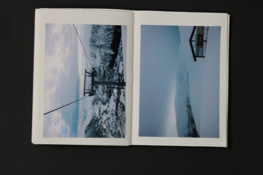
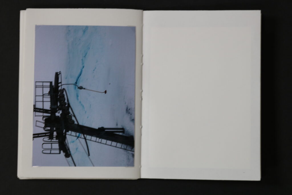
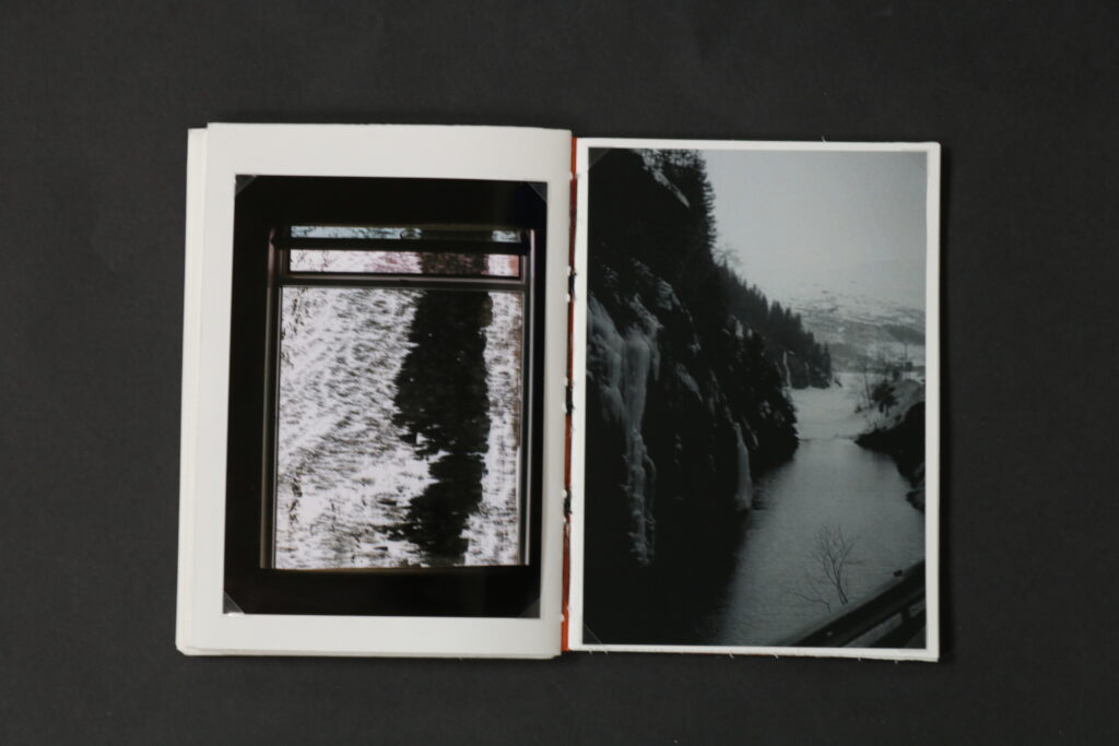
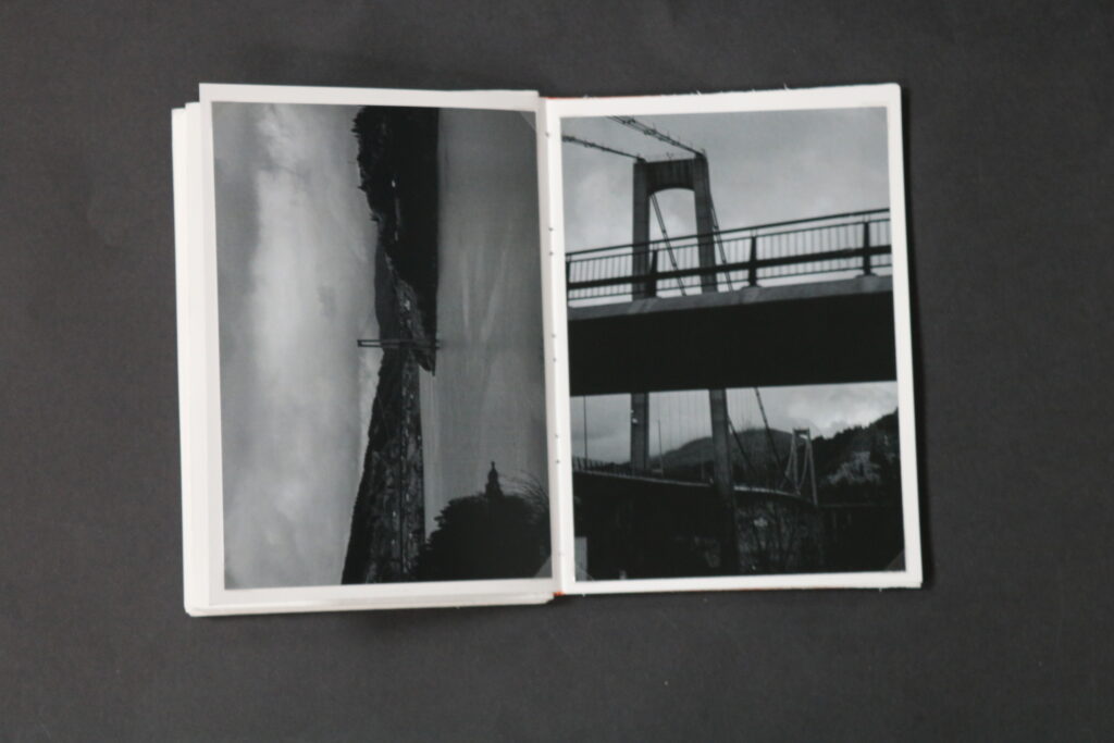
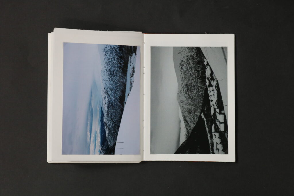
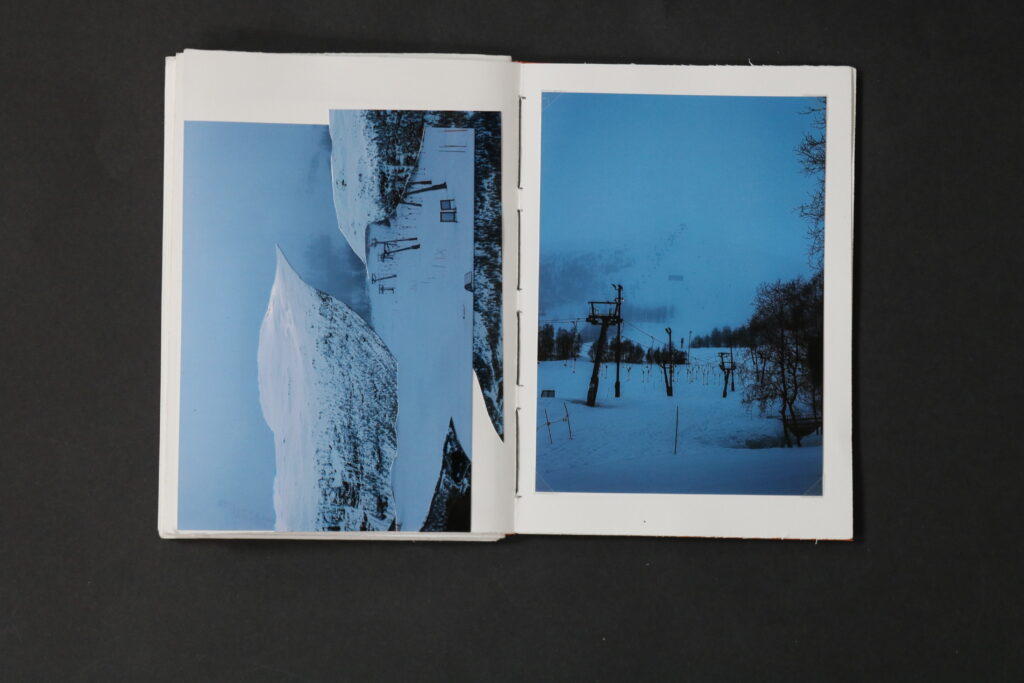
I think the book also has many connotations, explored through the montaging of the images as well as the layout. The layout tells a story, throughout the book. This book is a collection of various trips, however the layout put the narrative together, by having the images displayed in the order of events. Starting by showing more archival images, and ending with the most recent. The montage of some of the images, to me, shows this curiosity and seeking for something, as the images are in pieces and “incomplete”, it is like the viewer is invited to puzzle them together, to explore them, exactly like it was necessary for me to explore in order to produce the images.
In summery, every image challenges to observe it through a curious mood, to me the book is quite experimental as I have never done a hand made book which involved me to saw the pages together, but not only being an experiment it is a book documenting my journeys. It shows the viewer to have a different outlook on the world and I wish it motivates one to seek their goals, for this instance if it be traveling.
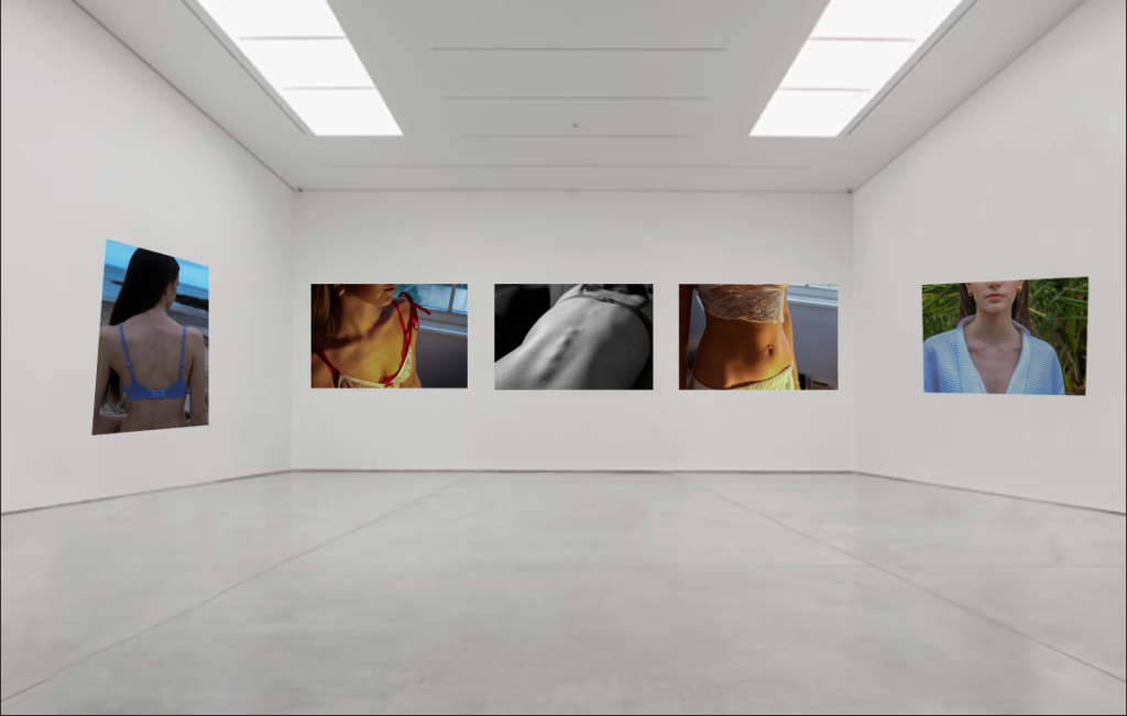
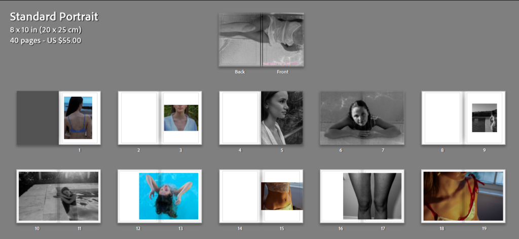
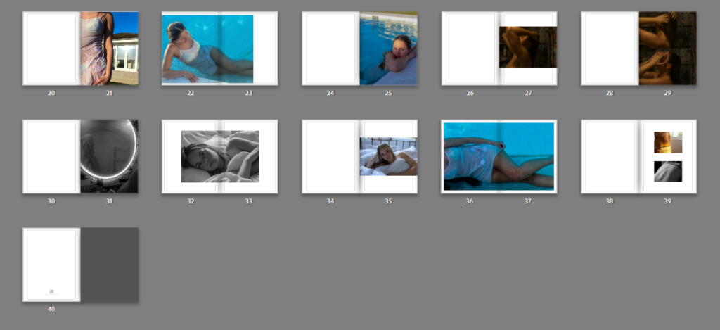
I am calling my photo book ‘The Male Gaze’, the title of my book is in a light pink colour which carries on with the theme of stereotyping women. It contains a series of images which I have taken across 40 pages. I have chosen to create my book in portrait as it fits my portrait images better. Moreover, I have chose the sequencing of these images in a way in which each image will have a corresponding/ similar image on the next page. While placing the images into a book format in Light Room I did have to re-edit some photos to make sure that the tones flowed through each page. For example, with my black and white images, I had to adjust the black levels and the exposure, where as with the colour photos taken in the pool, I ensured that the colours of the water where all matching. Furthermore, I am pleased with the outcome which is shown in the screenshots above as it corresponds with my own interpretation of the theme of Observe, Seek & challenge.
Experimenting with my photobook:
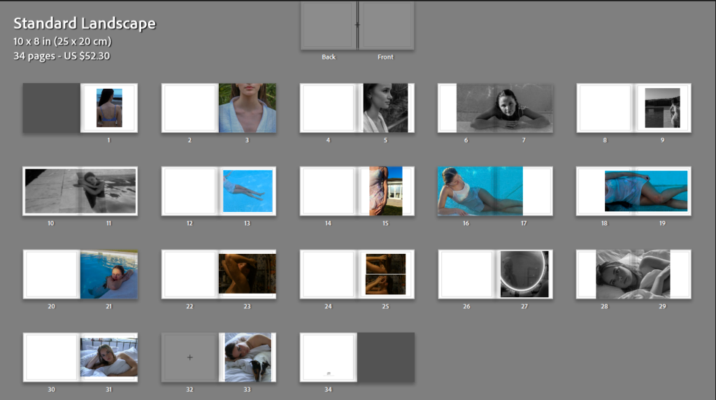
I experimented with my book in landscape, however, i decided to switch to portrait as II believe it suits my portrait images better.