LINK TO PHOTOBOOK:
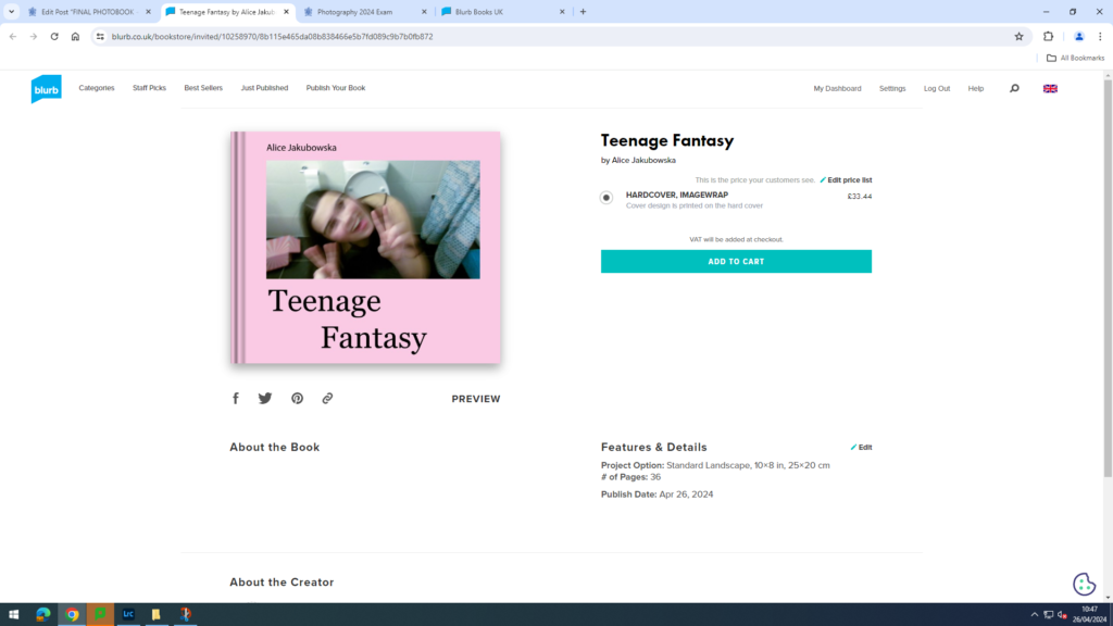
Here is a link to my photobook: Teenage Fantasy
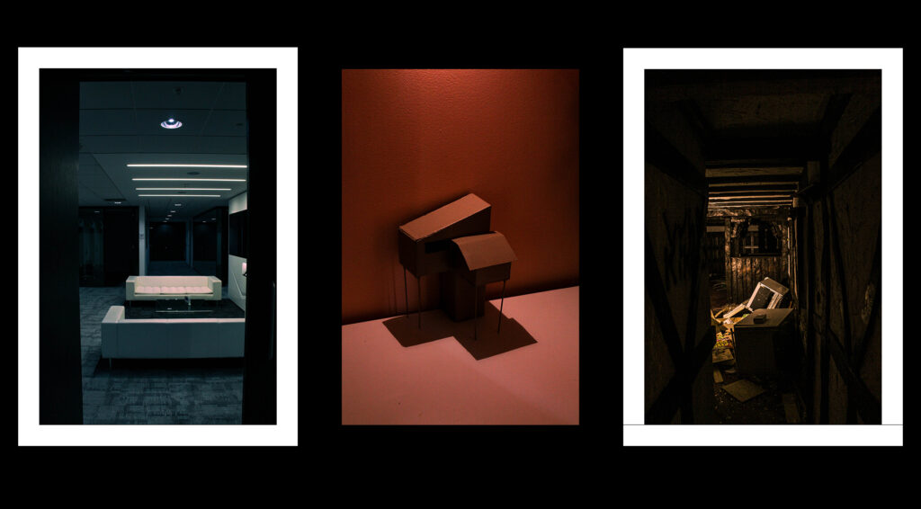
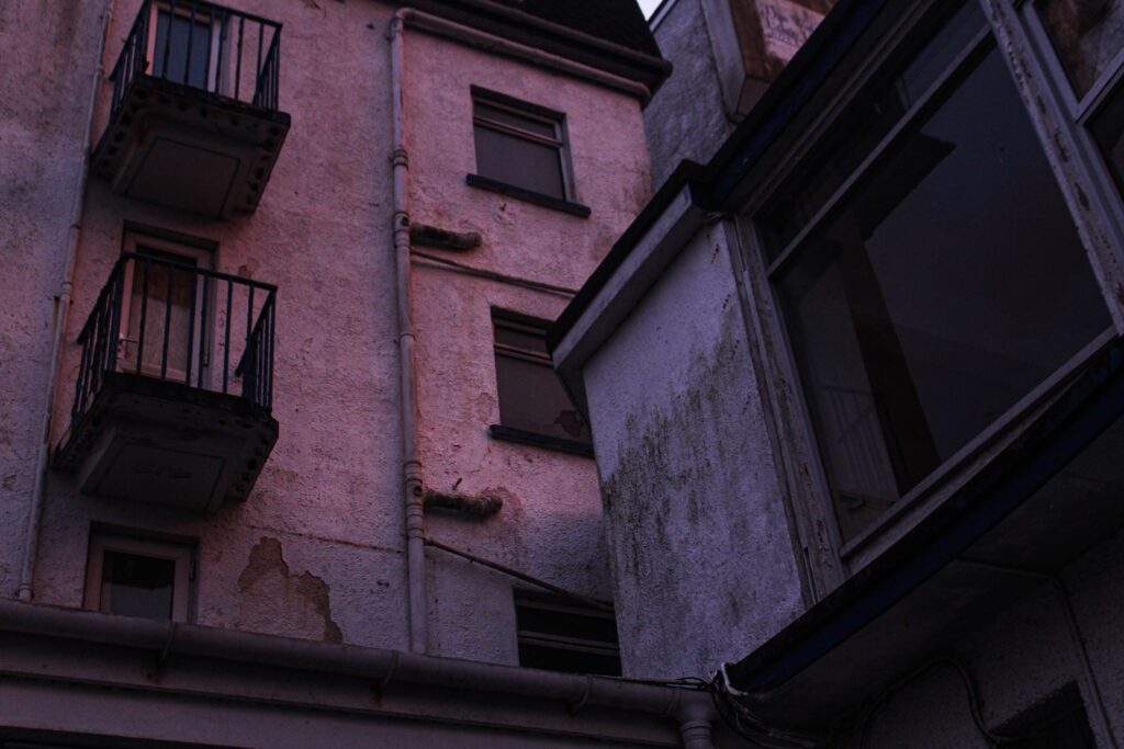
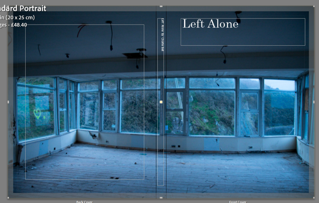
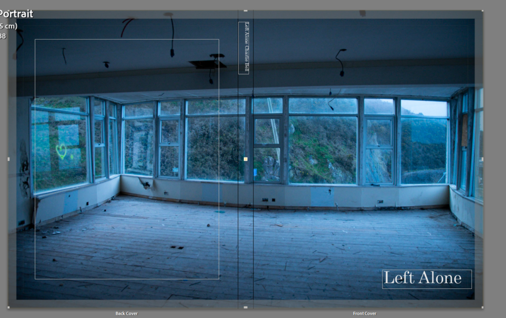
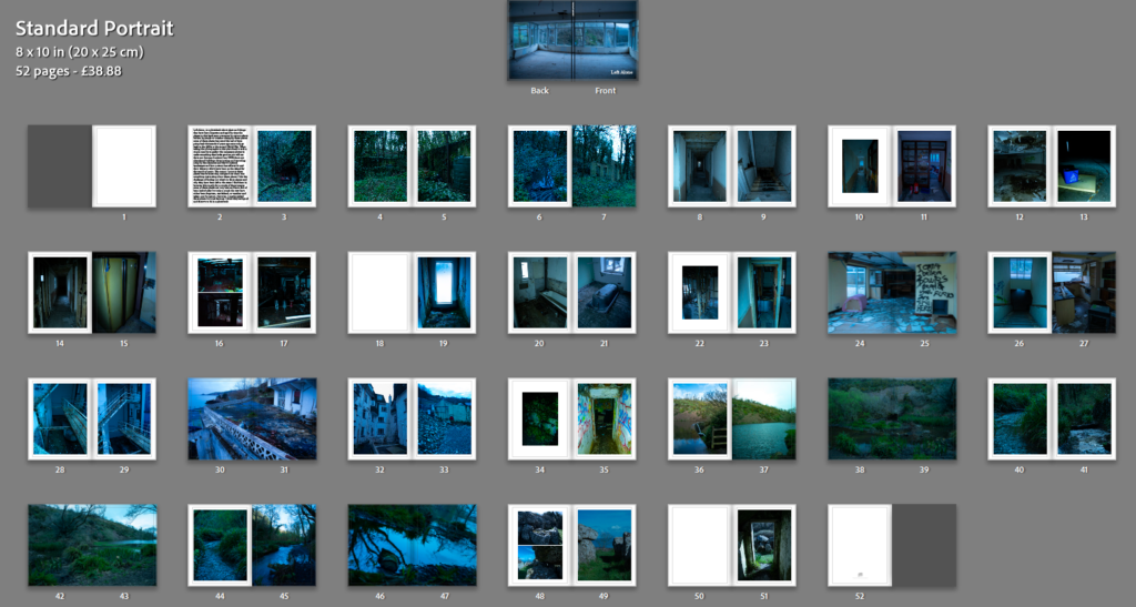
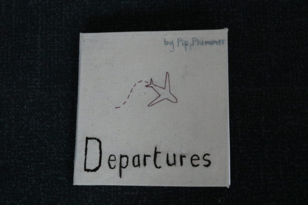
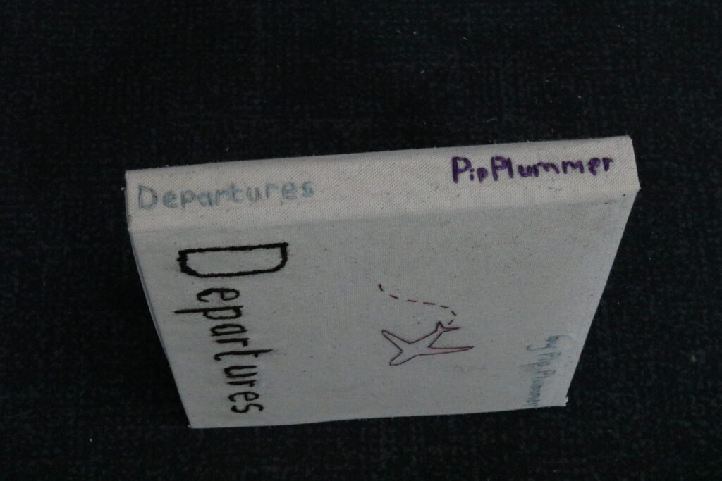
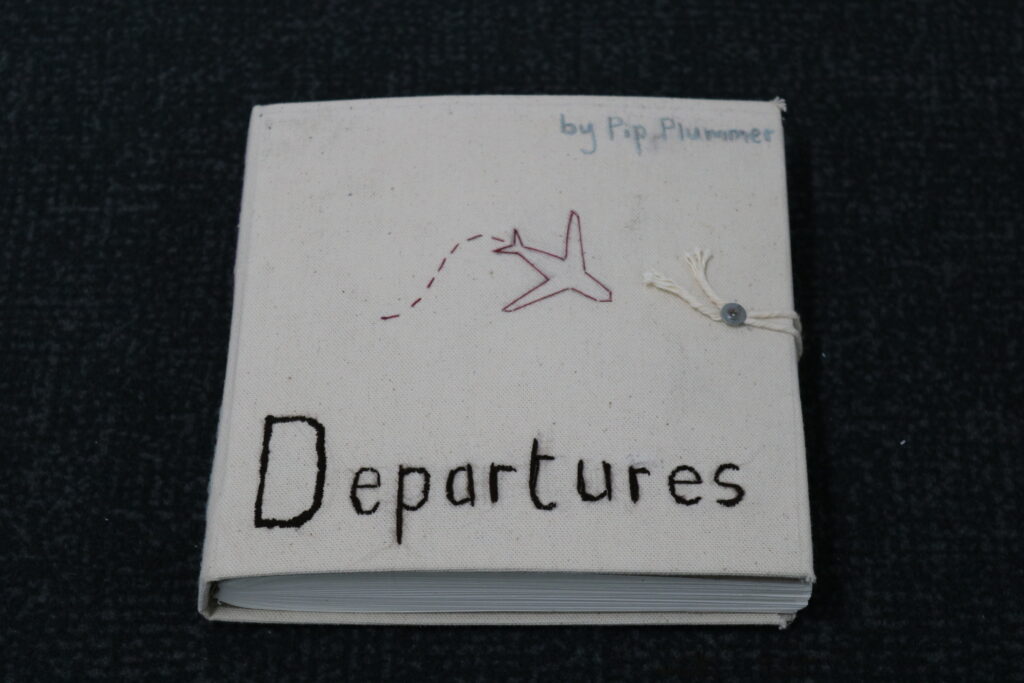
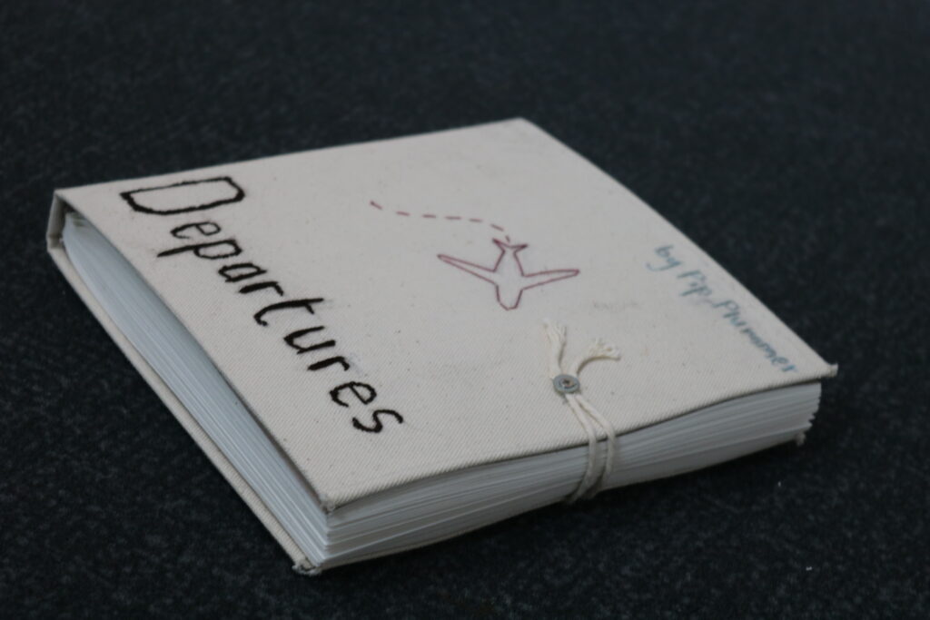
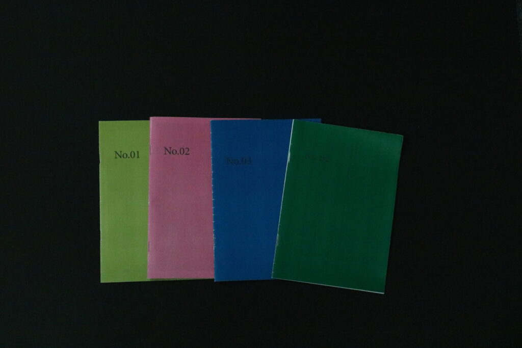
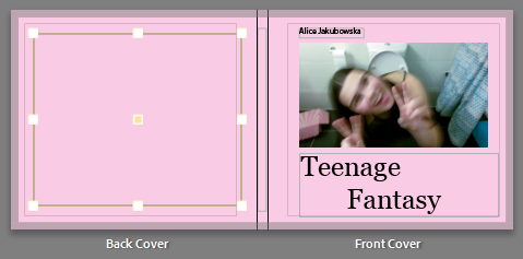
FRONT + BACK COVER:
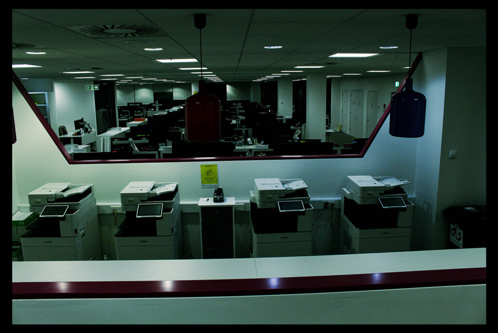
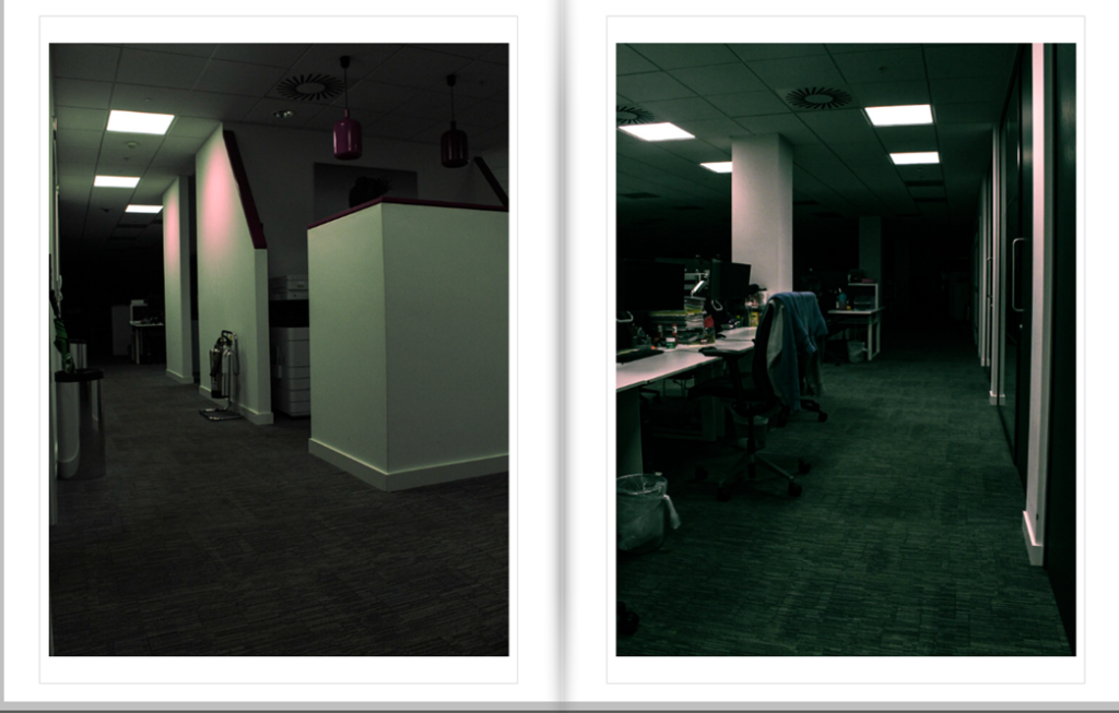
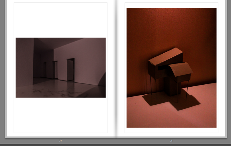
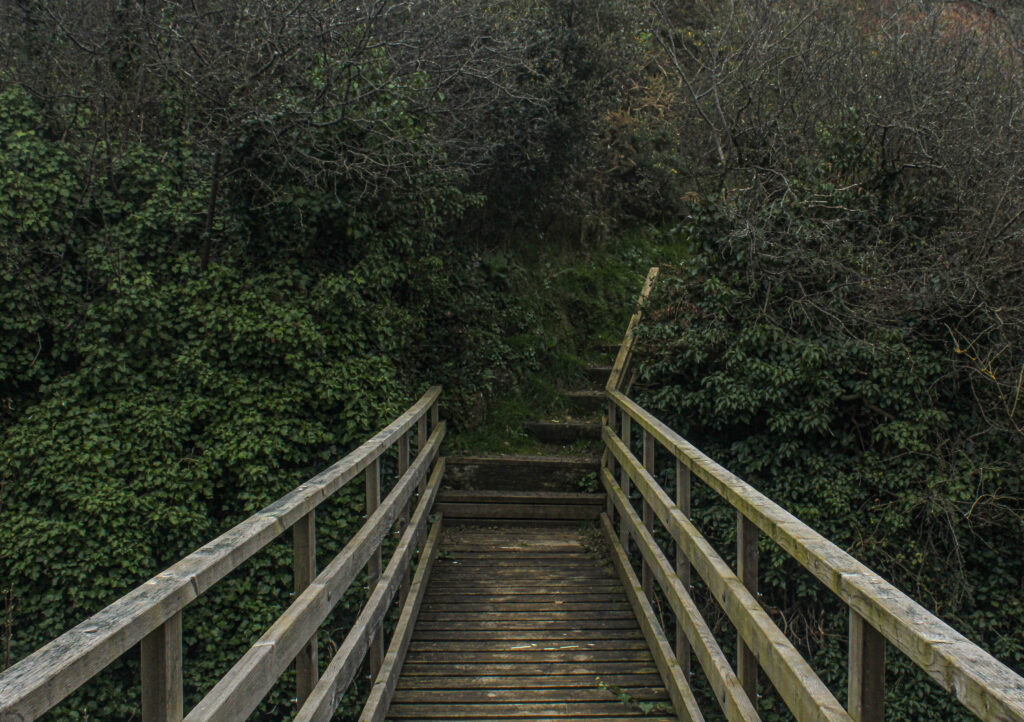
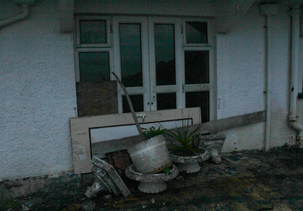
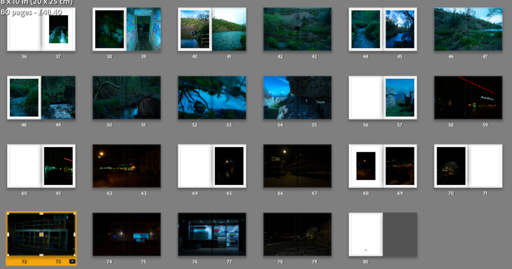
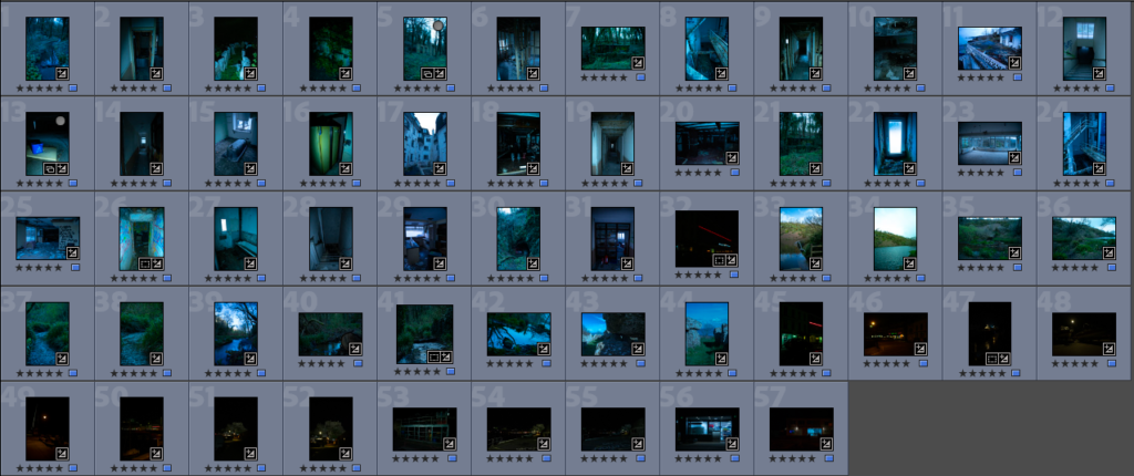
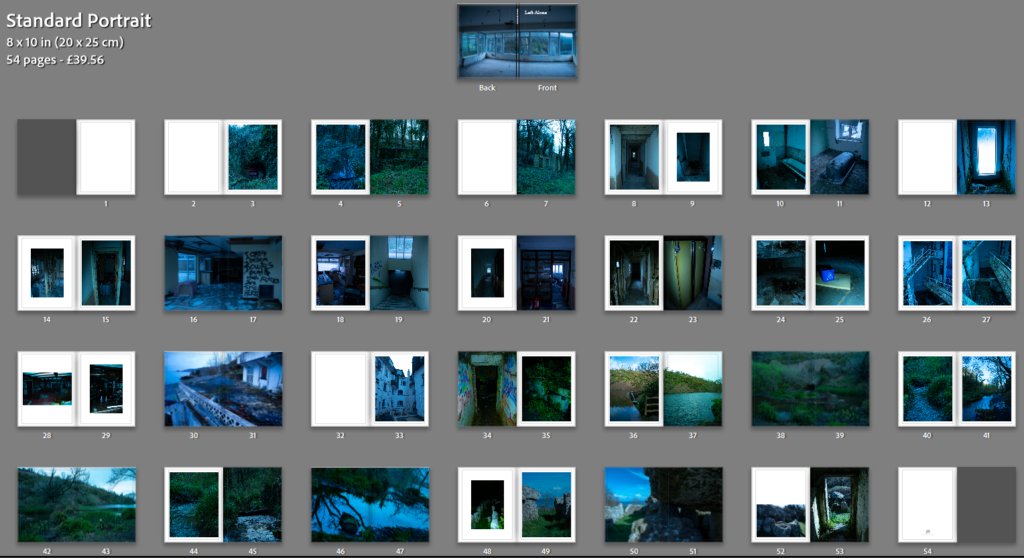
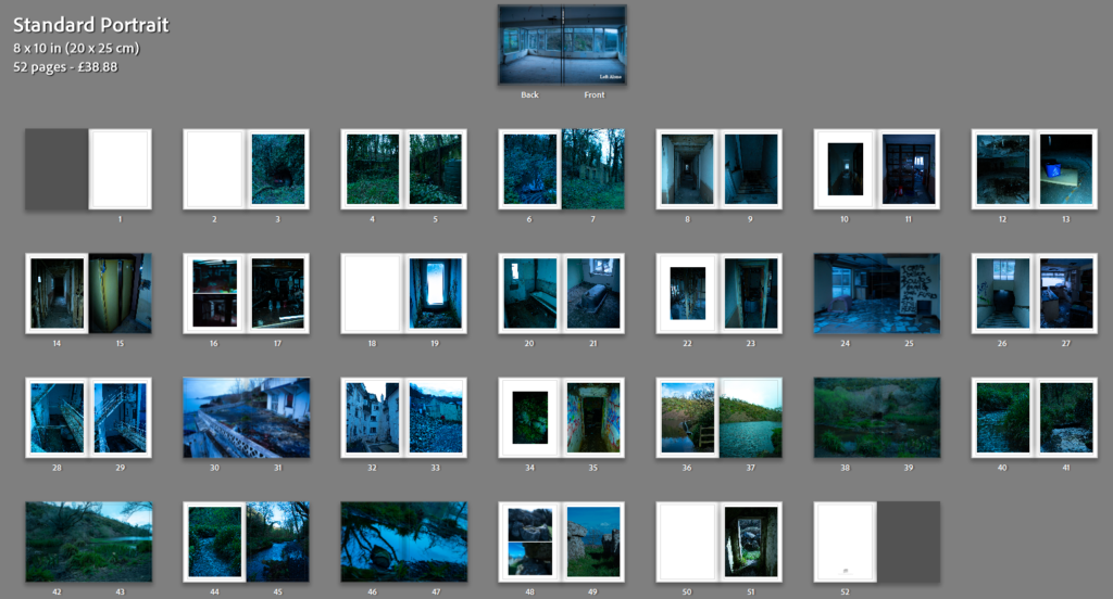
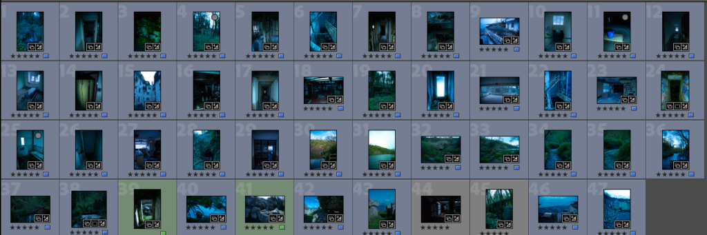
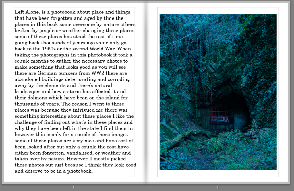
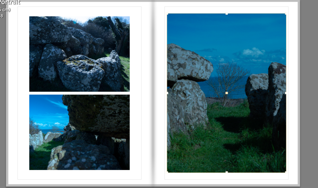
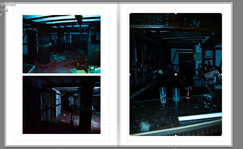
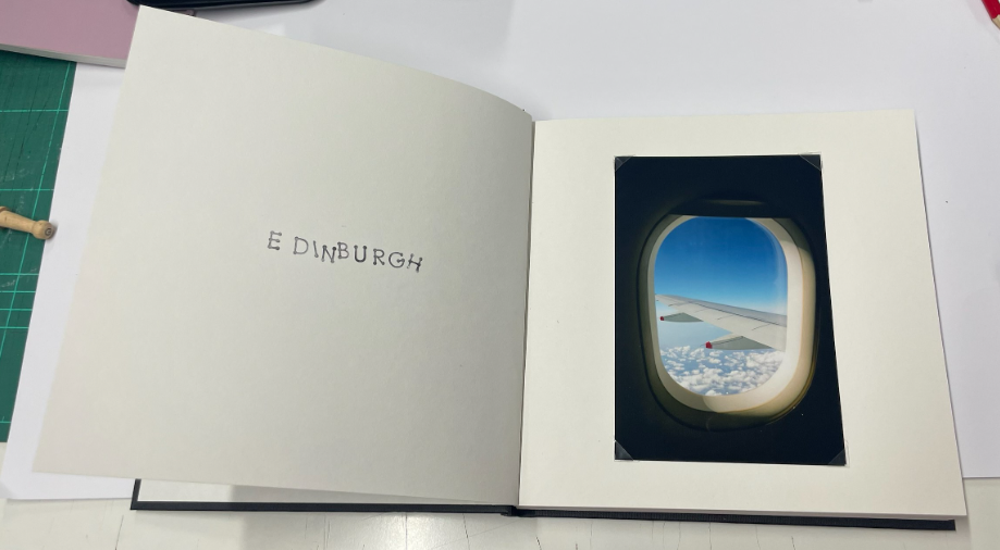
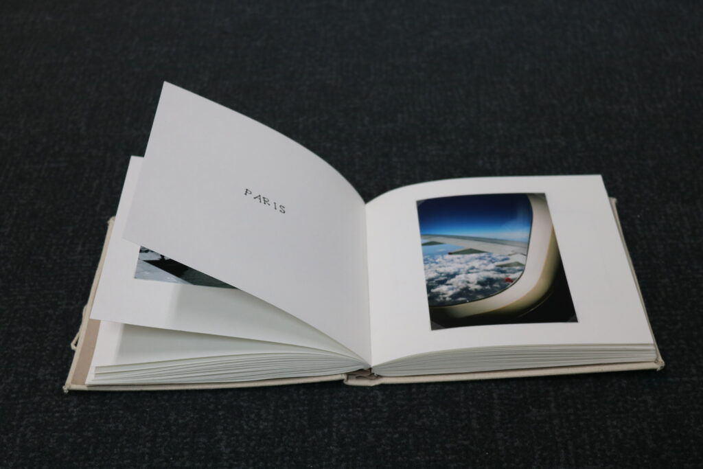
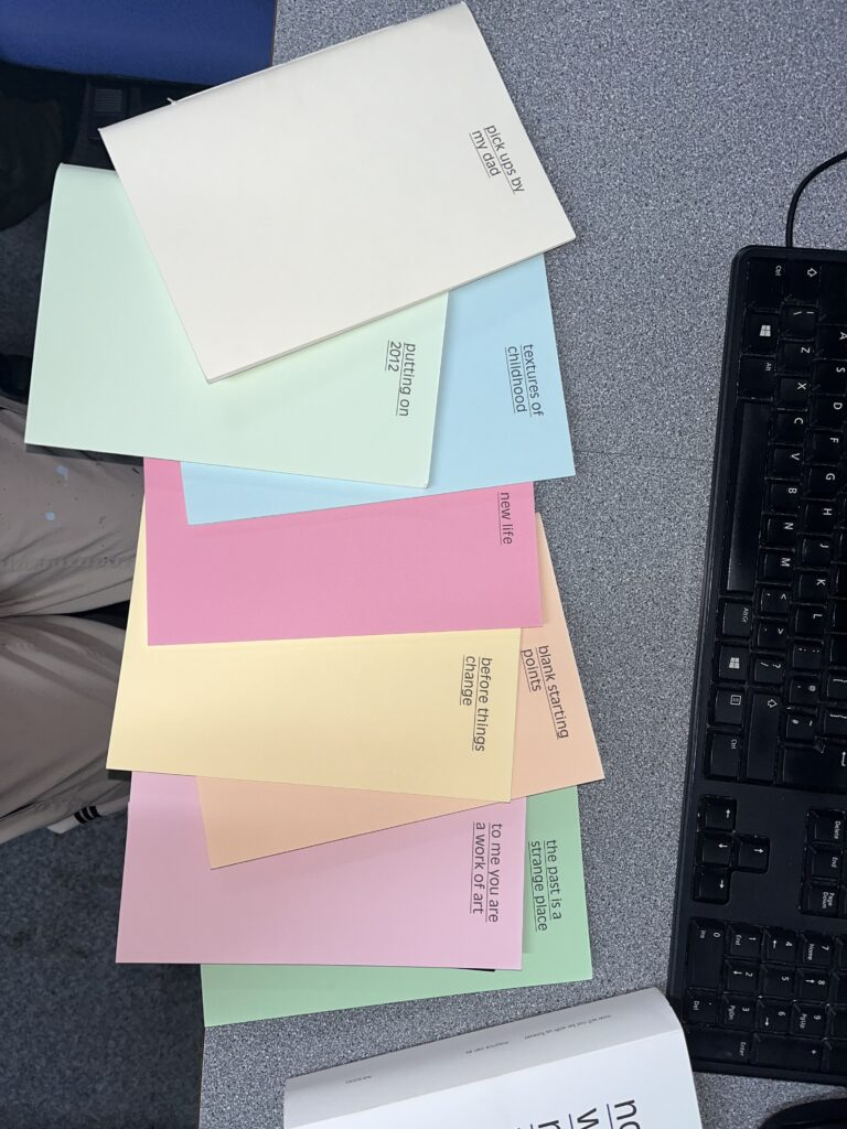
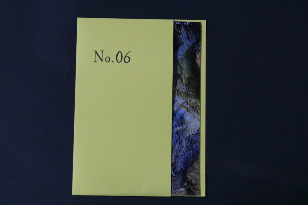
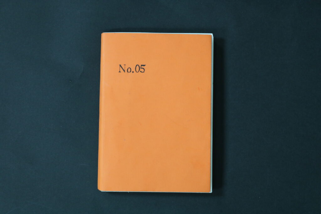
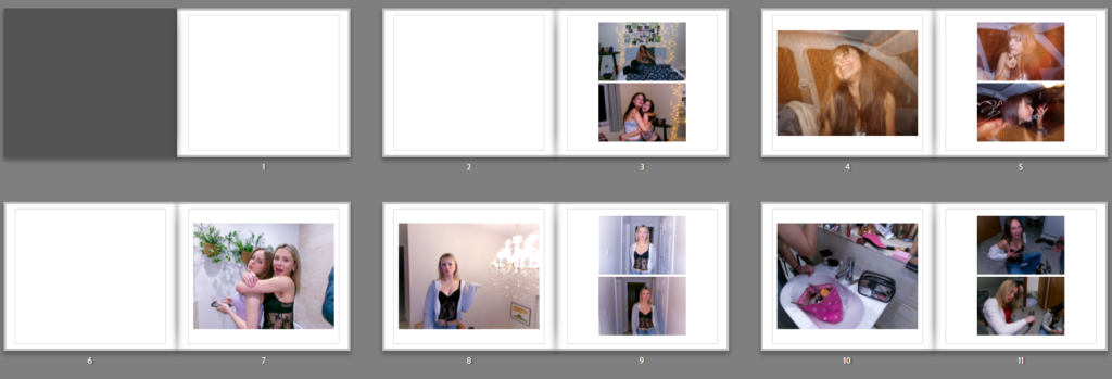
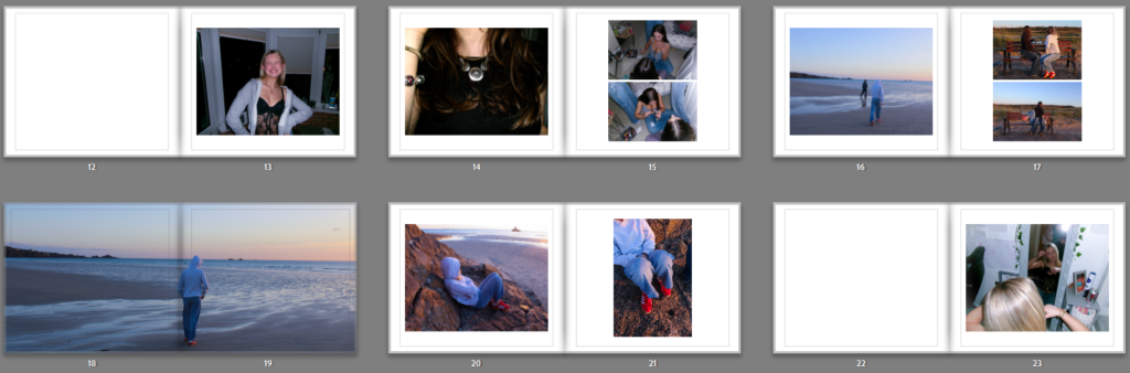
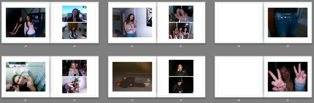
PAGES:
EVALUATION:
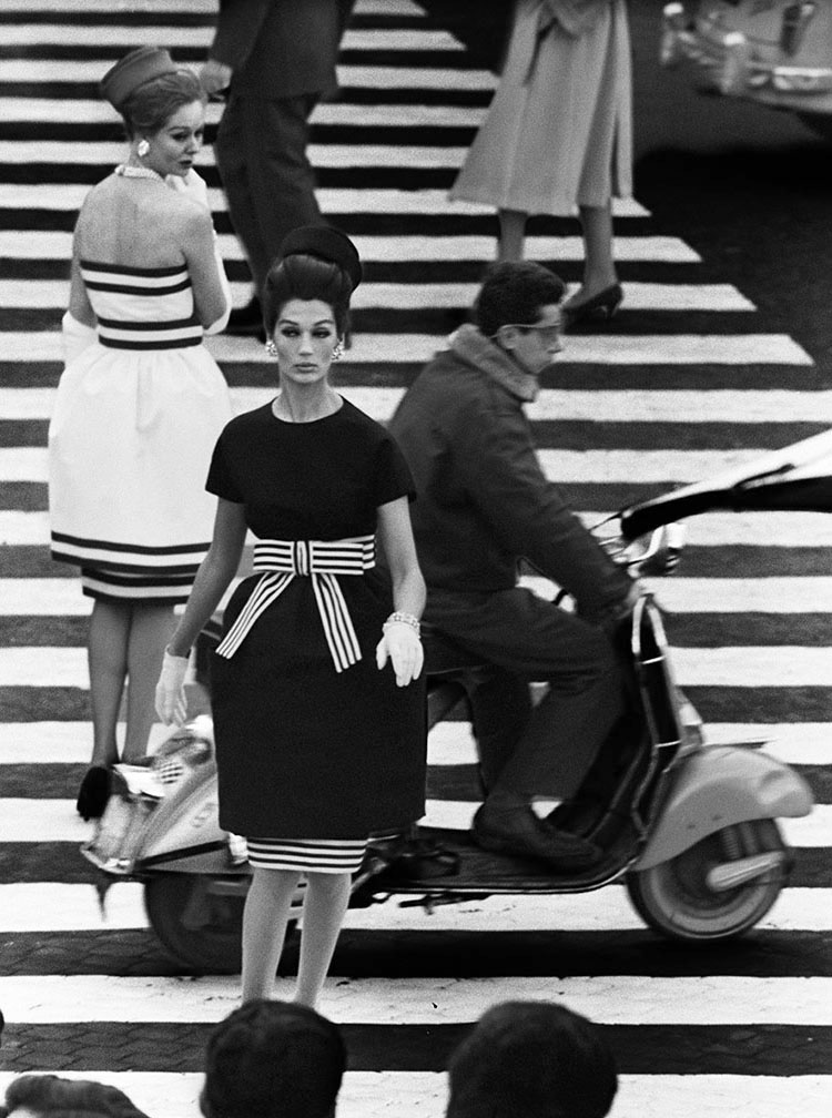
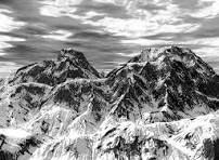
In the process of making this book I have clearly learned key skills for future projects. After reviewing my final outcome of the photobook I am pleased with the result. My aim for this photobook was to explore the exam topic observe, seek and challenge through the concept of femininity and girlhood. In terms of my focused artist case studies I think I leant towards Nancy Honey; I did take a photoshoot focusing on Cindy Sherman however I concluded that I did not want that to be incorporated into my photobook. My inspiration for the photobook was Justine Kurland’s ‘Girl Pictures’ which I think is clearly shown through my photobook.
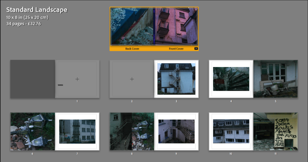
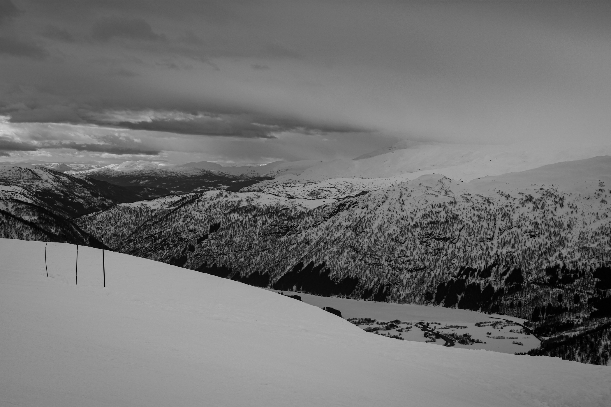
Overall during the process of making this photobook I really enjoyed it, I was able to use knowledge from my previous photobook and how to make it better. Even though creating the book was a very similar process it was much more different since I was using coloured images. I enjoyed experimenting with different tones and temperatures and creating a narrative through my images. The placement of the images I learned was very important, the photobook needs to flow without a disrupted pattern. I was able to create this well flowing narrative from my three key photoshoots; a party, girls watching the beach, girls together in a car and outside. By placing the images in that order I was really able to highlight the different ways in which girls spend time together. I the process of picking out the design I wanted to add more picture from my previous photobook, yet I also wanted to find a design I was able to repeated in order to still keep the photobook organised. Looking back at my photobook I am content with the final product and overall think that it clearly states and shows femininity through observe, seek and challenge.
In terms of improvement I believe I could have done slightly more shoots. I did two shoots more in the style of Sherman however didn’t like the pictures and didn’t have enough time to do a last minute shoot. Overall, I think what was needed in this photobook was some more creativity in a more hyper realistic way. I wasn’t able to do some of the shoots I wanted to do due to personal reasons however I still am pleased with my final result. Even though all my images used in the photobook fit with the aesthetic and compliment each other, I wish I had a few photos which clearly show hyper-realistic femininity in inspiration to Sherman works like hyper realistic makeup.