Online link to my photobook
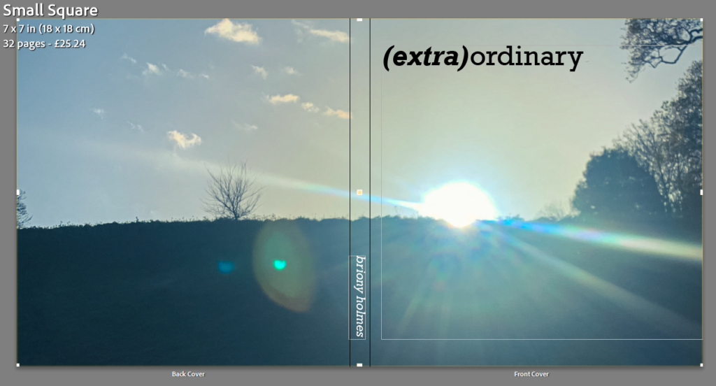
I decided to make my book square shaped with a hardback to fit with the photos that I took.
Cover

I decided on the title (extra)ordinary as it separates the two words ‘extra’ and ‘ordinary’ which I think it think sums up my project quite well. I really liked the simplicity of the image I chose for the cover image as it was abstract while still being casual. I knew I wanted the cover image to wrap around onto the back so this was the perfect image as I liked how the sun rays span across the whole image.
Pages
With each page I tried to match the pictures based on similar colours or shapes but making sure not to put images that are too similar together as I wanted there to still be some form of juxtaposition in them. I also didn’t want to put images together that would be next to each other in an everyday setting, this is because I want it to be almost random and unexcepted. My favourite concept was with the eyes as I knew the possibilities were endless. I ended up decided on pairing the blue eye with a close up of bubbles as I liked how they shared a similar shape (circular), the juxtaposition came with the eye having 2 big circles whereas the bubbles has multiple small circles. Similarly, with the brown eye I wanted to focus more on similar colours with the juxtaposition being the difference in shapes (straight lines vs circles).
When designing how my images would appear in the book, I wanted there to be some standardisation with some unexpectancy. I did this by having every other double pages (on the left of the images below) follow the same structure: medium square (e.g. page 4) with a full bleed (e.g. page 5) and then a full bleed image (e.g. page 8) with a small square (e.g. page 9) and it continued in that order. I created the irregularity through the other double pages (on the right) which either featured a double page spread, singular square image with nothing next to it, or a row of 4 images which created a timeline of movement.


