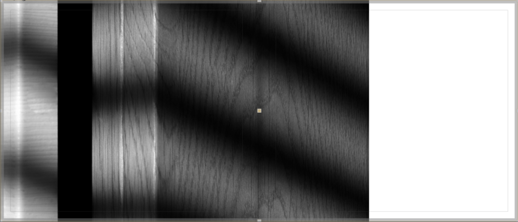
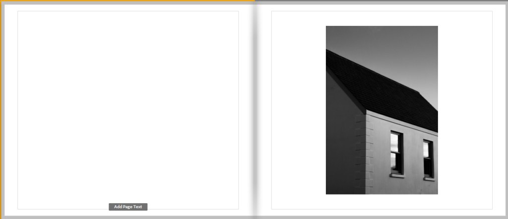
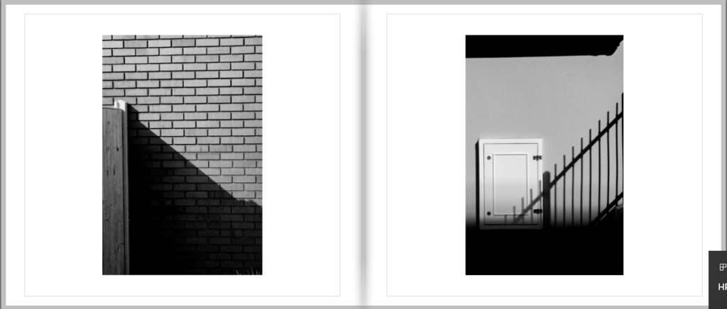
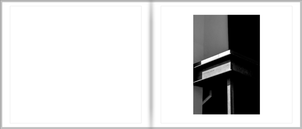
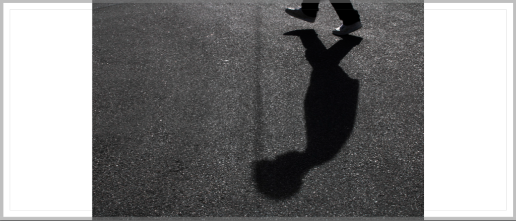
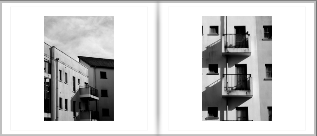
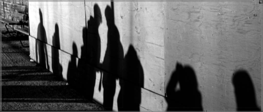
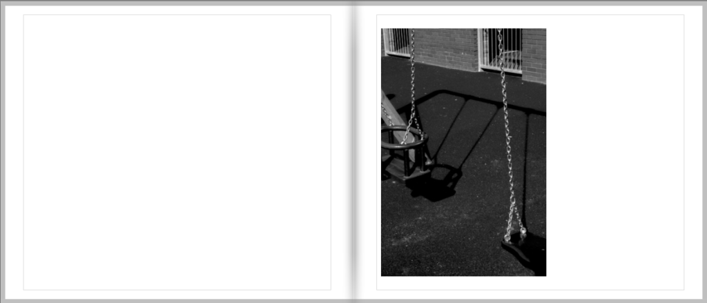
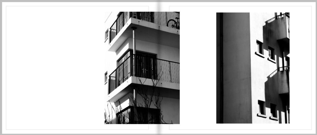
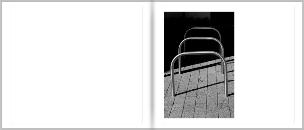
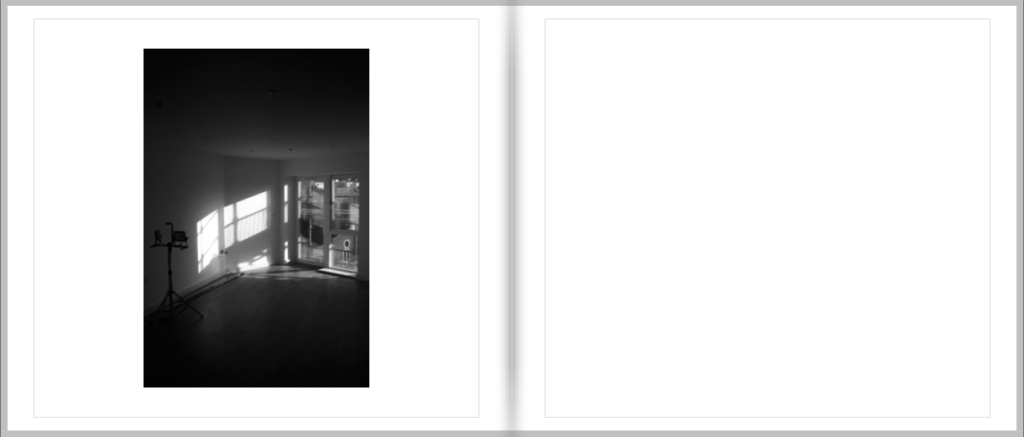
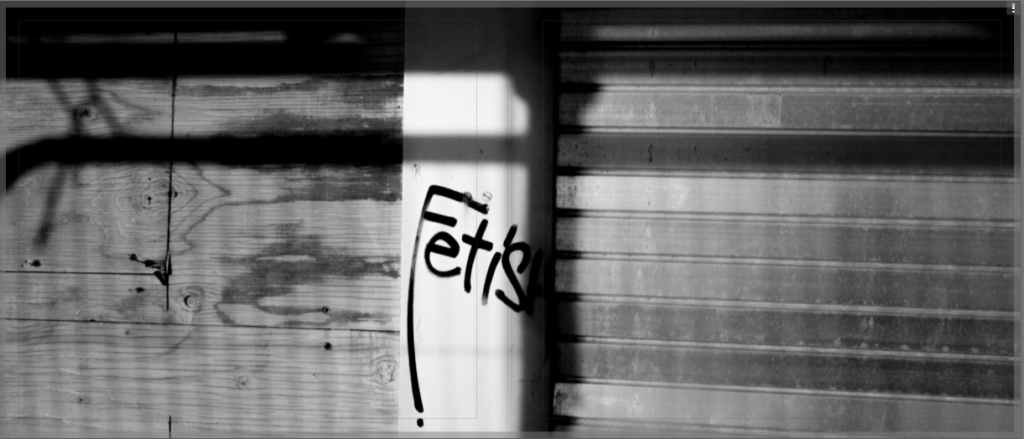
For my Final layout of my photobook I have created a simple design that uses a mixture of cropped images and double page spreads.
- Paper and ink – Premium Matte paper
- Format, size and orientation – Standard Landscape 10 x 8 in (25 × 20 cm)
- Binding and cover – Hard cover image wrap
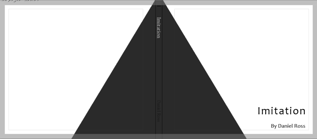
- Title – Imitation
For my front cover I used photoshop and created a dark grey triangle to wrap around my cover and back, this somewhat looks like it could be a shadow which is fitting for the book and is also greyscale, similar to my photos. When designing this book I went through 5 different lay outs before concluding on this one as I wanted it to look perfect to me and the ones I had done previously just didn’t look right to me.
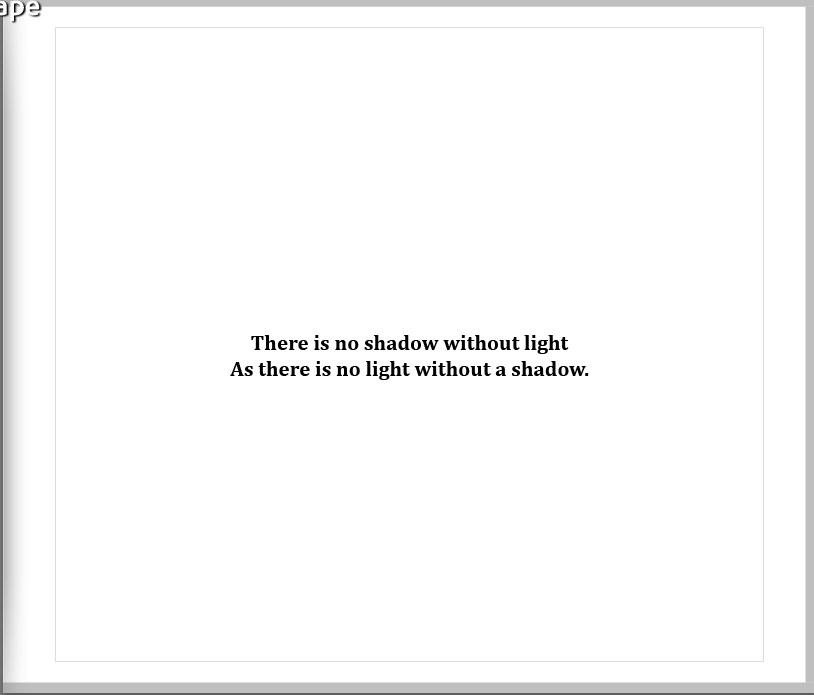
For the opening page I added a quote over plane white as I wanted it to be simple, I’m not 100% sure where the quote is from I just remember hearing it in a movie and it can be put up for interpretation on what the meaning is.
Overall I am very happy with the way my photobook has come out as it is simple and minimalistic as I had hoped for when first starting this project.
