For the cover of my photobook I wanted to create something unusual rather then just using a singular image.
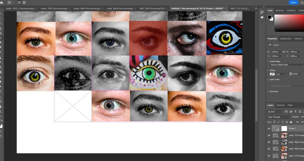
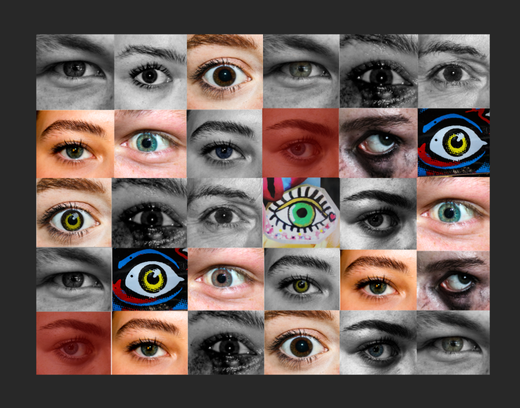
I experimented with different images of eyes, edited them differently and made a montage that could be used as a cover.
On lightroom I imported it as the cover to see what it would look like.
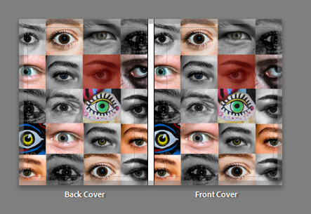
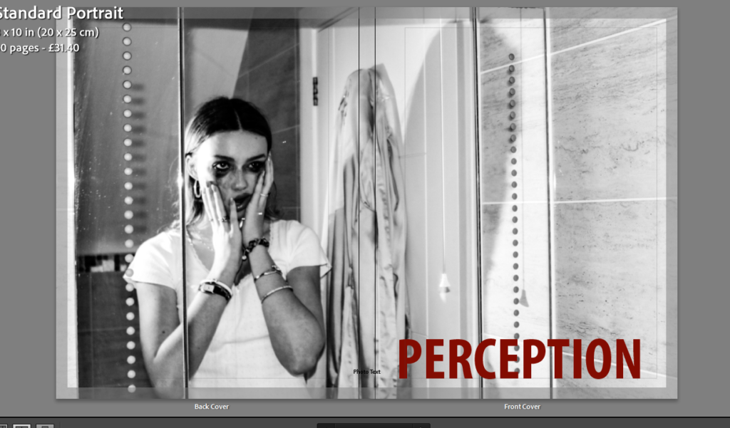
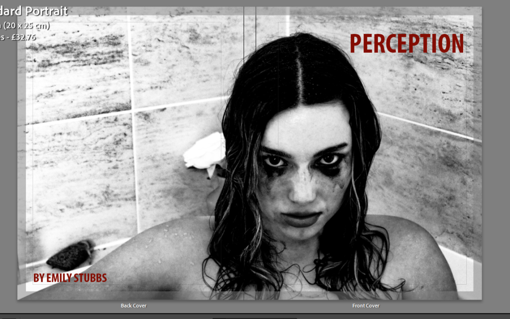
However, I realised this didnt match the contents of my book and felt a bit random so I tried some other options.
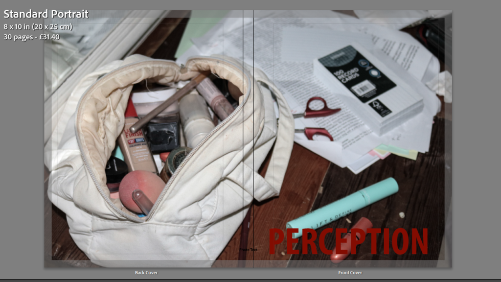
My final decision:
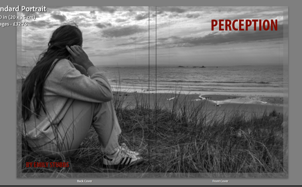
I decided on this image as I liked the way this outcome matched the title as the girl is looking out (perceiving) and how the layout of the image fits the format nicely. The monochrome makes the burgundy text stand out and creates a clear contrast ensuring it is easy to read.