Along with making a photobook, I chose to make some final prints for my project as another way of presenting my work. I make a total of six final pieces using ten of my best images and think they turned out well. I think that I used a variety of my images to show a snippet of my project as well as showed a variety of colours and ways to present them. I am happy with how each of my window munts turned out and think that the first one with the four images is my favourite as it is very bold and draw viewers in catching their eye immediately. I think that the last three also turned out well and as they are simple it allows you to focus solely on the image and its colour as opposed to how it has been presented.
mini mock-ups:
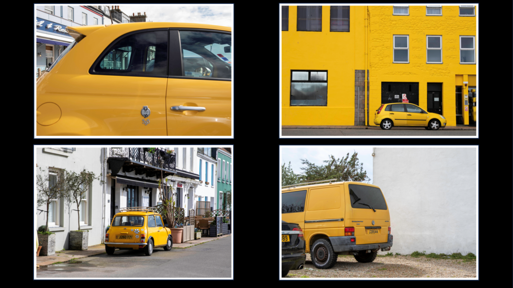
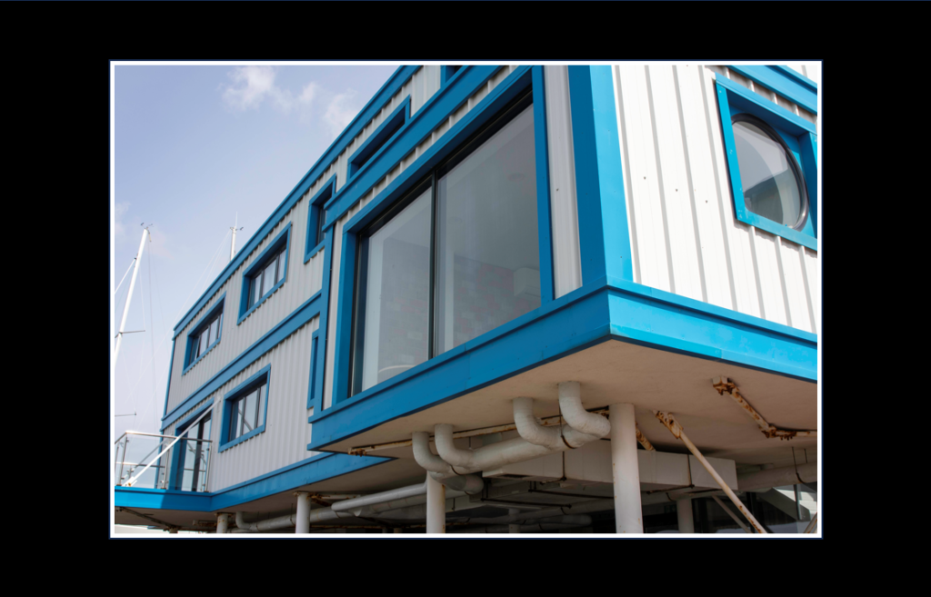
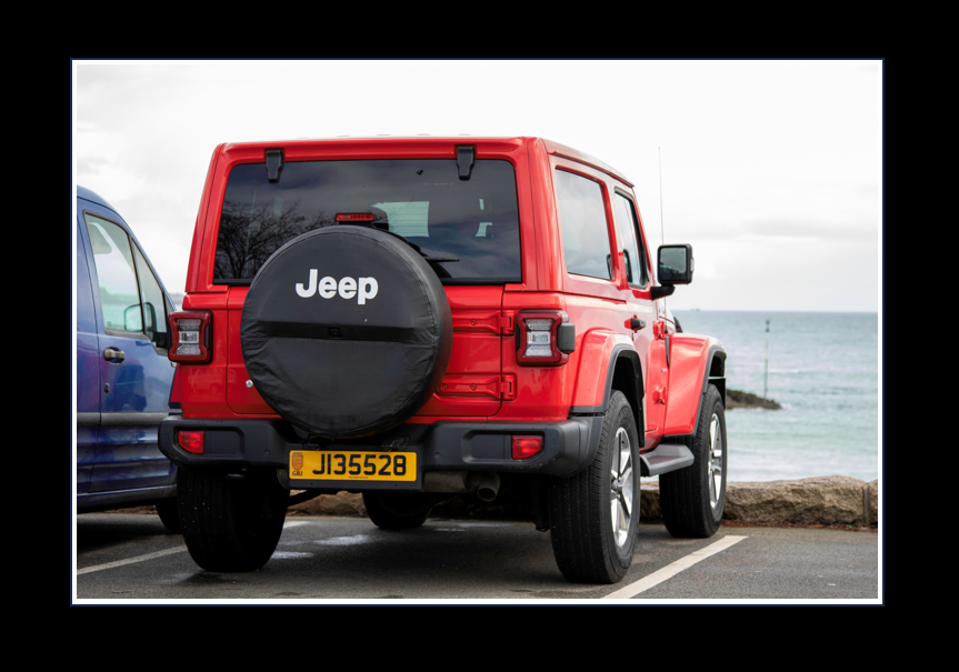
For my first three final prints I chose to make window mounts for them by taking a piece of thick black card and made measurements on the back to ensure that my image would be centre and that the cut out was the perfect size. I then used a ruler and an angled knife to make the cut outs and then used masking tape to hold the images in place on the back. I think all three of these turned out really nicely and the frames make the images stand out more.
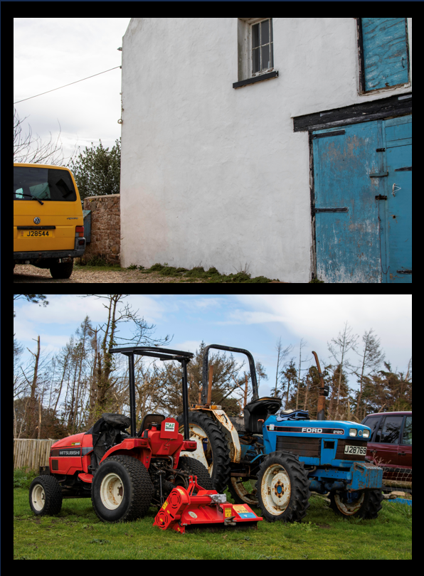
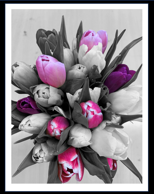
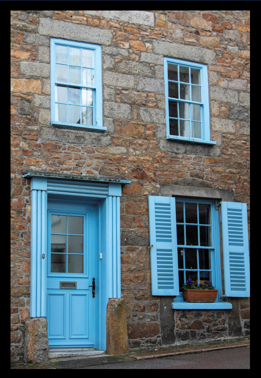
For my last three final prints I used spray mount to stick them onto some foam board and then used a ruler and craft knife to make sure they were cut out straight. On one of them I left white boarded as I thought it made the flowers stand out more and pop. With the other two I cut them right to the edge of the image. After that I then used double sided stick tape to back them on the same black card as the window mounts. I think all tree of these turned out well and they really focus on the colours in the images which I like.