final images:
layout:
Narrative: What is your story?
Describe in:
- 3 words
colour, history, bold
- A sentence
My book is a way of showing that we seem to take colour for granted and don’t appreciate it as much anymore.
- A paragraph
Through my book, I hope to show that as colour has become such a regular thing in our everyday life, we don’t think of it the same way as people used to back then. I think that when colour film first came about it was such a big thing for not only photographers but also people generally. Now it isn’t seen as a big ting as technology is evolving everyday and taking images in colour is something everyone one can do whether it is on a phone or a camera etc. I am hoping that my images a have produced make us realise how beautiful colour is and also makes people spot things they maybe haven’t seen before when on a walk or driving. I have also took like on my lay out of my book so that not only do the images fit together but the colours within each image contrasts with one another. Personally, through out my project I discovered many hidden gems from housed to restaurants of bring colours/ containing bring colours that I did not know where there. Hopefully, after viewing my book, other will be able to look out more and discover new places and appreciate the colour in our world.
Design: Consider the following
- How you want your book to look and feel
- Paper and ink
- Format, size and orientation
- Binding and cover
- Title
- Structure and architecture
- Design and layout
- Editing and sequencing
- Images and text
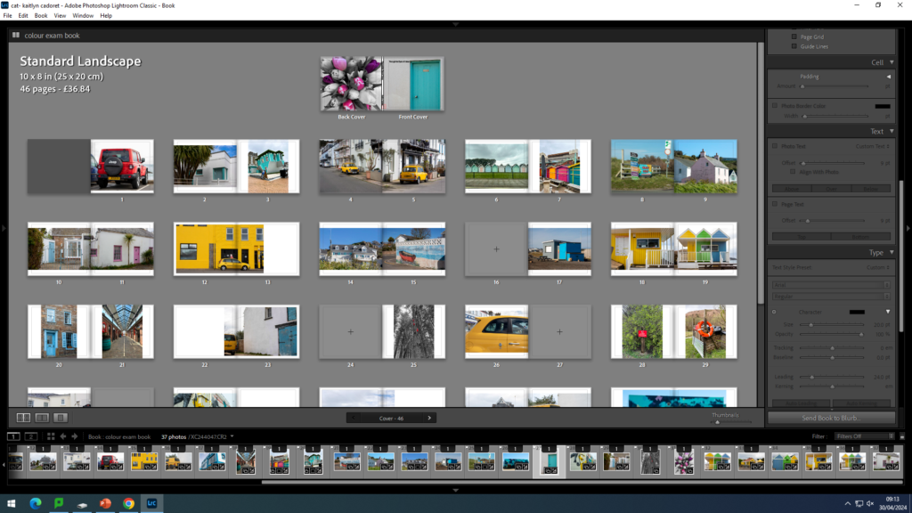
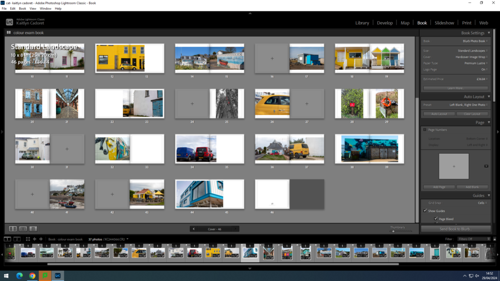
When designing my book, I wanted it to look neat as there was a lot of colour, however I also wanted the colour to be the main component that everyone focuses on. I chose to use ‘Premium Lustre’ paper so that my images have a nice finish on them and makes the colour bright. To go with this I chose to have a hard back cover with an image wrap meaning the two images on the front and back cover with be printed straight onto the cover. For my title, I wanted to use something that describes my project so viewers immediately have an idea of what it is about. I decided to keep the text minimal in my book and only have it on the front and back cover. I chose to do this so that viewers aren’t distracted from my images and can take the colour in fully, as well as adding their own interpretation along the way. This also means that my images can be bigger filling more of the page so that the detail throughout them is clear.