CREATING THE VIRTUAL GALLERY:
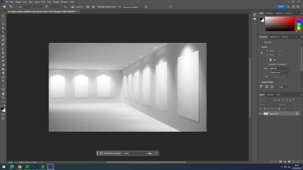
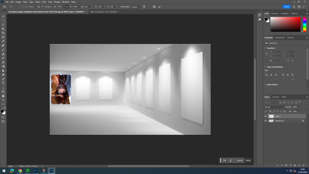
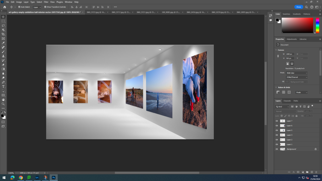
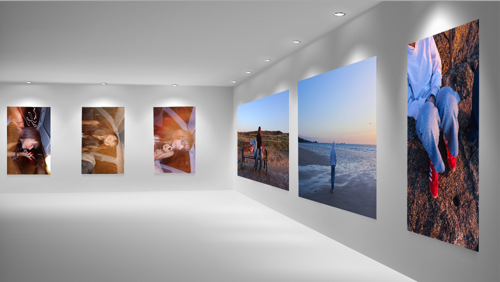
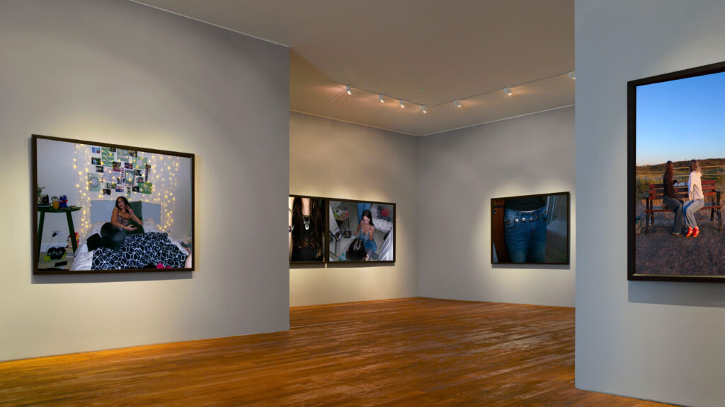
I created the virtual gallery on Photoshop 2024. I had already previously saved the pre-set of the virtual galleries onto my media drive, from my previous attempts at virtual galleries. I decided to do two galleries and use different images so that the presentation of the images flowed. In the first gallery I used images from photoshoot four, I decided to place the three images of Grace in the car in the back, like a trip-tick as they are similar and work together as a three. I put the more yellow toned image in the middle so that the other more blue/purple toned images can be on either side. I also used images from the beach that worked together in order to have a subtle contrast from the dark images in the back.
In the second gallery, I used my images from photoshoot one however also used an image from the beach. This gallery shows girls hanging out and portraying stereotypical ideologies of what girls do when they hang out with each other. I added some abstract close up images of belts and necklaces to highlight the stereotypical views of feminine dress code.
LINK TO PHOTOBOOK
Link to Photobook ‘Teenage Fantasy’ here:
FINAL VIRTUAL GALLERY:
EVALUATION:
– How successful was your final outcomes?
– Did you realise your intentions?
– What references did you make to artists references – comment on technical, visual, contextual, conceptual?
– Is there anything you would do differently/ change etc?
Observe, Seek, and Challenge was presented to us as our 2024 exam theme. My interpretation of this theme was femininity of girlhood and teenage girls. In terms of observing I was observing the behaviour and stereotypical views society has deemed fit for what teenage girls should be doing, therefore I was seeking a way to present these views created. I presented girls in my photobook as hyper feminine and edited my pictures to be hyper realistic too. I made the girls seem very feminine and ‘beautiful’ to create the illusion that society has created. However I also took images of girls smoking and drinking alcohol which would be seemed as a more masculine and anti-feminine to do, which challenges the dominant ideologies in society. My intentions for this project was to highlight these ideologies and show that they clearly affect society and growing teenagers in term of restraining them for allowing to explore their identities and life. Even though I am pleased with my final outcome of the book, I would of like to explore more ideas in terms of challenging the dominant stereotype which was one of my intentions I was hoping I could try, yet wasn’t able explore.
My main artist references that I focused on were Nancy Honey and Cindy Sherman, when exploring ideas for my photobook I started looking into the work of Justine Kurland. Even though my main studied artist’s were Honey and Sherman I ended up focusing more on Honey and Kurland. This is due to the fact I took a photoshoot in the style of Sherman and it didn’t really fit with what my intentions were with the photobook. I explored Honey and Kurland work in a more visual and technical way as I preferred how their images looked visually and that’s how I wanted my photobook to visually look, whereas I studied Sherman’s work in a more contextual and historical context; exploring the idea of stereotypes. In terms in areas to improve would improve in being more organised with my photoshoots so I would be able to have a larger variety of images. Furthermore, I intend in my next project to highlight binary oppositions and show the difference between what society expects vs what society is actually like.
For my final outcomes I created a photobook and created four window mounts. I created a photobook that highlight’s societies stereotypes towards femininity in girls. As I was editing I created a purple, pink tone in my images to really focus of the significance on dominant ideologies and stereotypes, even in terms of colour. Pink is typically a stereotype for femininity and a ‘girl’ colour. Overall I am pleased with the aesthetic and layout of my photobook, however wish I explored more of the counter types and created a photobook with the narrative story by showing binary oppositions. For the window mounts I picked my strongest images that I thought would present well through a window mount. I am overall happy with my final outcomes, but for my prints I would try to create something with multiple images, perhaps a trip tick.