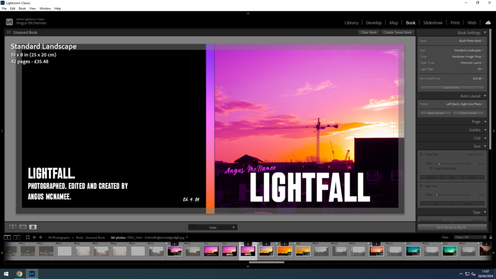
I wanted to have the title “Lightfall” because I thought it was appropriate for my themes and photos, the evenings and night times in Jersey. Also because I think it just sounded cool and interesting.
I wanted the front cover to be eye catching, with the title big and visible and my name seen on it as well. I think that what I came out with was very good. Lightroom didn’t let me add text to the spine for absolutely no reason, so I left it and instead added a nice little gradient that matched the colour palette of the front cover image. And included on the back some details, like the publish date and the author.
My front cover was originally going to be different, it used a different photo and even a different name, “Day and Night”:
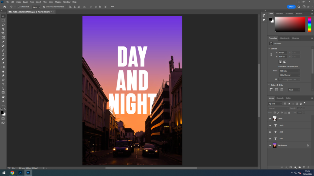
I personally loved this version, the gradient and the text blending in so well together and the buildings below and the text going behind the tops of the buildings. This unfortunately didn’t make the final result as the image, being taken vertically, wasn’t the right size for the page, if I tried to zoom the image in to fill the page it would only make it blurry and pixelated. Also the title “Day and Night” I wasn’t too sure about. I wanted a short name which would roll off the tongue when saying out loud, which is why I settled for “Lightfall”.
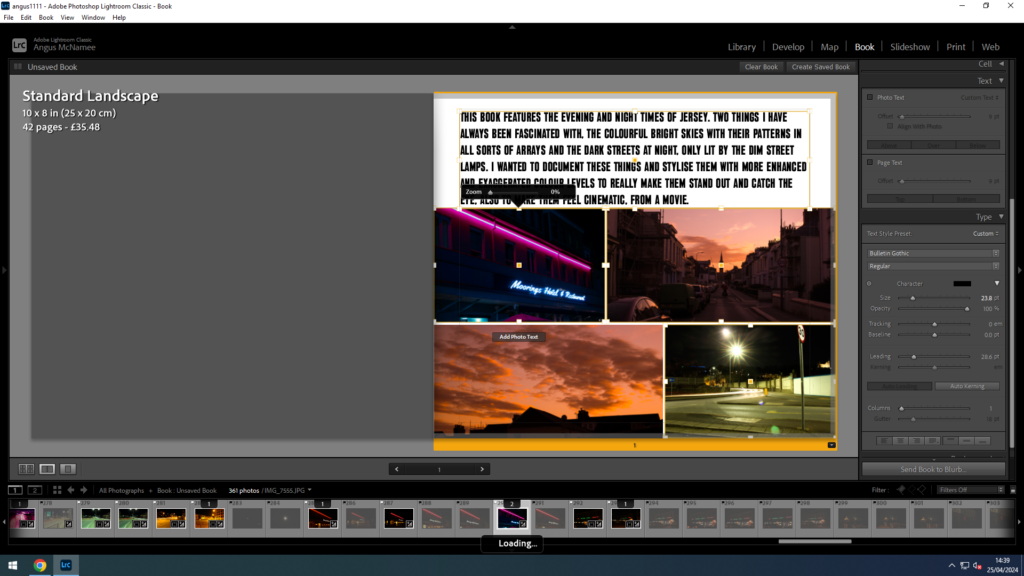
The next page tells the viewer a little on the contents of the book and the ideas of it’s origin. Along with some photos underneath.
Overall, the 51 photos are all reasonably spaced out from the edges, I chose to do this because I felt it made the photos more professional and better to look at. All sky images have been separated from the night images because I didn’t want the order of photos to be messy. Initially, the collection of night photos were going to be shown first, but because of the title, “Lightfall”, it felt that it would make more sense for the lighter images to be shown first, then to show the darker ones, to follow a sort of day cycle.
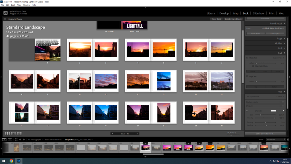
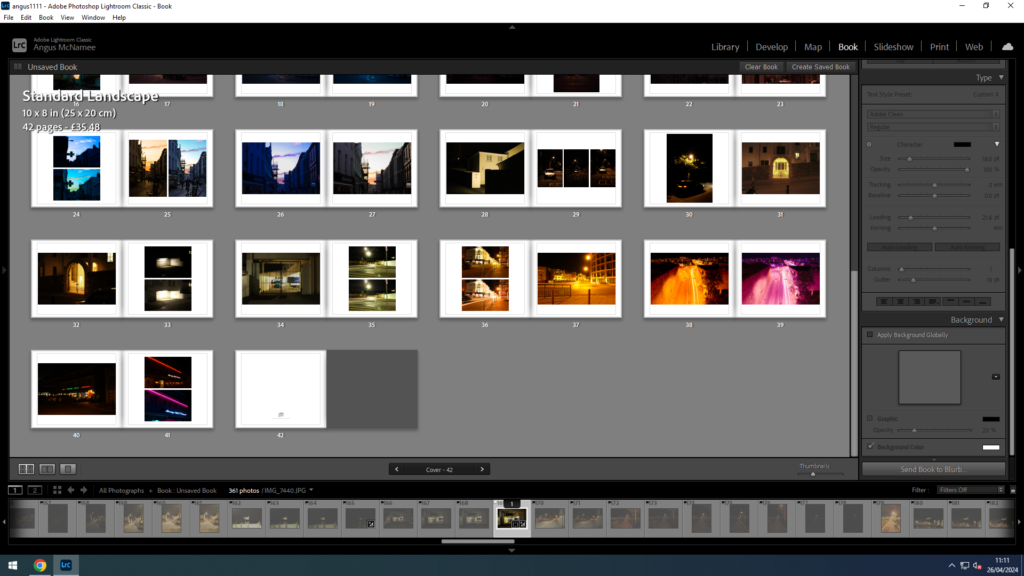
I did the same for my dark photos, spaced them out to professionally present them. I like the way these ones are slightly more contrasting from the white page because they are night photos.
Overall I am very satisfied with my photobook and I can’t wait for it to be printed out. The composition, I couldn’t be any more proud of and I think is great. I wanted to improve on my last photobook, “Left Behind”, as I wasn’t too happy with it and I felt I could do so much better. This new book, I believe I have managed to do that.