The Final work I have produced, that being prints and photo book, have turned out much differently than I had expected but better than what I had initially thought. For example:
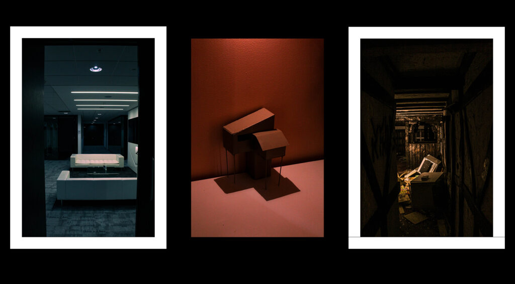
My format of laying out my prints went well, and my choice in images for these 3 frames link well together, as I didn’t use the same environment repetitively, there are 3 different types of subjects and liminal spaces I present here, and mounting them up went well, with all of them looking unique and good.
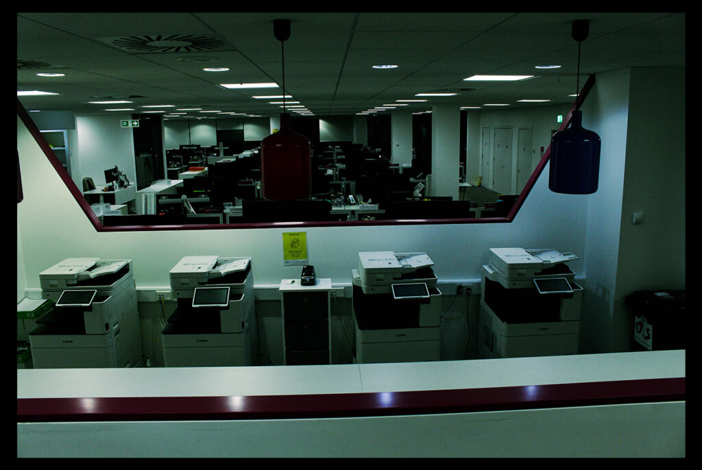
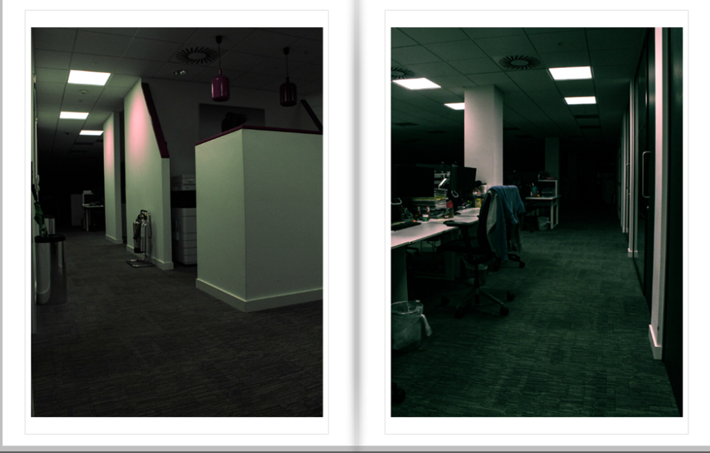
Not only that but the overall composition of the prints I chose, give a good glimpse at what to expect in my photo book, whilst also including good depth of field, dark and light areas, cold feeling and tones. I like how it conveys a slight sense of fear through its emptiness and cold feeling, it shows eeriness, and familiarity in some images.
My initial intentions, where to capture more hotel like areas, and playgrounds whilst including some birthday styled settings, which I personally found unsettling, however creating my own models and capturing more office environments, not only linked to my artists and the idea of liminal space, but can be easily relatable a lot of people in the world, especially for people nearing my age group, with a lot of people going to offices when they leave school, or after university. Through this I found out what worked best for my photo book, which was that its better to keep the images consistent in the office rather than a scatter of different types of areas that show liminality. This keeps the narrative more understandable, and interesting as if you are the one going through this office seeing all of these weird areas you wouldn’t have seen, but through this edited lens which makes it even creepier.
I did make an attempt to do a similar style to Thomas Demand’s work in how he developed his images. This was by creating the environment from scratch, using cardboard and other paper materials, which would eventually in his case look like an office building or a weird house. These 2 images where one doing a similar method to this:
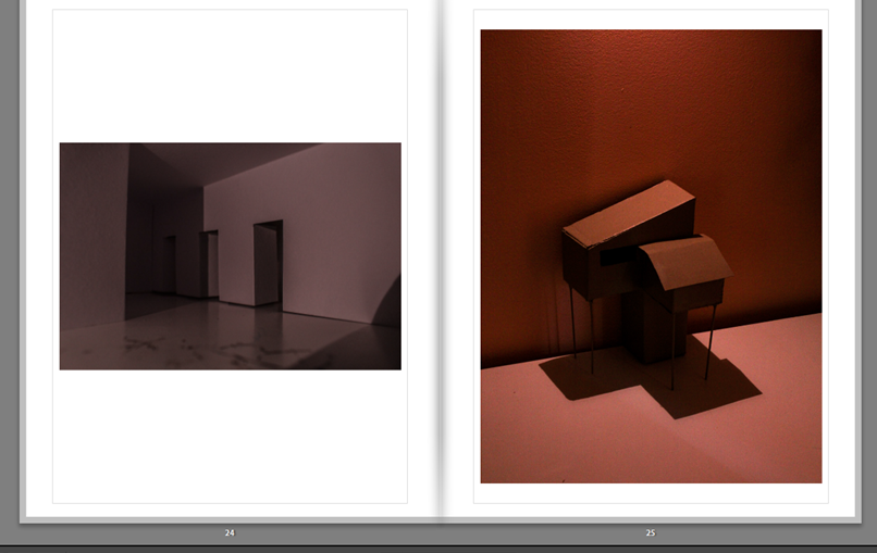
The image on the left was a piece of paper folded and cut into a way which makes it look like a hallway with doors open and closed from a certain angle. The second image being a type of house on stilts which was made out of cardboard and a bit of wood for the stilts, both are hand held size, and I had been using different types of angles and especially lighting to see which would suit the images best in my opinion. Similar to Thomas Demand and James Casebere’s work this capture of an environment shows mostly emptiness and liminality but with my own twist, of style, lighting, and setting.
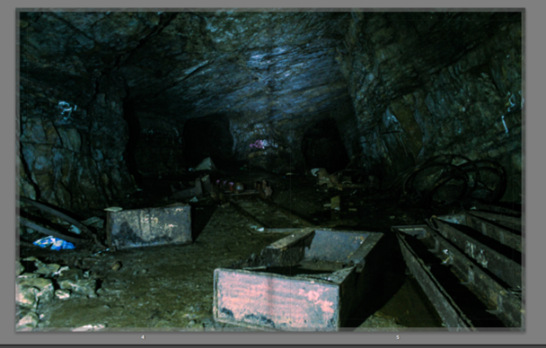
As a whole my work came out well, and the aesthetic and style of image I was aiming for links well to this idea of liminal spaces, and the work that I had a initially wanted to create wouldn’t have been produced as well as I did with this one, it would have been messy, and caused me to have different types of aesthetics to each my images, which would have lost my style to the images. What I would have liked to do differently is to have taken images of different types of offices, but using the same context and environment, but different types of set ups which would be in different offices, this would have made it a bit more unique in how each these offices liminal spaces would have presented a slight change in feeling. Another thing I would change is how I imaged some of the areas I was in, for example the cave, I didn’t have enough lighting, showing how unprepared I was for it. But also the settings on the camera to capture more of the background, where I should have used a higher F stop to really express quality everywhere in the cave.
In conclusion my final result in the photo book and my prints ended up going well, choosing 52 of my best images out of around 1500 images if not more over my 10 photoshoots, created this well produced book, well composed images, using a wide range of features for what subject and area they where taken in, like the shading, colour contrast, black and whites, and directions, I am happy with what has finally come out of this project.