Here is a link to the final photobook – Left Alone

later Developed Photobook
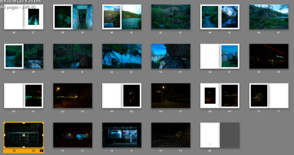
At this stage I have added more photos to the photobook the original number before I added the photos was 39 pages now there are 80 pages not all the pages have one photo some might be blank and some are double pages but there’s 57 photo in this book more then my first photo book.
All The Photographs In The Photobook
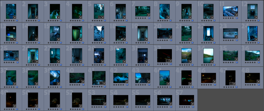
here are the 57 photos and there a mixture of 6 photoshoots combined to make my photobook
Figuring Out A Title
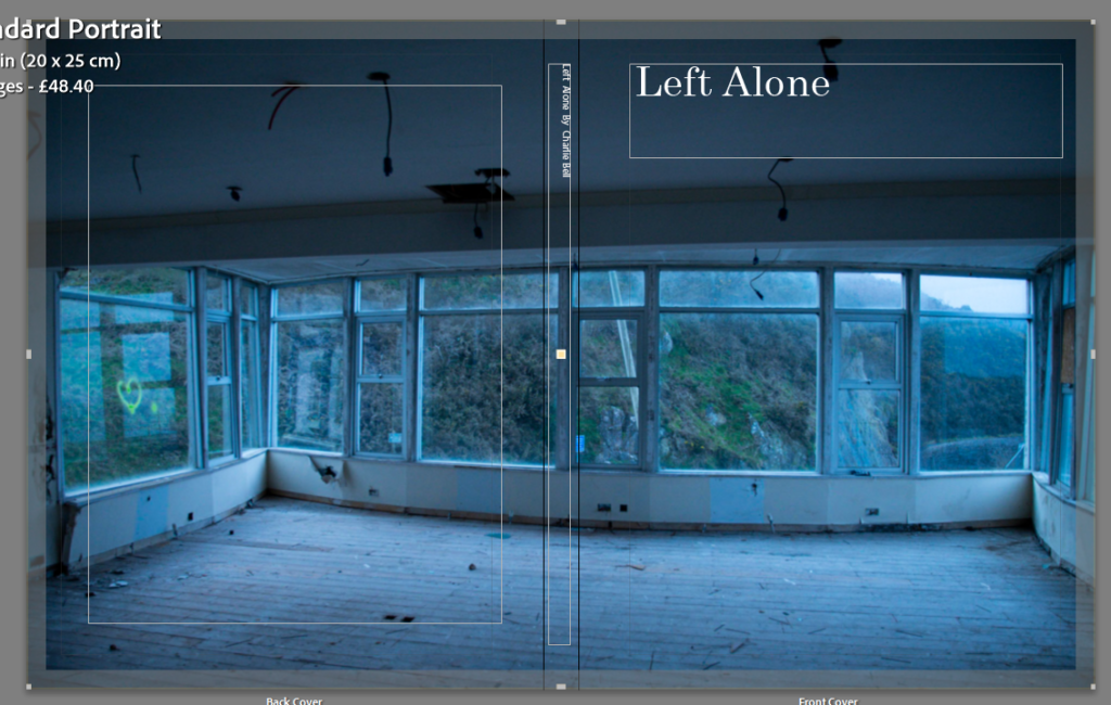
right now the title of the book is observer, challenge and seek so I want to change it to something that sounds better and that suits the book more the book has a lot of nature in it and abandoned thing there also old things in the book so maybe “left alone” sounds a bit cliche however its the best I have at the moment but it fits the book and the feel of it so I happy with the title.
Re-Doing The Layout
On day 2 of the exam I decided I didn’t like the original layout of the photobook so I changed it I took away photos that didn’t fit with the theme of the photobook and I added some new images that go with the theme of the book
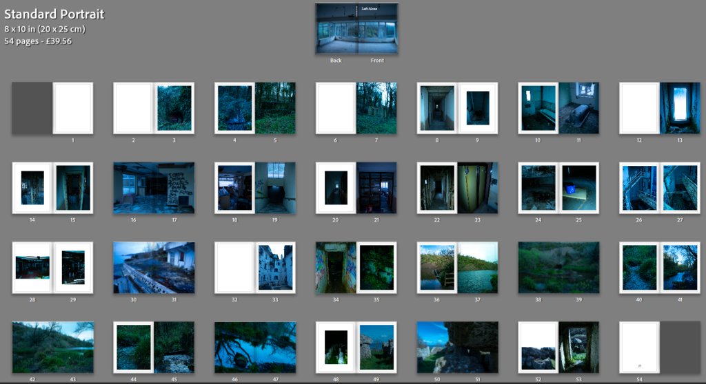
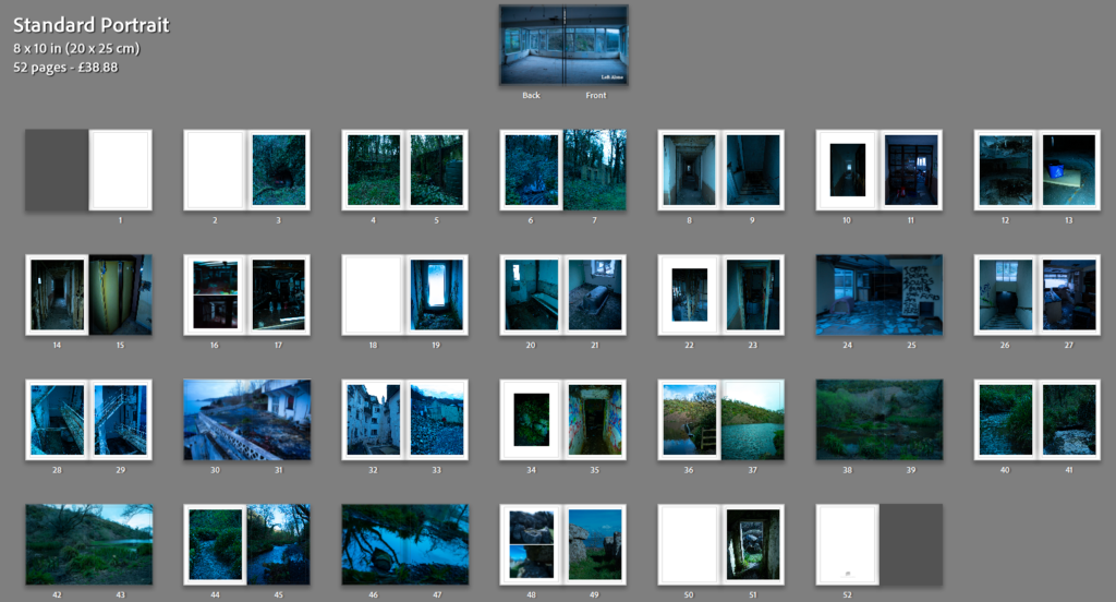
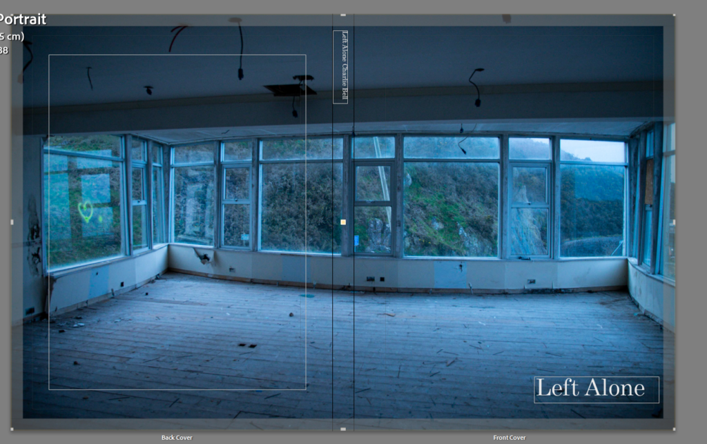
the differences of the layout are noticeable most of the photos are the same however I took out all of the night photography photos because they didn’t fit with the theme of the book and added only a couple photos to fill up the book and make it look good the front cover is also different instead of being in the top left its in the bottom right of the cover.

I am using about 45 images in the book a lot less than the original 57 photos and there only 52 pages instead of the original 80 pages however the book makes a lot more sense and I will still be changing and tweaking the book so this isn’t the last change however it is still a big change to the books layout and how its viewed.
What To Write In The Book
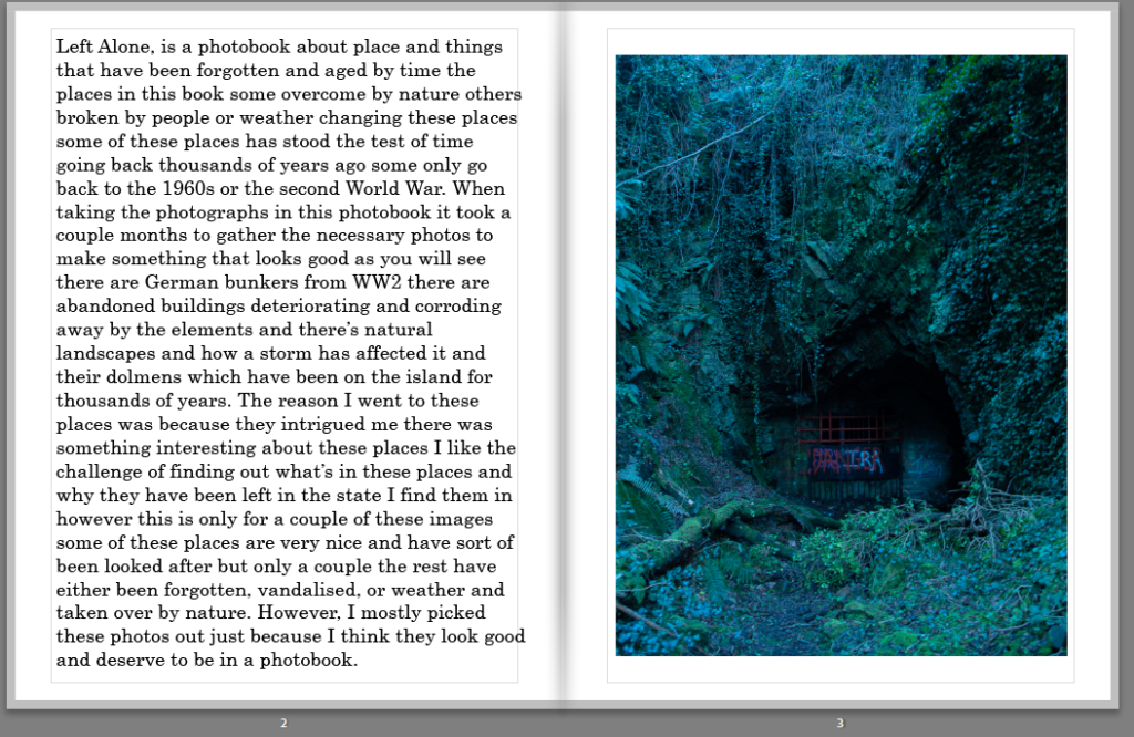
I wrote this is in the front of the book it’s mostly talking about what’s in the book and why I took the photos that I did I think it’s good to have a little bit of writing in the book even if it’s not much just something for people to read and to see what the book is about giving the viewer a bit of context however not much as I want to let the viewer use the imagination a little when looks at my photos.
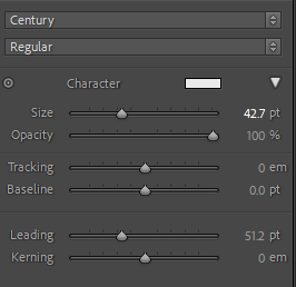
century is the font that I have been using for this photo book I used century for my first photo book the reason is I like the way it looks its very smart and not to flashy,the setting on the screen shot are from the title.
what the books layout looks like after day 2
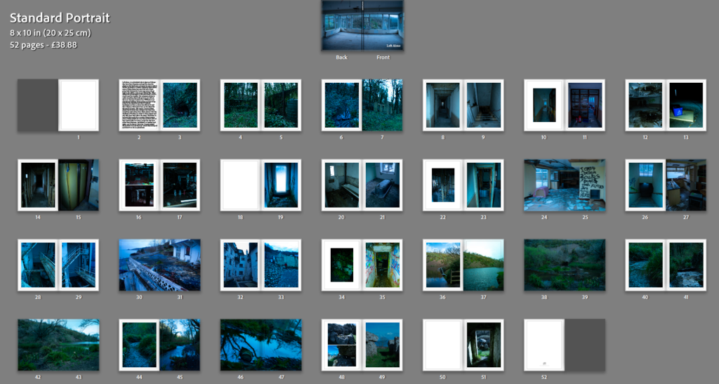
The photobook will probably not change that much after this I might tweak it on the third day and maybe add a couple more image but nothing to much I am happy with what I have now I might also add some writing and give the images names/title but I don’t know for sure if I will yet.
Final Edit
there’s not really to much changes to the photobook however these 2 screenshots show I just added a different layout to get 2 images on 1 page to make the photo book feel and look more full the images themself look better smaller especially the ones that are showing the bar.
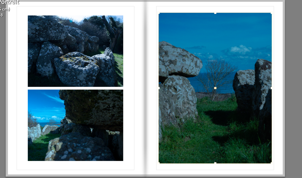
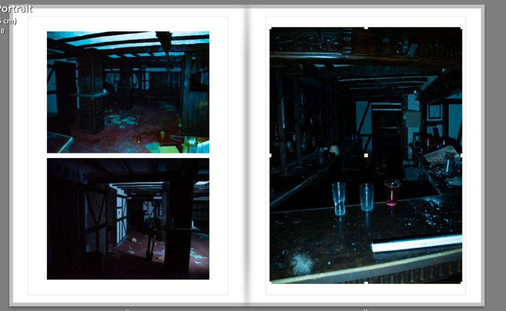

this is the final form of the photobook I think it looks good I might do some miner editing just before printing the book but it looks good and I am happy with my final outcome.