STYLE:
I originally was going to create a magazine rather than a book as I’m using very few images. However, decided to do a book to make it look more neat and put together.
CONCEPT:
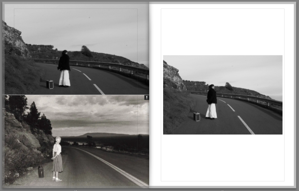
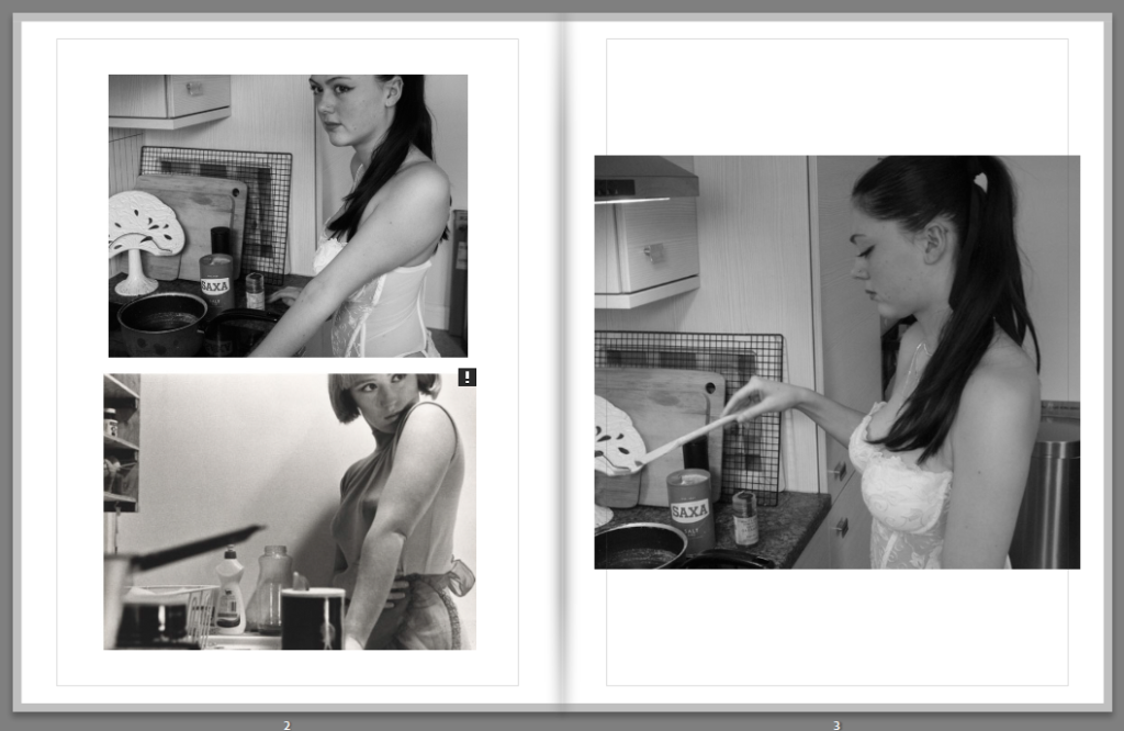
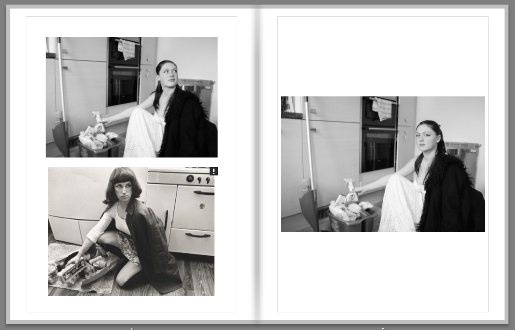
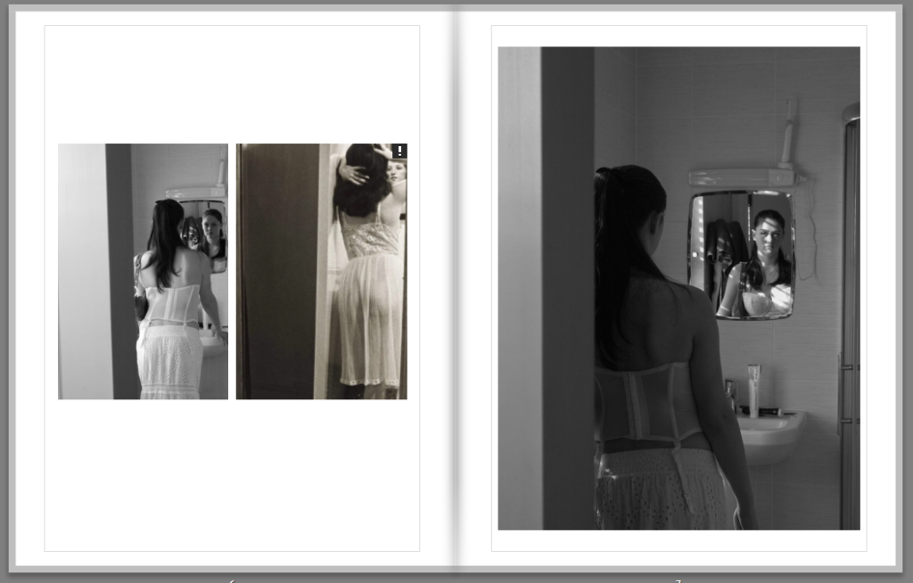
My aim was to recreate Cindy Sherman’s famous pictures surrounding the male gaze and experiment with ‘gender performativity’ by using props, makeup etc.. After having done that photoshoot, i was very pleased with the outcome and how similar some of my images looked compared with Cindy Sherman’s. My book consists of a compare and contrast with Sherman’s work, as i place my recreation of her images next to her original ones. Its meant to be brief and almost to demonstrate how photography can be analysed, reused and manages to still get its message across, in this case, The Male Gaze.
LAYOUT:
On the official pages i have placed my work and Cindy Sherman’s on the left, and then a similar photo on the right which is mine. On the left page is the more identical one to Sherman’s work whilst the images on the right pages are just more form the same shoot.
Back and front cover:
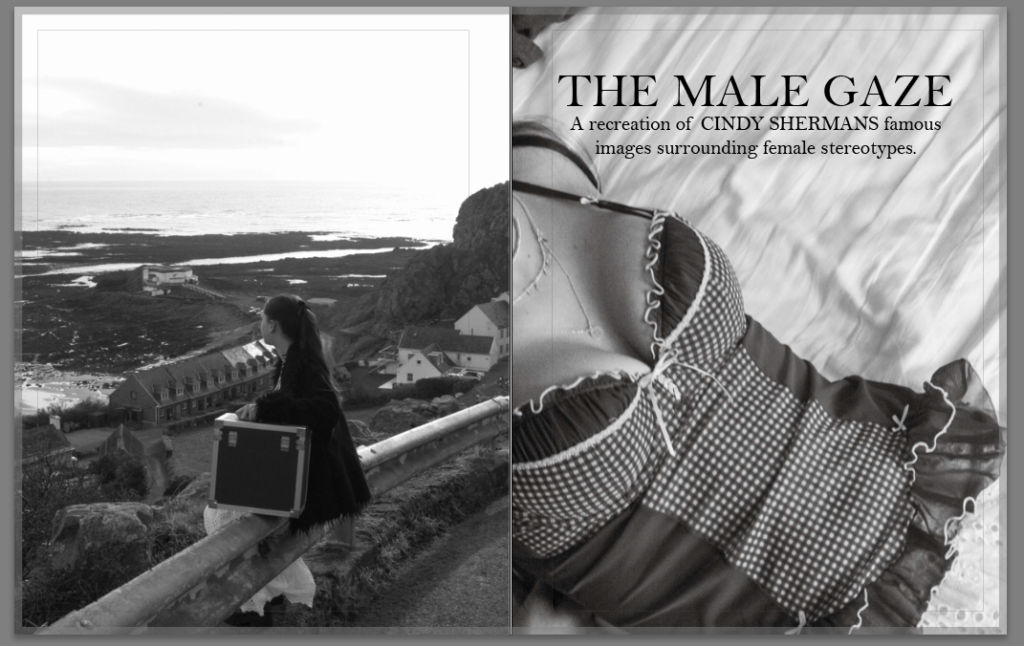
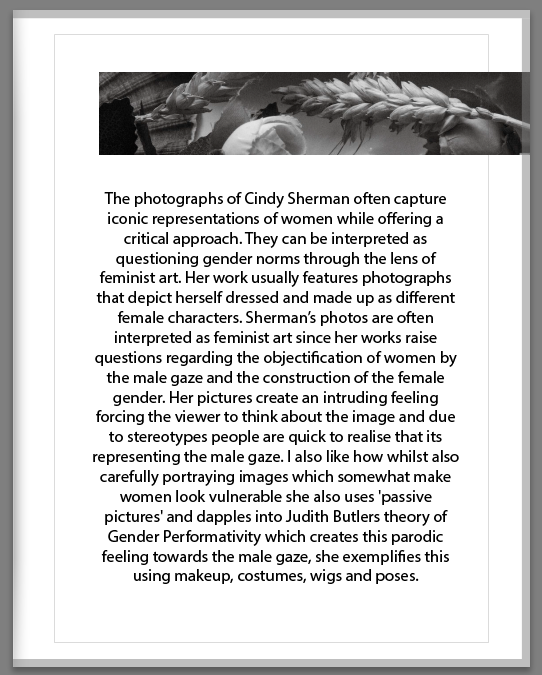
This ‘blurb’ on the back of front page gives the reader an in sight on Cindy Sherman overall and her main objectives when creating these images. I also added my own image on the top as a headline to create a neat welcoming feel into the book. The flowers give it a feminine feel to it.
Official page 2,3:
Page 4,5:
Page 6,7:
Page 8,9:
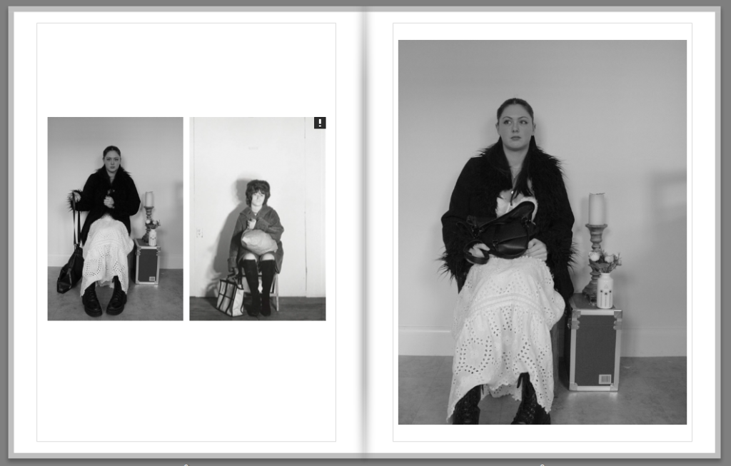
Page 10,11: