Experiments
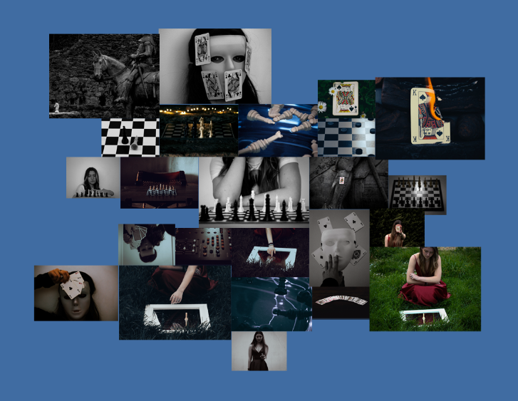
First layout

For this layout I decided to lay it out in the way of a mind map, excluding any boarders. If I were to chose this design I would mount all my images on white board so they are all raised from the board while remaining the same height as each other. I like how chaotic the layout makes the images look, all while still displaying the main features of my project.
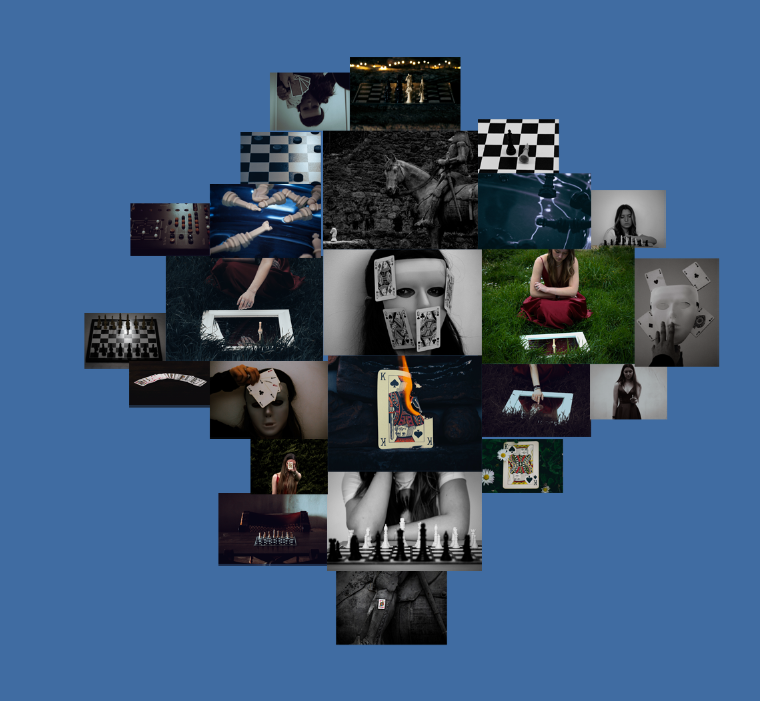
Second layout

A similar design to my first idea, except the outcome looks more tame and organised. For this idea I would be mounting my images on card since I think having my images flat would go nicer with the design layout.
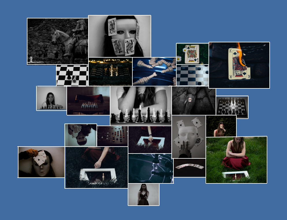
Third layout

This time around I stuck with the sort of mind map style as my first layout, yet this time decided to see what it would look like with a boarder. To create these mounts I would stick my images to white foam board while making sure to leave a gap from the edge.
Final layout

I chose this as my final layout since I think with each of the photos having a slight boarder helps to create a sense of familiarity among my images, making them connect better and become more visually appealing. I also like the idea of my photos being spread out in a chaotic fashion, yet the closer you look a story starts to show due to all the images branching out from the black and white chess piece in the centre in a similar way to that of my photobook.