Final prints presentation

About
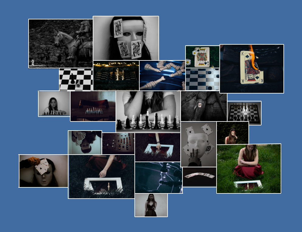
I think that the presenting and mounting of my final prints turned out well, I stuck with my plan by keeping a 1cm boarder around each of my images which helps to connect them all together as well as making them contrast against the white background. I am also pleased with the size that each of them turned out which, in my opinion, helps to create a nice balance when viewed all together.
The only issue with my final prints is that the images printed out slightly darker than I had originally planned, however, I feel as though this turned out for the better as it helps to make the photos feel more dramatic and mysterious which creates a similar feel to that of my photobook.
Evaluation
Did you realise your intentions? – My intentions towards my final prints stayed the same from my main idea. I had always planned to have an effective yet simple mount, keeping it the same for all my images in order to help highlight the connection between them. I also planned to print out quite a few images in order to help show the range of images throughout my project.
What references did you make to artists references? – I made quite a few links to my artist references with 4 out of 6 of my photoshoots being dedicated to recreating their works in my own style to match the theme of my project. Overall, I think that my artists helped to shape the way my project turned out, both visually and contextually.
How successful was your final outcome? – I think that my final outcome was successful as I managed to mount up all my images in a manner that I’m happy with as well as the overall aesthetic being what I had in mind.