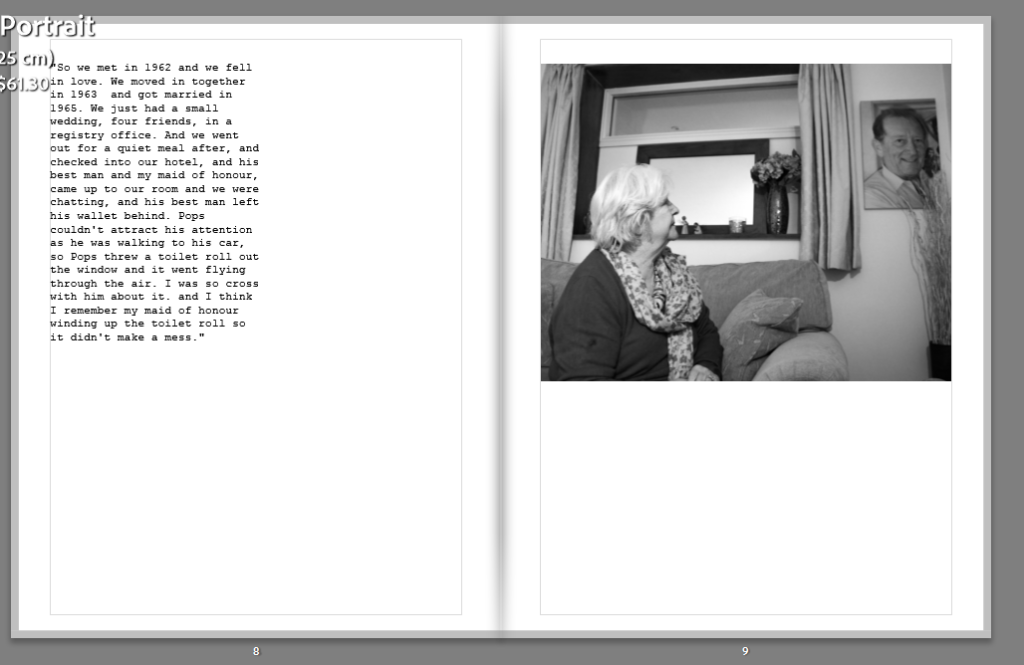
I began by arranging my archived images with the wording on the back because I find it sets up the story well and describes their important moments. I was unsure how to place them, but I found doing a double page spread with the writing on the side was the best. The large image is impactful, instead of small and lost in the page.
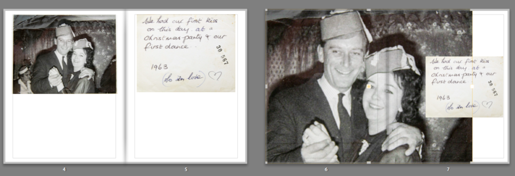
When adding the writing, I chose to whiten the background and darken the writing to make it stand out more and less yellowy. Although this takes away the old look of it, I find it fits in better with the black and white image.
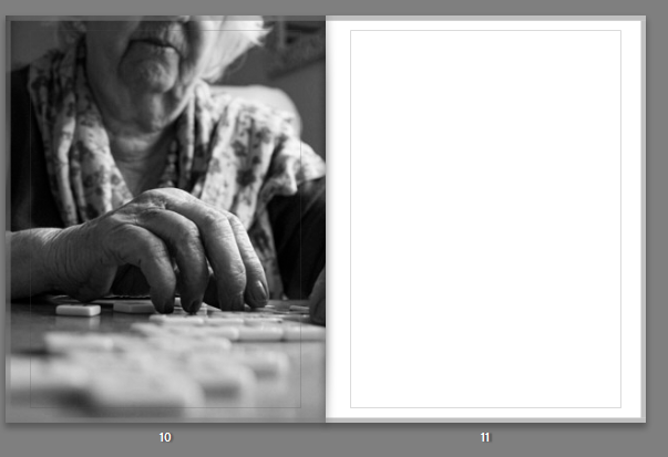
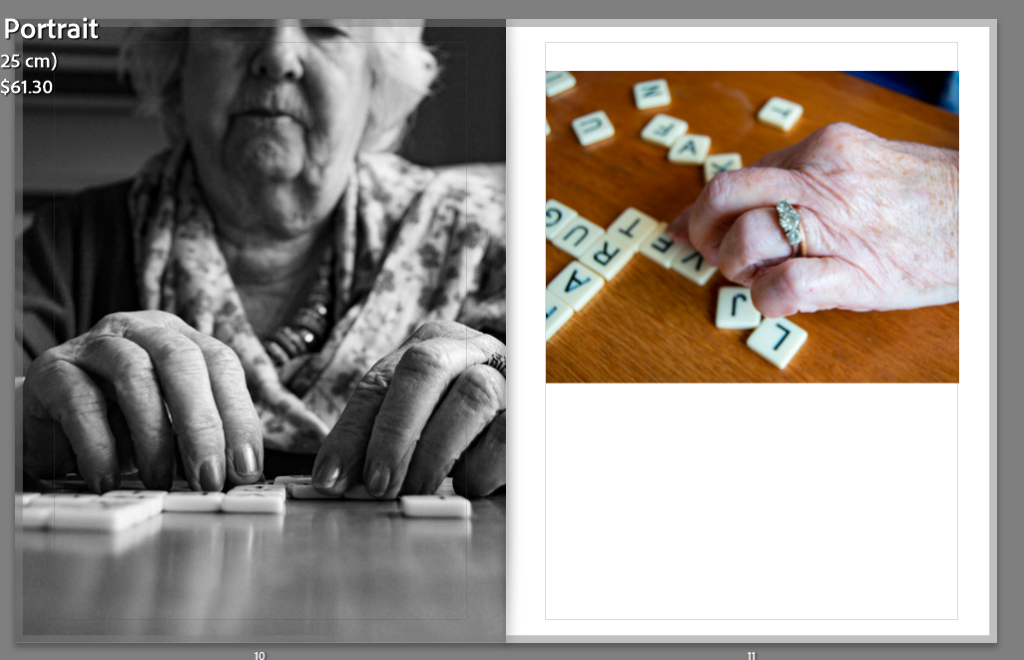
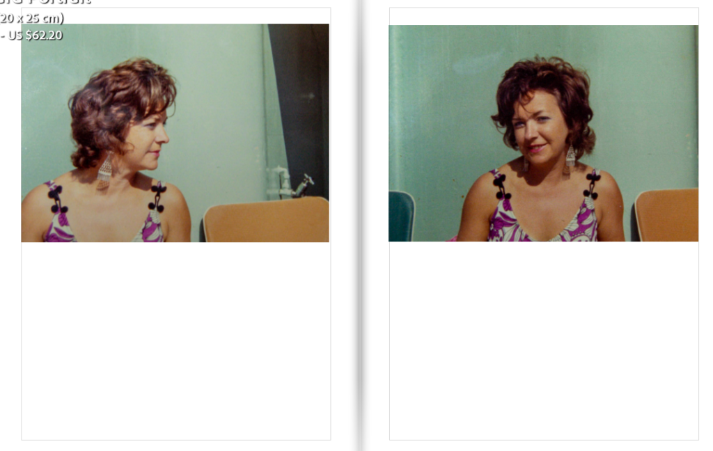
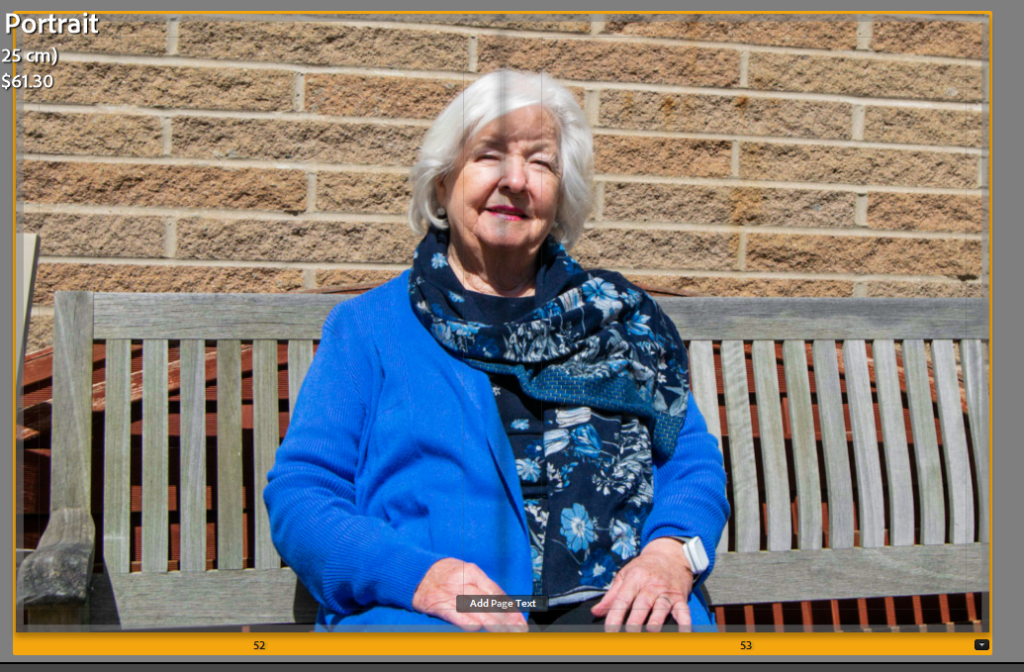
I placed three images on pages to decide which was the best composition, so I could choose which one to use.
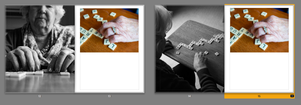
I then narrowed it down to two and placed my next image beside them to evaluate further. In the end I decided I preferred the image with her face in, because it has a short depth of field, and her face juxtaposes more with the next image of her hand.
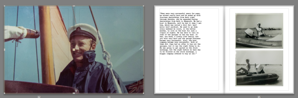
I chose to create some simple pages in the book, using an image and then telling the story with my grans dialogue next to it. This layout is inspired by Larry Sultan’s book. I think the simplicity can become affective when amongst double page spreads and collages and causes a break amongst them.
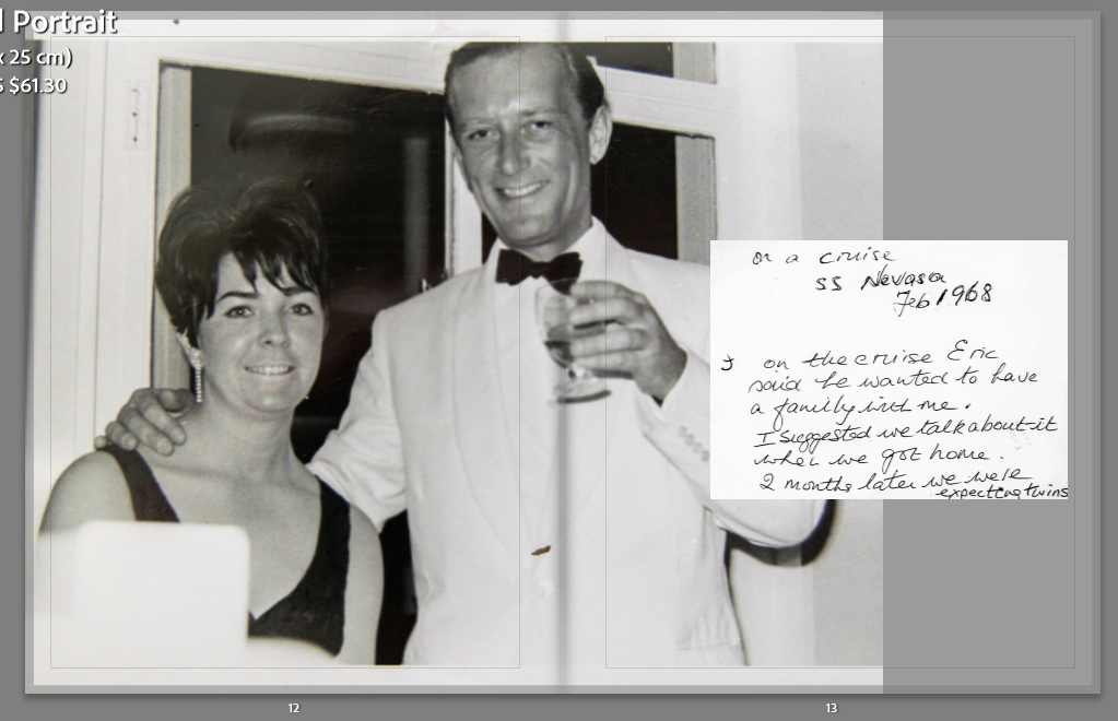
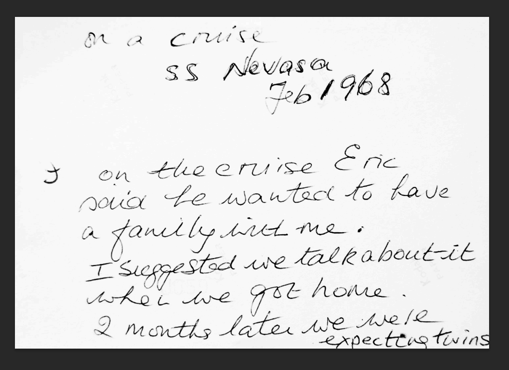
I created the same double page spread several pages later so show consistency and mark the next milestone in their life.
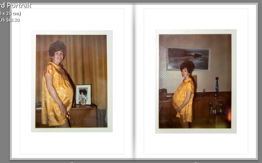
I then followed the story of what the writing said, placing two images of my gran pregnant. I chose to place them each on a page because it creates an organised composition, with the same tones of yellow and lighting. I also chose to do this because it presents the twins, the images are taken on different sides, as if my gran is showing each twin. This double page can be viewed metaphorically for them.
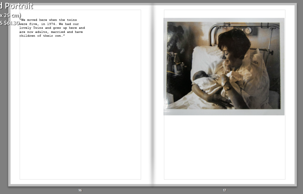
Again, I followed the story on by using an image of my gran with one of the twins. I used the same structure as the other simple pages with writing, but this time with an archived photo. I want to make sure that even though the layouts are varied, they have a pattern and similar structure throughout.
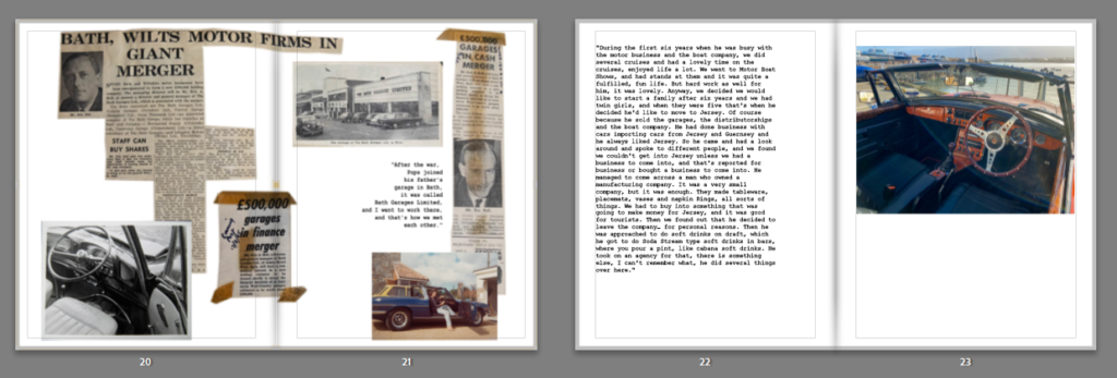
I inserted the scrapbook collage I made, and followed it with my image of the car to cerate a link between the two.
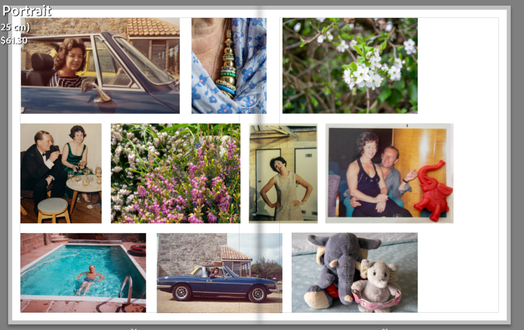
I then moved on from the simplistic layout to a collage, like Sultan’s. At first, I was only going to use archived images, but I realised that I could incorporate my new ones too. I chose to do this because the images all link in a way. My nans necklace in my image connects to her glamour in some of the archives, showing that she still feels the need to dress up, possibly in my grandfather’s legacy. The white flower is a hawthorn bush, which my grandfather loved, and it links to the other flower image, creating a semantic field of nature. My grandfather spent a lot of time photographing nature in his free time. Final the elephant toys link to the archive above it and carries the theme of elephants through the book; linking to the title. I made sure to choose images with a similar tone and lighting, such as light blues, beige yellows and green.
Here I attempted to subtly show the change in my gran, by placing a new image before an old image where they are both looking in the same direction. However, in the new image, she is looking up more, which I think can present the loss of my grandad, as if she is looking up to him, not at him anymore.
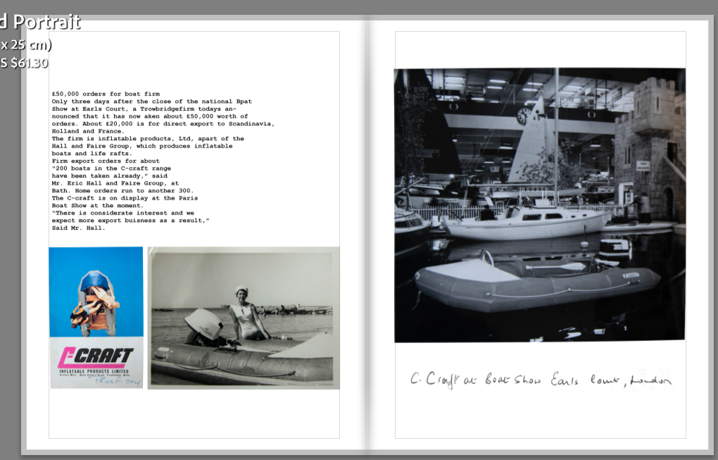
Next, I moved onto his boat company, using the scrapbook pages I made.
I chose to add a double page spread because I hadn’t a full used one yet, and I think it reminds the viewer that my grandad is the centre of this story. It also fills the page and creates a break, like the simple pages. I then followed this with two images of my gran modelling on his boat design, and a story she told me about it. This is a similar layout to other pages, keeping the consistency and organisation.
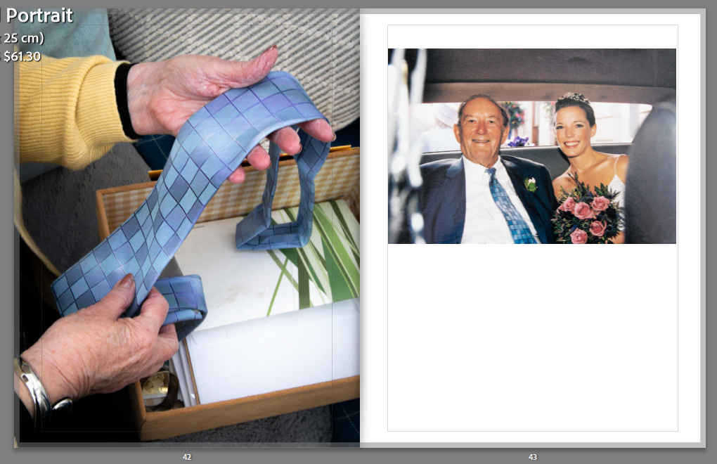
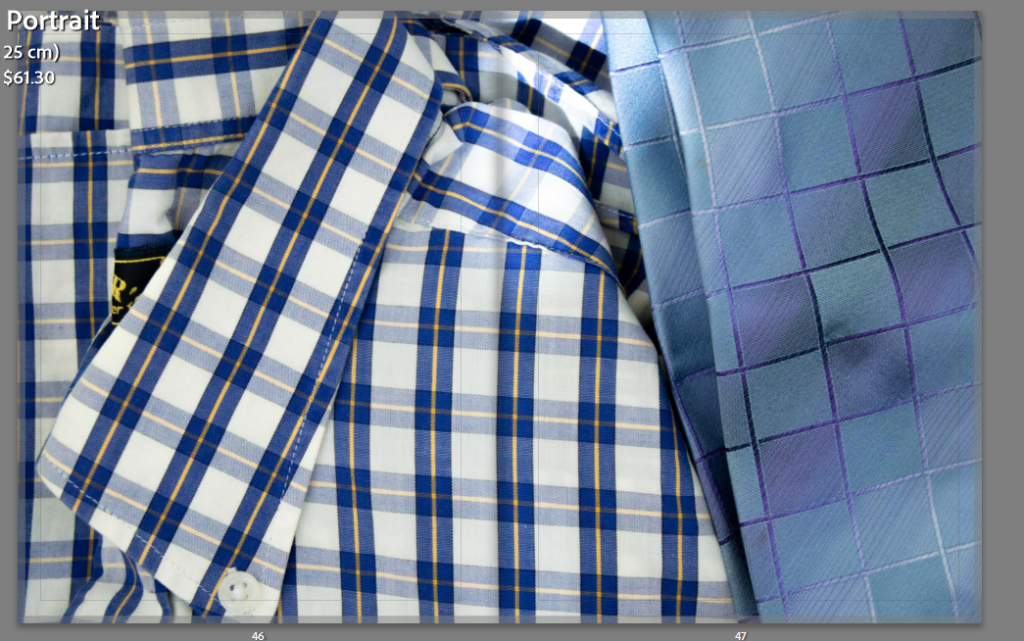
Later in the book, I moved onto presenting his loss. I showed a more recent image (around 2003) where he is wearing his tie, juxtaposed with my nan holding it. This shows he is no longer here to wear it and shows the change in time. There are colour similarities too, such as the greens, blues and whites, making a further link.
I created another collage, because it creates patterns, and gives me the ability to insert more photos. I placed mostly new images, apart from one of my grandads. I chose to put it in because it links with the images from Beauport due to the cliffs. It also is like a memory of him amongst the loss. I made sure to keep the top and bottom left images in line to keep a basic organisation.
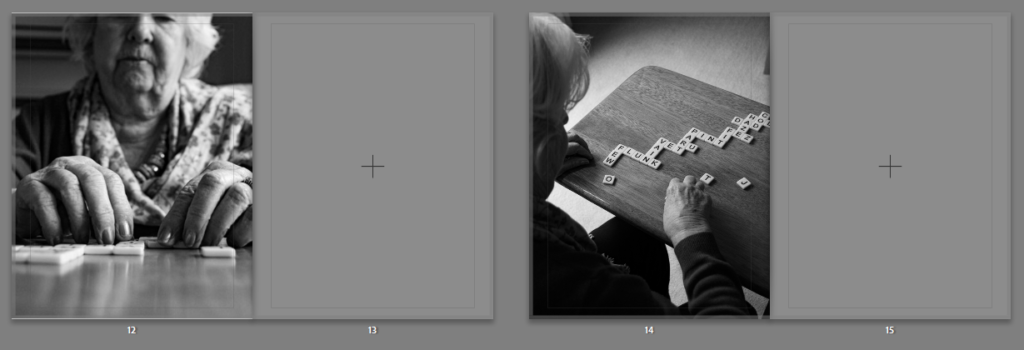
Another double page spread because I decided I needed more than one full one. I also like the detail, as a close up instead of a portrait.
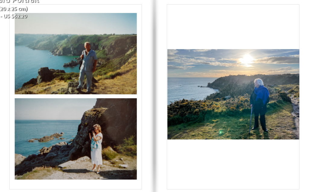
These three images really present how people change but places don’t. I retook the image of my gran in the same place to juxtapose the image of my grandfather there. There is a strong link between the images.
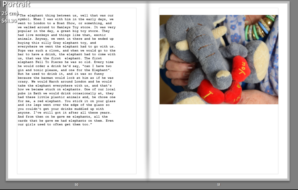
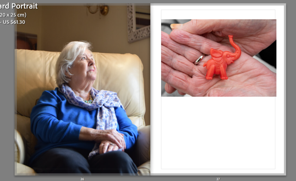
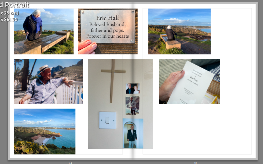
I chose to add the description for elephants at the end, to create a summary of their love, and to show why the name of the book is called ‘Elephants Never Forget’.
Opening page vs closing page:
I chose to put these at the beginning and end to give the book a start and finish. They are both taken in the same seat, one with my grandad, and one without. I find it sums up the meanings and my intention behind the book and describes his loss. I also like how my gran is still smiling at the end, emphasising how she has adapted to the change and still feels he is with her at heart.
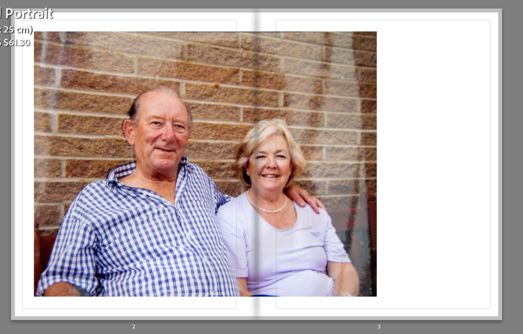
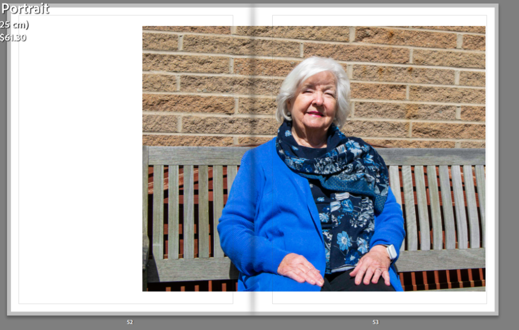
Originally, I had them both and full double page spreads, but I didn’t like the way her face was on the fold f the page, meaning you wouldn’t be able to see the image properly. Overall, I prefer the image at the side because it creates a nice composition, one beginning on the left and ending on the right. Like how a story is read, left to right, but in a visual format.