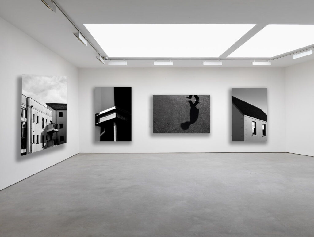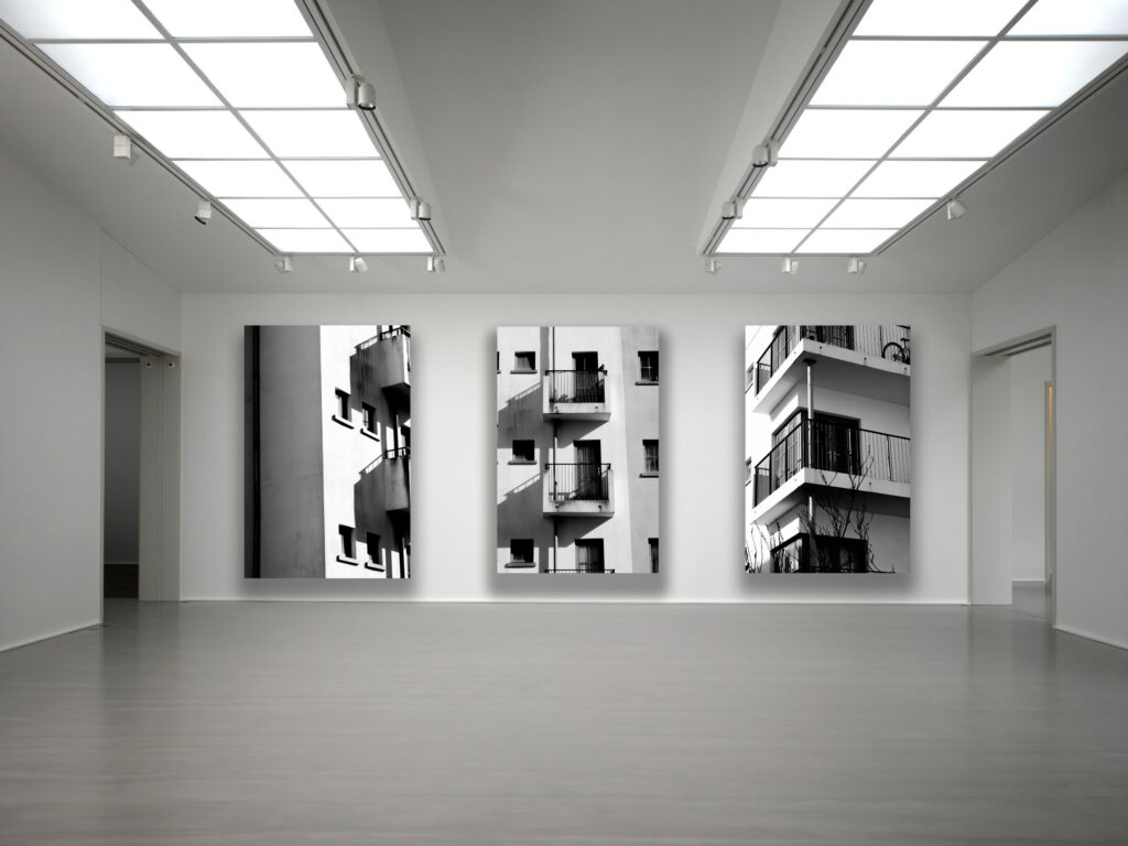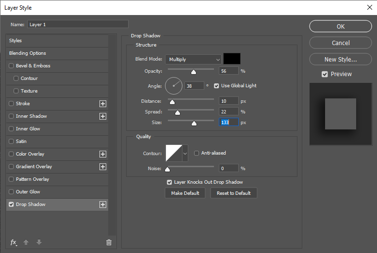

For my Virtual gallery I found a blank image of a studio space and brought in my images. to make it more realistic I added a drop shadow which I angled to match what the natural shadow of the light source would be.

Overall i really like the presentation of this gallery as i believe it greatly compliments my images and allows them to mix together however still stand out as there own.
When mounting my images i will definitely be taking inspiration from the layout of these galleries.