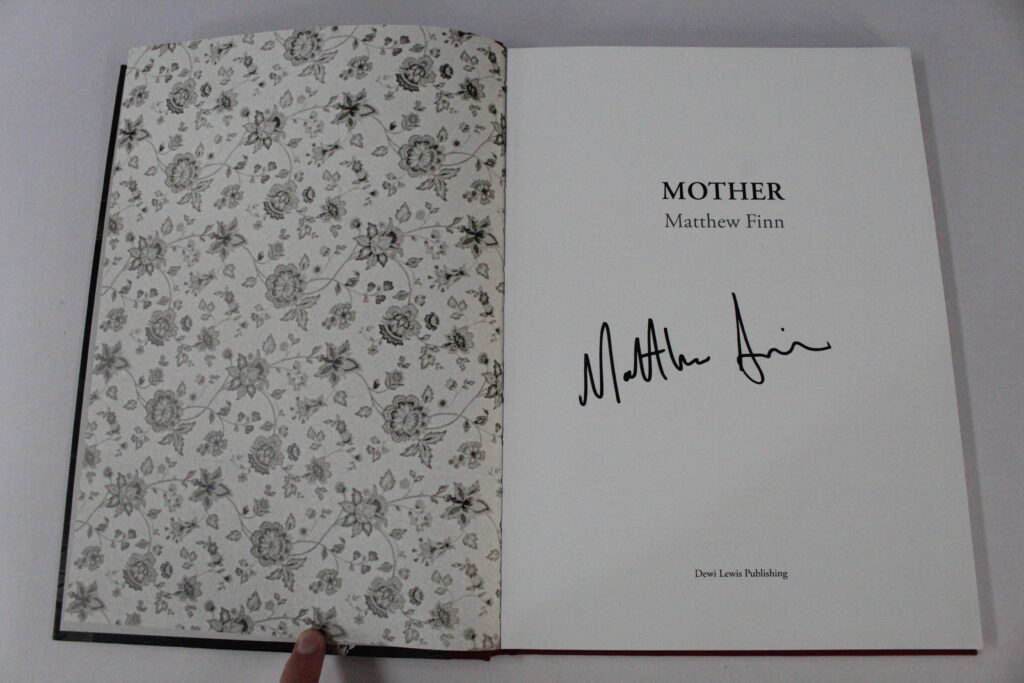
The photobook I used for the inspiration of my layout was “Mother” By Matthew Finn.
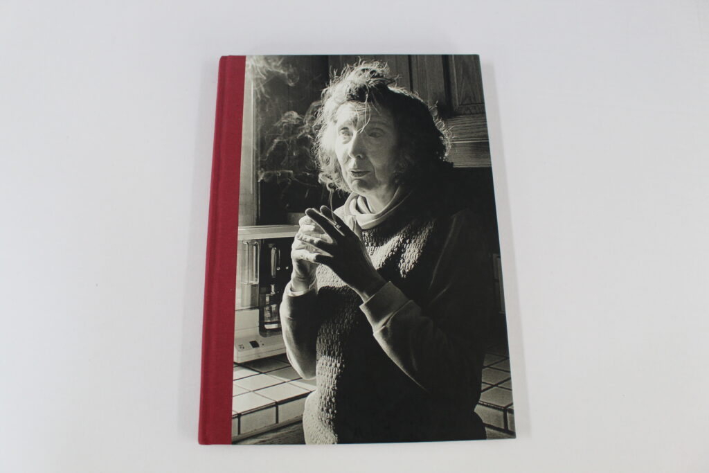
Mathew Finn made this book from photos he has taken of his mother over the years starting from his “Need to create stability” but due to this happening so often Finn stated that it became a “Ritual” and he couldn’t abandon it. One of the main inspirations for this book was to represent his mother as the only parent figure in his life, while his father abandoned him and his family to move on with his life. Many of the photographs are of his mother smoking a cigarette which he states is significant because on the day of his fathers funeral his mother told him that his father had remarried multiple times and had many other children, this news apparently deeply effected Finn and is where his need to create this photobook started. He felt the need to include his message at the front of the photobook before people read it to create a sense of clarity with the audience, And without the context his photos may lack meaning. Though In my photobook I chose not to include any written context I still think that the message that I was trying to portray was clearly evident to the reader.
In the back of the photobook Elizabeth Edwards wrote her account on the subject and named it “Feeling her presence” she describes his images as “not just portraits in the usual sense of the world, yet they are an account of life, a deeply humanistic response to a set of human circumstances” Which really gives the photobook more meaning when it is analysed in such depth.
I chose to use this photobook as my inspiration due to its layout, Though it can be seen as not having any relation to my photobook our formats are really similar. Finn used multiple different formats to display his images, though there are some consistencies throughout.
some of the formats he used are
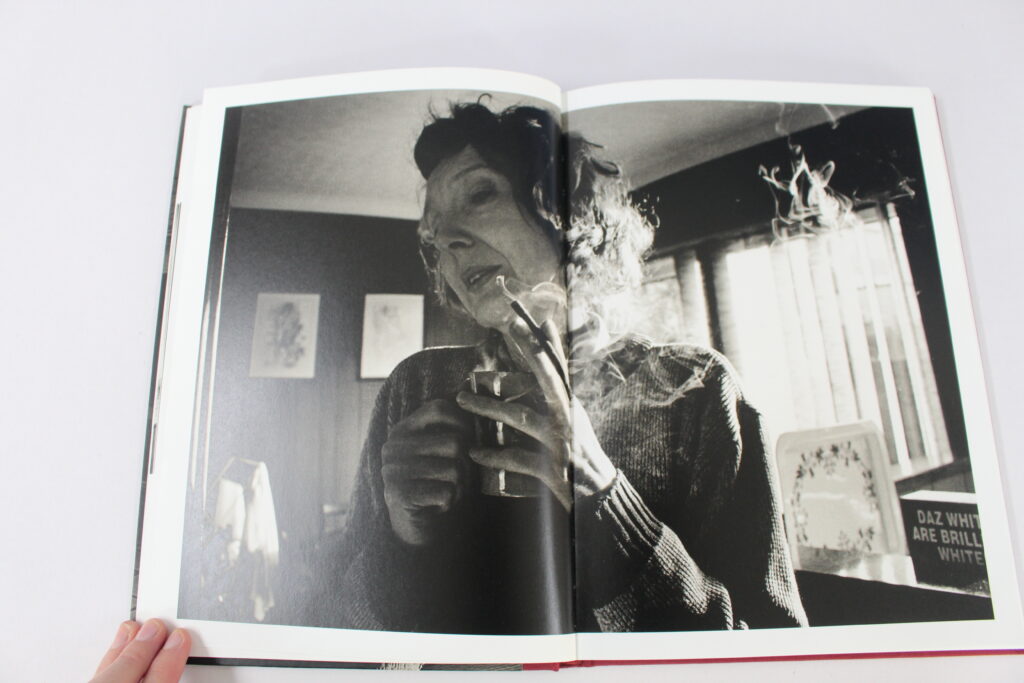
Having a double page spread for one of his stronger images. Though all of his pictures are of his mother, some can be seen as more significant than others such as this image. Finn explained the reasoning behind this image in his context at the front due to his mother smoking on his fathers wedding. By Finn making this image spread across two pages it creates an insight to the audience that this is one of the main images in his book.
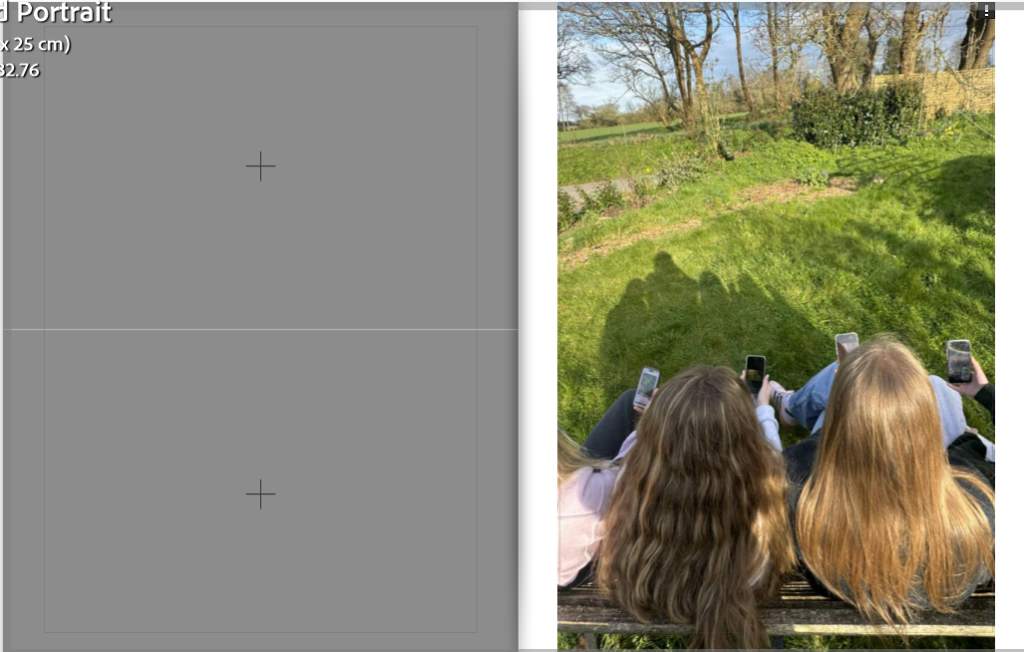
Similarly used double page spreads for my images in my photobook due to them also being significant to me. All of my images that are on a double page spread are my images of nature so that they are more captivating and appealing to the viewer rather than the darker images.
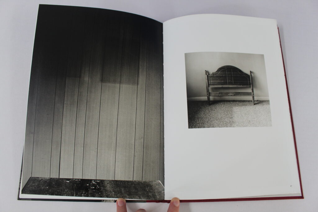
Having one image bigger than the other on two pages. Finn may have done this technique to try and symbolise a relationship between the two images that might not be as evident to the viewer. I like this technique as my interpretation of it is that even though the image on the left is bigger it doesn’t mean that its more significant than the smaller one on the right. I also like how even though they are very different each of the images contain the same type of wood which shows the correlation together.
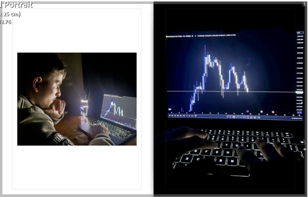
On these two pages on my photobook I also made one a full bleed and the other smaller. I used this technique due to both of the images being very similar as the vocal point of them is the laptop screen. I also wanted to signify that neither one of the images are more important but yet work better as a pair than individually.
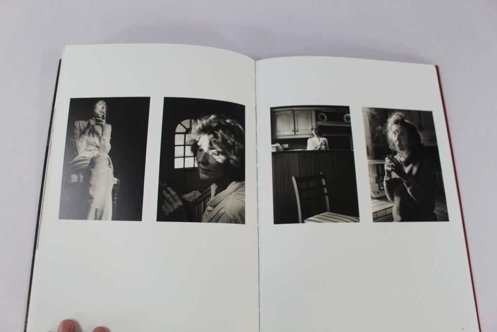
Having multiple images on the same page. Finn would have done this technique due to all of the images having a relationship with the other, Though He does not state this in his photobook It looks as if the two images on the left are his mother when she was younger comparatively to the right where it looks as if the images are of older people. This shows the evolution of his mother which he wouldn’t of been able to achieve without having multiple images on the same page.
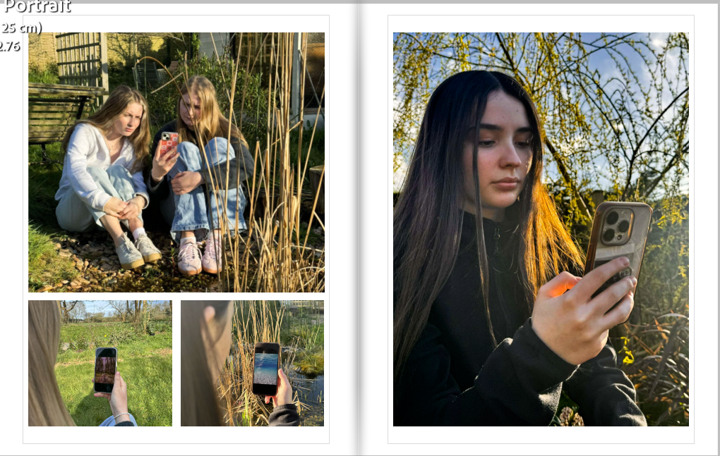
On these two pages of my photobook I also put multiple images on the same page, This is again due to the relationship of the images and how well they work together. I also chose to use this technique as it saves space in my book as I didn’t want it to be too repetitive and waste pages.
An image on one page and leaving the other one blank. Finn may have used this technique to help not make his photobook appear as too crowded. The use of this type of simplicity can also help to make the viewer not feel too overwhelmed with images and brings the attention back to the main focal point of the book which is his mother.
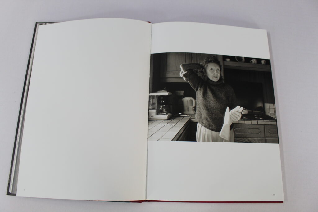
I also used the same technique on these pages of my photobook where I wanted all of the attention to be on that one singular image but I also didn’t want it to appear too crowed by spreading the image across the double page. Due to this image representing both nature and technology clearly I didn’t feel the need to add another image on the left side.
In conclusion I am glad that I found Finns photobook as I feel that we have very similar ideas for how we wanted our photobook to be interpreted by the layout and though we have different meanings behind our books I was still inspired by his intent and how he4 presented his mother to the audience through just a few images of her. One similarity between our intents is that his book is clearly evident to have an emotional toll on his viewers, as is mine in the same respect that I want it to be also eye-opening to the audience and for them to be emotionally impacted by it