Contact Sheet
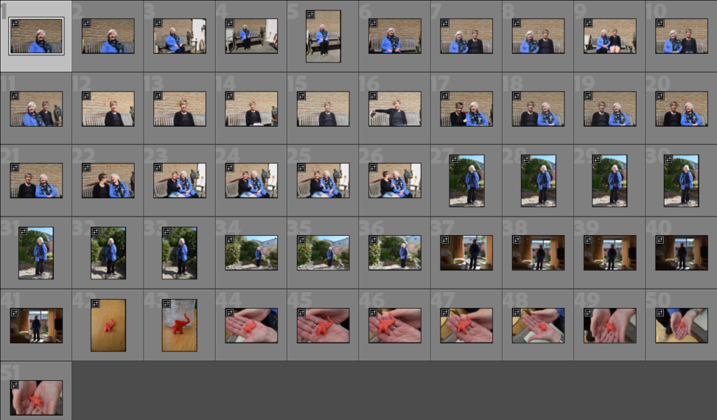
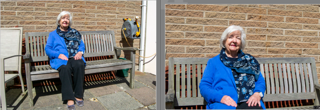
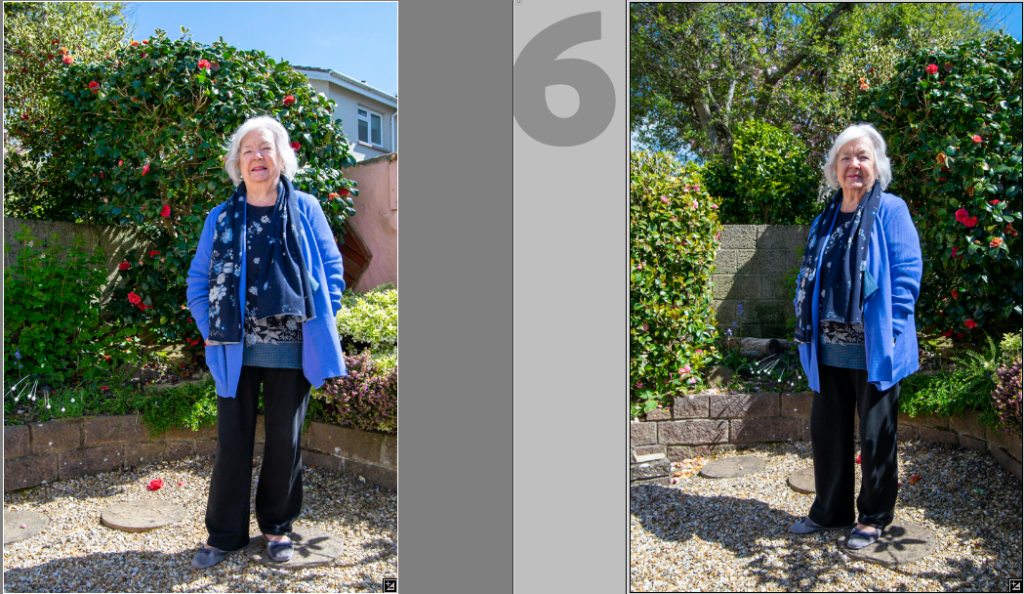
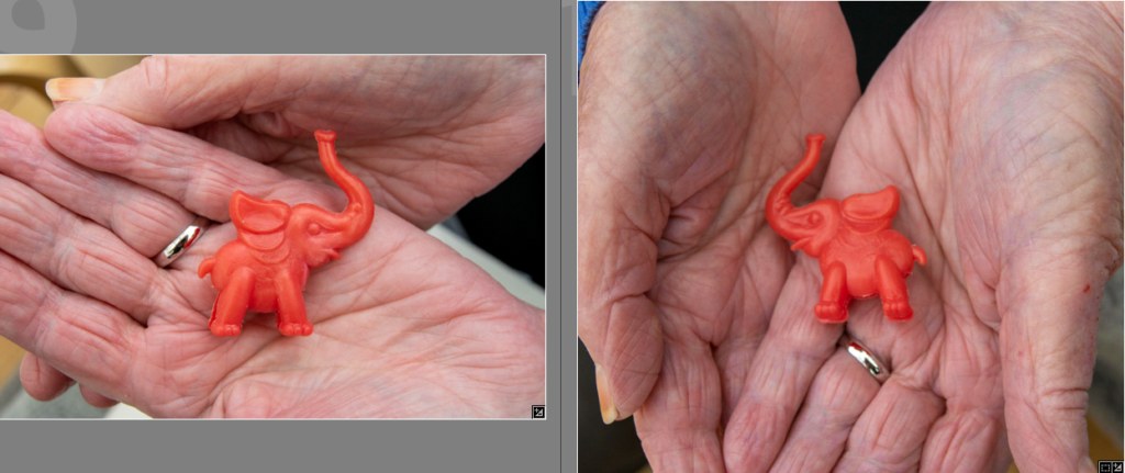
These are the images I have flagged and chosen to edit

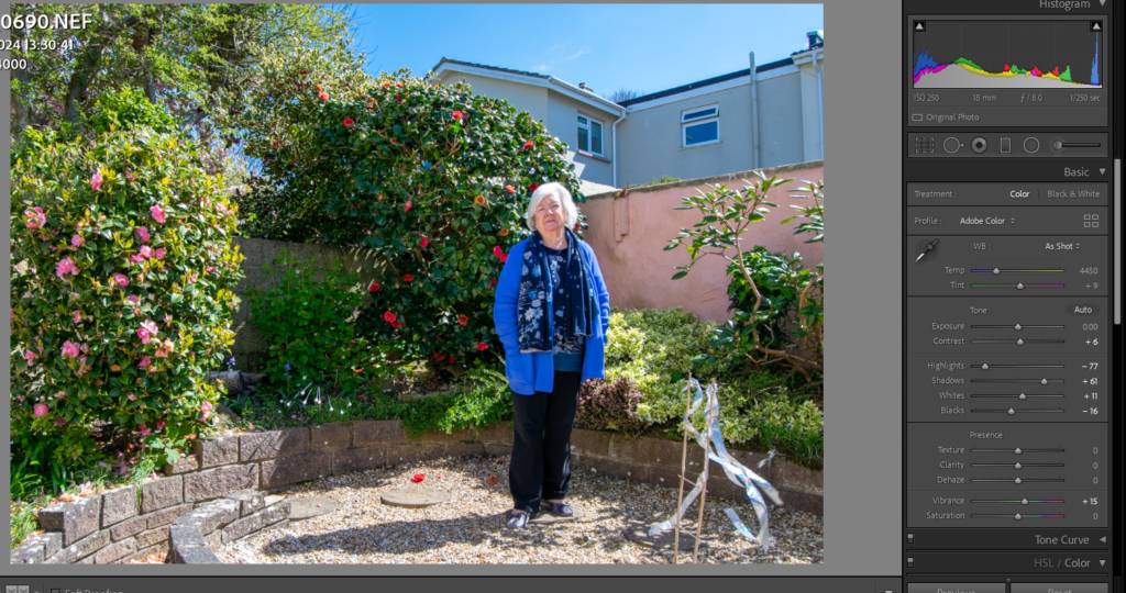
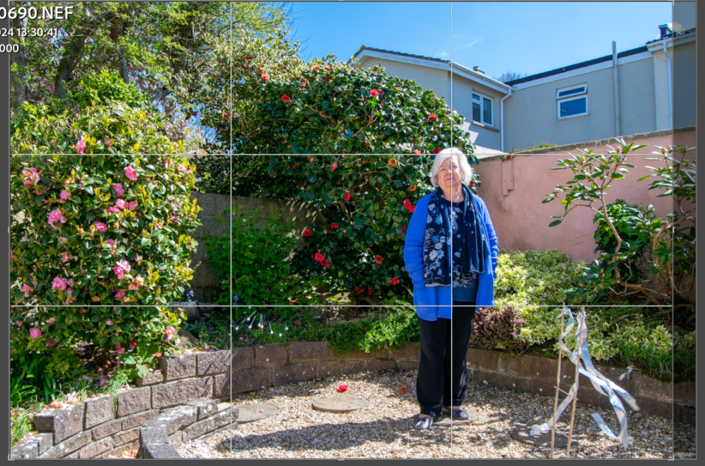
When editing these images, I chose to place her on the right third to create a better composition than if she was slightly too far to the right. Larry Sultan did this in his work and it inspired me to try it.
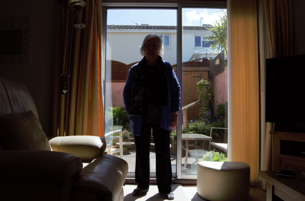
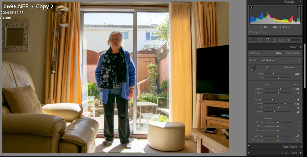
I struggled to edit this image because of it shadows and under exposure. However, after making three virtual copies and comparing and contrasting what was best to adjust, such as exposure, lifting shadows and lowering highlights, I came to this edit as a conclusion. I still don’t think the image is quite right because there is so much backlighting, however I find it cerates a vignette around her and the lighting adds a sense of drama, similar to Sultan’s images.
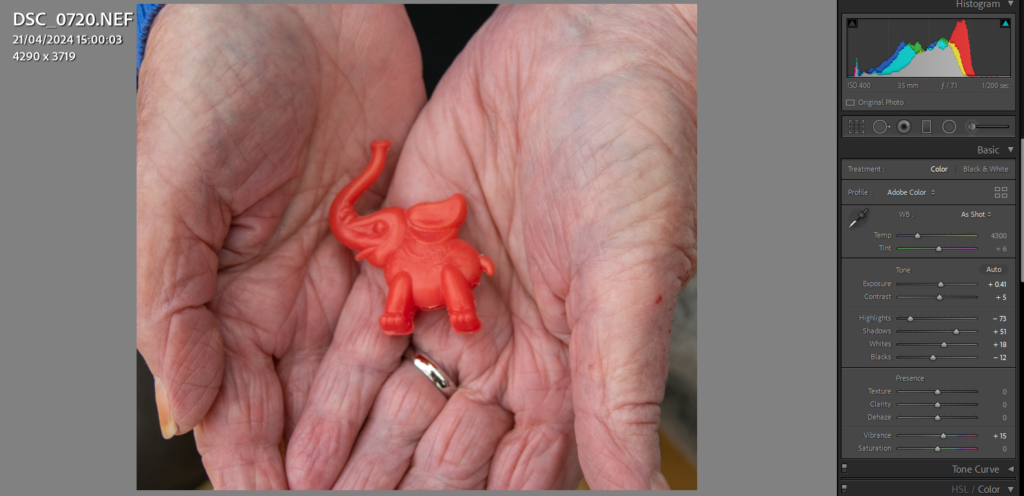
I wanted to take an image of this elephant, however I struggled to find a way to frame it because it is so small. I decided that photographing it in my gran’s hand would be the best because it shows whose it is, and links to my other hand images.
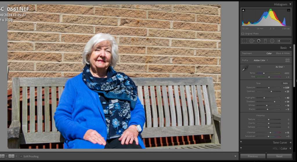
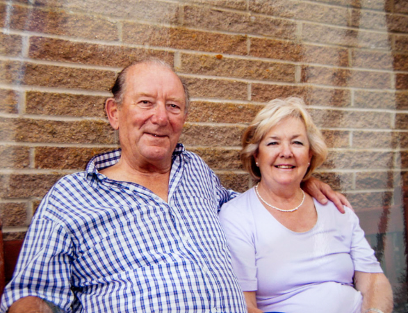
I took this image to compare with another image of my gran sat on this bench with my grandad. I think it is nice to show how she is still happy even though he is no longer here, and I may start with the photo of them both, and end with this one. The lighting was natural in this, so for editing I focused on correcting the exposure, adding a small amount of shadow for the depth, and brightening up her jumper with colour correction.
All images – I won’t be using ever image here, but the images that fit best on the pages and with other photos.


Photoshop editing:
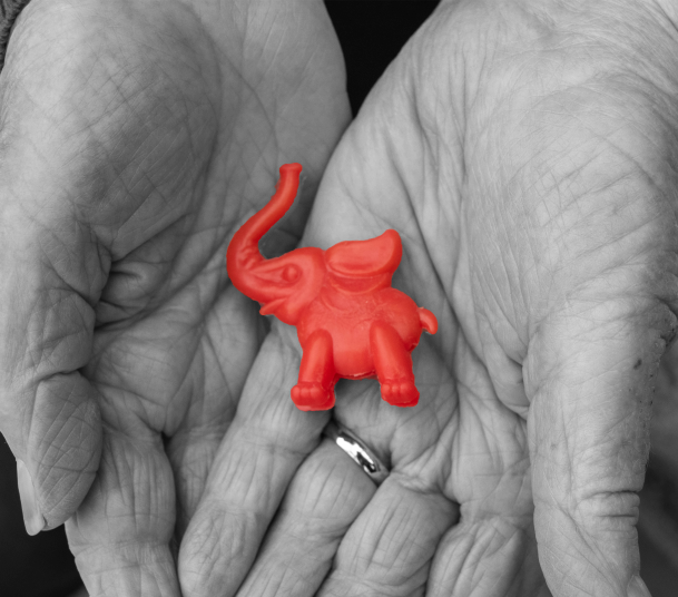
I experimented with turning everything black and white, apart from the elephant. However I don’t like it.
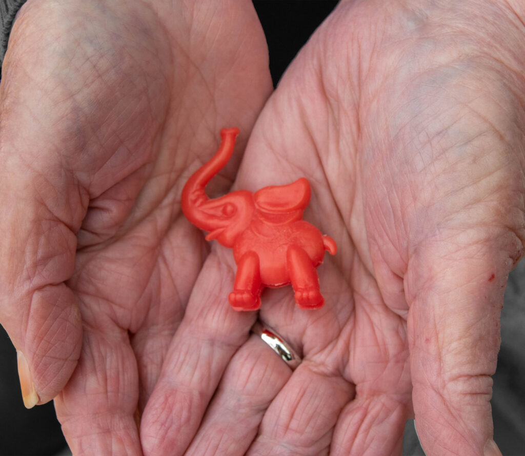
This edit is more subtle as only the background is black and white. I will try it with my other image.
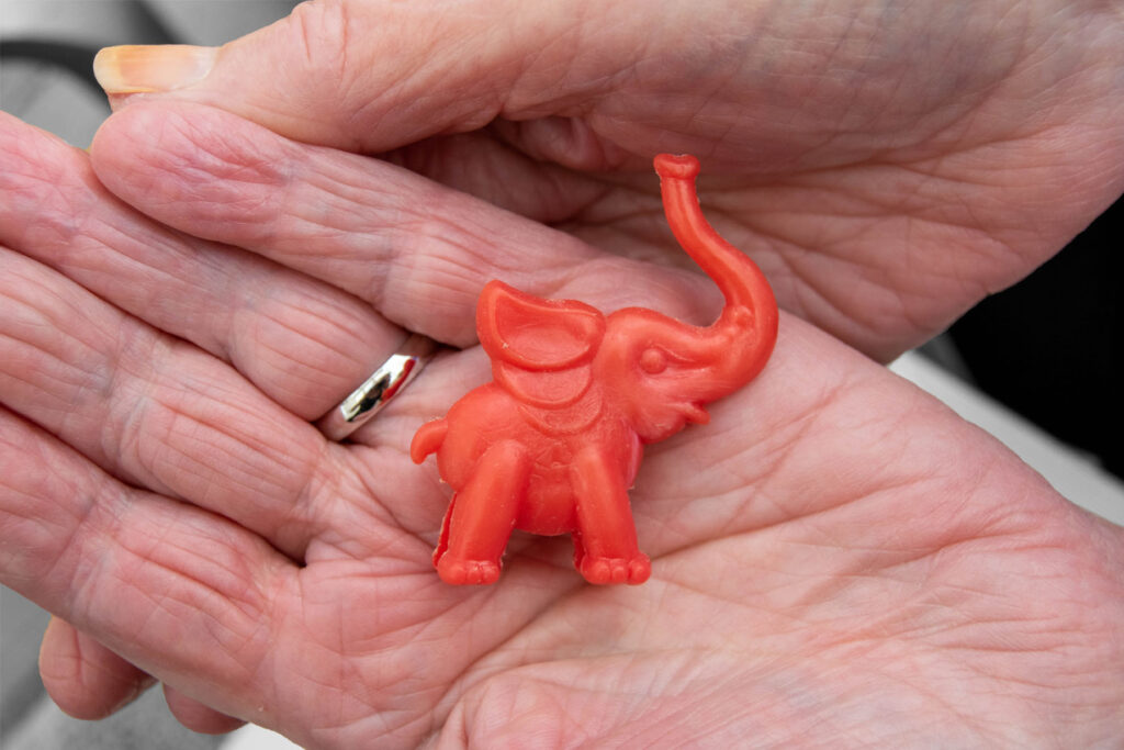
I prefer it with this image because you can see more of a difference when the background is black and white.