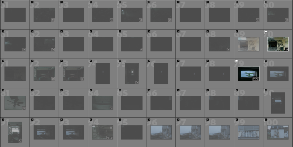
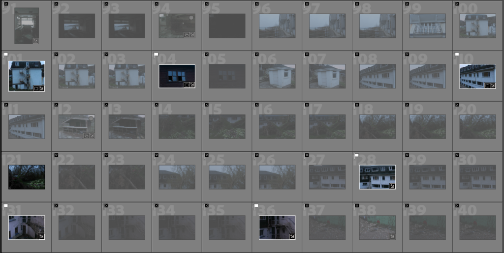
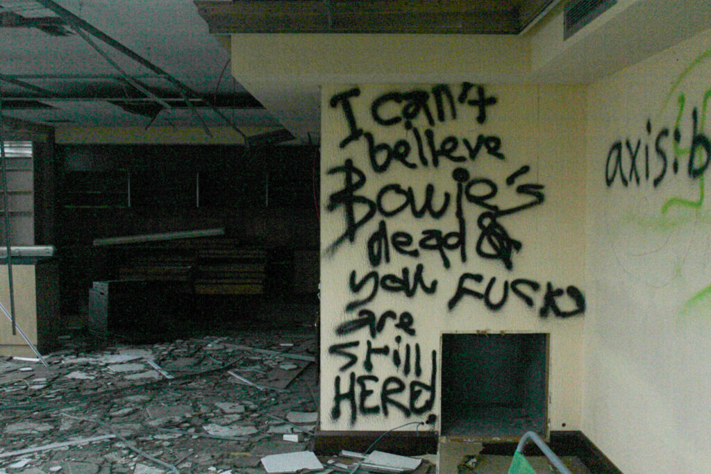
This photoshoot was carried out at the abandoned hotel at Bouley Bay. This was perfect material for my project as there was smashes glass, broken railings, smashes windows. rusty metal, boarded-up doors, graffiti, random furniture that had been left and more. This was my most successful photoshoot out of them all, however a massive problem was that half the time I had my camera on the wrong setting. This was because I was taking photos both inside and out and forgot to adjust the aperture to fit the setting and lighting. Therefore, a lot of my images were either heavily under exposed to the point where I couldn’t temper with it in Lightroom or just fully black. Although that happened, I still had a good few successful images that will make final outcomes.
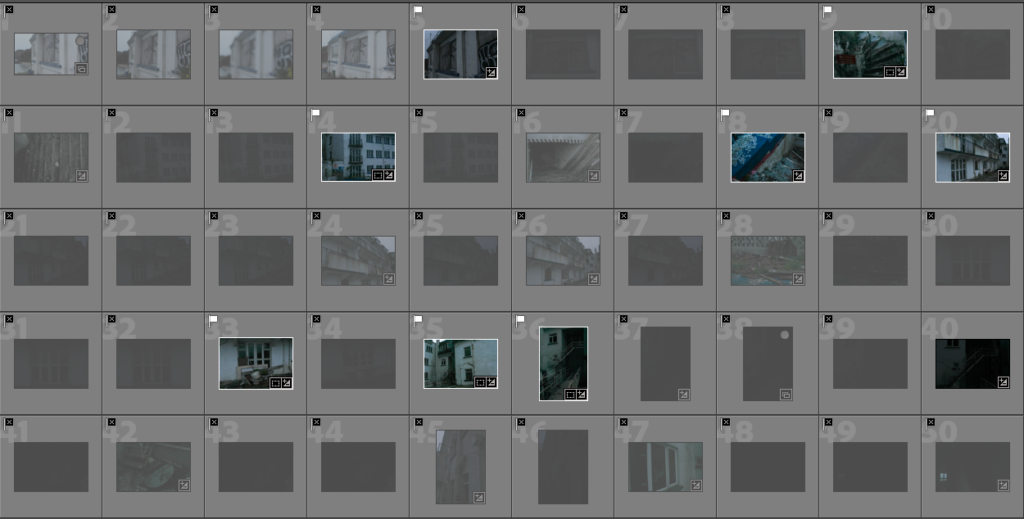
Contact Sheet

Final Outcomes
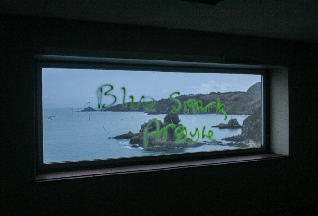
Although a lot of my images were underexposed here are all the successful outcomes which I’ve edited and experimented with.
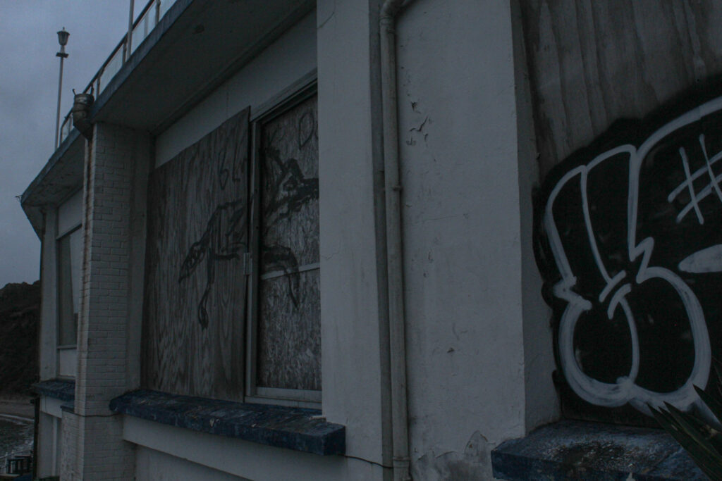
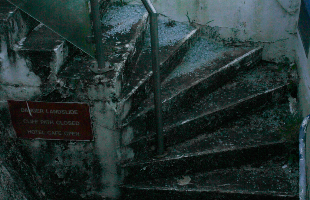
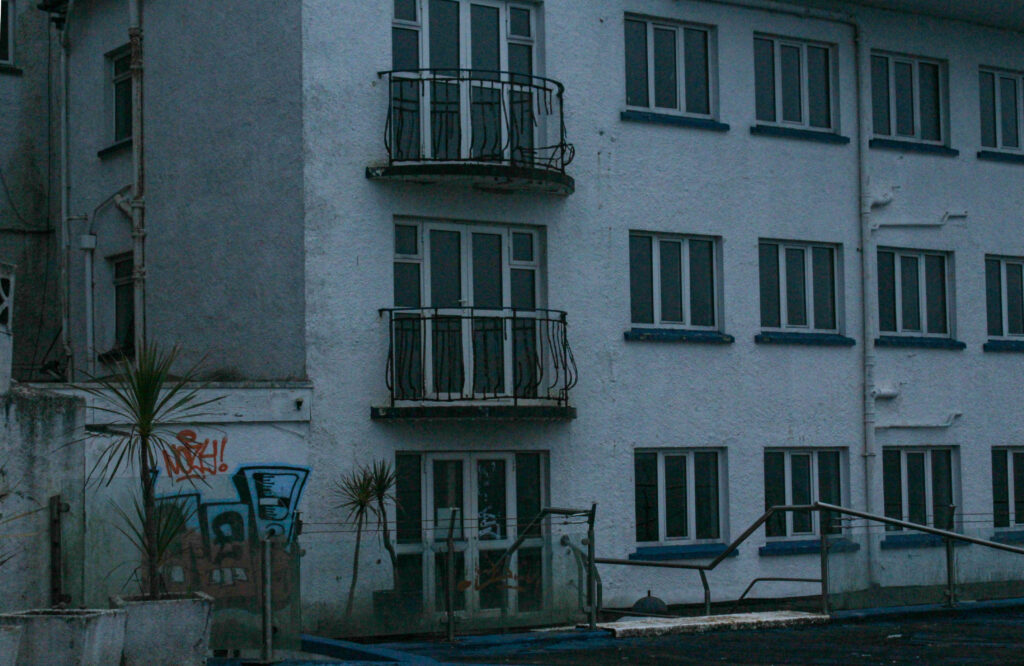
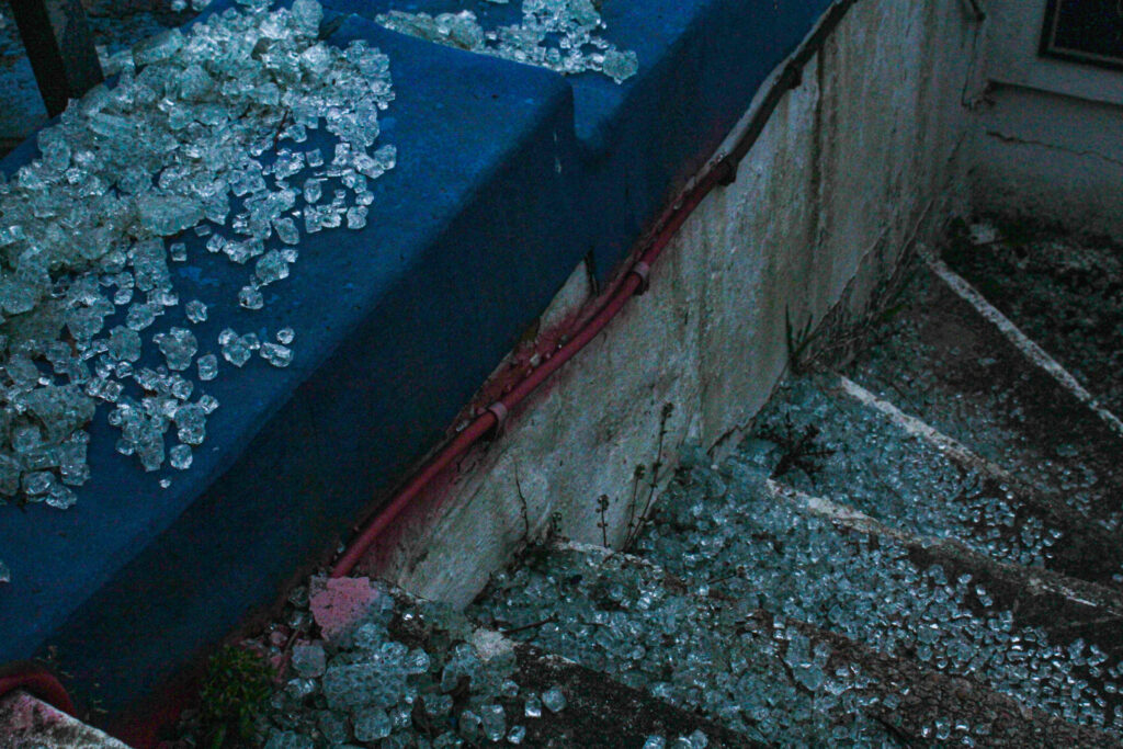
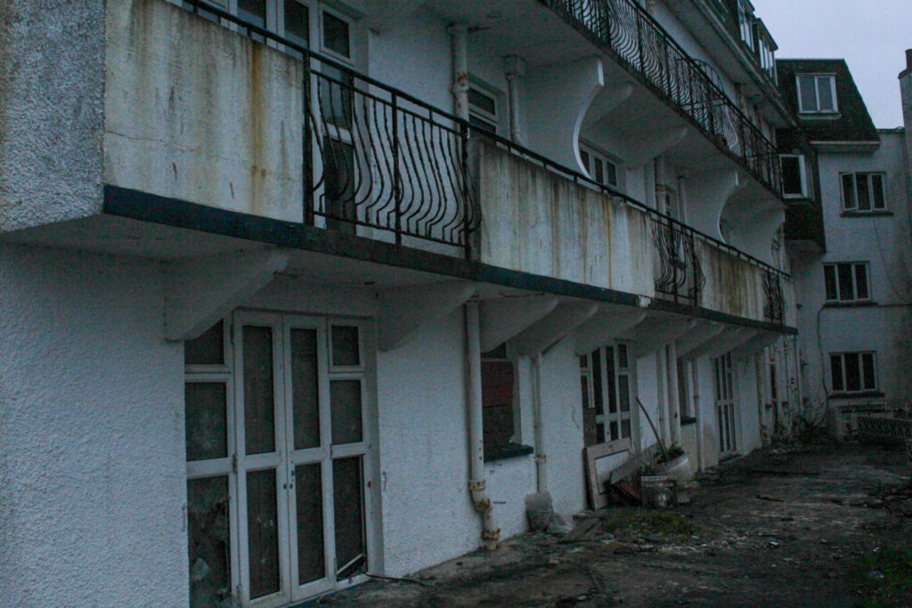
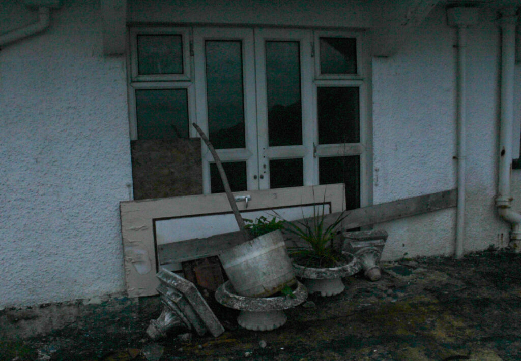
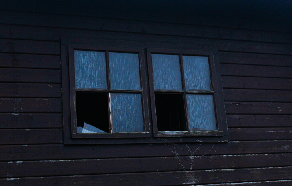
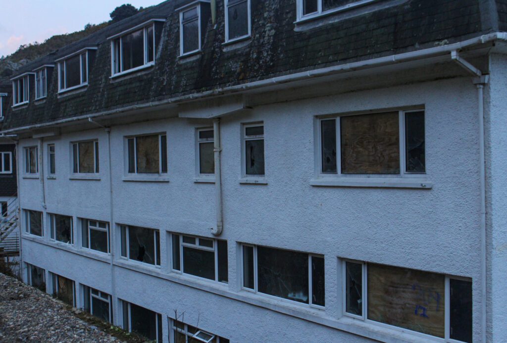
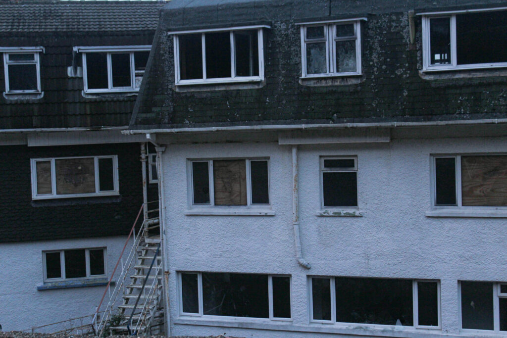
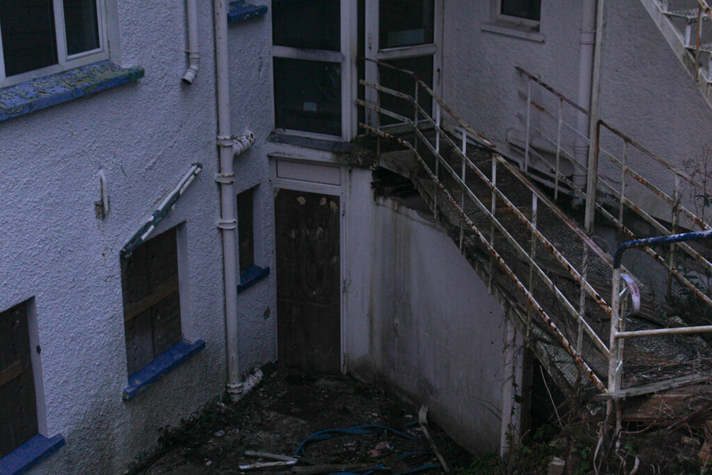
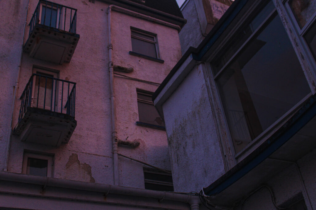
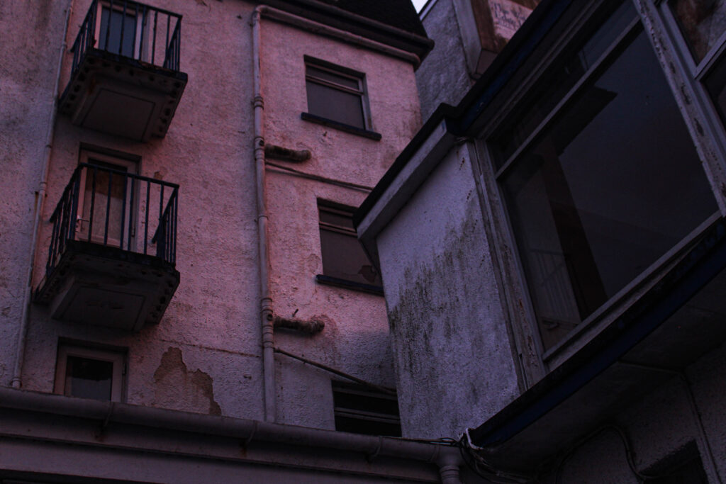
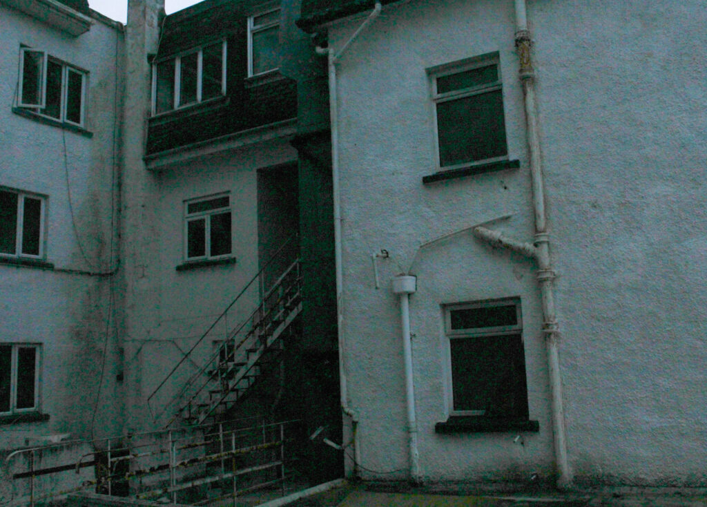

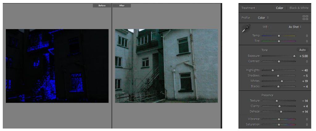
The two images above were completely black when I first transferred them onto light room. Ive shown below the before and after as an example of how just changing the elements to an image slightly can change the whole thing. Exposure is the main element in this image and as shown, I increased it fully along with the shadows and whites. I did this to bring more light to the images.
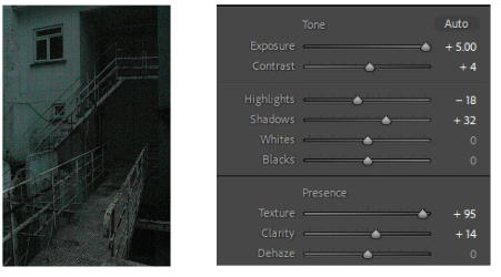
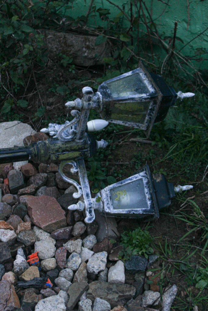
This Image was very blurry so I increased the texture to stop this slightly. Although the outcomes are very grainy and have this green, aqua haze over them, I really like the outcome and I think it sort of looks like images of footage from a security camera; which correlates with my theme of seeking, eerie abandoned buildings perfectly
Editing process
Here are some examples of the editing process I went through to create some of my final outcomes.

This image was also very underexposed so I increased the exposure and also experimented with exaggerating the colours and tones a bit. I changed the colour green’s hue and liked the outcome of the bluey haze over the image so I did the same with the aqua colour to get this outcome.
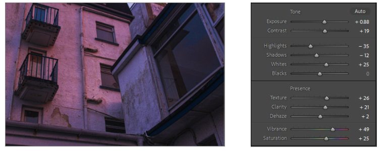
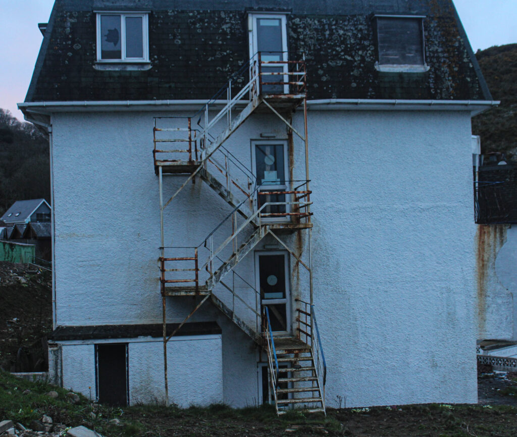
I took this image as the sun was setting, that explains the pink lighting in the image. I like this as it contrasts the rusting, run down building which is not a very pretty thing, with the bright pink light from the sunset which is usually seen as an aesthetic feature.
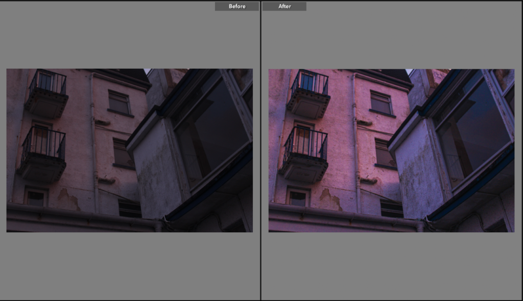
I didn’t do as much to this image as the others as the quality was high, but the image on a whole was quite dull. Therefore I increased the whites, clarity and exposure. By decreasing the highlights a bit, this enabled the image to look smoother.
Comparing my work to Matt Emmett’s
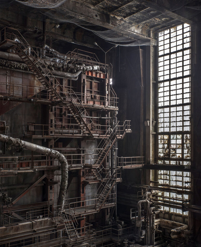
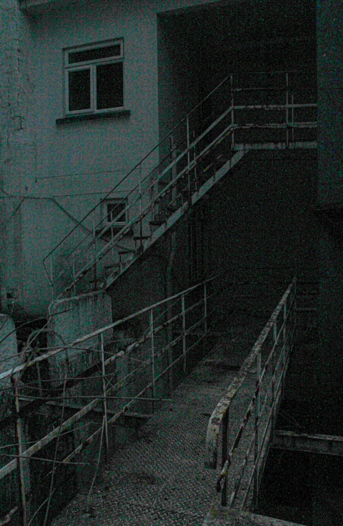
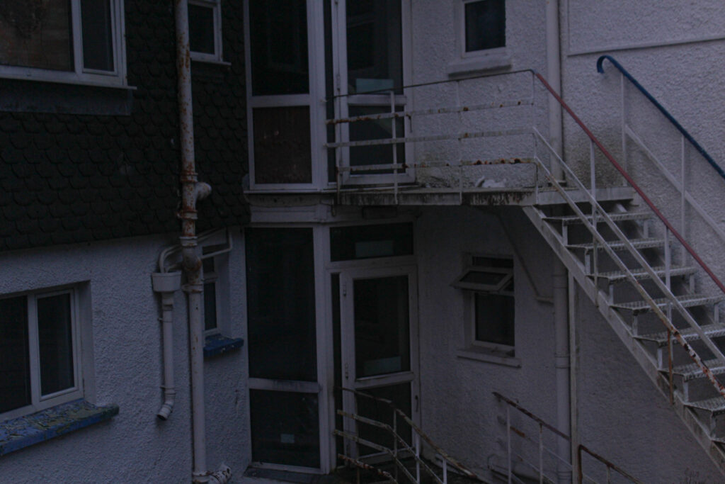
This image I took (right) reminded me of the image on the left, taken by Matt Emmett, when I developed and edited it. I think the significant similarity is the metal barrier stairs that are rusting and appearing unstable. Both were taken in abandoned, run down buildings. Emmetts photo is a lot lighter then mine, he has more natural lighting coming in which brightens the tones of the image. As mine was edited to be brighter then it originally was, it appears quite grainy and has darker tones. I like that you can’t fully see the background, I think it adds depth and contrast to the lighter parts of the image. When I increased parts of my image such as the exposure, whites and highlights, it also changed the tone of the image; through tempering with a few things it created this aqua haze over the image. This to viewers may look like not as good quality, compared to Emmetts image, however, I think it makes it more interesting and eerie.