Inspiration – Seascapes – Hiroshi Sugimoto
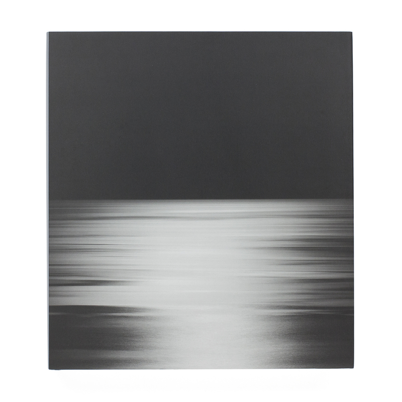
For more than four decades, Hiroshi Sugimoto has been photographing seascapes around the world. “A sharp horizon line and a cloudless sky- here began my consciousness.” writes Sugimoto, “From there my thoughts race to the origins of human consciousness itself. The sea reminds me that within my blood remain traces of human evolution over hundreds of thousands of years.”
His Seascapes series began in 1999. Photographed with cartographic precision, each image shows sea and sky bisected by a seemingly infinite horizon. Rather than taming the subject through repeated documentation, the series grows more awesome and sublime, until the images reveal only the transient atmospherics—the thickness of fog or stillness of the water.
Water and air. These primordial substances, which make possible all life on earth, are the subject of Hiroshi Sugimoto’s Seascapes series. Sugimoto has called photography the “fossilization of time,” and the ‘Seascapes’ photographs simultaneously capture a discrete moment in time but also evoke a feeling of timelessness.
This volume, the second in a series of books on Sugimoto’s art, presents the complete series of over 200 ‘Seascapes’, some of which have never before been reproduced. All are identical in format, with the horizon line precisely bifurcating each image, though at times the sea and sky almost merge into one seamless unit. Each photograph captures a moment when the sea is placid, almost flat. Within this strict format, however, he has created a limitless array of portraits of his subjects.
Seascapes
Size -250 × 277 mm
Pages – 272
Illustrations – 213
Binding – Hardback
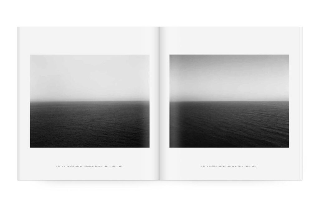
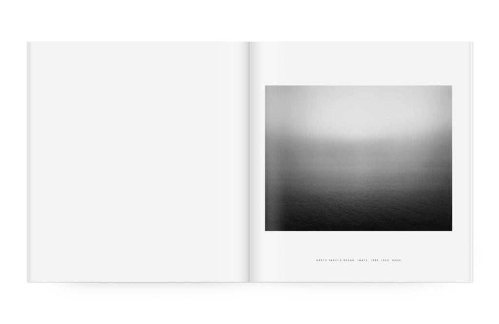
Layout
In “Seascapes” by Hiroshi Sugimoto, the layout is intentionally minimalist to enhance the impact of his photographs of the sea. The simple design allows the images to speak for themselves, capturing the essence of the vast ocean and its timeless beauty. The clean layout helps create a sense of tranquillity and contemplation, drawing the viewer into the serene world of Sugimoto’s seascapes.
My Layout
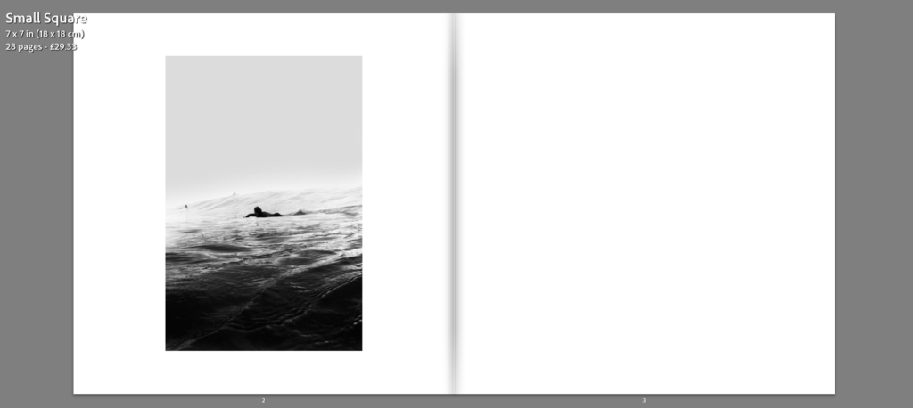
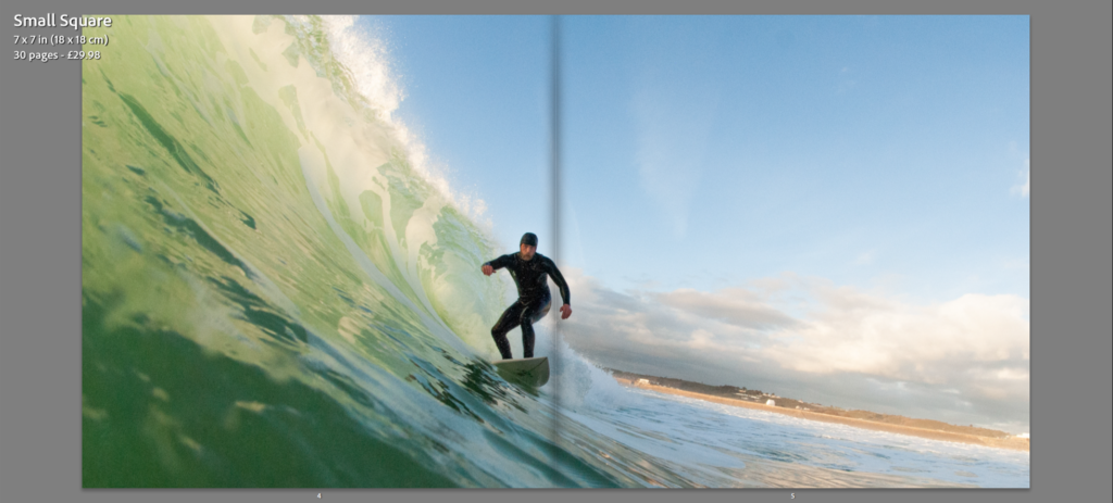
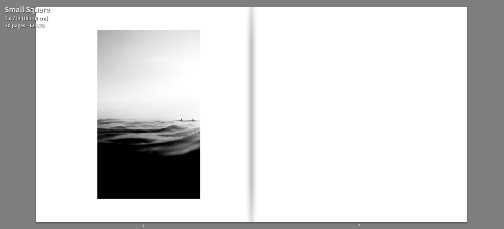
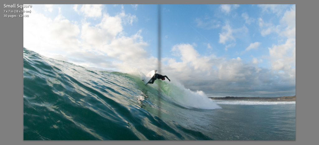
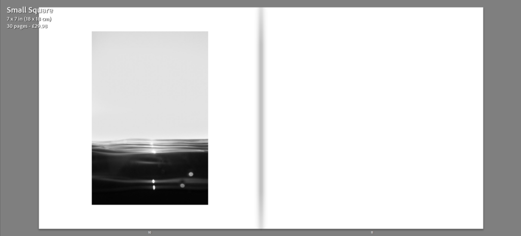
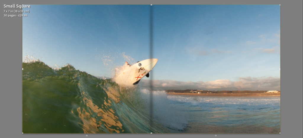
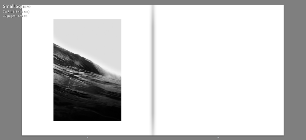
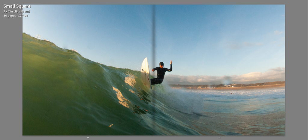
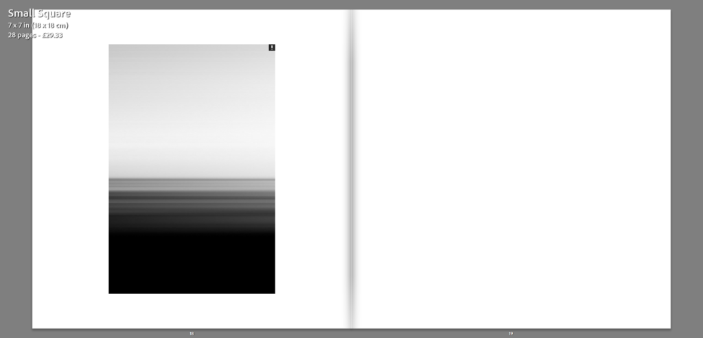
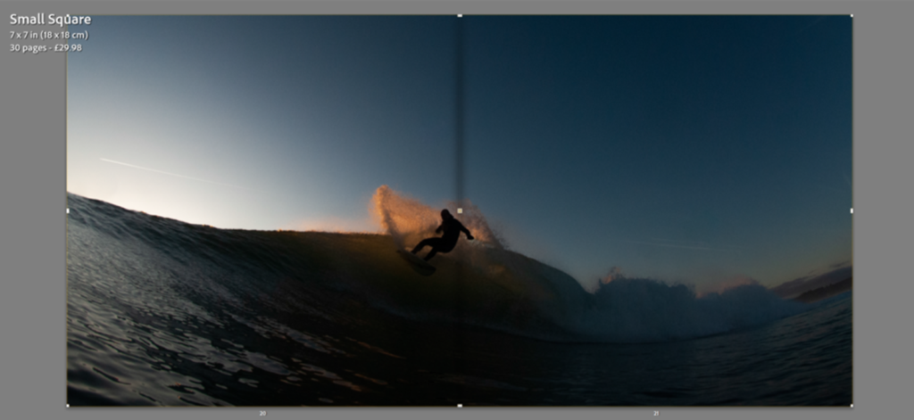
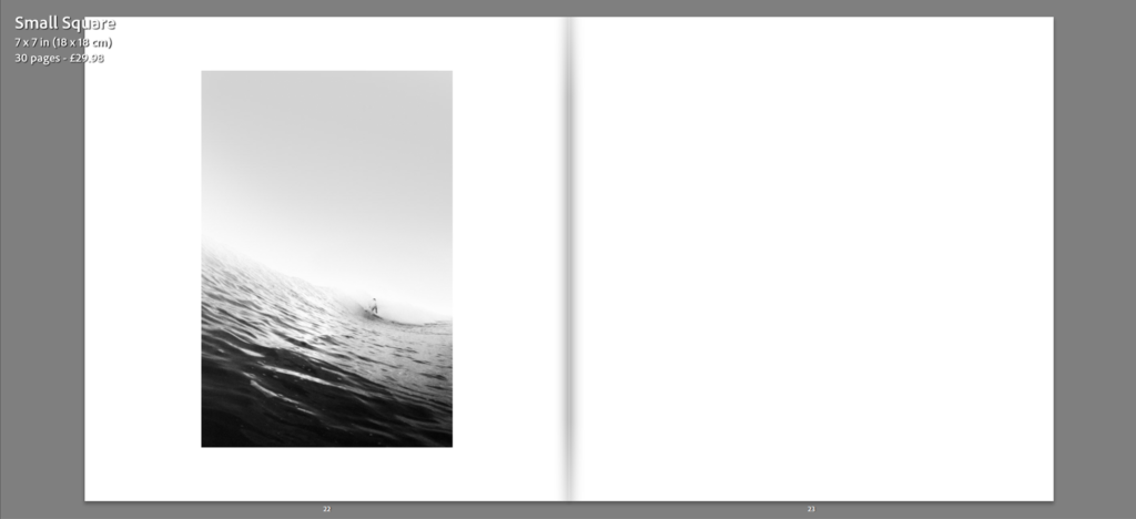
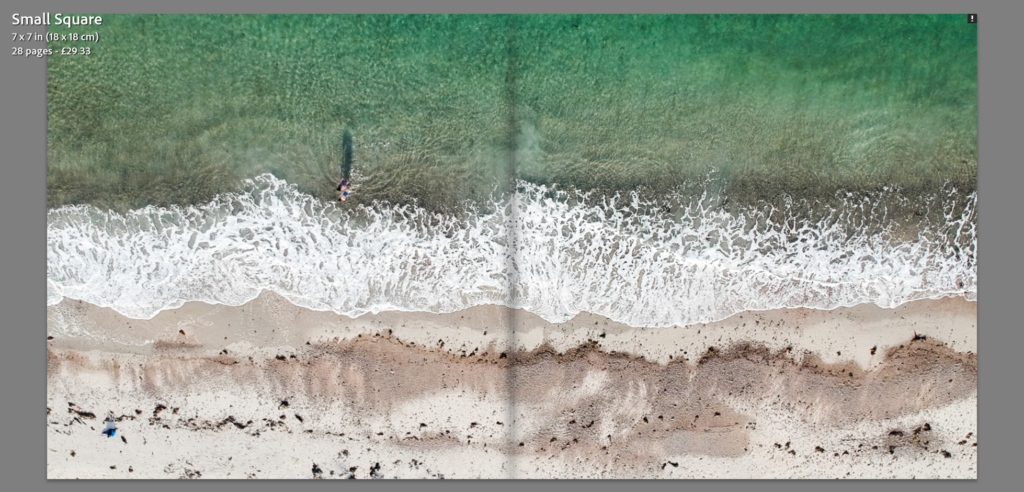
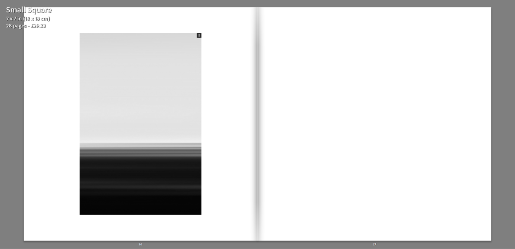
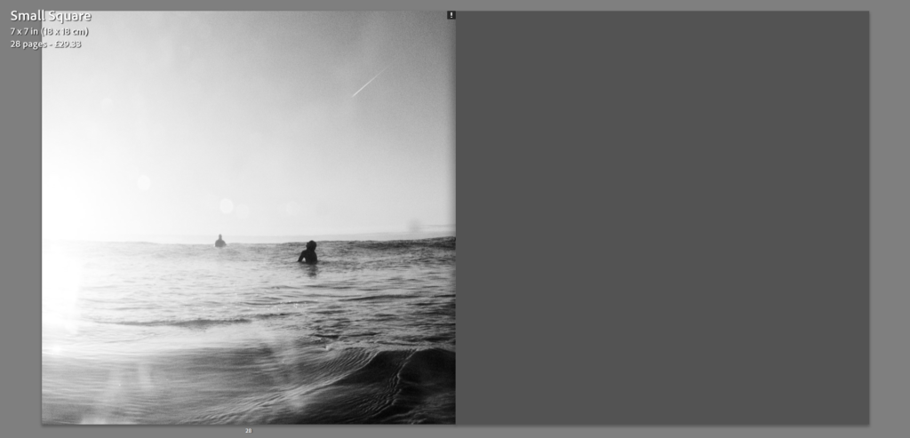
To evoke a similar feel to the works of Hiroshi Sugimoto, the layout of specific images, the ones having taking inspiration from Sugimoto, will be similarly set out to the ones featured in ‘Seascapes’, with a clean, simplistic, uncluttered design. By keeping the design simple, the focus remains on the image, along with continued theme of minimalism. Other, more complex images will be lay out across a double page spread allowing the image to be displayed on a larger scale, enhancing the sense of detail.
Book Settings
- Paper and ink – Premium lustre paper
- Format, size and orientation – Small Squares 7 x 7 in (18×18 cm)
- Binding and cover – Hard cover image wrap
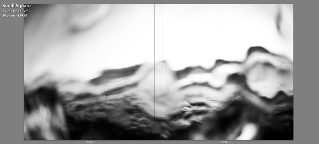
- Title – ”Surfscapes” – taking inspiration from Hiroshi Sugimoto’s ”Seascapes”
Photobook

