Style:
I decided to make a hardback photobook as my images are all documentary and I thought that with the overall outcome it would be more fitting to my theme.
Concept:
I want my photobook to show the unseen, more underground sides to Jersey that people don’t know or have forgotten about. The aim of my photos was to show viewers these places and how they have been left but also to show the brighter sides to them, how nature has taken over the majority of buildings like this and brought more life to them. I was strongly inspired by the works of Matt Emmett, he photographs derelict, abandoned buildings and places from all over the world; although it was challenging as I didn’t think there was many abandoned places in Jersey, after researching and exploring there is actually lots of places here that have just been left. This is also why I chose the theme of seek because it relates to exploring and finding out about these places, seeking the unknown.
Layout:
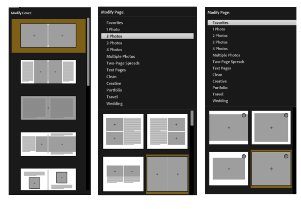
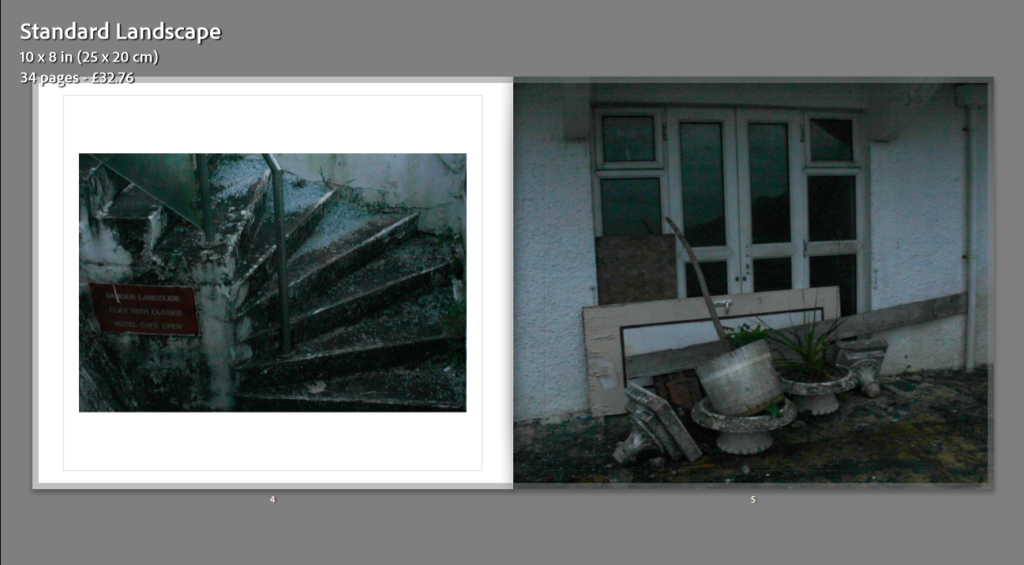
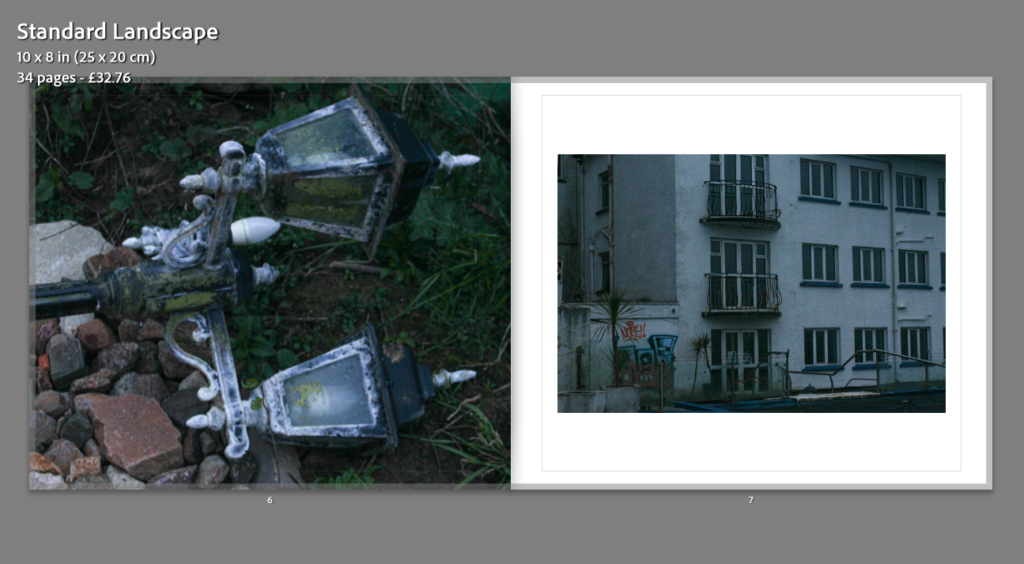
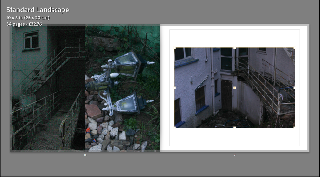
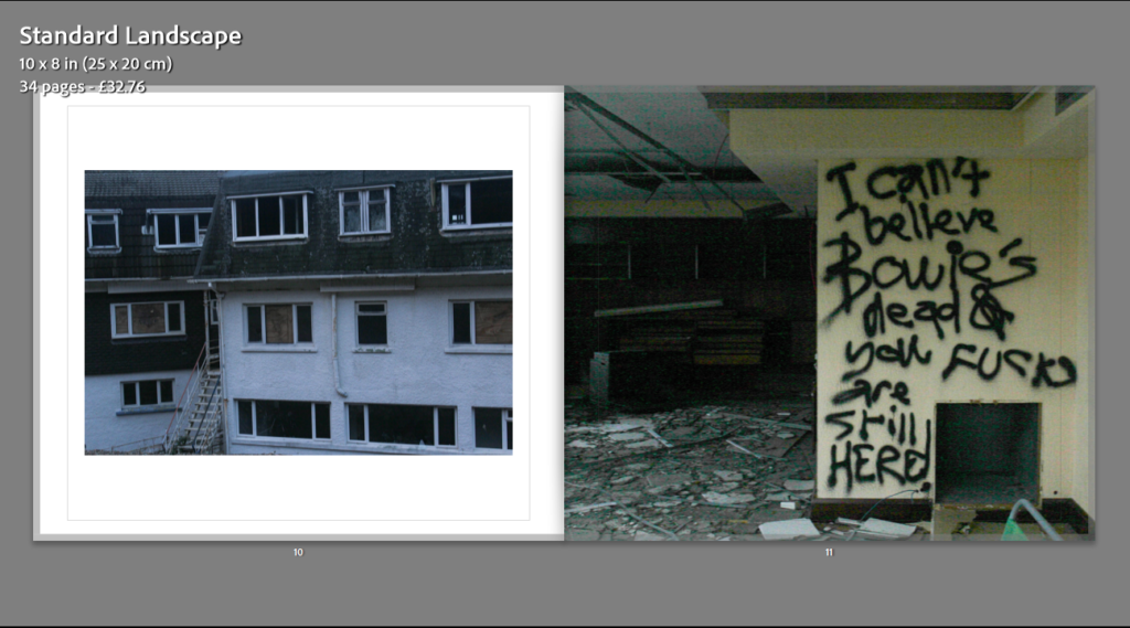
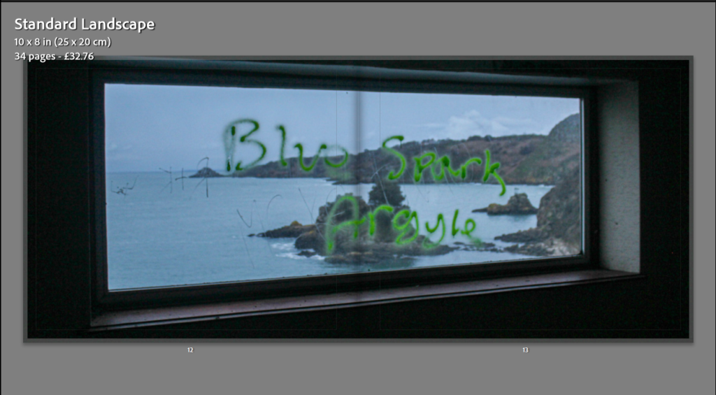
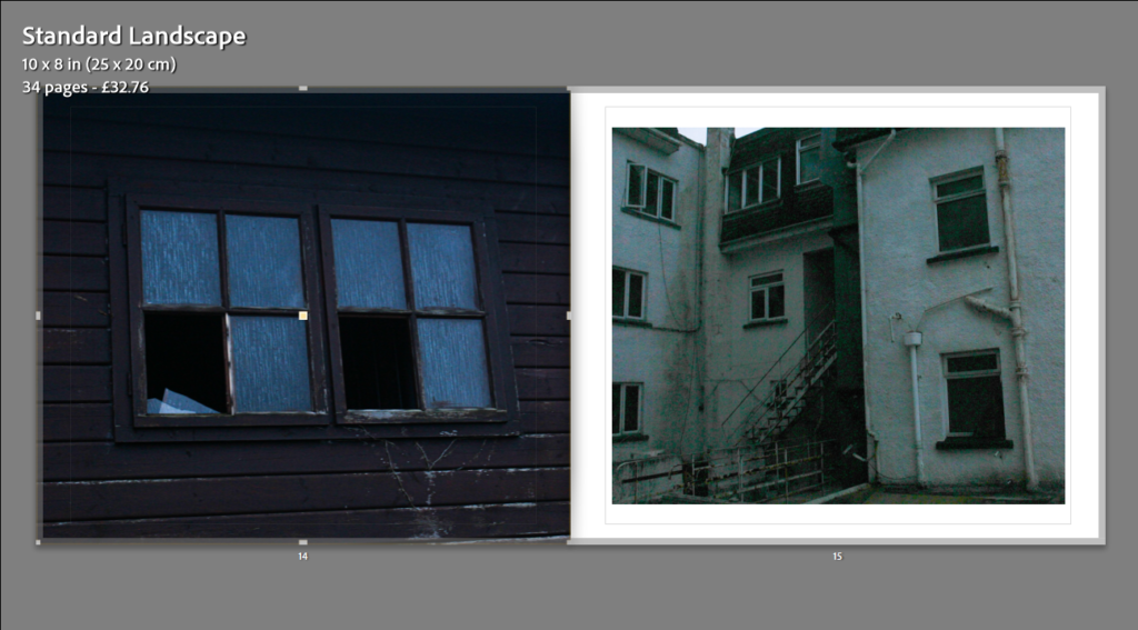
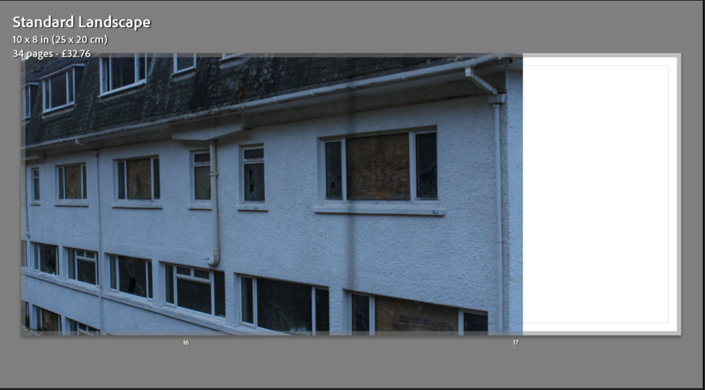
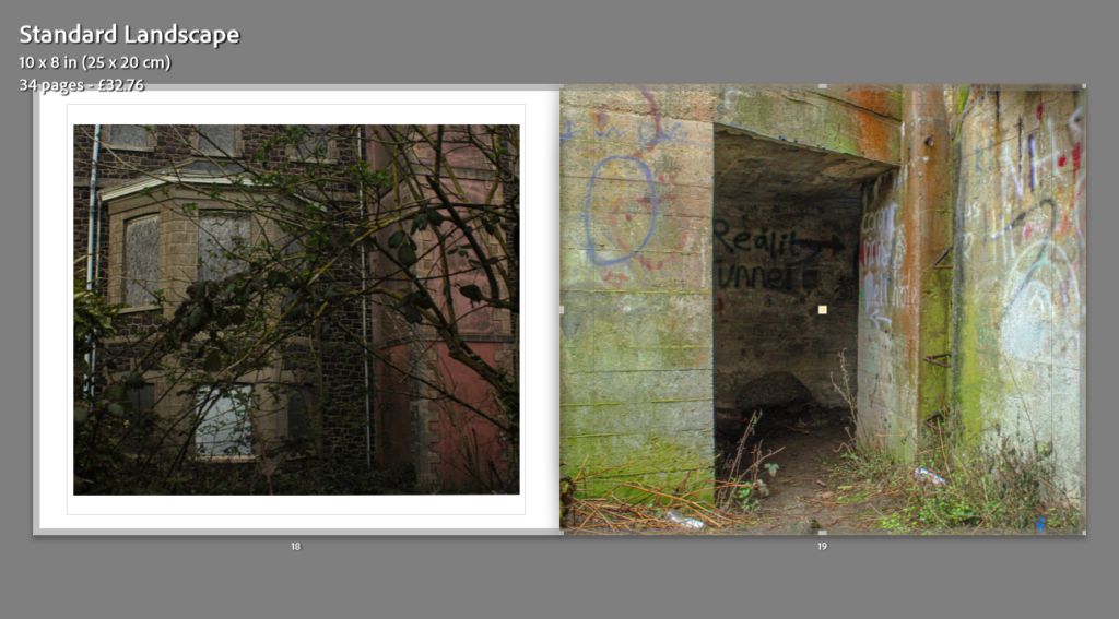
Here is a preview of the layout for my final photobook. I tried to display my images differently from page to page to make it more interesting to the eye. Throughout the process of creating my book I used one of three options, of presenting my images on a page, all the way through; this was one image, two images, or one image as a double page spread. I had multiple options for the layout of my images, which I have screenshot and displayed below.
My photobook
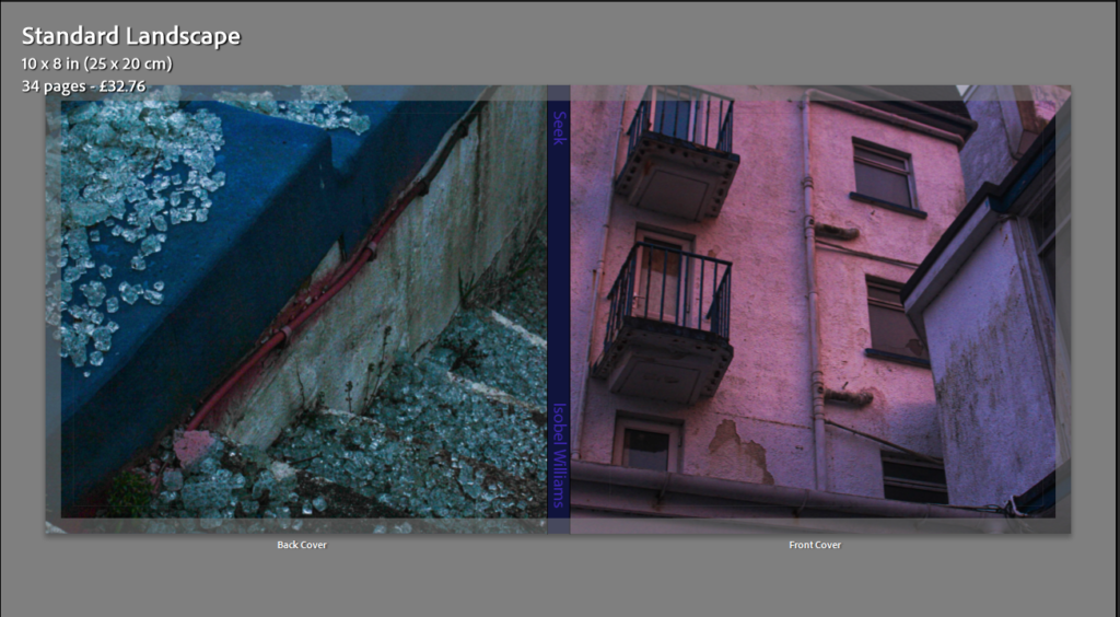
Front and back cover
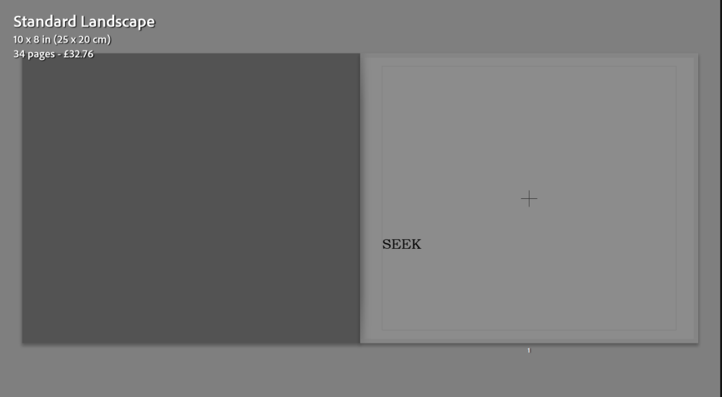
Page 1
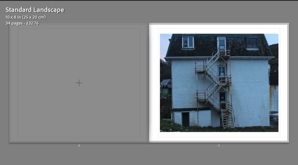
Pages 2&3
Pages 4&5
Pages 6&7
Pages 8&9
Pages 10&11
Pages 12&13
Pages 14&15
Pages 16&17
Pages 18&19
Pages 20&21
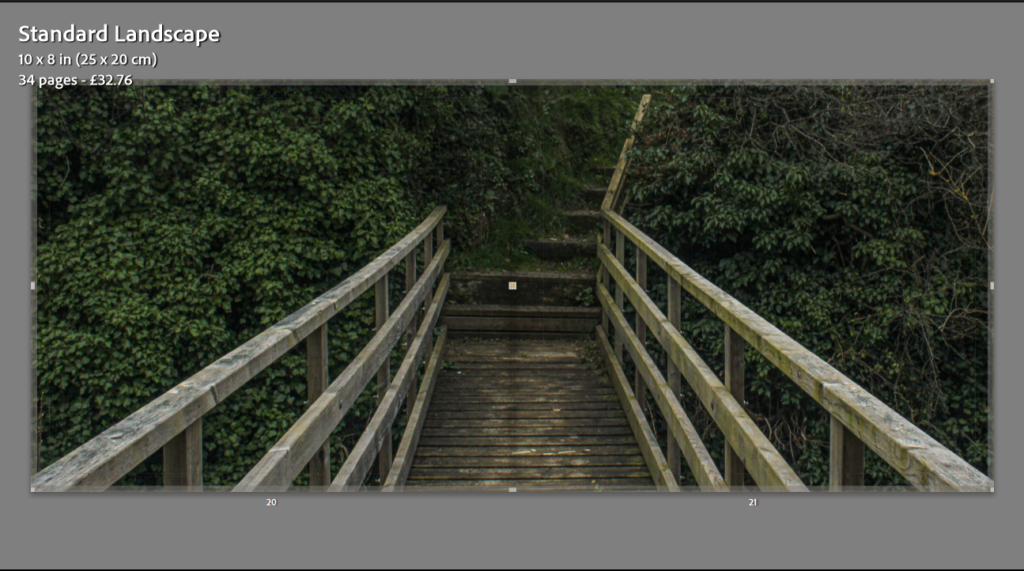
Pages 22&23
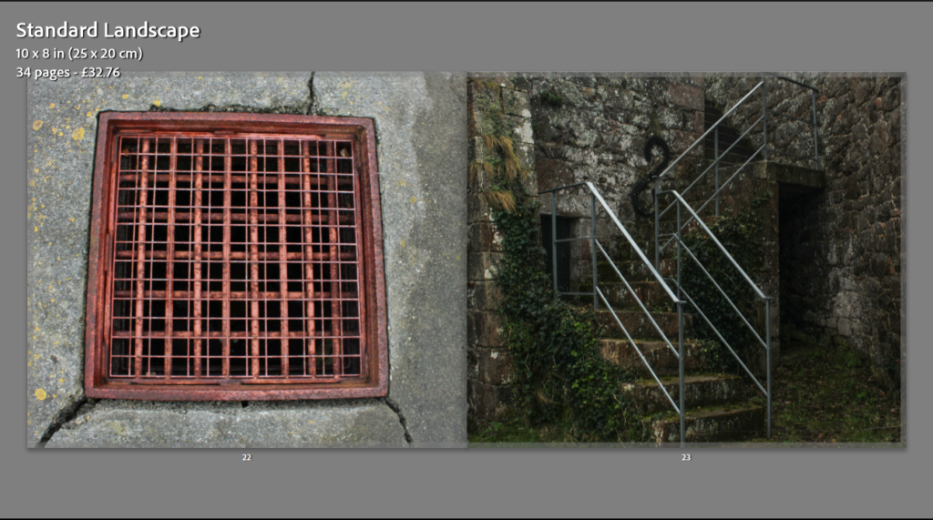
Pages 24&25
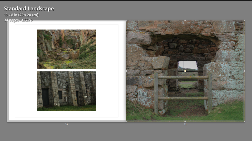
Pages 26&27
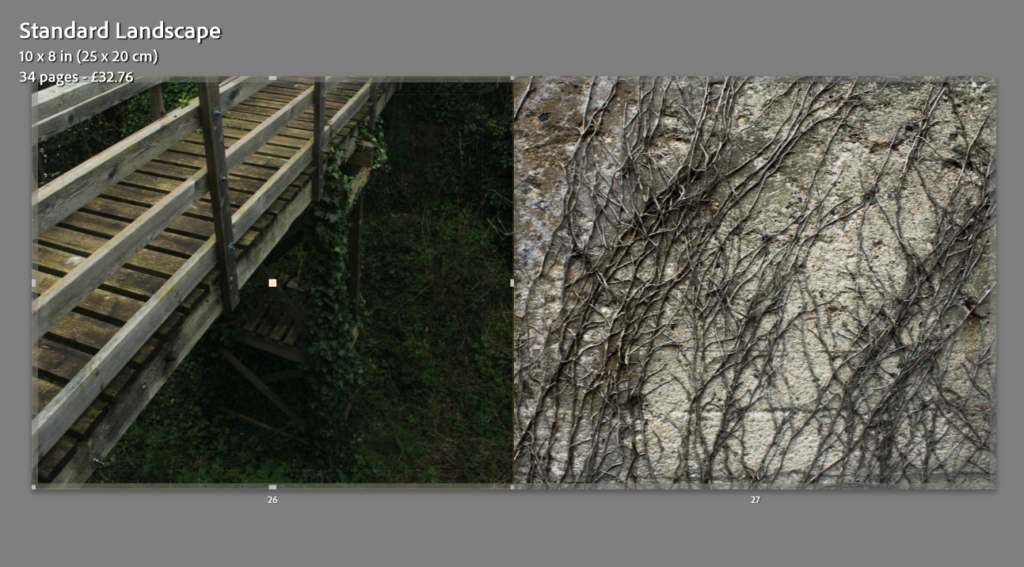
Pages 28&29
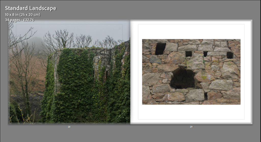
Pages 30&31
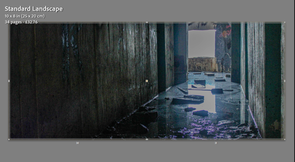
Pages 32&33
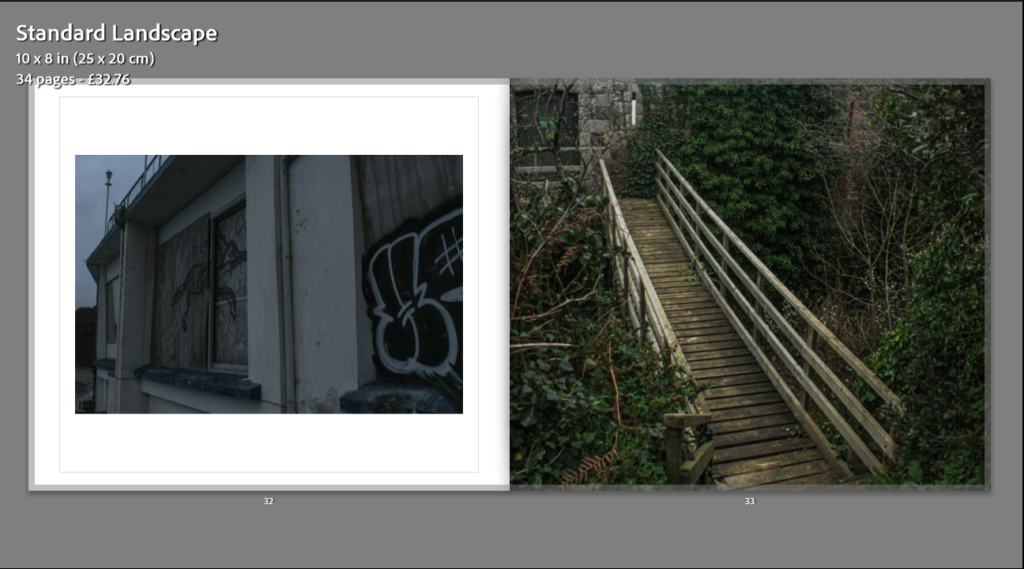
Page 34
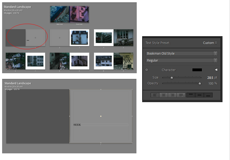
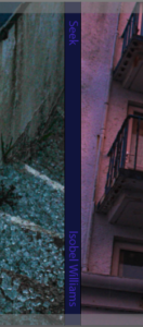
After constructing my photobook, I decided to add text to the front cover and first page. I did this by inserting text and using the tools I’ve shown above on the right to change the colour, size and font of the text. I made the spine of the book this dark purple colour as it blended more with the more popular colours of pink and blue from the front and back page; when I added text to the spine ( the title and my name) I edited it to be a slightly lighter purple then the one on the spine. This was because any other colours like white were too harsh. I decided to make the first page blank and add the title of my book as a title page when you first open my book. This is just to bring my book together.
Reason behind my photobook
Matt Emmett- Forgotten heritage
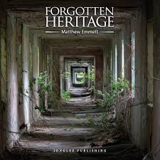
‘Forgotten Heritage’ is a photography project that uncovers the brutal beauty of abandoned Buildings and derelict industry. Emmett displays all his images that I have previously studied and are inspired by. Emmett shows a vast variety of images, from abandoned buildings and sites in the middle of forests and jungles; surrounded by the beauty of nature that has began to take over these sites, to derelict work industry buildings, rusty and broken down.
The front cover of his book is eye catching. In that image he used the repetitive technique of shape to draw viewers in. He has carefully positioned himself so that he’s central and can get the perfect composition. The natural lighting in the image creates an illusion of the square shape running right the way down this creepy hallway. This technique forces a focal point that falls at what looks like the smallest square, but also the end of the hallway; it leaves viewers wondering what is at the end of this path, what is beyond?
Forgotten Heritage is a documentary book, he reports real life settings, using photos, these derelict areas for the rest of the world to see.
I was inspired by the book when designing my own photobook, not only because I used Emmett’s work to base my work off of, but also the layout and design of his book. There is no text in his book from page to page, just his straight up photos. I like this as it is forward, there are no distractions just a display of all his work, as mine is as well. I like the fact he doesn’t try to show the dark side of these places, he almost try’s to show that although these places are very derelict, there is also a lot of beauty to them. I think I successfully did this in my work by taking images such as, the abandoned hotel with the bright sunset reflecting off the wall, or a derelict heritage sight with bunches of colourful green leaves covering and surrounding it.