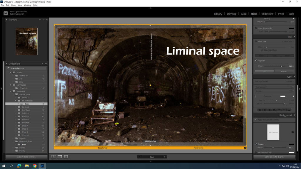
For my front cover I chose to stay with a simple look with the title being bold and clear for what it is. I also think the font suits the name well but isn’t fancy or over complicated which suits the theme of liminal space.
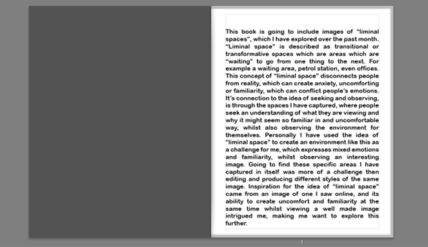
I then decided for my first page I would give a description/introduction to what my photobook is going to present and how it relates to the theme of “observe, seek and challenge”.
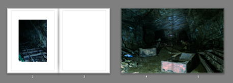
This leads into the old, empty, abandoned areas which starts off with the caves where not many people have recently been in to see or even know about its existence. This is to show Old liminal spaces where people used to explore decades ago and even use during WWII, and is perfect because the areas I Imaged where transitional which show depth.

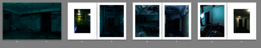
My idea of my photo book layout is to have it seem like you are the photographer wondering through interesting spaces, where you start with the oldest most untouched, to then gradually transition into the newer, more common areas. Places like this abandoned hotel had broken rooms, rubbish left everywhere, and showed a trace of people, or templates for where people used to be, which I liked a lot and found the space in itself very uncomfortable but interesting.
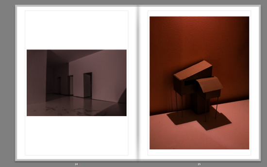
I also had inspiration from some other artists like Thomas Demand who created models and photographed them in very unique ways, so I created my own and wanted to try different angles and lighting to capture a sense of liminality, the first image looking like a hallway, but is a bit of folded paper with some doors cut into it, and the image on the right where I made a model of a type of house out of cardboard, and wooden sticks.
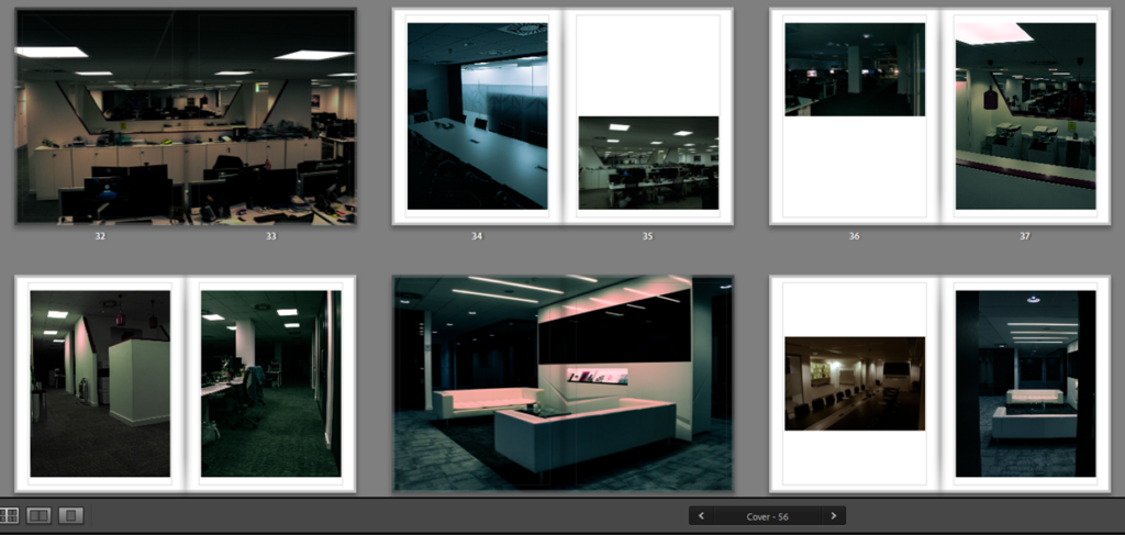
I used contrasting layouts which use warm and cold images opposite each other, with some warm and warm, and some cold and cold. I like thought about where the readers eyes go to and from when they open the next page, and used specific images which would make someone’s eyes flow on the page, especially in the office buildings, it switches up some of the layouts so it doesn’t seem boring.
Overall I Like how my photo book is laid out because of how it transitions from older areas to newer and modern areas, meaning in itself the photo book is being a liminal space as a “state of being” . Moreover, the templates I have used for each of my images work very well, as most of them are bold and eye catching, and the ones which are smaller, are more interesting for the viewer, as it makes them look closer, but also feels nice to look at. My choice in the double page spreads are well used because of the bold more ominous images are right in your face which puts you more into the “situation” I was in.