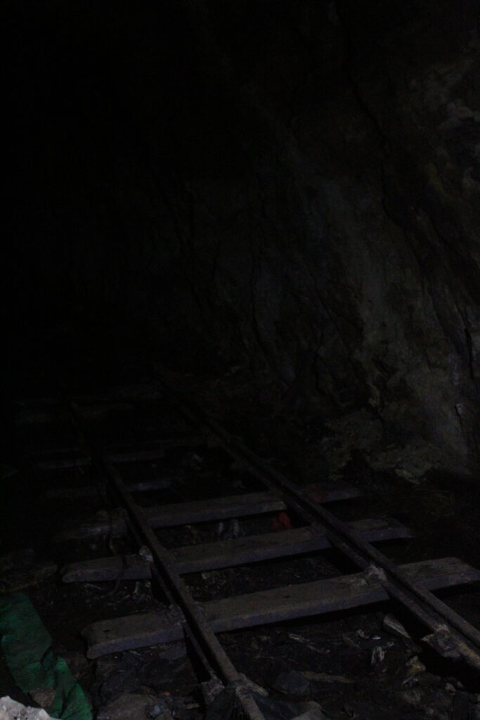
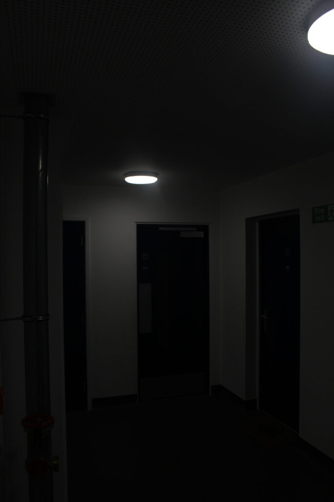
For example this image was originally dull, dark, and doesn’t have anything really clear to look at in the image.
By exposing and contrasting the images features a lot more, with adjustments of highlights and a bit of clarity the image started to look visible and more aggressive. This was one of the type of styles I was aiming for:
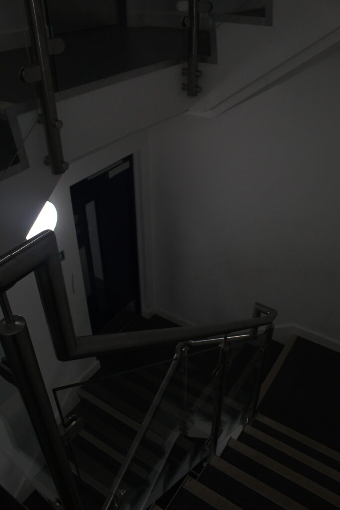
Here I used the same features as I did with the first photoshoot edits, as I did this throughout most the images. The other type of style I was aiming for was, a soft, grainy, hazy feeling.
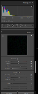
By increasing sharpness and “noise” of the image it created a type of “memory” affect, where you would have an unclear look and feeling about what the image is or where it came from, but is recognisable.
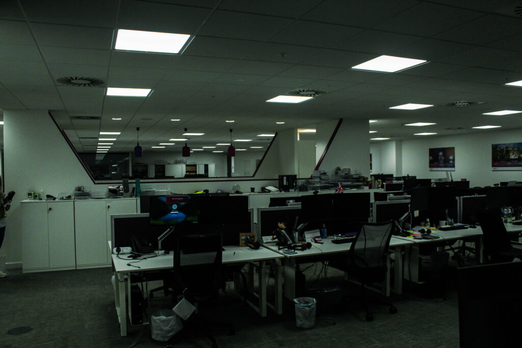
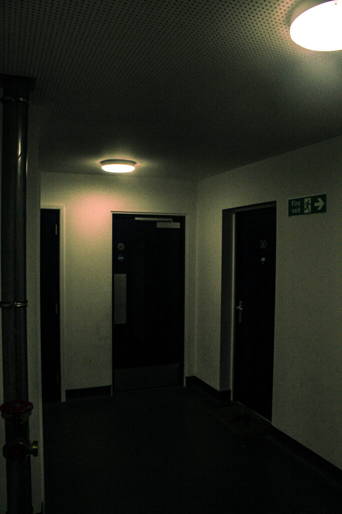
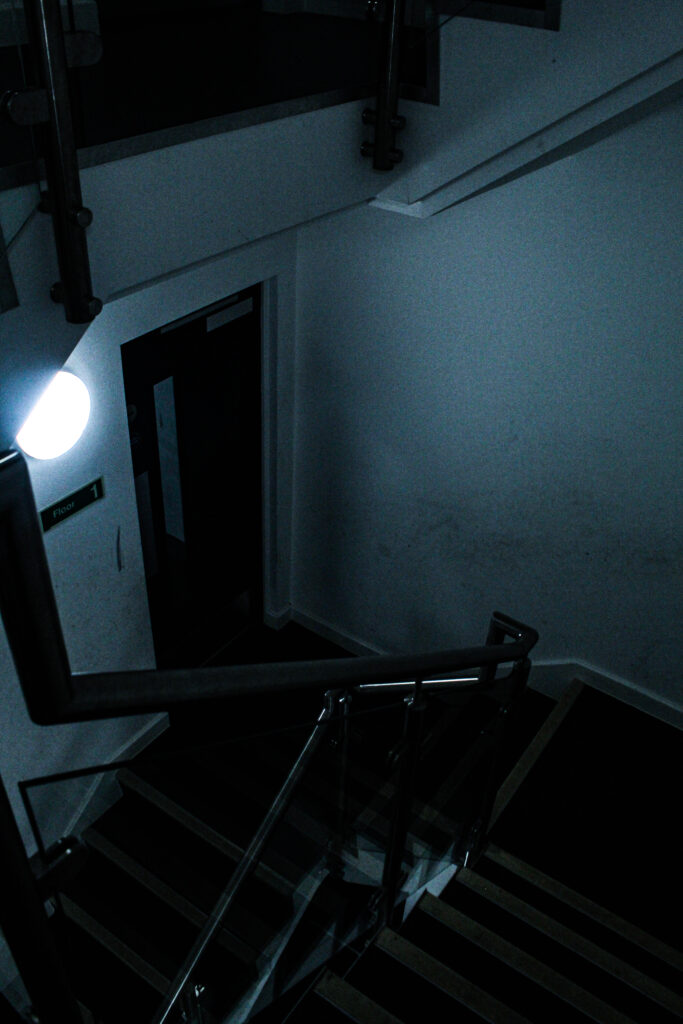
My images switch from abandoned areas which aren’t accessible, to slightly more accessible familiar places like office buildings, which people don’t really see during the night or closing hours, which will make the space seem uncomfortably familiar because of its empty essence.
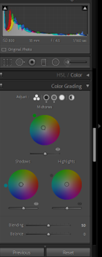
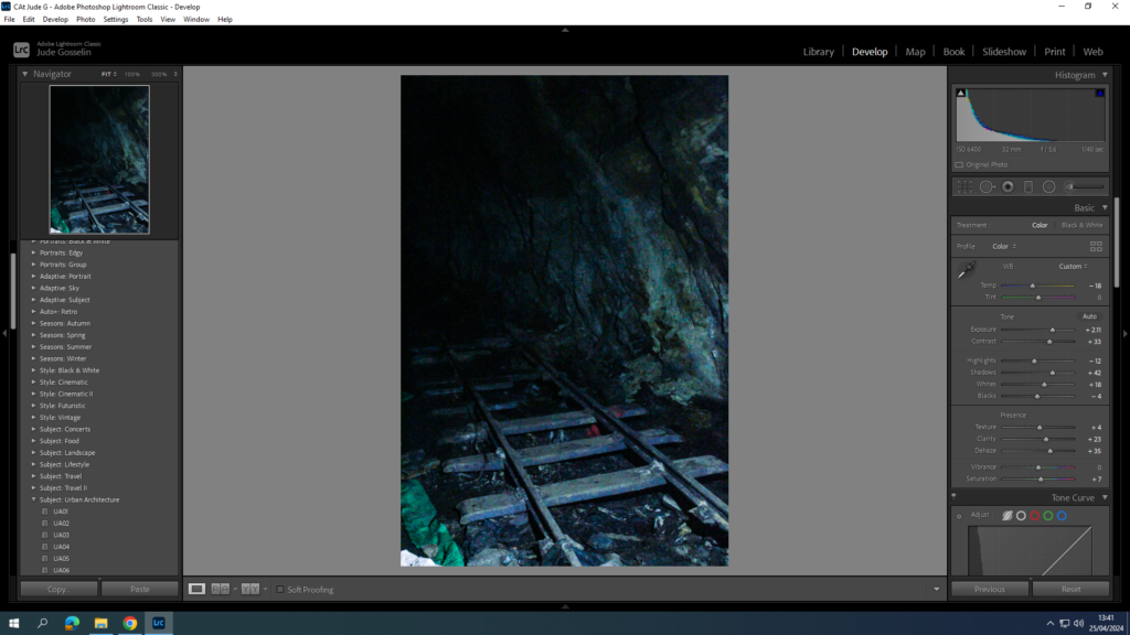
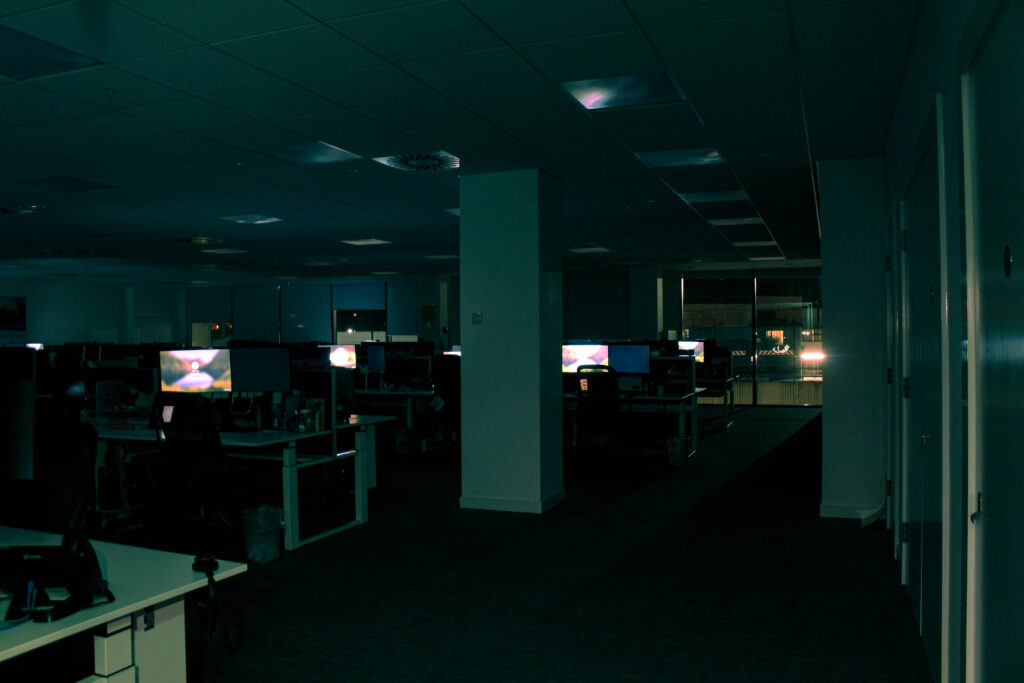
A theme of editing that I held consistently in my images was a type of “vintage” or “Distant memory” style, by simply using high contrast, and making the Mid-tones slightly green, and the shadows slightly baby blue. This would create a cold vintage look. However with my warm images:
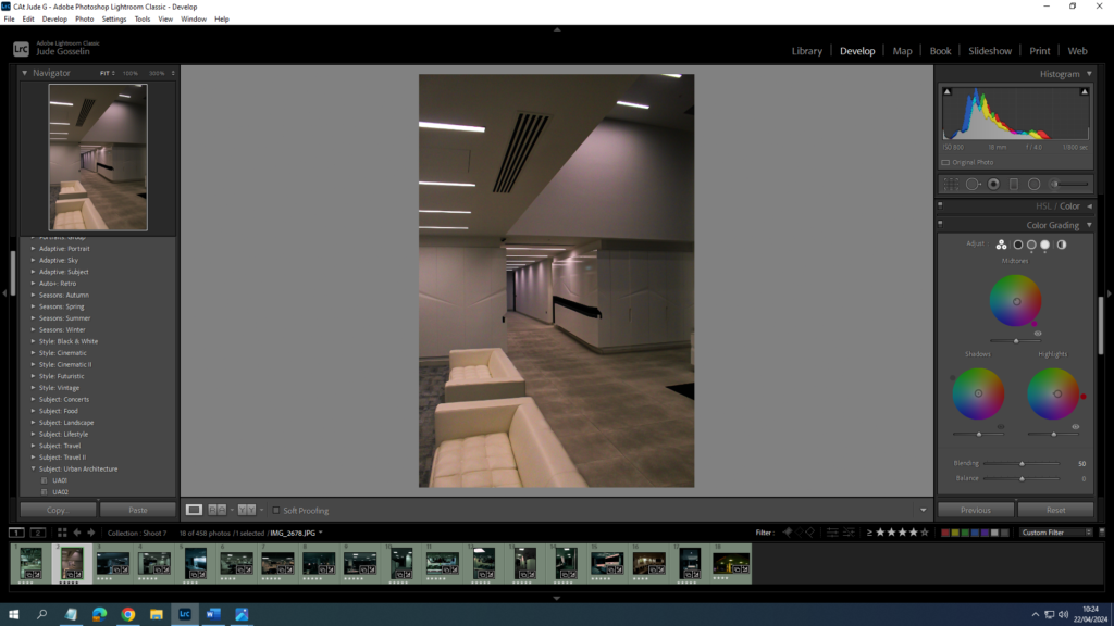
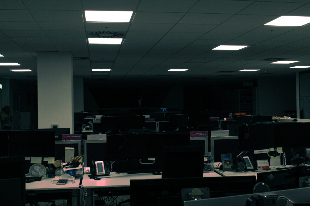
I would use more Red, pink, and orange colours for the Mid-tones, shadows, and highlights.