Front cover:
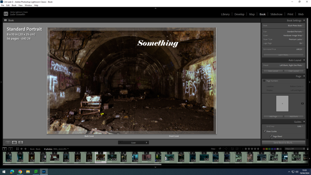
so far I am finding a suitable font and name for my book. I have chosen this type of image, as I think caves with a lot of mess attracts peoples eyes into what they are looking at, and where they might have or have not seen it before.
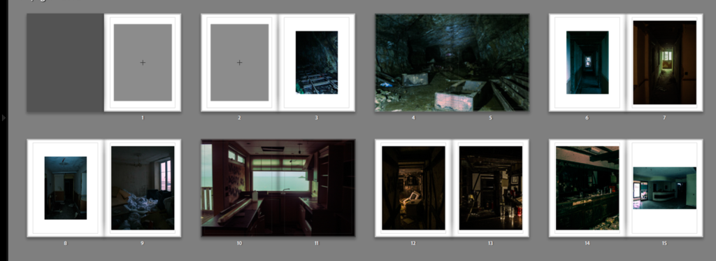
I have used a good consistency of page designs whilst not having a clustered look. I kept the nice look of warm and warm images or warm and cold which contrast each other and work well together.
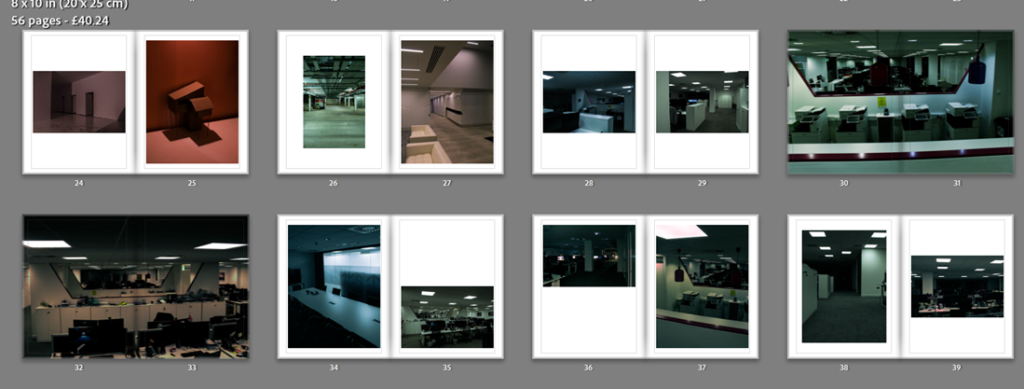
All the images I have used here use the same context as each other, for example what subject is in the image and what is included in the images, like the use of lines and their direction. My choice in double page spreads was to do with how strong the image is.
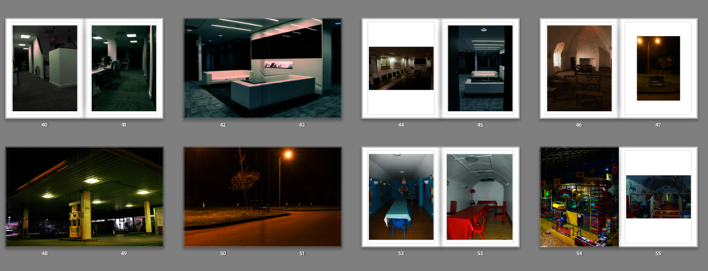
Overall how Lay out my images and what type of images I used, work good together, and I like how they all flow with how the reader is viewing them.