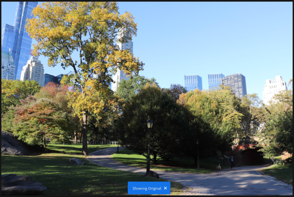
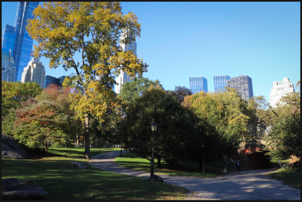
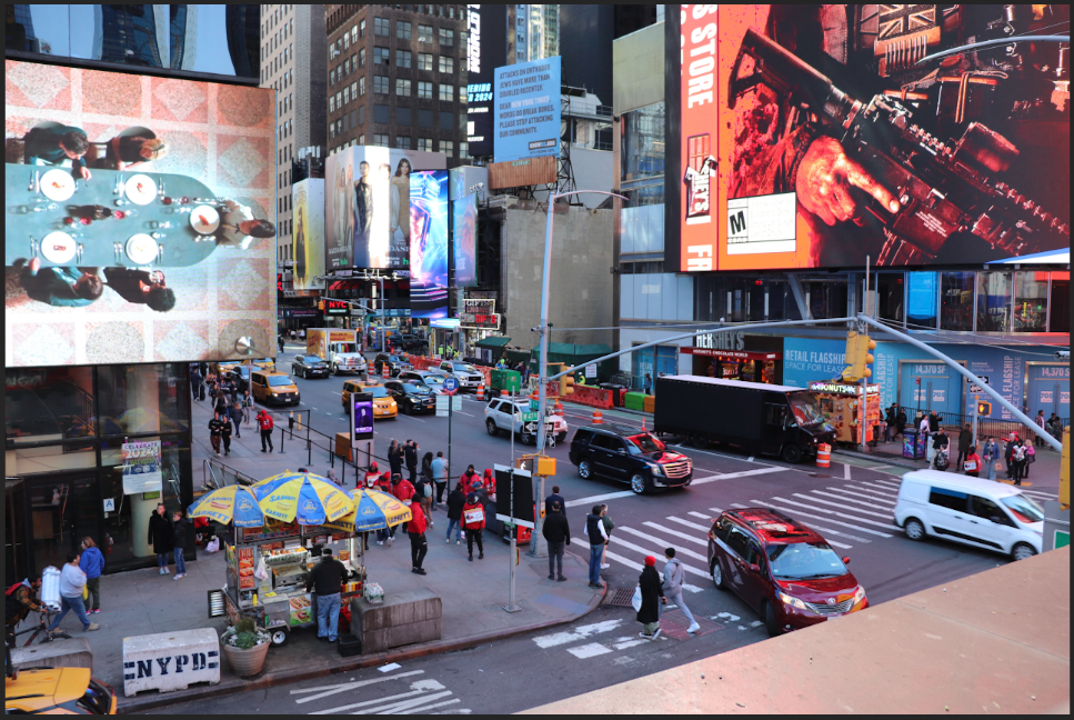
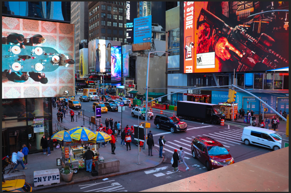
The images I have chosen from this shoot are some of my favourites. I was very lucky to get a majority of sunlight for my trip and so the scenes are full of light and blue skies, which is very important in image making in order to capture colours. I therefore wanted to focus on the colours in the city, with the vibrance tool, instead of the traditionally black and white street photography of New York. I think, especially with the Autumnal colours and crisp blue skies, that this has been effective and I am happy with the results.

The original image is good because of the light, but I think that it could do with a little brightening and increased saturation.
The final image is subtly different, but better as it is brighter and more lively in my opinion. You can see the clearness and crispness in the cold air.


I think the original image is good, but the presence of the graphic adverts and lights of Times Square suggests a vibrant and bright environment, so I wanted to increase this with both vibrancy and saturation.
I think the final image achieved this. The screens are bright and their light shines over the people below.
