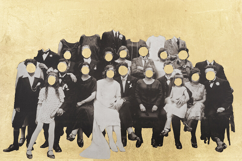
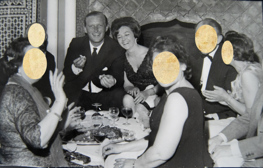
I want to edit some of my archived images in the style o f Benitah because I find her work can present feelings and storied through her editing process. I am going to experiment with her ideas in my own style to present loss and highlight my grandparents in images. Here is some of Benitah’s work that has inspired me:

Rather than prints, I am going to experiment in photoshop because it leaves more room for experimentation and I can produce multiple outcomes.
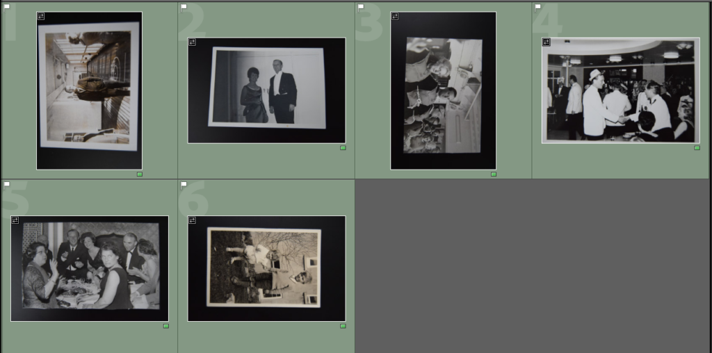
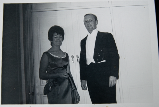
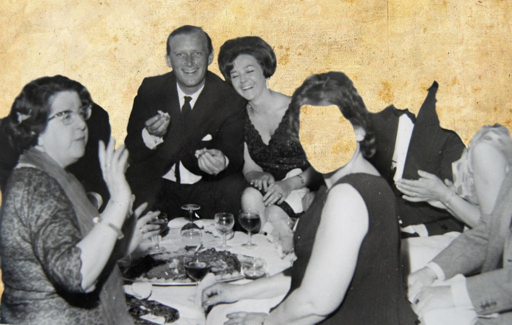
I selected the images I want to use for these edits in Lightroom using the colour selection, and rating them green.
Basic edits
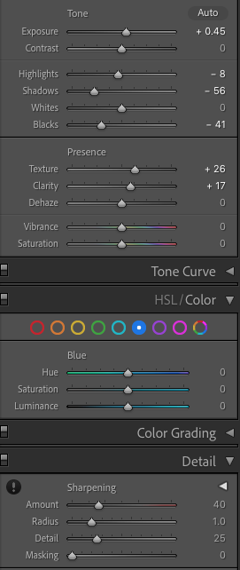
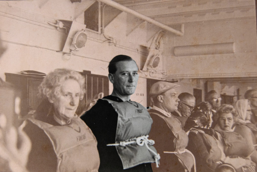
The two main things in the images that I focused on was blacks/ whites and detail. I didn’t edit them too much apart from correcting the amount of shadow and highlights. I then sharpened the images a bit, adding some noise reduction to reduce grain. I also added texture and clarity to define some images and make the details more prominent. Whilst editing I had to think about the quality for printing, and I know (from my previous prints) that adding too much clarity/ texture/ sharpening can cause the image to look worse when printing.
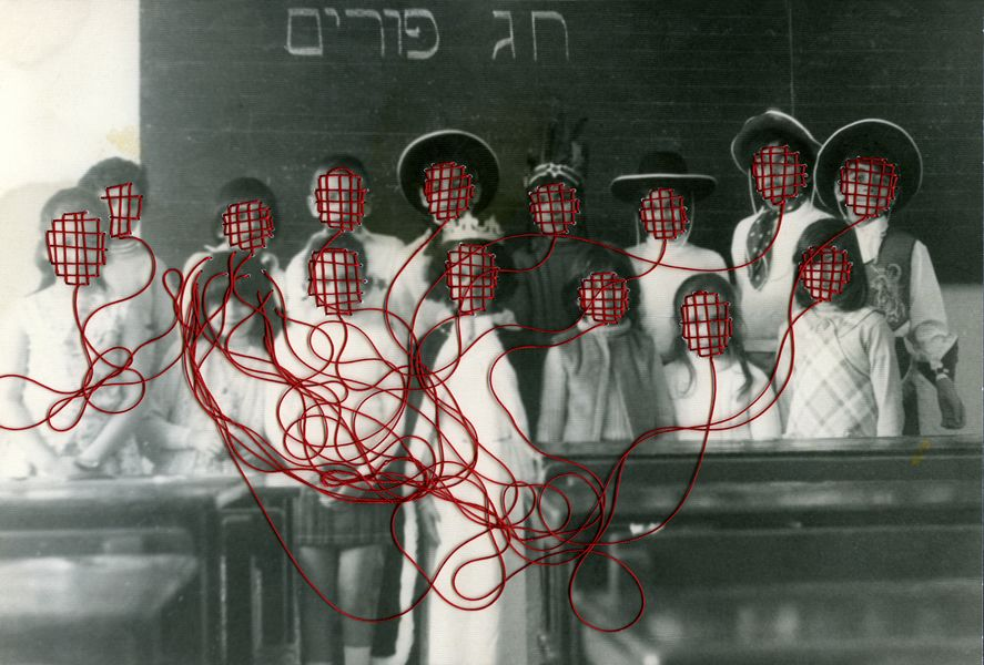
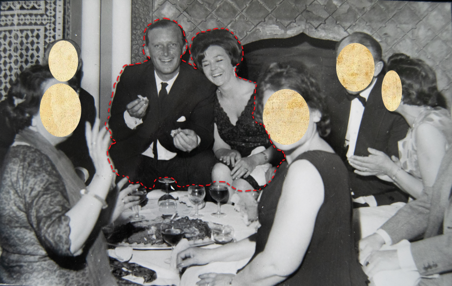
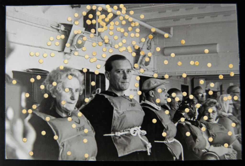
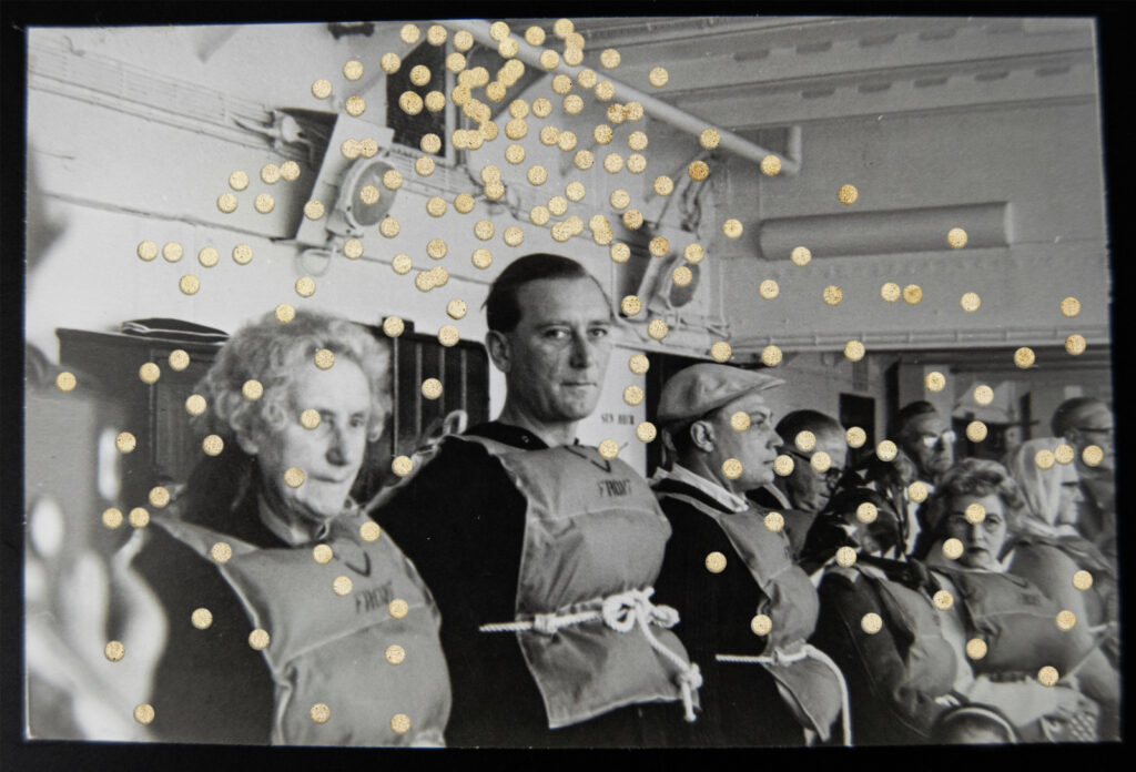
I began editing an image in photoshop in the style of Benitah, focusing on the different shapes she uses to cut out the faces, the tones of red, and how she constructs her edits.
I tried removing the face using the quick selection tool to cut completely along the lines on the face. However I felt this didn’t look right and tried circles – like Benitah.
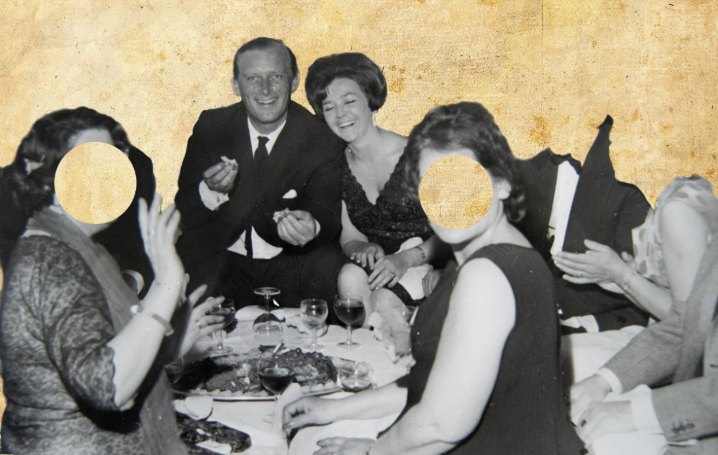
I selected circles, and selected ‘create layer via cut’ to show the background through. However I feel like this would work better with an image with more faces in, so I experimented more.
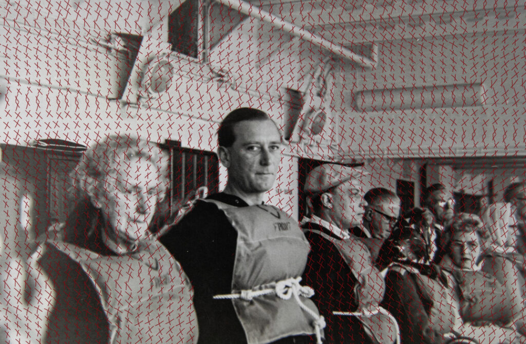
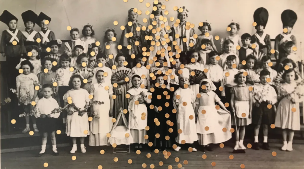
I tried adding the red thread sewing technique that she uses, but with the pen tool. I added a drop shadow to make it slightly more realistic.
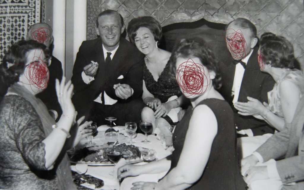
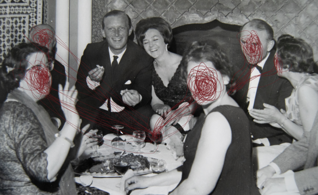
I tried drawing with a darker red on their faces, and made it coe from the wine glass. I have seen Benitah do this a few times in her work, giving the ‘string’ a place where it has come from. I like this edit more than removing the faces, and feel like it fits the tones more.
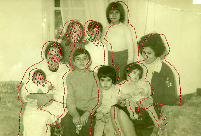
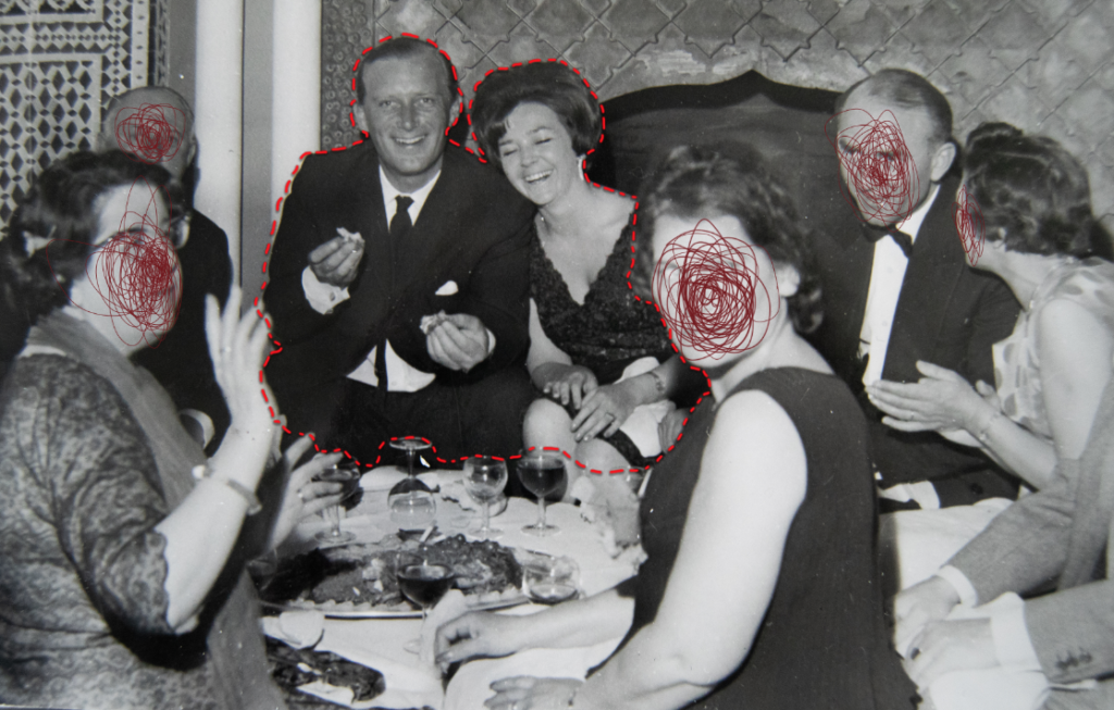
More edits- I experimented with different editing for these images until I found a final result that I liked. I want to keep some subtle because when putting the book together overall I don’t want it to be too much.
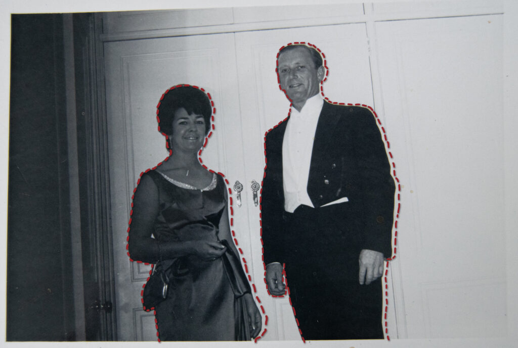
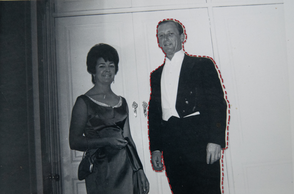
For this image I’m not sure if I should have the thread around just my grandad to emphasise his loss, or if it creates a better composition with them both outlined.
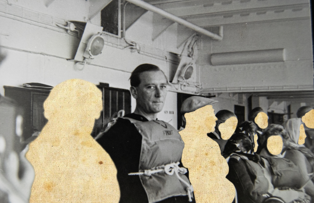
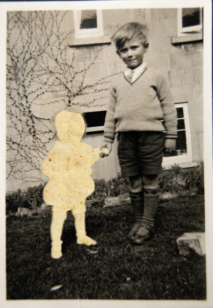
I want some basic edits so I made this image look like burnt paper – inspired by Jessa Fairbrother
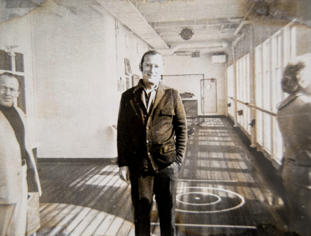
I edited this image of my grandad and his sister, attempting to focus the image on him, however I don’t like the edit and I decided it doesn’t link to the project.