This is a link to an online copy of my book: The Essence of Woman
Monthly Archives: April 2024
Filters
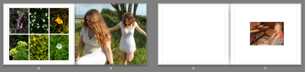
Photobook final layout
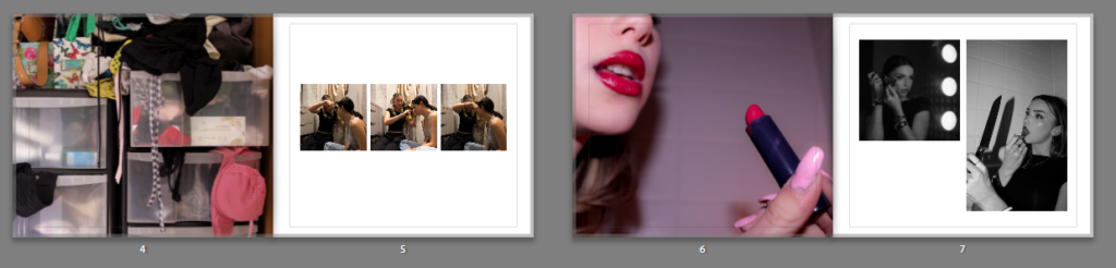
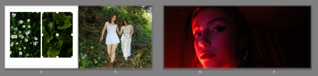
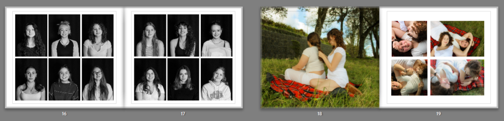
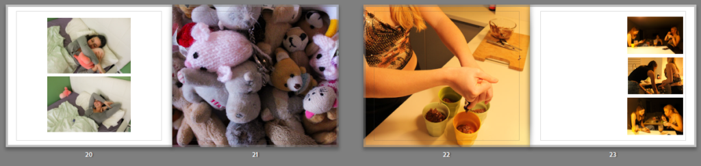
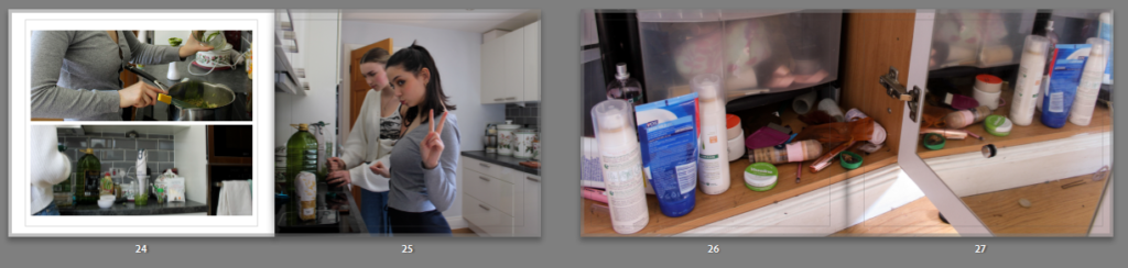
This is the final design of my photobook.
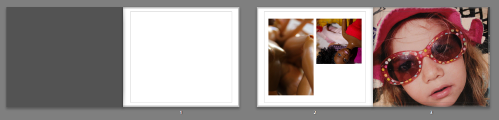
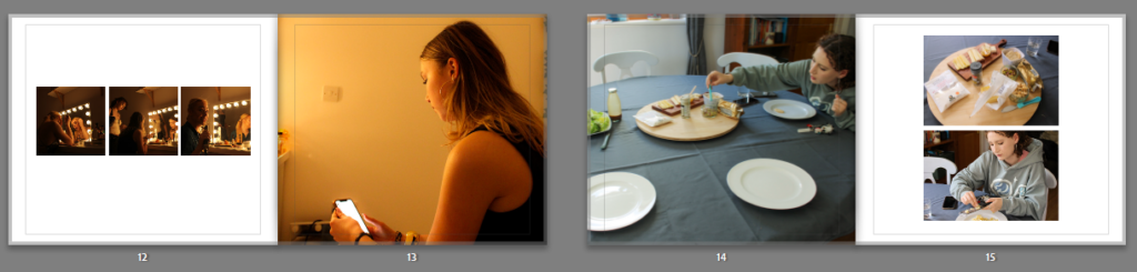
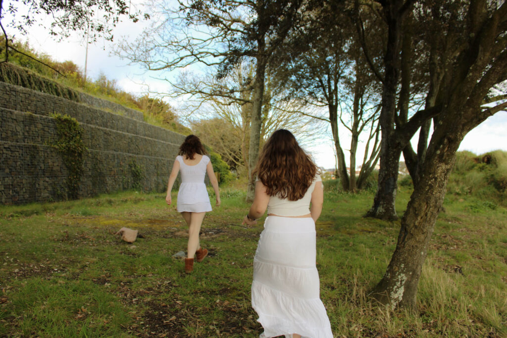
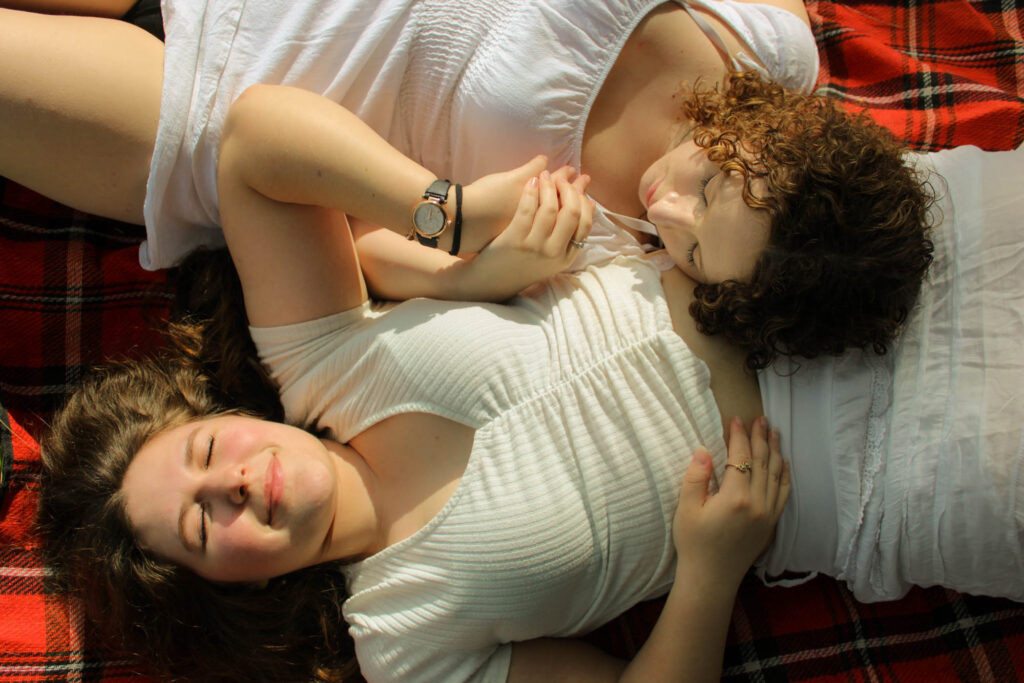
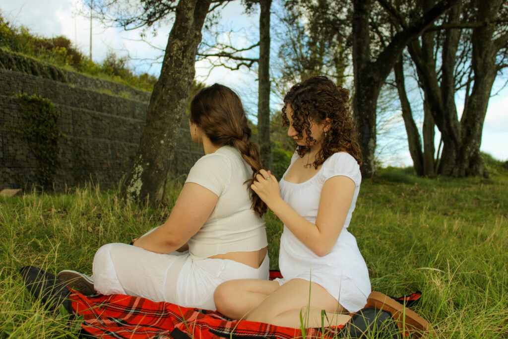
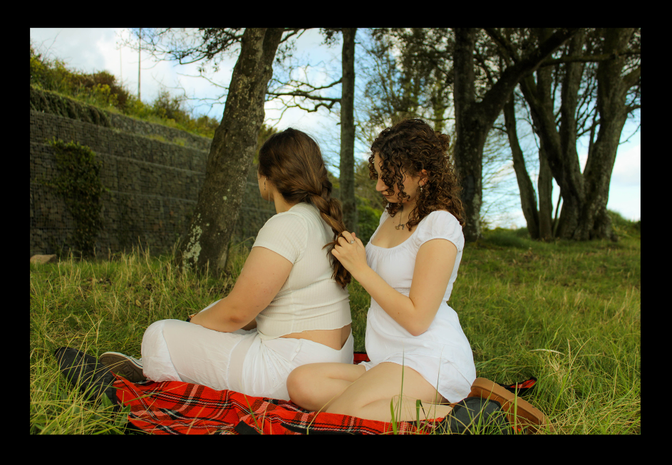
The process of making my photobook was straight forward as I am familiar with the software through making a photobook in the previous project of ‘Nostalgia’. I imported images to edit through Lightroom from my numerous photoshoots, in addition to a few archive pictures I have used in order to portray this idea of girlhood I aimed for, leaning into a nostalgic element from the previous project.
Once I had finished editing my images I simply added my favourite and best outcomes to a collection set which I then used to form the book. Using the templates in the settings, I added in my images to start creating the book. From then on it was easy to complete the book.
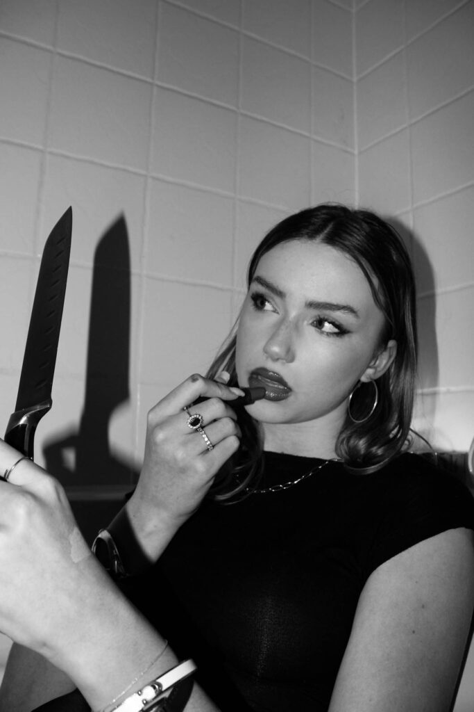
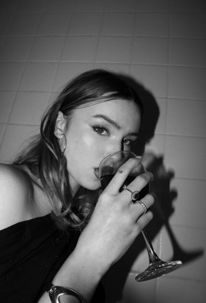
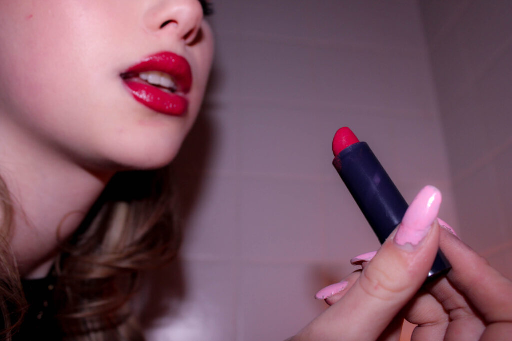
I believe my project has been successful, and I have created some strong outcomes for the theme ‘Observe Seek Challenge’. Taking inspiration from artists like Justine Kurland, Tom Wood, Nan Goldin. I have successfully produced an outcome which reflects the perception of femininity and girlhood like I wished. My photobook shows evidence of this outcome.
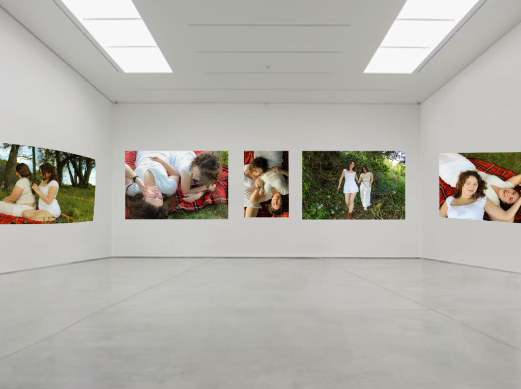
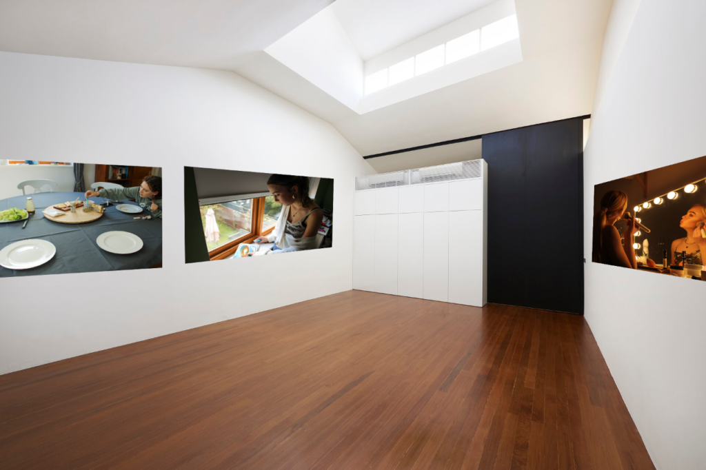
Virtual gallery
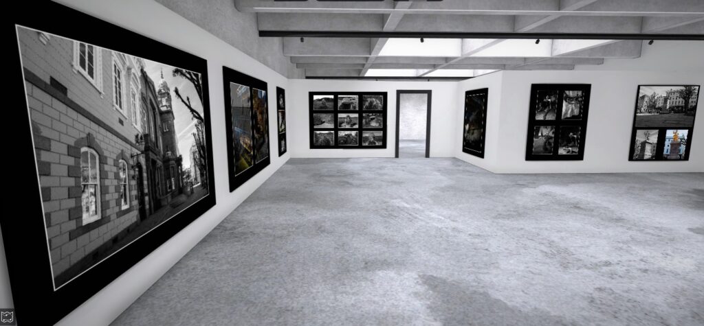
I’ve used photoshop to create a virtual gallery. Using the distort tool to fit some of my best outcomes onto and image of an art gallery. This is to show how I would present my final images from this project in a real life gallery.
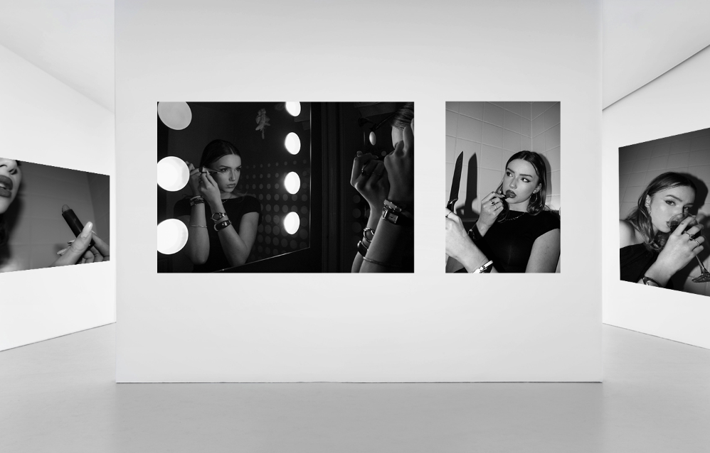
PRINTS: Final outcomes + presentation
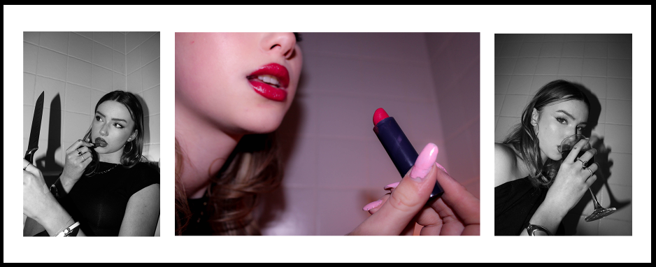
I have selected some of my final images to be printed so that I can frame them. This gives me another physical outcome to provide evidence from this project. These are the photos I have selected:
I have used photoshop to help me plan mock ups of how I want to present my images when framing them. I have organised this into a series of 3 total mock ups.
1
For my first sequence, I have chosen to put these photographs together (one A4 and one A5). I think the compliment each other well and are from the same photoshoot. I will put each photo on an individual piece of foam board, and then use an additional piece of foam board to combine them.
2
I really liked the idea of this photo as a stand alone image. So I have printed it in A3, and will be framing it as a window mount.
3
Finally, I have then chosen to put these 3 images together in a sequence as they’re all from the same shoot and compliment each other nicely. This is a combination of one A4 image (centre) and two A5 images (far left and far right). I like the contrast between having the pop of colour in the middle opposed to the two black and white images. The centre image is less focused on the subject, which breaks it up between the black and white portraits. I think this is a strong sequence as they all contain the subject using props, adding to this theme of femininity and what objects are associated with that.
Evaluation
Photobook
Link to my Online Photobook: An Island Coven; Jersey’s Witches from Ritual to Trial
Virtual Gallery
Written Evaluation
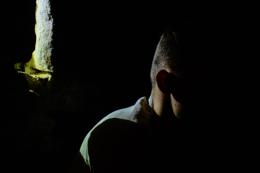
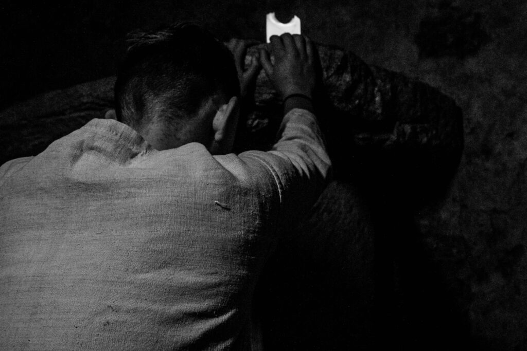
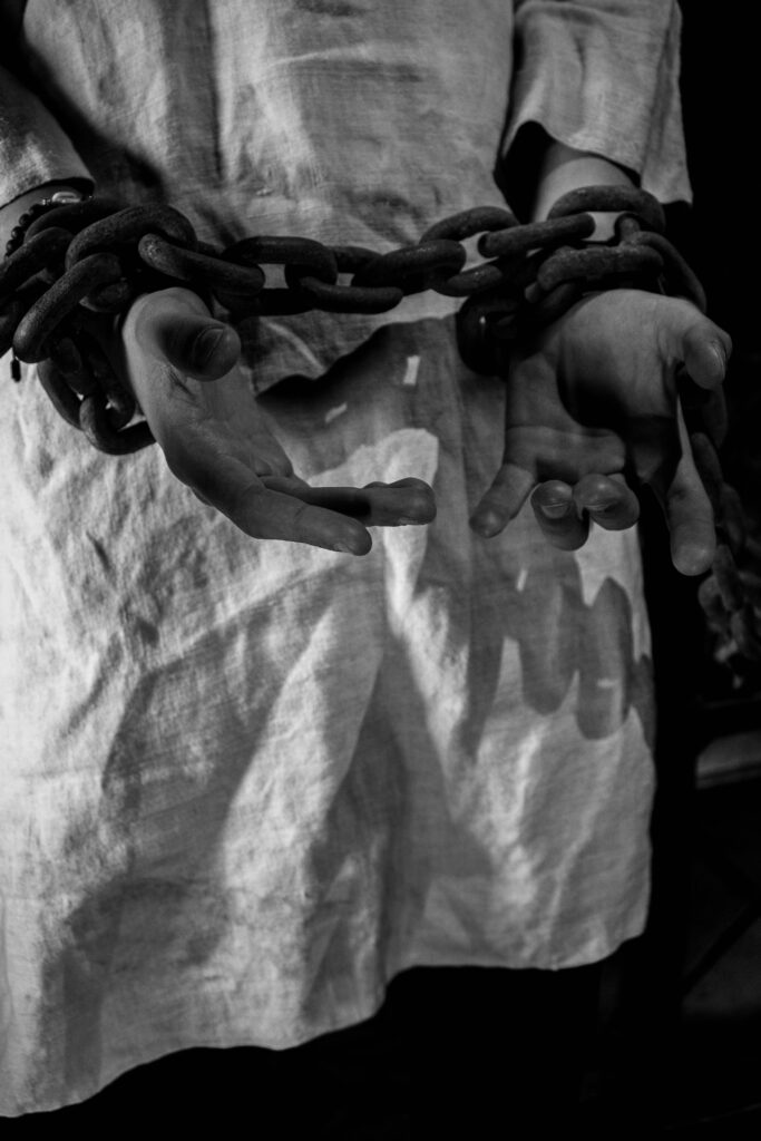
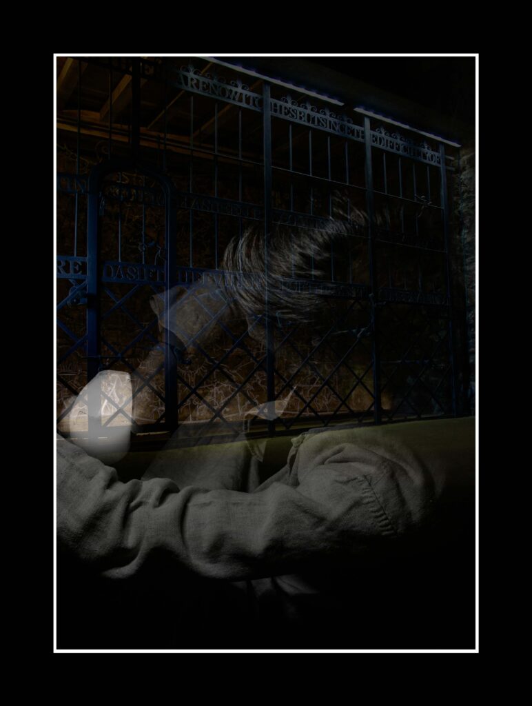
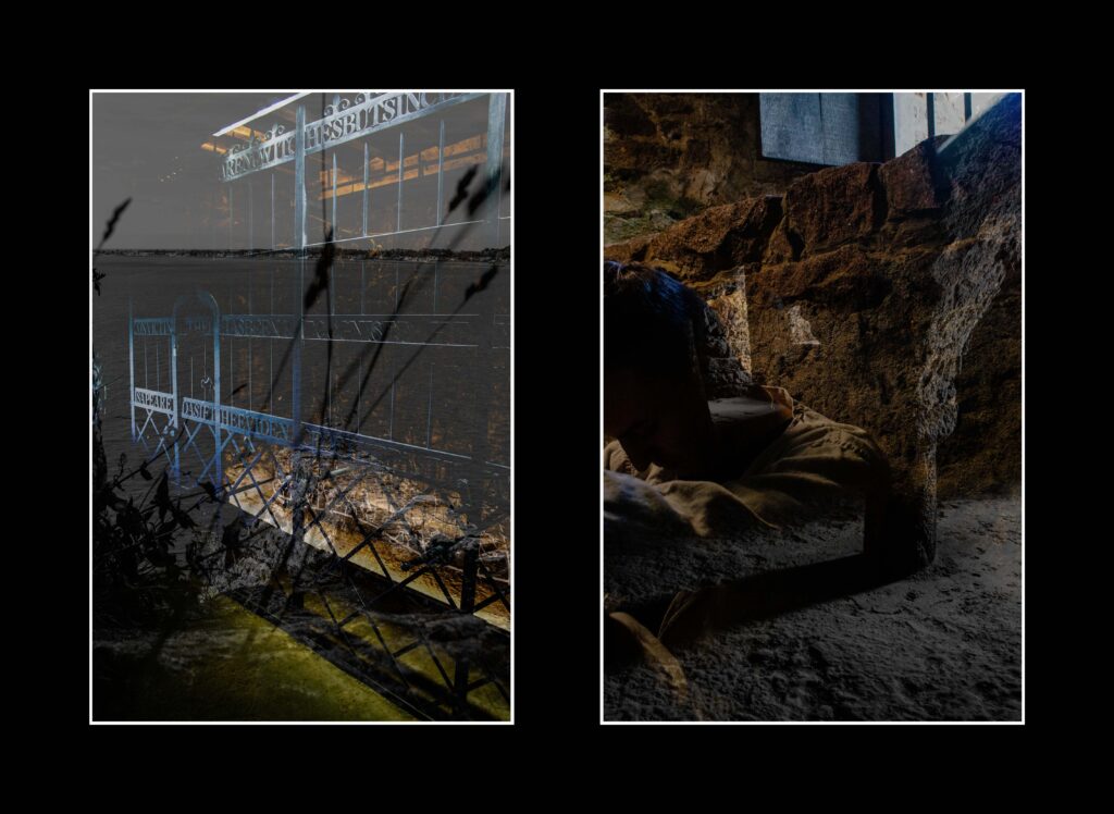
I think that this project was highly successful as I have been able to create high quality, strong images that tell the story of Jersey’s witches. I performed 6 separate photoshoots that were all meticulously planned, and I believe that my best images came from Mont Orgueil Castle. By working with a single actor and lighting assistant, I was able to produce images like:
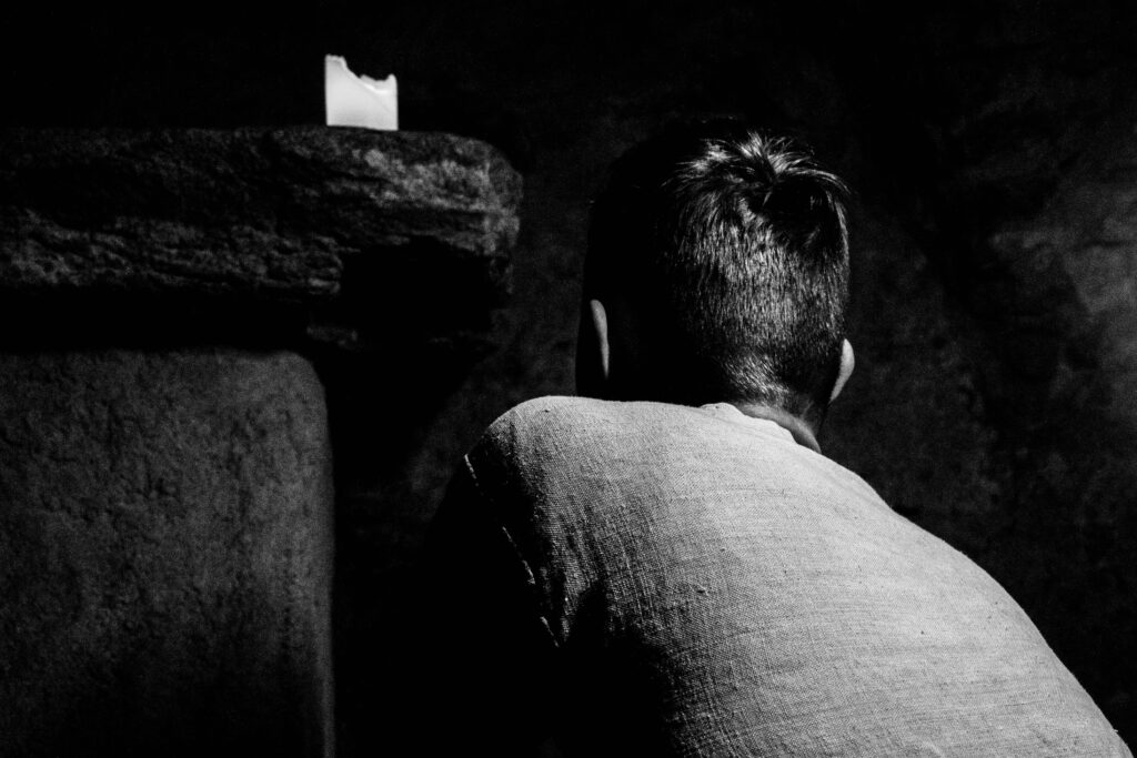
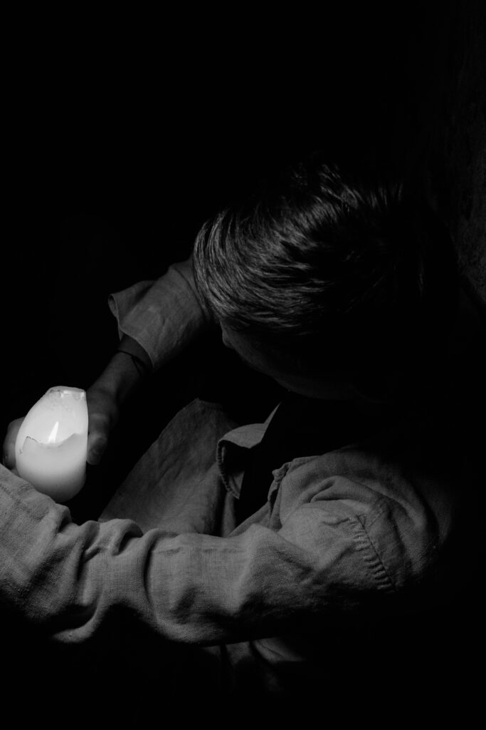
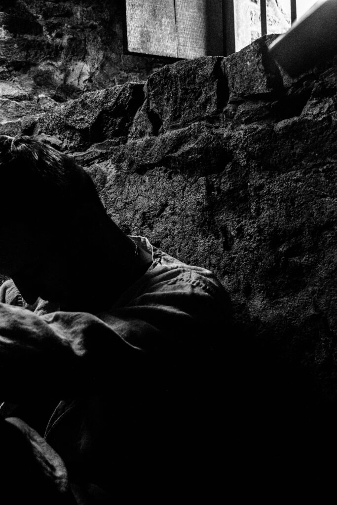
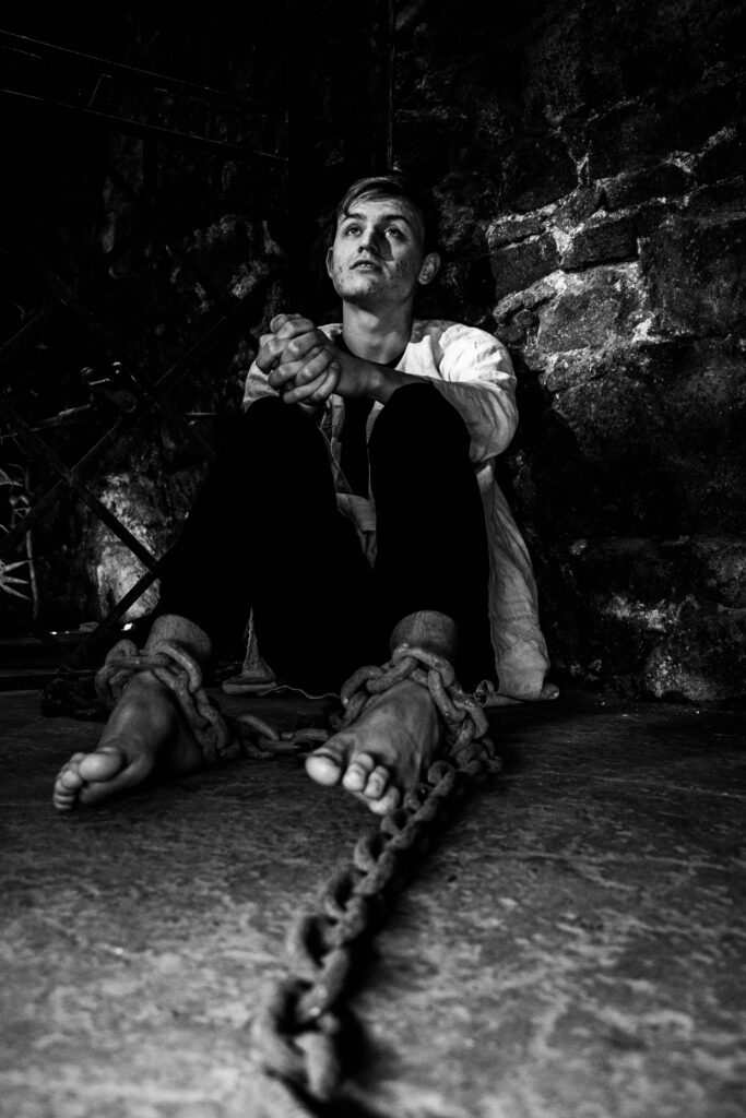
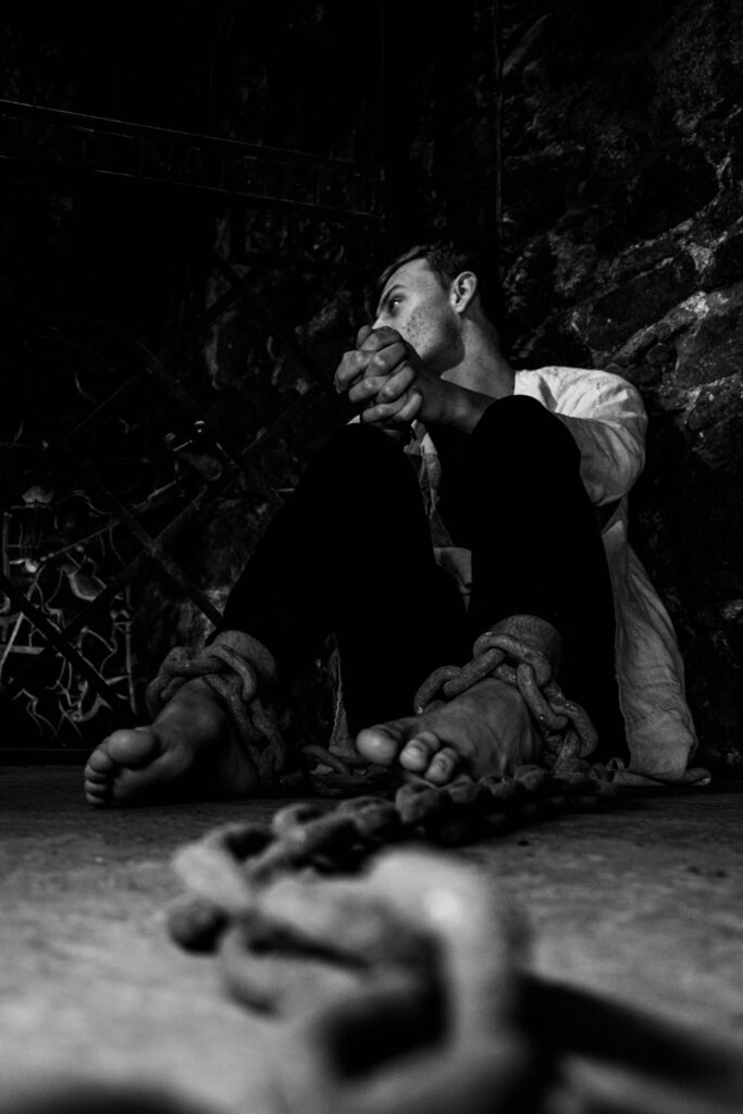
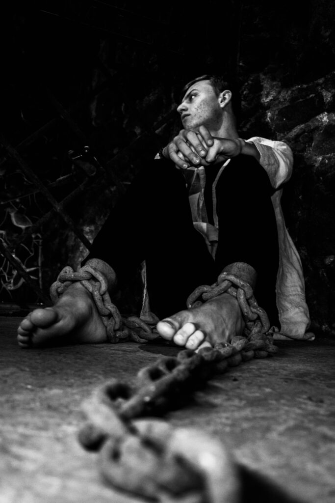
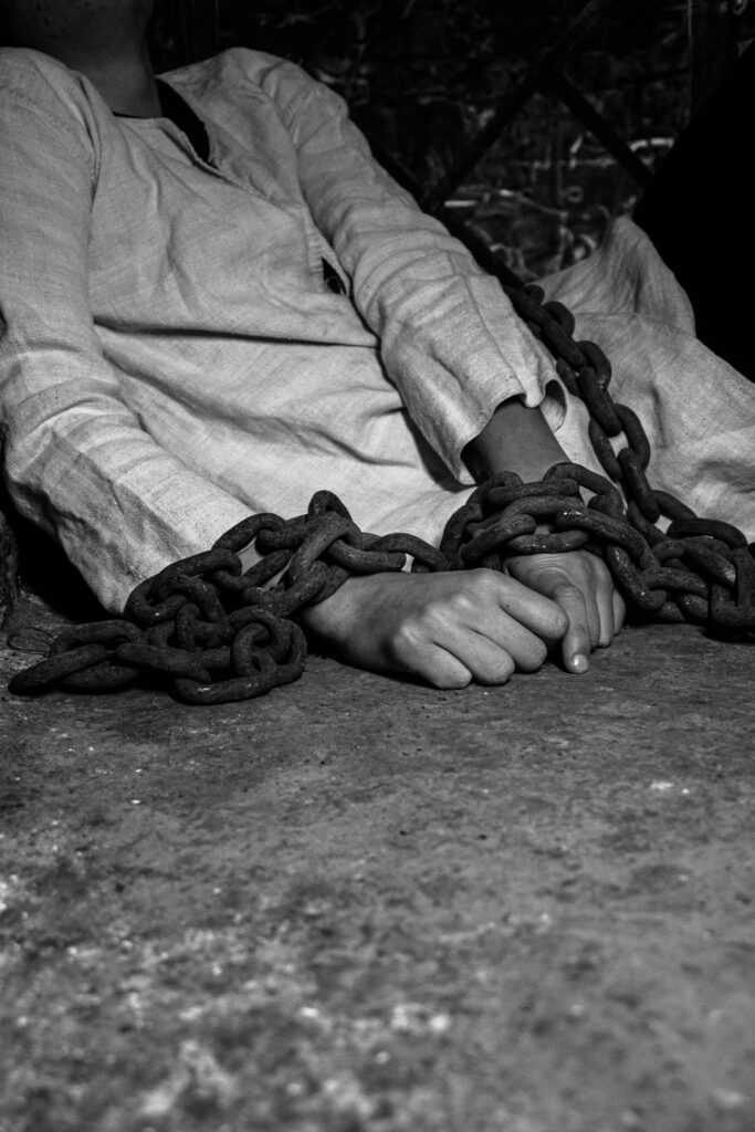
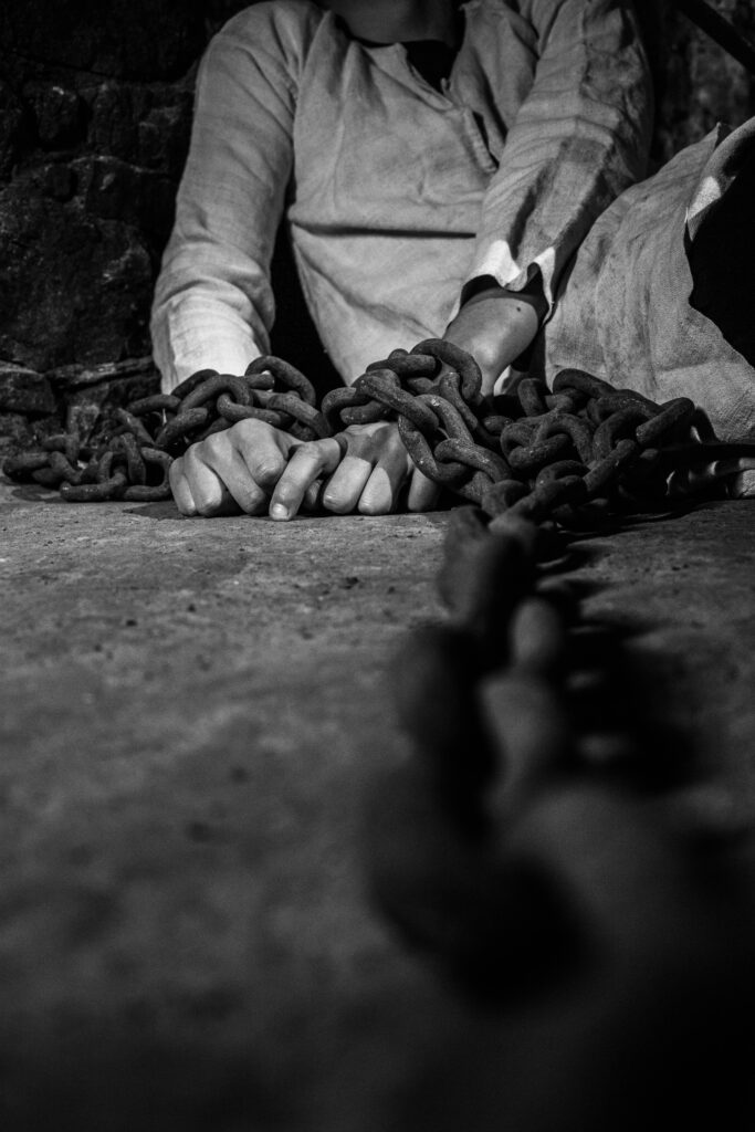
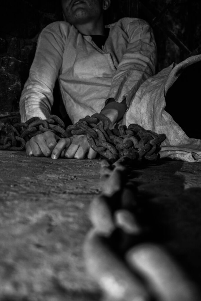
The majority of these images are monochrome to force the darkness to control the atmosphere created by the image. However, I do believe that I could have created more colourised final outcomes.
I did however, use photoshop to create double exposed images that combined both monochrome portraits and colourised landscapes that provide deeper stories and meanings behind each photograph.
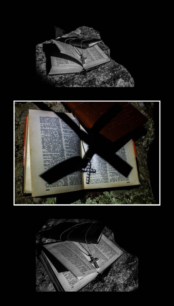
My intentions from the beginning were to tell a story using historical documents and evidence as well as specific sites that were prominent during the infamous witch trials. I believe that I succeeded in displaying this idea through my photobook, finding creative ways to combine the images that I gathered with the information collected from a wide range of resources.
By using Andrea Eichenberger’s series of images from ‘Le Milles Briques’ as a basis, I was able to create emotive photographs in the dungeons of Mont Orgueil Castle, gathering both portrait and landscape images that could be presented together to develop the story.
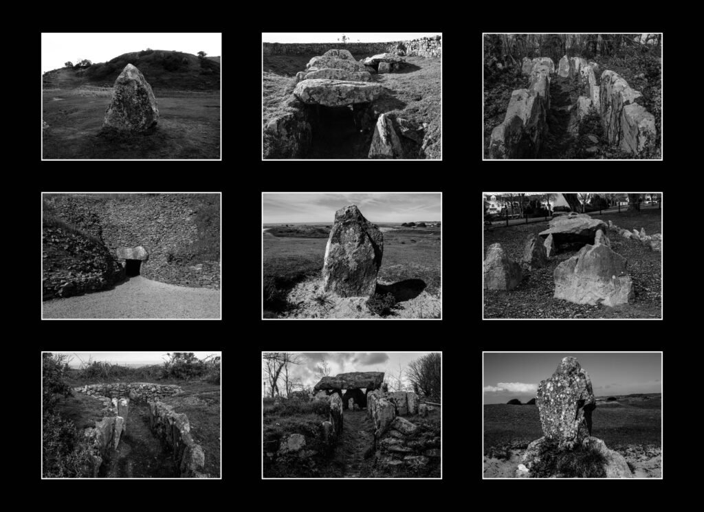
Bernd and Hiller Bechers’ typology techniques are utilised to their full extent when creating my typology study of the dolmens and megalithic remains around the island. I also kept these images monochrome to not only create a historical atmosphere but also because at the time when the Bechers’ were creating images, they were restricted to monochrome imagery.
Some of Sesh Sareday’s images directly influenced some that I used in my project but I feel that they would have better suited a more paranormal study, incorporating slow shutter speeds and shadows more so within the project. Despite this, I believe that the overall project was a huge success in how I took the idea of witchcraft and developed into a personal, historical study, directly relating it to my own interests and the island’s history.
Evaluation
How my final images fit into the theme of Observe, Seek, Challenge
Observe: Observing the use of technology around us.
Seek: Seeking nature in this world of technology
Challenge: Challenging technology addiction
How I feel
Overall I am very satisfied with how my project developed. The photobook really is a visual representation of the story that I wanted to portray and it has also been really eye-opening to me due to my in depth research about the negative connotations when it comes to technology. Not only did I chose to focus my study on technology vs nature to help other people understand about this problem but also to create some clarity with myself about my future of constantly using technology.
How they turned out
My final images look professional and I am glad that I chose to do many photoshoots to really show the effects of technology on older and younger people which very much helps me elaborate my point.
What was challenging
However I did face multiple challenges with this project which isn’t always a negative factor due to me just needing to use more creative ideas to go around these obstacles. One major obstacle was the weather in Jersey. This greatly impacted my project due to a lot of my images representing nature needing to be archive images, this is because In my photobook I wanted to create a powerful contrast between my images of technology which I wanted to present with negative connotations with a darker and more dystopian feel where as for my nature images I wanted them to be bright using the natural light from the sun and the vibrance of plants but due to the season that I did my photoshoots in It was often raining with a lack of sun and a lack of nature due to many luminous plants being killed in the winter. Another major obstacle That I faced was while developing my photobook some of the images where not as high quality as I would of liked them to be which meant I needed to make some sacrifices. Such as I couldn’t use a lot of my archived images due to them being shot on an older iPhone and some of the more powerful images that I wanted to be on a double page spread in my photobook I had to make them cover only one page or they would of printed out pixelated. Also on my front cover I couldn’t use the image that I wanted and felt would best describe my photobook as a whole from looking at it due to it again not being the right image size.
Artist references
Something I also regret looking at is the limited amount of photographers who tried to capture the same style that I was aiming for since it consumed a lot of my time trying to find artists to find inspiration from. Though on a positive note I am very happy with some of the photographers that I manged to find such as Andreas Varro and Eric Pickersgill due to our similar ideas and I found their work really captivating and inspiring which Overall gave me multiple more ideas of photoshoots than I originally had. I really admired how Andreas Varro created his work to portray a dystopian, unnatural world within his images while trying to prove a point of what our future could look like if we keep going in this direction. Where as I really liked how Eric Pickersgills main focal point of the image which was portraying technology just for it to not actually be in the photo. Almost trying to create a visual representation of how our body’s look while using devices and how unnatural it actually seems.
Developing this photobook has also helped me understand Lightroom classic a lot more than previously when developing my old book. I wasn’t very satisfied with how my photobook on nostalgia turned out as I had limited photos to captivate what I wanted to so seeing my photobook online now has installed me with much more confidence then I had previously about making photobooks and just my general photography skills.
Framing and Mounting
The Images that I have Printed have been organised into a variety of diptychs, triptychs and typology arrangements. Some images however, worked better to be presented as solo outcomes. The majority were presented in window mounts, while a few were mounted onto foam board or using both techniques. When planning how I wanted to present these images, I created a series of mock-up pieces using photoshop software.
Final photobook
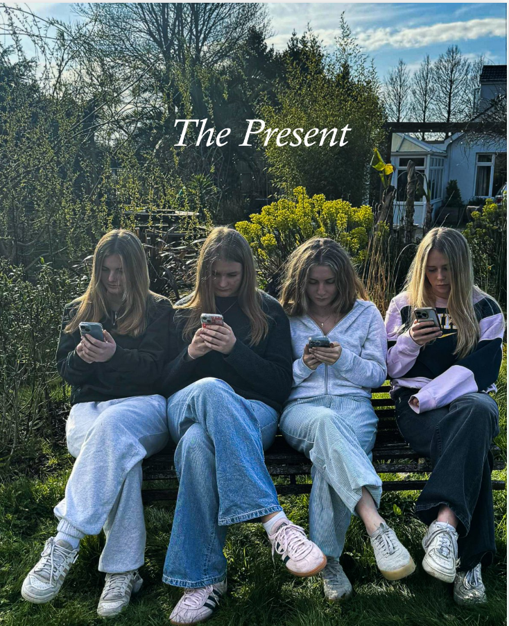
Here is a link to my online photobook; Titled The Present
PHOTOBOOK: Concept + Narrative + Design
NARRATIVE
What is your story?
Describe in:
- 3 words
- Girlhood and femininity.
- A sentence
- Creating documentation of what girlhood is through exploring aspects of femininity in teenage girls.
- A paragraph
- Depicting girlhood through themes of femininity and identity. Exploring different forms of gaze to capture what it means to be a woman and creating images which explore the lives of teenage girls.
DESIGN: PLAN
How you want your book to look and feel: I want my book to look hyperfeminine and very stereotypically ‘girly’. I want it to create a feeling of nostalgia and comfort. The images vary slightly in terms of how I’m wanting to portray these aspects of femininity, and I want my book to reflex this variation.
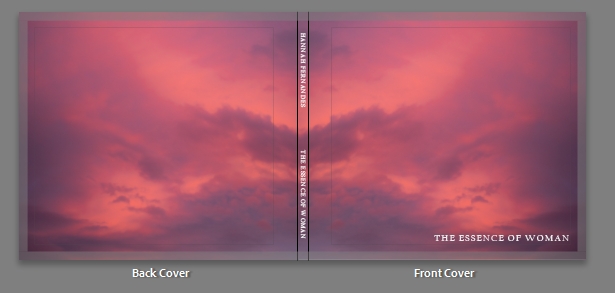
Paper and ink: Hardcover book with premium paper and lustre finish
Format, size and orientation: Standard landscape format (25cm x 20cm)
Title: The title of my book “The essence of woman” is something I thought of at the very beginning of this project. I think it portrays my intended look and feel for my book. It communicates that the book is about what it means to be a woman, showing young girls who are developing into womanhood. Yet they still carry their childlike tendencies and appreciating nostalgia.
Virtual Gallery
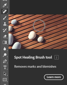
To create my Virtual gallery I used photoshop as I would be unable to do it on Lightroom classic and due to the internet ban I wasn’t allowed to use what I normally use which it “Art steps” Firstly to to pick my gallery I went onto this folder

and chose which gallery’s I liked the most. Then I uploaded my final images to photoshop.
Due to some of the images having photos on them already I used the “Spot healing brush tool” to create an empty canvas to put my images on.
I then dragged the image by unlocking the background image onto my virtual gallery
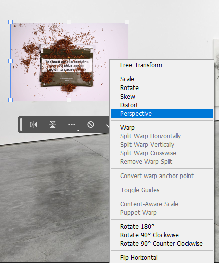
Then I pressed “Control T” to downsize the image and then i pressed “Perspective” By right clicking the image to make it look more realistic hanging on the wall
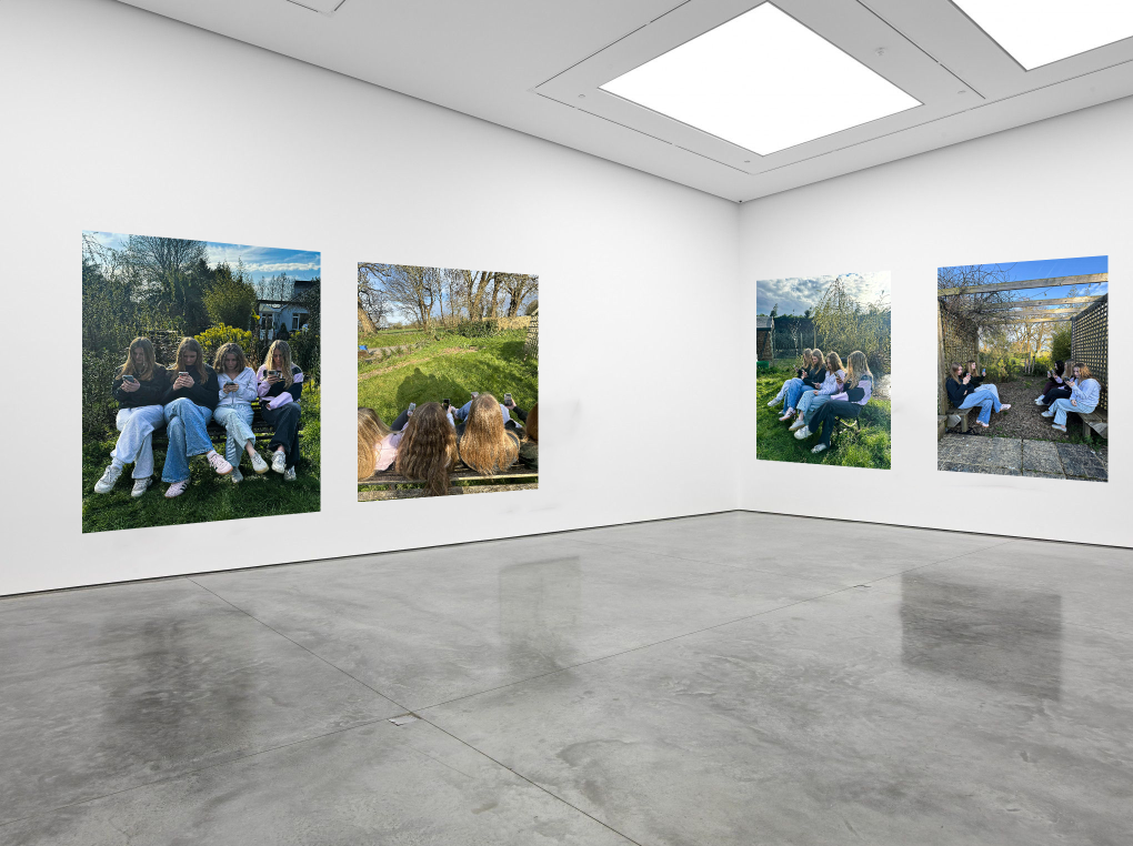
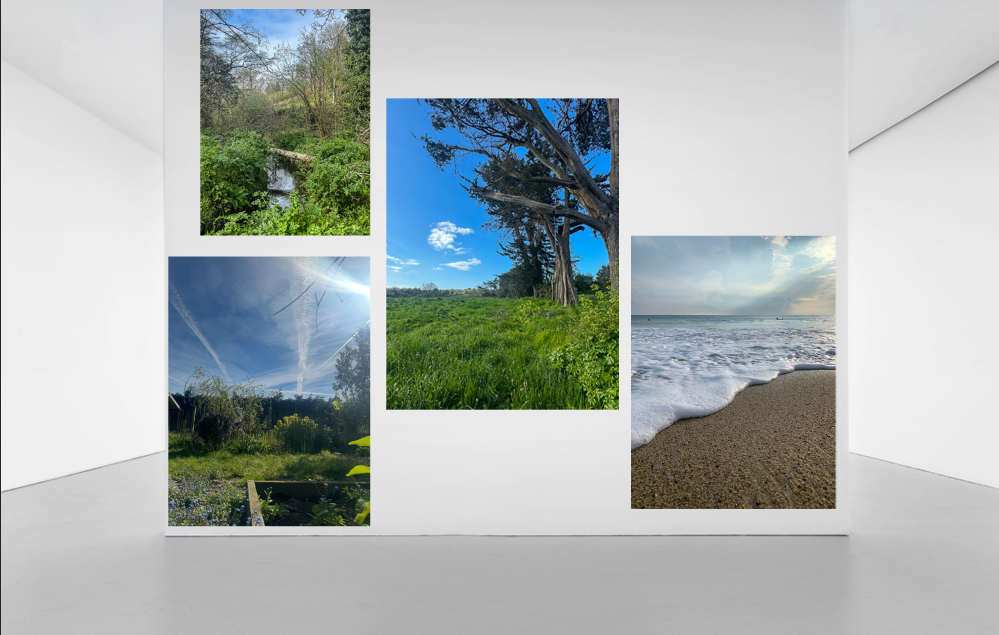
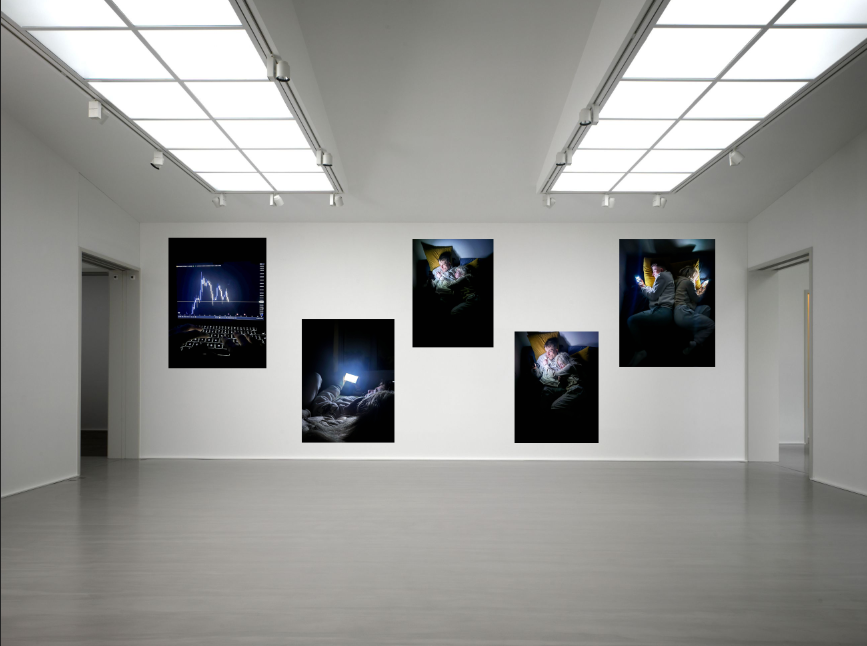
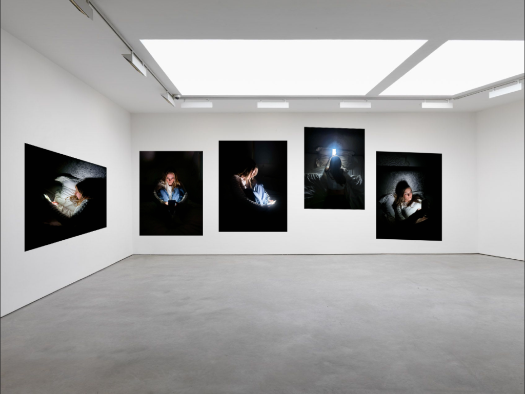
Overall I’m not too happy with the final outcomes due to the fact that I never really use photoshop so I’m not used with how to work it. I generally don’t think that these images look as realistic as my old virtual galleries did on Art steps. But doing this process has helped me become a little bit more confident with working on photoshop.