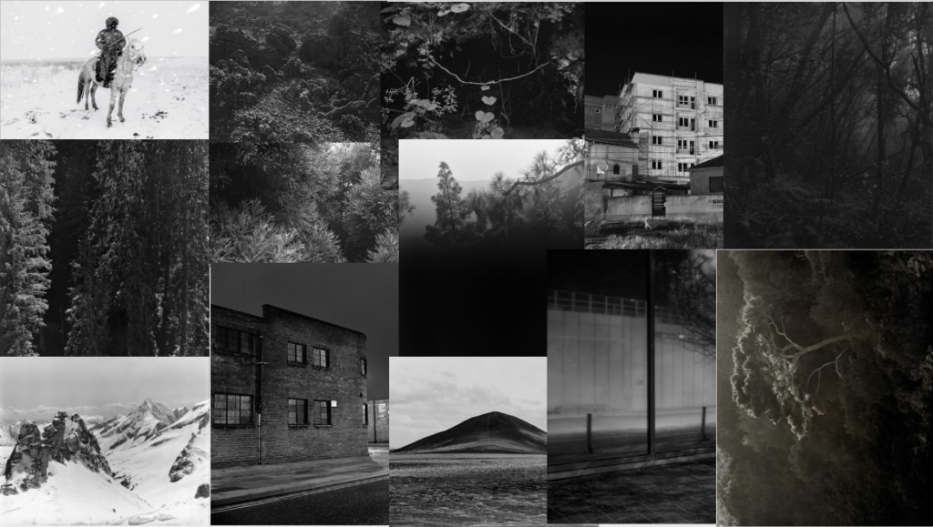
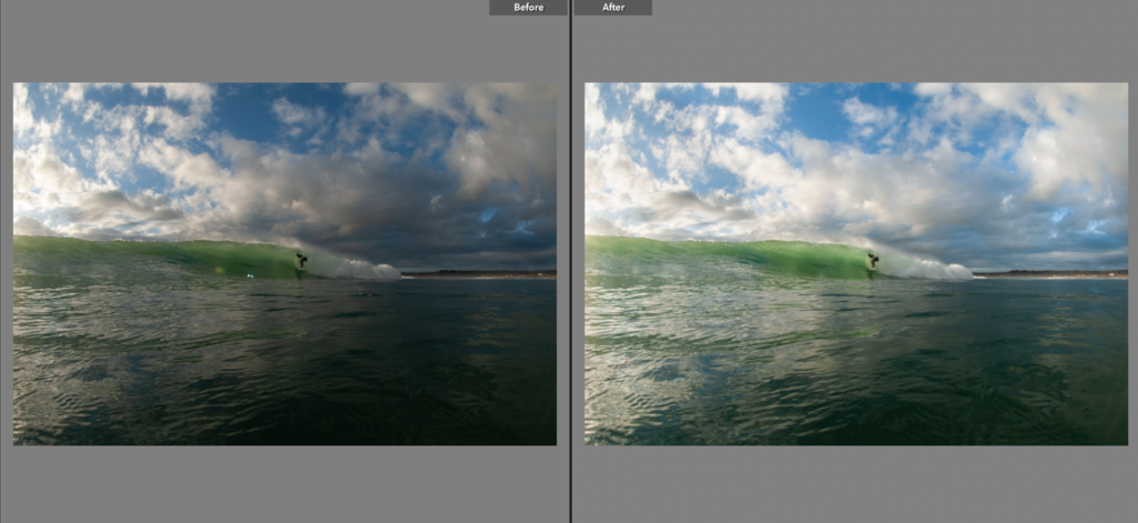
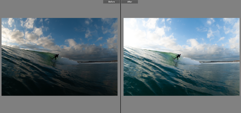
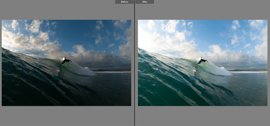
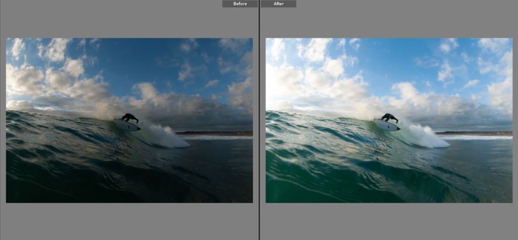
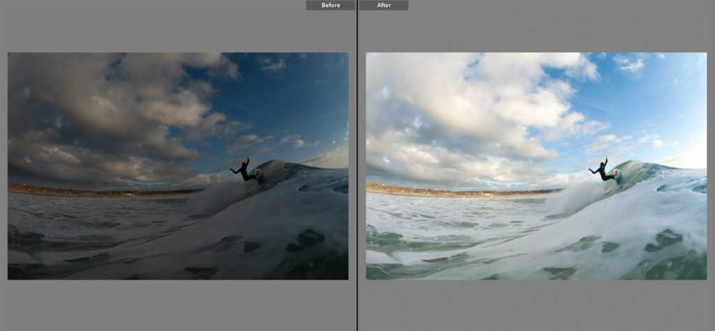
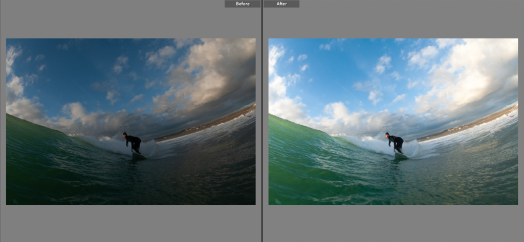
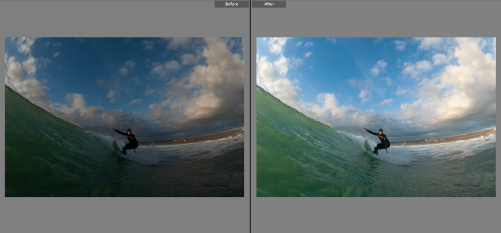
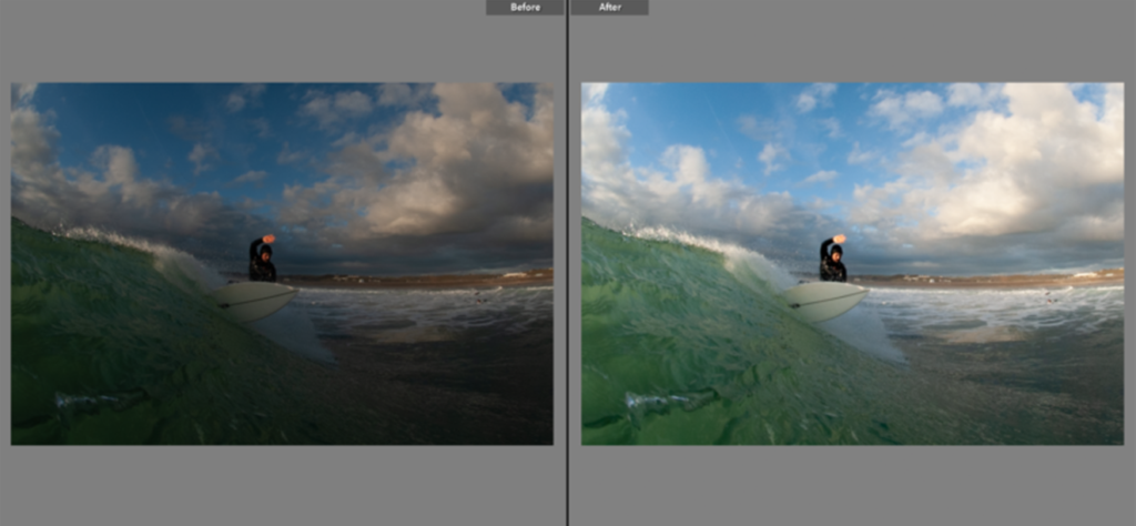
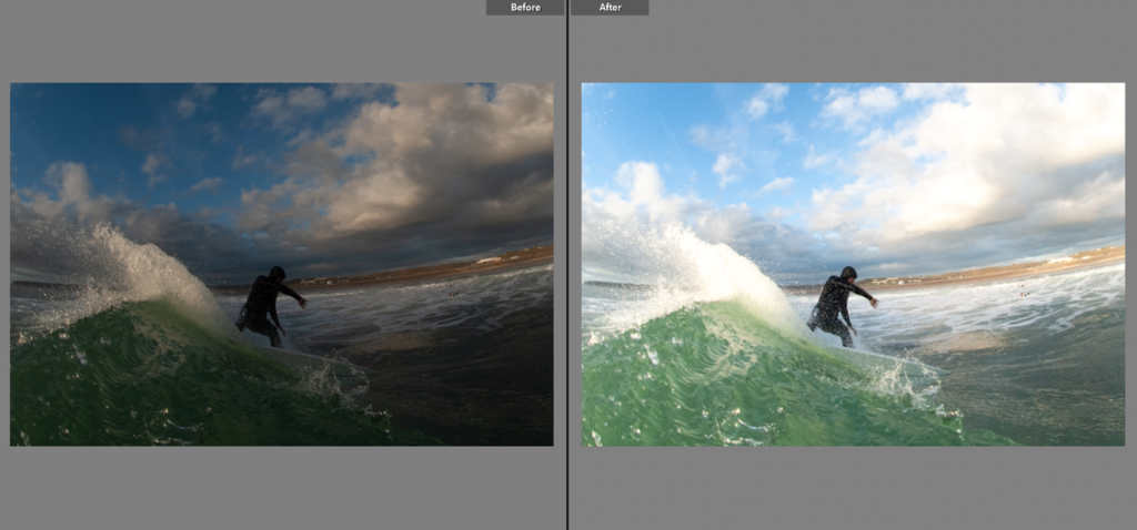
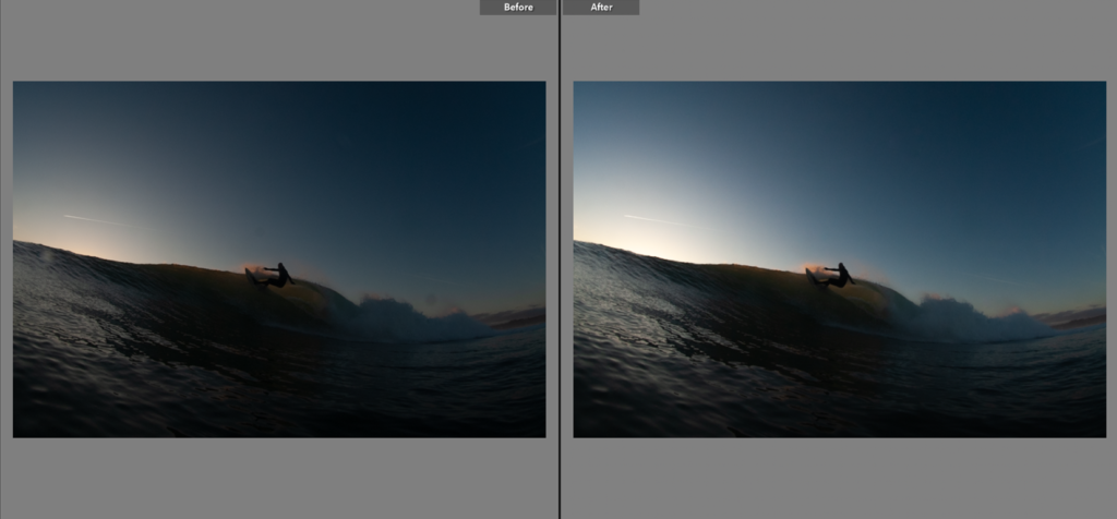
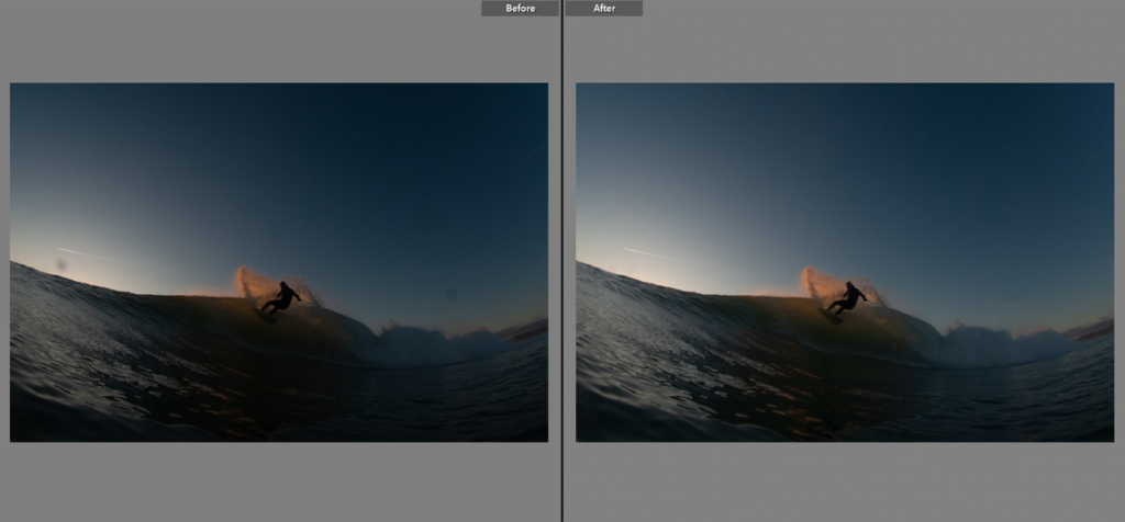
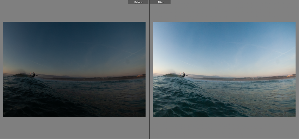
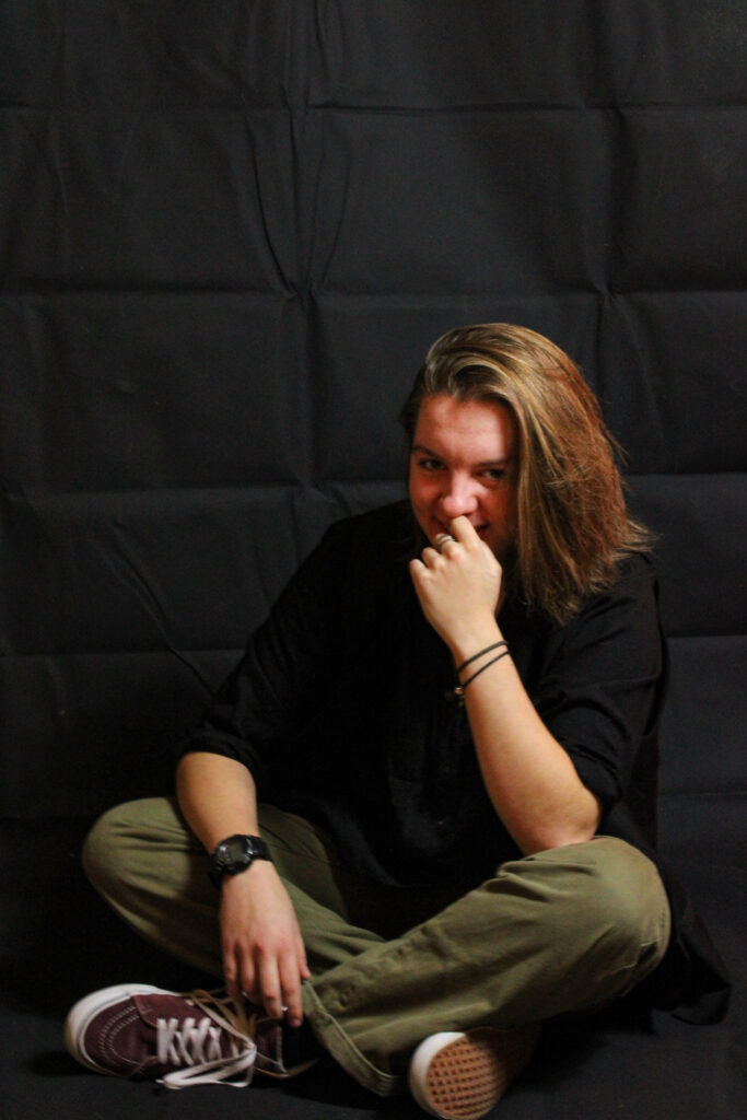
What I found out during the last photography mock is that I am good at night photography and that my night photos are a lot better then my day time photos what I want to explore doing during the night photography is trying to get a good photo during very low light and trying to use my light source to light up a large dark area however I would also like to do more industrial and natural locations such as a forest and industrial areas during night time I would also like to do more urban photography however I do want to get more of a variety of photo rather than just urban, I also want to do more abandoned and historical sites of jersey I think that would turn out good if done correctly. my urbans an city photography I will be taking inspiration form Liam Wong just because he’s done some really good work and the photographs that he produces are amazing and are visually appealing. I will also be taking inspiration from Chris Burkard who has some great natural long exposure night photography.
My two artists are similar in some ways yet extremely different in others. Cartier-Bresson is self-proclaimed as someone who wishes to remain invisible to his subjects – a faceless camera in the crowds which takes candid pictures. Klein, on the other hand, is far more direct with his camera, choosing to be upfront and in the faces of his subjects. He enjoyed the reactions of his subjects, finding that these made his images far more successful, and also staged some images. In the article I read to find criticism of his work, the author suggests that Cartier-Bresson’s images were in fact staged, but that he never actually stated this. He suggests that Cartier-Bresson’s images ‘aren’t Street Photographs anymore and shouldn’t be coined as that’ due to the possibility that they were taken when ‘you already have found the right background and are just waiting for the person to enter the frame.’ Therefore, the key distinction between these two photographers is that; one (Klein) was an openly staged photographer who enjoyed being both in the faces of unsuspecting subjects and a puppeteer of more theatrical images which he manually staged; the other (Cartier-Bresson), however, prefers to be invisible and has the philosophy of ‘the Decisive Moment’, suggesting complete candidness in each of his images, but is debated to have actually staged his images and not mentioned this. Cartier-Bresson is more highly regarded than Klein, perhaps because he came before him, but it is also clear that their styles differ quite widely. Klein, when photographing his hometown for his photobook New York, wanted to present it as gritty and loud, just as he saw it himself.
The publication is, in many ways, a projection of Klein’s dislike for the city, but is, in others, a sort of love letter to New York. Either way, the publication had been commissioned by Vogue who ultimately rejected it because of its harshness and unconventionality (he included images which were blurred, distorted, or unfocused). They wanted a romanticism where Klein preferred a realism. The publication later became renowned after being published in Paris and it is now a famous staple. Cartier-Bresson, on the other hand, was more focused on creating an aesthetically pleasing vision of whatever he was photographing, no matter how harsh it may have been in actuality. He, like so many consumers of his photography, enjoyed the harmony of form, line, and shape to create a perfect composition. His fame arguably derives from this love for aesthetics.
A key difference between the two artists is their subject matter and specialisation. Whilst Cartier-Bresson is regarded as, first and foremost, a street photographer, his work also focused on geo-political and social issues across the world, often dealing with far more stirring situations than that which occurs on the streets of most cities. The time in which he operated created a multitude of subject matter for him, meaning that his work is some of the most prominent and important of many historical events across the 20th Century, such as the Chinese Civil War of 1949, the partition of India in 1947, the Second World War of 1939-1945, and the Cold War’s effects in Eastern Europe which spanned the second half of the century. Klein however, did not branch from street photography, except to become a fashion photographer for Vogue. His work is more ‘fun’ than Cartier-Bresson’s, arguably, as it is either based on the aesthetics of fashion or the day-to-day life of various city dwellers, whilst Cartier-Bresson was commissioned to travel all over to be the key documenter of important historical events, placing him in higher regard because of his more dangerous working conditions and, as one may argue, more ‘serious’ work ethic. Both artists paid specific attention to aesthetics, but in different manners.
Conclusion
Overall, the two artists are not fundamentally similar when delved into, despite the immediate appearance that they may be. Their intentions differed, which resulted in different styles, subject matter, and outcomes, and is perhaps why they are so often compared alongside each other; they compliment each other.
In this project I want to observe how we perceive beauty, what makes something inherently beautiful? – and what can be classified as beautiful? I want to look at how Beauty standards warp our ideals and how unobtainable they are – I intend to do this through focusing on the mundane and aesthetic values in daily life that are not necessarily always believed to be beautiful.
Observe– How do we as a society classify something as being ‘beautiful’? Seek– What do I find an aesthetic value in that is unconventional? Challenge– Create images based off this. I want to focus on abstraction and close up photos of objects – Photographing still life to capture patterns in objects and nature, exploring the general aesthetics of the mundane. I also want to incorporate portraiture into this project looking at how we look at ourselves and our bodies, using Photomanipulation to obscure the images through either thread, writing or collage.
I want the final outcome of this project to be presented as a Zine. I think having a linear order to which the photos should be viewed may help in communicating my themes and ideas. Within the zine I want to have the images presented on their own without any accompanying text – as I feel text would take away from both the abstraction, I want the book to be purely visual to keep with the theme of recognising beauty. I also want to create a short mixed media Video possibly on the theme of denial of beauty standards or comparison? – I want to use collage and photomanipulation techniques to make a video out of photographs I take – I plan on mainly using portraiture for this section.
Whilst editing my first set of image i wanted to experiment with different colours but also black and white, but overall focusing on allowing shadows and reflections to be the main focal point in each image.
when editing this first image you can see I used a black and white style, enhancing the shadows and black areas in the image by dropping the shadows and increasing the contrast, however I didn’t want the white to be too grey so i used the black and white mix to enhance the white through the use of blue and yellow.
i also added a slight vignette to add a dramatic feel to the image.
With this second image i experimented with the use of colour and black and white, firstly though i cropped the image as i did not like the environment around the main focus point as it was messy and made it unclear on what the viewer should be looking at.
Personally I prefer the black and white image as it creates a more dramatic feel that I am looking for in my work.
For this photoshoot i explored areas around where i live during the last hour before sunset to try capture shadows forming on the street and the buildings, overall im not very happy with my outcomes as i believe the lighting just want right and the photos just dont match the aesthetic i was hoping to achieve.
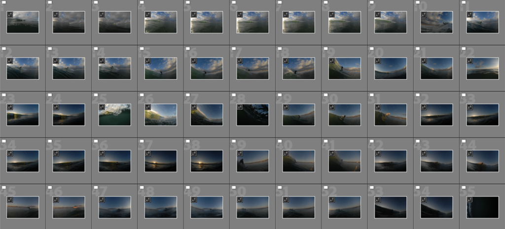
However as you can see in the above screenshot I marked my images with a star rating, you can see some images I really liked however others were test or just very weak.
With these photographs I have layered other mages on top to get a double exposed look in inspiration from Tamara Lichtenstein I have done this by using photoshop and creating layers and then turning down the opacity to make the top later opaque.