FINAL IMAGES & COMPARISON FROM SHOOT’S 1, 2 & 3:

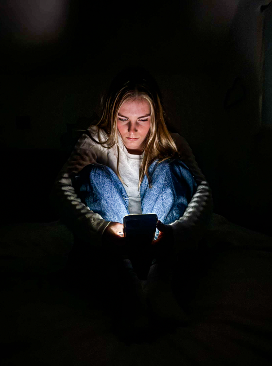
To choose my final images, I flagged all of the images I liked to put them into one place. I then colour coded the images to grade the to highlight my best images. Green being my favourite/best, and yellow being close to the best.

FINAL IMAGES:

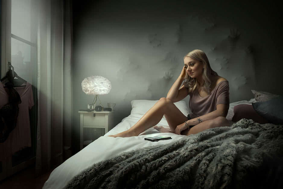
This is one of my favourite images from all three shoots so far. I think that the composition of this image is almost perfect as the model fills the whole length of the frame and you are still able to see her figure. Furthermore, this image is very similar to my artist reference, Nancy Honey.

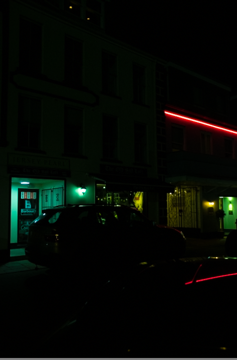
The natural lighting during this photoshoot made it challenging at times as the light was shining into the camera, however, I overcame this issue by changing my camera settings to make sure that it wasn’t over exposed. By doing this, when it came to editing these images I did not have to do much. Furthermore, I enjoyed staging this shoot by placing pillows in certain ways to create texture.

IMAGE COMPARISON/ ANALYSIS:

(left) Nancy Honey- Apple of my eye 1991 (right) My own interpretation

I chose to re-create this image of Nancy Honey’s as I believe it is a very strong image as it is a young girl trying on a bra with the label still on which suggests this could be her first bra. Furthermore, this image can be almost seen as the gate way into becoming sexualised through the male gaze. My version of this image is very similar as it both shows a bra from the back. However, in my image, the background is a wide open outside are which can be seen as scary to many people as it is the fear of the unknown.

(left) Nancy Honey- Daisy 1980-2010 (right) my own interpretation

(left) Nancy Honey- Daisy 1980-2010 (right) my own interpretation

Although the angle of these images aren’t quite the same, they both have many similarities. I like how within both images the models are making direct eye contact with the camera. By doing this, the models can be seen as strong individuals while they are opening up to the possibilities of being sexualised and being vulnerable.

EVALUATION:

I believe that my photoshoots have gone well. However, I could have benefited from taking more images which would allow me to have a larger variety of images. I think that I have stuck with the theme as well as my artist reference Nancy Honey. My next photoshoots will be more focused on my other artist which I have studied Cindy Sherman.

Layout Experimentations

Potential Layouts

diptych option 1
diptych option 2
triptych option 1
single option 1
single option 2
single option 3

Photoshoot 1 – Night Photography

Overall, I like most of these photos. The darkness however on most of them had a static-blurry effect on them which essentially ruined the overall photograph. They didn’t sit right with me so I had to withdraw a lot of them from the final presentation. With what I had left though I thought were great and came out very nice, especially the slow-shutter road images with the lights from the cars casting streaks of light through the road. Happy I finally managed to do some of those as I didn’t do any in year 12.

Artist Study Maurice van es

Now will not be with us forever

Maurice Van Es was born in 1984 in the Netherlands. He is a visual artist that works with photographs. He graduated from the Royal Academy of Arts in Hague using his graduation project “Now will not be with us forever”. It was a book cassette which contained seven different books. This work was published by Lodret Vandret and was exhibited in New York, Paris and Amsterdam.

In this book he deals with photography’s intrinsic dimension: seizing a moment that will not return. He does this by focusing on his close surrounding environment, his family and what he is familiar with. This would be done through images of his younger brother leaving for school each morning, or his grandfather putting on a pullover and other physical objects like a car or a blanket.

I came across this book in class and it immediately stroke my attention due to the unique layout of the book, or a collection of zines. It was unusual for me but it interested me at the same time.


Van Es captures detailed photos in his work “Textures of Childhood” (2012), zooming in on items from old family photos, such as his parents’ bedsheet and the couch. He adds dates to show when these things were used, giving them a sense of life that objects don’t usually have. The “book” is a set of eight booklets in a case, each with a different coloured cover and paper inside, ranging from shiny to soft. They’re like a beautiful plate of desserts, carefully made to be enjoyable.


The project as a whole is imbued with an exploration of the passage of time. In “New life” (2012–14), van Es captures the evolving dynamics with his younger brother, who, upon reaching sixteen, refuses to be photographed. Van Es responds by documenting his brother’s attempts to evade the camera, resulting in a series of candid images reflecting adolescent frustration. In contrast, “To me you are a work of art” (2011) presents a touching homage to their mother. Described as “Unintentional installations made by my mother,” the booklet departs from the typical format, featuring a pocketed folio containing five posters depicting everyday domestic scenes.
The book “Now will not be with us forever” acts as a big self-portrait, showing what’s important to van Es in his life. While most of the book focuses on his relationships with others, the thickest booklets, “Putting on 2012” (2012) and “The past is a strange place” (2010–present), are all about him. “Putting on 2012” lists every piece of clothing he wore in 2012, while “The past is a strange place” has photos of his daily life. These photos reveal how van Es notices small and interesting things in ordinary life. He uses a bright light in his photos to make the details stand out and sometimes makes things look weird or abstract.

Since it was the layout that captivated me more than the subject of the photographs themselves. not because the photographs were unsuccessful, but instead because the subject of them doesn’t link to what I wish to explore. I wanted to focus in more detail about the layout of them.

What I like the most about his outcomes is the layout, as it is unusual, compared to traditional methods of displaying images, such as a standard photobook. One of the many things about his layout is how he is not afraid to combine various techniques, like how in the compilation of the zines there is a folder containing photographs which unfold to an A3 paper size. To me this layout enhances the message of the collections itself. Through this layout he can mix different photoshoots by putting them in groups, a zine for each photoshoot. Like when he grouped textiles from childhood, into a zine consisting of only zoomed in photographs of different fabrics. When thinking about how I plan to present my final outcomes if I follow Murices’ methods that he used for this book, I will be able to communicate the message of my selected theme the best. as my idea consists of many different approaches to the subject, my outcomes are also going to vary from each other, therefore by grouping them together, zine per photoshoot, I am able to show them in a better way than in a photobook. I also want to experiment with the different ways of the image display, like the foldable images in the folder.

Shoot six

Shoot six was again the abandoned hotel but with more areas which closely relate to a presence of people but also liminality how the space has been left to thrive in decay.

Artist Study – Mickalene Thomas

Mickalene Thomas is a contemporary African American Artist best known for her elaborate collages and paintings of similar style, she uses scraps of magazines and rhinestones to embellish her work. Her depictions of African American women explores both her relationship to her femininity as a black woman but also empowering black women in a broader social setting.

Thomas references classical portraiture and borrows scenes from popular culture – Combining traditional genres with African American women combatting the Eurocentric view large amounts of art and history has had placing Black women in the spotlight.

“Positioning black women — artists, actresses, characters, and her own family — as mentors and muses, and as heroic figures in a lineage of their own, Thomas overrides oppressive narratives.” 1

She takes ques from artists such as Manet,  Gustave Courbet and Henri Matisse. Often directly pulling poses from their works. “She models her figures on the classical poses and abstract settings popularized by these modern artists as a way to reclaim agency for women who have been represented as objects to be desired or subjugated.

Much of her work is a criticism and rejection to the male gaze specifically the over-sexualisation and miss representation of Black women and culture in art. Her subjects often look directly at the viewer challenging the dominant male gaze in art. This more assertive posing of her models shows a confidence in their skin and bodies which is essential to her combatting the ideas of typically gentle and submissive portrayals of women.

She creates elaborate mixed media paintings often incorporating Acrylic, Rhinestones and enamel. She often uses Collage to obscure bodies of her models and rebuild them into new settings. She uses bright block colours as a result of her collage he models are often dressed in bright outfits reminiscent of the 1970’s – she often does this in reference to her childhood growing up in the 70s. Thomas mentions being inspired by the work of contemporary artist Romare Bearden known for his abstract brightly coloured oil paintings. she also sights much of her inspiration coming from movements such as dada and cubism.

A good example of Thomas’s process is her 2010 works ‘Le déjeuner sur l’herbe: Les Trois Femmes Noires‘ (The Luncheon on the Grass: The Three Black Women) based of off Manets ‘Le déjeuner sur l’herbe‘ – This painting caused intense controversy when first completed depicting two nude women with two fully clothed men – Thomas now responds to this painting to challenge to notion of the male gaze all her figures are fully clothed looking to wards the viewer giving them agency and personality when compared to the female figures of Manets work. The ‘Le déjeuner sur l’herbe: Les Trois Femmes Noires‘ went through 3 stages before becoming the fully complete painting.

Thomas started by photographing her models in the MoMA sculpture garden, in poses reminiscent of Manets work.

She then created multiple versions of the same collage with differing materials.

The final painting is 10 x 24 ft based of the original photo but painted on wooden panels with oil, acrylic and enamel. Thomas has stated that she chose the large size to “take up space” in traditionally white male dominated spaces.

I would like to incorporate Thomas’s style of collage into my work as I am drawn to her use of texture in her work and her ability to create entirely new images from scratch.

  1. Byrd, Rikki (November 27, 2017). Hyperallergic ↩︎

Shoot five

This shoot was re-done in those half cave / bunker type tunnels but with better lighting and where we went deeper into the caves, it showed a lot of decay and a huge sense of eeriness, and a sense of place which has been left to exist without ever being touched again. I like how it has not only materials in there but also how a presence of people were in there as u can see the spray paint on the walls.

photoshoot 6

here are all the photos from photoshoot 6 they were taken at Gorey on the pier/harbour I got some really good images from this photoshoot and some of them are in the photo book

Shoot four

The fourth shoot was done in an abandoned hotel which suits the concept of liminal space perfectly through its transition between one thing to another, for example hotels are used to get between one place and another, this decaying hotel also has the transition between new to abandoned/old and decaying. I liked these images a lot because of its sense of presence by people who left it behind.

Photoshoot 3

Due to this photoshoot being similar to my first, My inspiration was again Andreas Varro. This is due to our similar use of artificial lighting and the dystopian look that we both aimed to get.

For this photoshoot I decided to do it after the sun went down, I did this to eliminate all natural lighting that could intrude into my pictures, I did this photoshoot in a bedroom at my house to create a natural setting. I used 1 model who was a female and took various images of her in bed while on her mobile phone. To achieve the outcome that I wanted I took multiple images of her in different positions and asked her to represent her ‘Natural state’ meaning to portray what she is usually like when she in in bed on her phone.

Conclusion

In conclusion I feel that this photoshoot really portrays the dystopian reality of todays consumption of technology from an outside point of view of how isolated a person is/looks in their usual day to day life’s. I am very happy with how the images turned out and I am looking forward to editing them in the future.

Final edits

I edited all of the above images above on Lightroom classic to develop these pictures into the tones that I was looking for. To do this on all of my pictures I exaggerated the contrast so that it strongly appeared that in all of my images that the artificial cool lighting really defined my models facial structure and impressions that they where displaying. I also wanted the background in the image to be purely black so to achieve this I made the exposure more powerful so that the viewers only look at the focal points of the image.

Image comparision with Andreas Varro

The image that I made and developed on the right was produced to share some relation with the image on the right made by Andreas Varro. The similarities between our images are quite evident such as both of our focal points are female models sat with or on their phones on a bed in their bedroom. Individually both images significantly display and represent to the viewers the dystopian reality that we live in, in todays society as this is so many peoples reality. The differences between our images though are that In Varro’s image he used the use of both natural and artificial lighting to aluminate the background of the image where as In my image I purely only used artificial lighting from the mobile phone to create more of an unsettling persoonia and feel, and to also covey the model as blocking out the reality that surrounds her while only focusing on her screen.