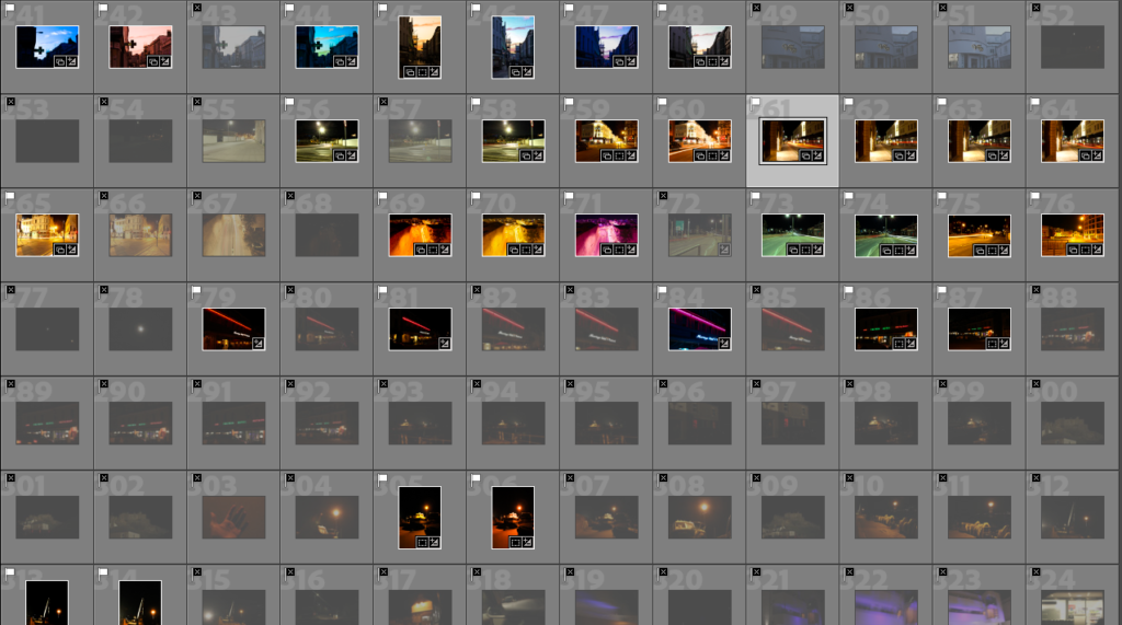
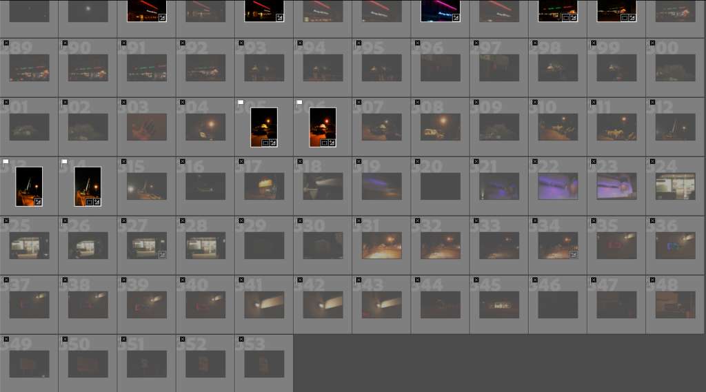
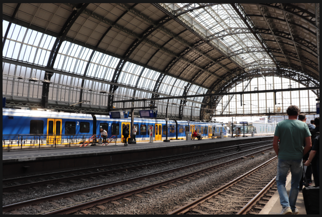
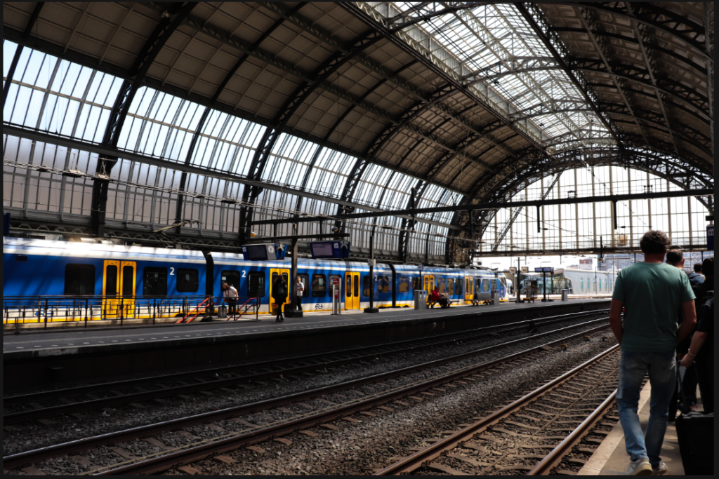
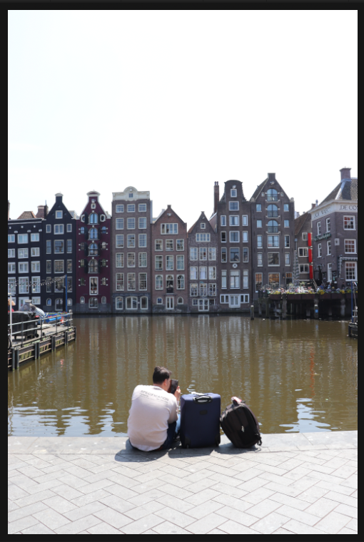
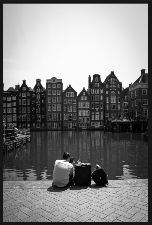
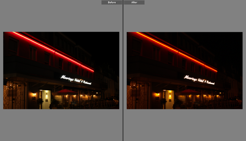
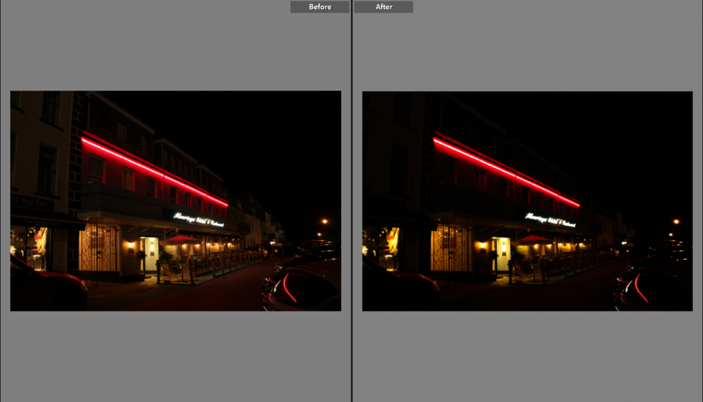
Photoshoot Development

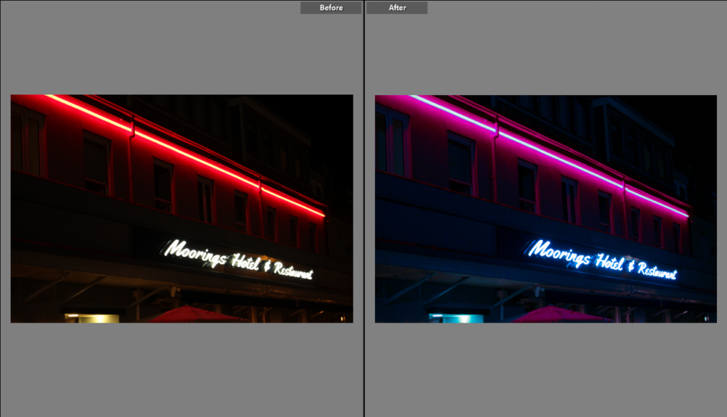
Some sky images, I changed the overall colour for some. I did this by changing the temperature and tint sliders, combined with all the basic sliders too and slight tweaks of the vibrance and saturation bars, these all were used to completely enhance and make the photos so much better:

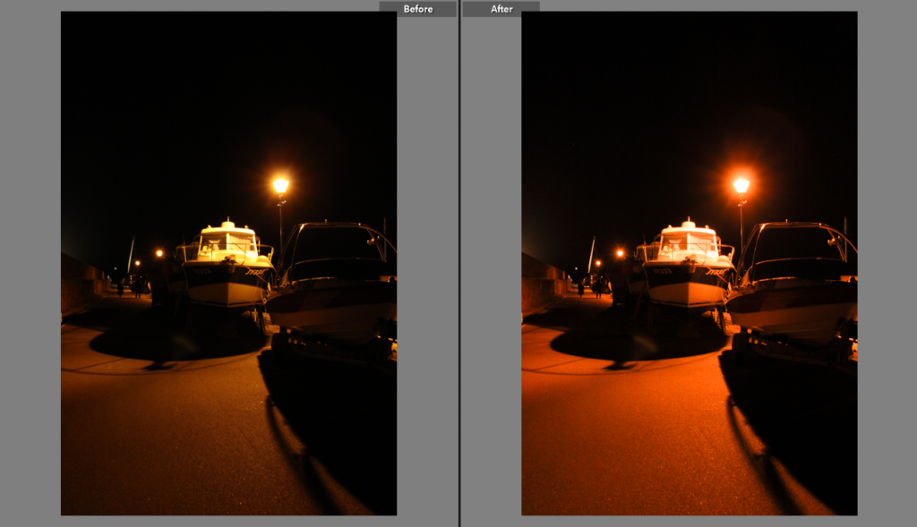
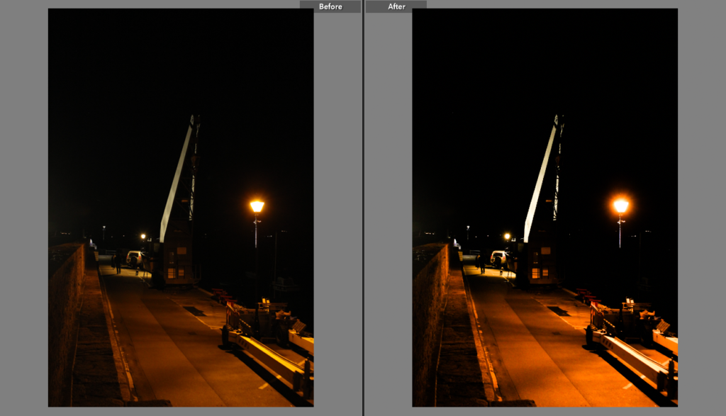
Most of the night images edits were mostly minimal and hard to even notice, as they were mostly toned to the way I saw fit already. The ones that feature the car lights though took a bit more work than the rest of the photographs. These were made by slowing own the shutter speed on the camera, so when a car was about to pass I would press the shoot button and the shutter would stay open, capturing all the lights and movement during that window of time. When the shutter closed, after about 20 seconds, the final image would show the lights from the cars turned into streaks.

This one captured a mobility scooter that went past, you can see the light it left on the bottom right.

Formalism

In formalism the Design, Composition and Lighting are dominant over Subject Matter. The photographer becomes a visual designer whenever a frame is captured.

In my work I believe I focus on the idea of formalism in the way the image is dominantly made up of bold lines shadows and tones, with elements of heavy texture or even the lack of texture.

This image has an empty alt attribute; its file name is image-156.png

here are some examples of my work from my first photoshoot in which I believe my work shows a heavy inspiration from formalism.

PHOTOSHOOT TWO: EDITING

EDITING PROCESS:

These images were taken during a night out with the girls that started with a car wash which led to going out clubbing. This photoshoot was to reflect this idea of ‘girlhood’ and the stereotypical view of how girls present themselves for a night out, specifically for the male gaze. In these images there are a range of portraits of girls getting ready and girls challenging the stereotype with knowledge about cars. During the editing process I kept the aesthetic of the digital camera, reinforcing the style of my artist reference Nancy Honey. Honey photographed this idea of ‘girlhood’ in a sense documenting how femininity is expressed through female identity. During the process of editing the pictures, I adjusted the tone of the images to more cooler blues and purples, which has connotations of calm, relaxed, and reserved, then warmer yellow tones.

Furthermore, I adjusted the images to cool tones in order to fit with the previous photoshoot editing style. However I also intend to edit the previous photoshoot with more warmer tones so there can be a contrast between warm and cool tones in the editing style. This photoshoot easily adjusted to the cooler tones as some of these images were taken in the dark, and moreover the coloured clothes of the girls simply works with the cool undertone of the image.

PHOTOSHOOT TWO: CONTACT SHEET

REFLECTION:

This photoshoot was slightly disorganised however I got some of the shots I needed. Even though the plan was not to do a car wash I still managed to get some images. However later in the night when some girls got ready to go out I managed to get some images of the girls getting ready. This was slightly unorganised as some girls already came organised and ready which limited the amount of images I could get. Even with the very limited photoshoot I still managed to get some shots which I think I could possibly use in my exam project. Reflecting on this photoshoot I overall think it could have been more organised and more images could have been taken. Applying this to Honey I believe some images can work of girls getting ready and doing makeup, some of these photos can also work with Justine Kurland’s ‘Girl Pictures’ even though she is not my targeted artist reference I believe she is relevant to the project.

During the editing process I will be enhancing the brightest and the idea of using ‘flash’. I will be exploring cooler temperatures such as blue and purple to reinforce this idea of femininity and girl power. Purples and pinks are often associated as feminine therefore reinforcing the gender stereotype I am presenting in my photography. However to further recreate Honey’s look in her photography, I will need to take some photo’s during golden hour.

MY IMAGES VS NANCY HONEY:

COLOUR RATING:

RED: BAD QUALITY IMAGES

YELLOW: RELATIVLY GOOD IMAGES, COULD BE IMPROVED

GREEN: GOOD IMAGES, THAT FIT WELL WITH ARTIST STUDY

PURPLE: BEST IMAGES, FIT WITH ARTIST STUDY, CREATIVE

Edits for photoshoot #1 – Amsterdam

When I edited these images, I wanted to make sure I didn’t detract from the vibrancy of the colour in a lot of them. For these images, I mostly increased contrast and made them brighter. For the images that didn’t have this level of vibrancy, (due to overexposure, underexposure, etc.) I made them black and white and increased contrast to make them more dramatic. See below for an example of one of the colourful images vs a less colourful one.

This was the original image. I wanted to preserve the lovely colours in the train and so increased contrast and decreased exposure just a little.

I like how this highlighted the rays of sunlight by adding contrast between light and shade.

This image was clearly overexposed and needed to be made black and white as it lacked the colour I wanted.

So, I increased contrast, decreased exposure, increased shadows, and decreased highlights. I also added the slightest vignette that is only a little noticeable.

I like the way these turned out and this is why I continued relatively the same pattern throughout all of my edits.

PHOTOSHOOT PLAN TWO:

WHAT?

In this photoshoot I intend to show stereotypical and counter typical views of femininity. In this photoshoot I am exploring girls knowledge about cars. Therefore in this photoshoot I am presenting girls cleaning cars and creating a counter typical view that woman are not only house workers and require the males help. However also in this photoshoot I am intending to take more images of girls getting ready as a second part to photoshoot one, so I can have more of a variety.

WHERE?

This photoshoot will be taken inside, in my friends house in her room where many of the girls will be getting ready. Furthermore, some of the pictures are also taken place outside at Roberts garage in St. Brelades.

LOCATIONS:

HOUSE – INCLUDING BEDROOM AND BATHROOM.

ROBERTS – ST BRELADES

HOW?

I will be using a Kodak Digital camera in order to take more vintage looking images, which have a slight grain to them. Furthermore I will be using the flash setting to try and re create Honeys images as well as trying to recreate the 2000’s aesthetic.

WHY?

This photoshoot intends to present the idea of girls stereotypically getting ready together and applying makeup; overall having fun. However I will also be taking images of girls with cars which can arguably be said as counter typical as more of a masculine trait.

GALLERY OF MY IMAGES:

Photoshoot plan 6

Photoshoot Plan 5

PHOTOSHOOT ONE: EDITING

EDITING PROCESS:

These images were taken during and before a girls birthday party. This photoshoot was to reflect this idea of ‘girlhood’ and the stereotypical view of how girls dress at parties, specifically for the male gaze. In these images there are a range of portraits and close ups of hair and accessories. During the editing process I kept the aesthetic of the digital camera, reinforcing the style of my artist reference Nancy Honey. Honey photographed this idea of ‘girlhood’ in a sense documenting the evolution of their feminine identity. During the process of editing the pictures, I adjusted the tone of the images to more cooler blues and purples, which has connotations of calm, relaxed, and reserved, then warmer yellow tones. The cool tones immediately changed the aesthetic of the images by adding purples hues, which is stereotypically a more feminine colour. Furthermore connotations of cool colours are often associated with feelings of calmness, relaxation, tranquillity or sometimes even melancholy, which can be seen through Honeys photography work.

Furthermore I decreased the exposure to sharpen the leading lines of the images (which is where your eyes follow in the photograph), however I also increased the highlights in order to bring some of the brightness of the flash back into the image, more so by enhancing the highlights in the image you are able to see the highlight point of the young girls faces. In some images I decided to add a white vignette in order to directly focus on the portraits of the girls and what they are doing, whether is it posing or laughing. By adding a white vignette it further brightens the image creating this bright grainy aesthetic of digital camera’s back in the day. By using the white vignette it is also improving the focal point of the images directly drawing the audience, and by brightening the overall image.

PHOTOSHOOT ONE: CONTACT SHEET

REFLECTION:

Overall the photoshoot went as planned, I managed to get a good range of images of girls getting ready and girls out together. I got many good shots in which I know I will have a range to edit from with different styles and angles. Furthermore by taking images of many girls, it gives me a variety to work with. Most of these shots are posed however shows girls smiling and being happy which can be argued shows the stereotypical woman of being less aggressive then men are stereotyped. This shoot fits with Nancy Honey more then Cindy Sherman, as it portrays young girls and this idea of girlhood, and becoming woman. Some shots that are inspired from Honey is girls doing their makeup and girls helping each other out.

Overall, I believe this photoshoot went well, however to improve I would like to take less posed images and more natural candid images. In which the girls don’t know I am taking images of them and just more in the moment images. During the editing process I plan to experiment with different hues and temperatures (cool and warm tones) in order to create this aesthetic f grainy old camera like the style of Nancy Honey.

MY IMAGES VS NANCY HONEY:

COLOUR RATING:

RED: BAD QUALITY IMAGES

YELLOW: RELATIVLY GOOD IMAGES, COULD BE IMPROVED

GREEN: GOOD IMAGES, THAT FIT WELL WITH ARTIST STUDY

PURPLE: BEST IMAGES, FIT WITH ARTIST STUDY, CREATIVE