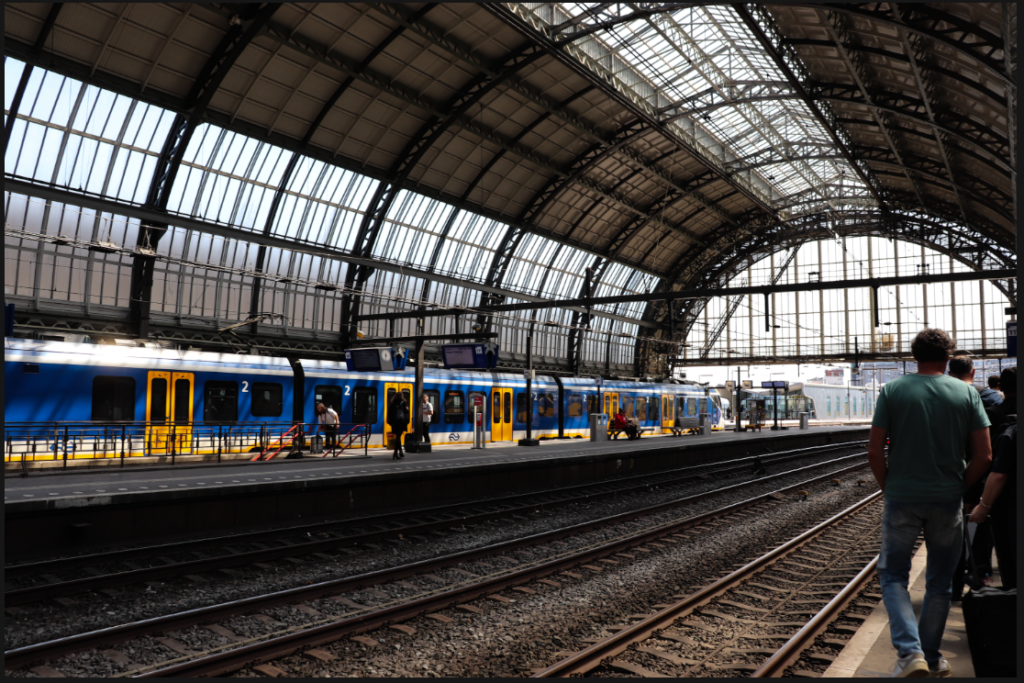
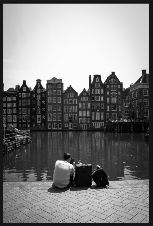
When I edited these images, I wanted to make sure I didn’t detract from the vibrancy of the colour in a lot of them. For these images, I mostly increased contrast and made them brighter. For the images that didn’t have this level of vibrancy, (due to overexposure, underexposure, etc.) I made them black and white and increased contrast to make them more dramatic. See below for an example of one of the colourful images vs a less colourful one.
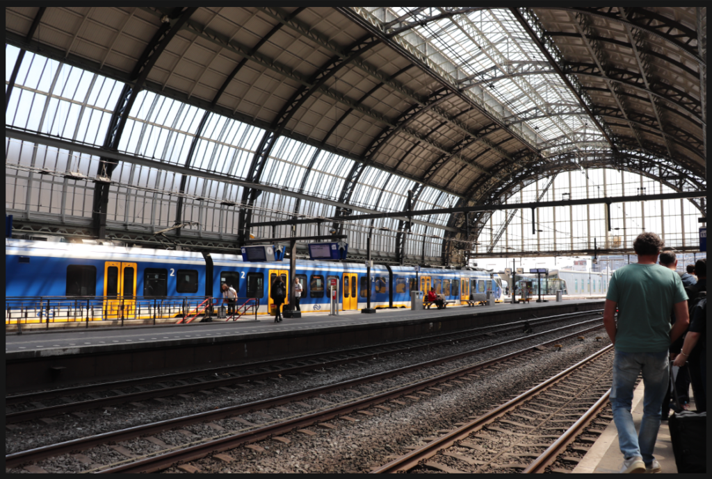
This was the original image. I wanted to preserve the lovely colours in the train and so increased contrast and decreased exposure just a little.
I like how this highlighted the rays of sunlight by adding contrast between light and shade.
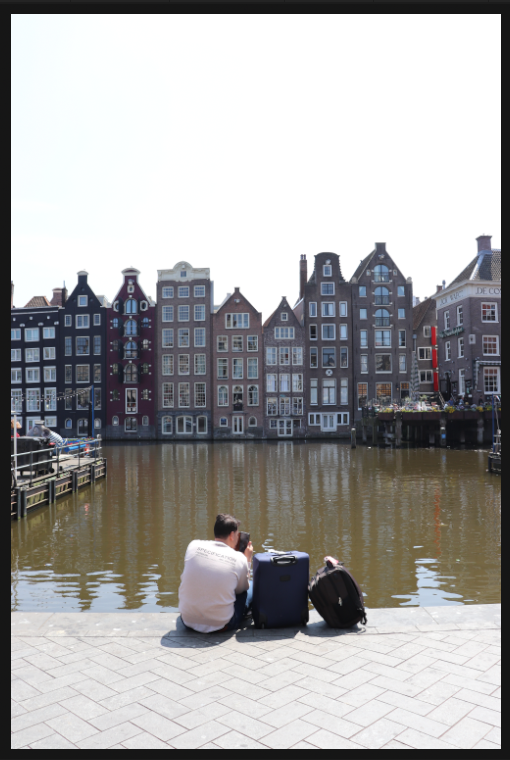
This image was clearly overexposed and needed to be made black and white as it lacked the colour I wanted.
So, I increased contrast, decreased exposure, increased shadows, and decreased highlights. I also added the slightest vignette that is only a little noticeable.
I like the way these turned out and this is why I continued relatively the same pattern throughout all of my edits.