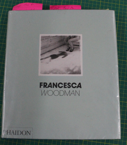
Scattered In Space And Time – Francesca Woodman – Chris Townsend
The Layout
Throughout this book the images are rarely layed out traditionally, the images are in boxes, film strips, polaroid framing etc.
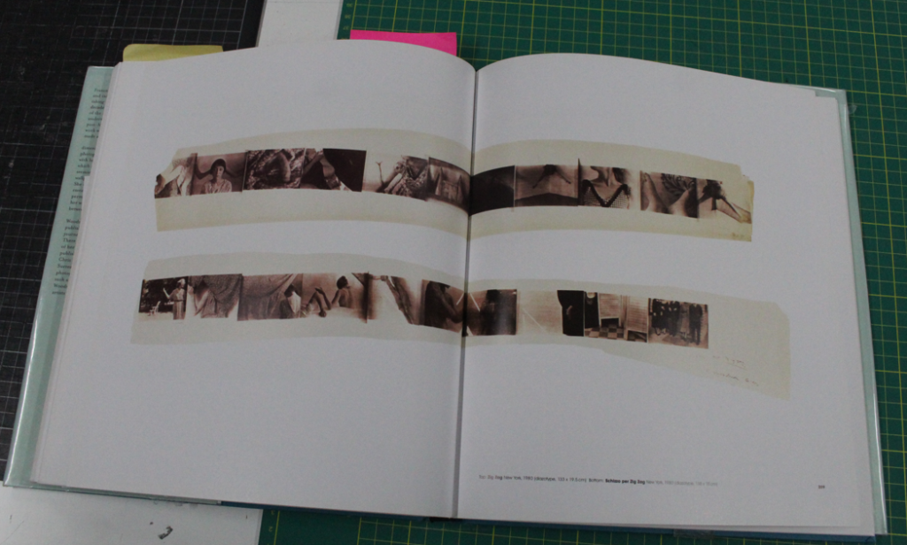
I chose to look at this book as I want to do a similar style for my layout as I think it makes the book more interesting and even offers a vintage feel to the images.
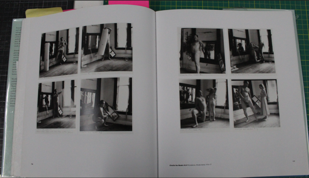
By using boxes and frames around the images you can compile similar/associated images alongside each other making them more powerful and creating a sense of narrative to the pictures.
The Images
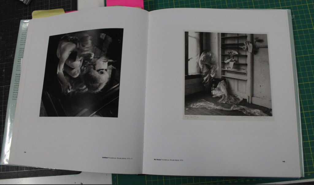
The images themselves relate to my ideas for my project as the book examines the influences of feminism and surrealism and focuses on the female experience.
My interpretation of the images is that they do in some ways represent female rage, especially internalised, which I found inspiring.
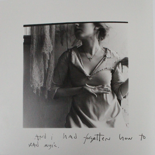
Some of his images also contain writing making the subjects of his images feel more real and giving the viewer a more personal relationship with the photographs. The writing poses to tell their story and give a glimpse of their personalities.
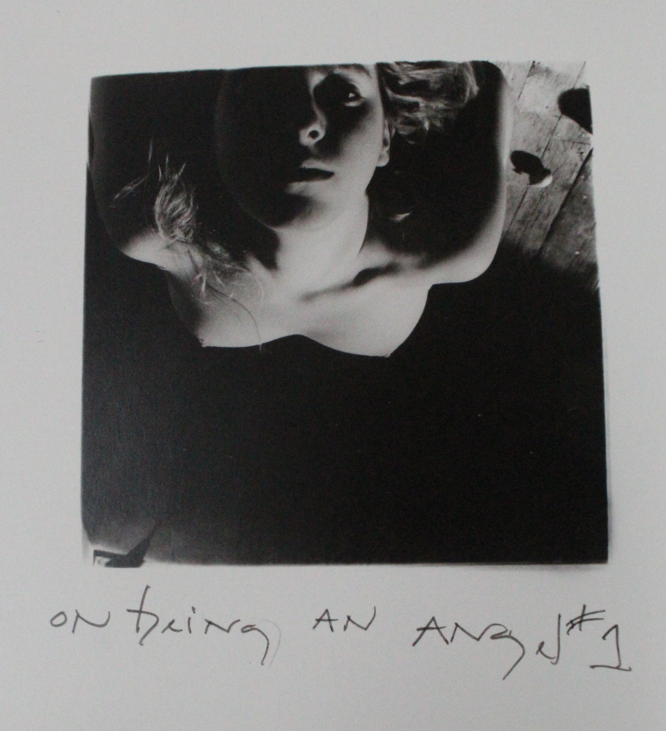
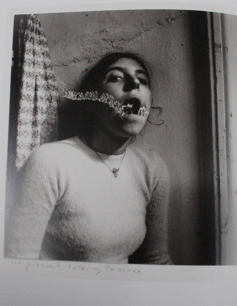
Some of her images are more creative with added elements to create representations. For example, the image above ‘Self portrait, talking to Vince Providence, Rhode Island, 1975-78’ shows a woman trying to speak or possibly shout and there’s something stopping her/covering her mouth. To me this represents her inability to be able to express her opinions and emotions potentially due to discrimination such as sexism or other struggles that hold women back. This image inspired me as it represents similar struggles to what I want my images to illustrate, portraying the ways in which women are scrutinised and put under pressure to be seen as delicate and unproblematic in order to appeal to societies expectations.